Design In-App Messages with Drag and Drop
How to Design an In-App Messages with the OneSignal Messaging composer
In-App Message Design
OneSignal's Drag-and-Drop editor for In-App Messages utilizes block elements. If you prefer to write code, see Design In-App Messages with HTML.
- Text: Allows you to add a series of text to your In-App
- Image: Add an image to your In-App Message along with a click action.
- Button: Customize your buttons to get user
- Close Button: Add, remove or customize the close button
- Background: Customize the background through size, image and opacity.

Navigate to Messages > In-App to create, view, edit, pause/resume, duplicate, and delete your In-App Messages.
Message Type
This is where the In-App Message will be located and how it appears on the screen.
| Message Type | Description |
|---|---|
| Top | Drops down from the top of the screen. |
| Center | Expands out from the center to partially fill screen. |
| Bottom | Pops up from the bottom of the screen. |
| Full | Expands out from the center to fill screen. You can choose with or without margins. To use this feature without margins, you’ll need to be using the following SDKs: iOS - 3.9.0, Android - 4.6.3. If the user does not have this SDK, they will see the in-app with margins by default. |
| Carousel | Add up to 10 screens (cards) with their own customizable content. Must have a Paid Plan and select the Full Message Type for this feature. |
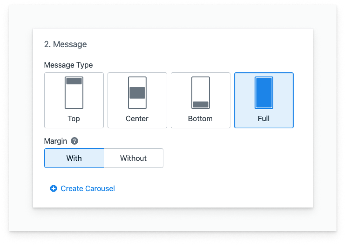
Image showing types of In-Apps you can create.
Orientation of your In-app Message
In-App Messages work in Portrait and Landscape mode.
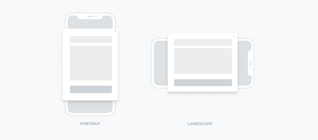
Image shows the orientation of phone for portrait and landscape
Different Block Types
Click Add Block to create a Button, Image, or Text element. You can drag, clone, or delete blocks using the Options at the top right of each block.
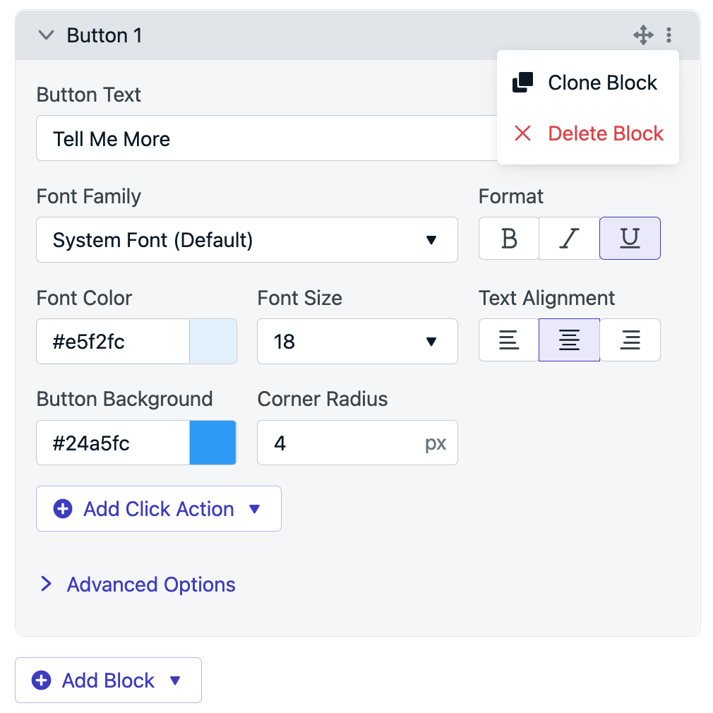
Image. Showing action to add and delete a block
Text
The Text block allows you to add text to your In-App Messages. Here you can use these to add feature summaries, describe the purpose of your application, provide personalized messaging and much more.
- Text: Here set the width and height of the screen in the In-App message. We use percentages to ensure your In-App Message is responsive according to the device the user is on.
- Font Family: Choose from some of the top fonts available from Google Fonts. Adding custom fonts available with HTML Editor.
- Format: Make your text bold, underlined, and/or italicized.
- Color: Select the color of your background. Additionally, add an Alpha value in the Color picker to have some transparency
- Alignment: Select if you want your font left aligned, center or right-aligned.
- Size: This allows you to select the size of the font.
Advanced Options
- Margins: This allows you to select how much space you’d like your in-app message to have around the background container. For example. If the width of the container is 80%, then you have a remaining 20% to use for margin. Then we can apply 10% for the Margin-Left and 10% for the Margin-Right. Similarly, we could also add more margin on the left-hand side than the right if needed.
Tips
- Changing Text with Languages: If you’d like to send your users In-App messages with different languages, we suggest segmenting your users into different Audiences by Language.
- Personalize Content: You can use data tags for the text blocks to personalize your content. Reference example here.
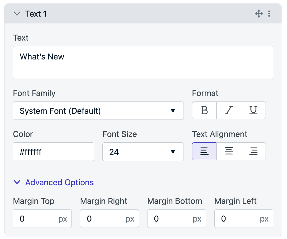
Image. Shows the Text element
Images
Select an image for your users to see. Images are often used to ensure your In-App Message is visually appealing and leads to higher engagement rates. in-app messages are displayed based on the dimensions of the phone.
Recommended image aspect ratios are 16:9, 4:3, or 3:2.
- Image: We support
.jpg,.png, and.gifimage formats. Max file upload size is 5 MB but you can host your own image resource and add the URL as well. These files are pulled in real time, so the smaller the size, the faster the message will load on the screen. - Click Action: Add a click action to your image.
Advanced Options
- Dismiss on click: Remove the in-app message from view when the block is clicked.
- Margins: This allows you to select how much space you’d like your images to have with other elements.
Tips
- Different Images for Users: If you want to display different images and background images to your users, use tag substitution on the Image upload URL. Additionally, you can also use tag substitution on the Image Click Action URL and direct your users to different links. See a great example here.
- Images with transparency: We recommend you use png images if you’d like transparency in your image. This can allow images to fade into the background container and create a really unique effect.
- Changing Images with Languages: If you’d like to send your users In-App messages with different images for different languages, we suggest segmenting your users into different Audiences by Language. This is the same approach recommending for Text with different languages.
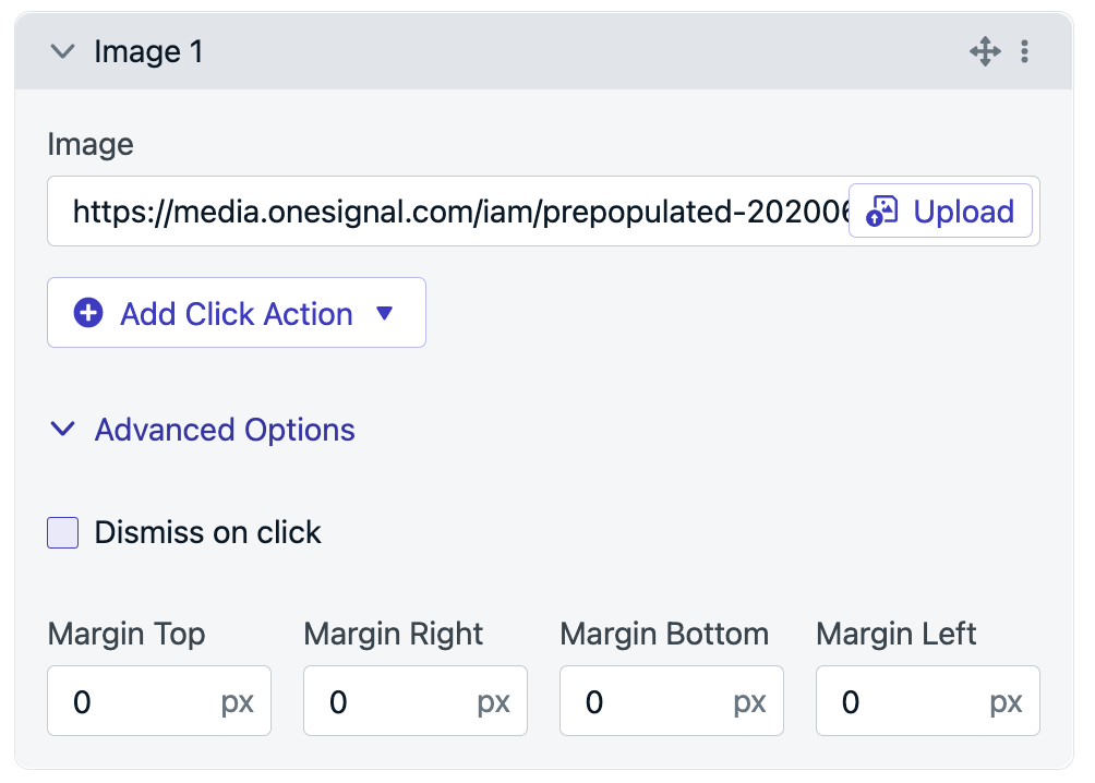
Image. Shows the Image element
Buttons
Button blocks allow you to add buttons to your In-App Message. Buttons can allow you to create call-to-actions for your users such as getting feedback and deep linking elsewhere.
- Button Text: Place your Call-to-Action (CTA) here.
- Font Family: Choose from some of the top fonts available from Google Fonts.
- Color: Select the color of your text. Additionally add an Alpha value in the Color picker to have
- Format: Make you text bold, underlined and/or italicized.
- Size: Allows you to select the size of the font.
- Alignment: Select if you want your font left aligned, centre or right aligned.
- Image: Here you can add an image to your button. Image formats supported are: t .jpg , .png and .gif
- Corner Radius: Allows you to determine how round you’d like the corners.
- Click Action: Add a click action to your button. Buttons can provide some of the following functionality:
- Tag users
- Send Outcomes
- Prompt for Push or Location
- Deep-Link to a page of the app
Advanced Options
- Margins: This allows you to select how much space you’d like your buttons to have with other elements.
- Border Weight: Set the weight of the border outline. If you do not want an outline, set this to zero.
- Drop Shadow X and Y: This allows you to determine what angle you want your shadow to be.
- Drop Shadow Color: Select the color you want your shadow to begin with. This will fade out to a zero opacity, depending on the spread of the shadow and the amount of blur applied to the shadow.
- Drop Shadow Spread: This allows you to select how large you want your drop shadow to be.
- Drop Shadow Blur: This allows you to choose how blurry you’d like your shadow to be.
- Dismiss on click: Remove the in-app message from view when the block is clicked.
Tips
- Personalize Button Text: You can use data tags to personalize the button text and the click action URL. See the example here.
- Image Contained vs. Overflow: If you want the image to be contained in the button, ensure the size matches the width and height sizes you provide. If you want the image to overflow the button, then add larger image and set the button background to have zero opacity through setting the Alpha (A) value to be 0. This way you can have buttons as full images, if needed.
- Soft shadows: For a soft shadow set a low color opacity using Alpha (A) in the color selector, and increase the drop shadow blur.
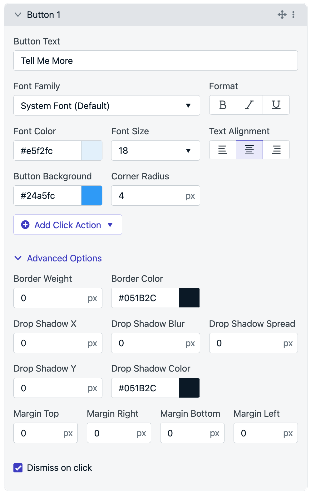
Image. Shows the Button element
Close Button
The Close Button allows you to turn off the close icon for your In-App Message. This can be used if you need to ensure your user clicks on a button selection, or if you want them to go through a carousel of cards without clicking out of the experience.
- Toggle On/Off: There is only one close button allowed per In-App Message, but if you don’t want it on your In-App Message, you can hide the button by toggling it off.
- Alternate Close Icon: Choose your own close icon, to ensure your In-App Message looks the same as your App UI. If you don’t have one, don’t worry - by default, we provide an icon being an X. We recommend your image is square around 10px x 10px. Image formats we support are .jpg , .png, .svg, and .gif
- Click Action: Add a click action to your close icon.
Advanced Options
- Margins: This allows you to select how much space you’d like your Close button to have with the container and other elements.
Tips
- Dismiss: If you remove your Close Button, we recommend adding a dismiss action within one of your buttons to allow your users to exit the In-App Message.
- Ensuring your user interacts with a group of cards: If you want to ensure your user see’s all of a group of In-App messages, then toggle off the close button. Then on the final screen add a dismiss action in one of the buttons. That way the user cannot exit the carousel/group of cards until completed.

Background
Customize your background for your users to see, through color and images.
- Image: We support
.jpg,.png, and.gifimage formats. - Click Action: Add a click action to your background.
- Background Color: Add a color to customize your background.
Advanced Options
- Margins: This allows you to select how much space you’d like your background block to have with other elements.
- Padding: Adjust the space between the content blocks and edge of the In-App Message. Default is 24px.
- Dismiss on click: Remove the in-app message from view when the block is clicked.
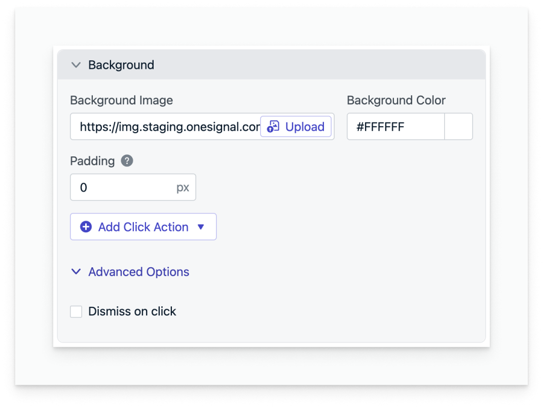
Background editor block
FAQ
How can I make a Full-Screen In-App? What SDK version do I need?
A full-screen in-app allows you to choose with and without margins. In order to create an in-app without margins, we recommend your apps be on the following SDKs:
- iOS: 3.9.0
- Android: 4.6.3
If the user has not updated their application, so they are on an older SDK, they will still receive the in-app message, but it will have margins by default.
How can I personalize the in-app message per user?
Tag substitution for In-App personalization is supported on the following fields:
- Text Block - Content
- Image and Background Image Block - URL to upload the image and Click Action URL
- Button Block - Content and Click Action URL
More details in Example: Personalization.
Note: Tag Substitution will be supported only on iOS version 3.3.0+ and Android version 4.3.0+ SDKs.
How can I remove the gray background or drop shadow from my banner style In-App?
Note: This change only applies to top and bottom banner In App Messages
We have added options to make the background transparent for banner style messages through the use of the plist and Android Manifest options. This will require these SDK versions at a minimum :
- iOS: 5.1.5
<key>OneSignal_in_app_message_hide_drop_shadow</key>
<true/>
<key>OneSignal_in_app_message_hide_gray_overlay</key>
<true/>
- Android: 5.1.9
<meta-data android:name="com.onesignal.inAppMessageHideGrayOverlay" android:value="true"/>
<meta-data android:name="com.onesignal.inAppMessageHideDropShadow" android:value="true"/>
Updated about 1 month ago
