TransPlot documentation
There are some packages to plot gene structures, for example ggbio, ggtranscript... But there are still some limitations for them. The IGV software provides a good visualization for gene multiple isoforms. If you want to plot protein-coding or non-coding genes, it seems a little bit difficult for you to draw with a lot of codes. Here I developed a small R package named transPlotR which makes gene structure visualization much easier. You can provide a little parameters to trancriptVis to make a plot with your own GTF files.
# install.packages("devtools")
devtools::install_github("junjunlab/transPlotR")Let's see a non-coding gene:
# load test data
data(gtf)

# non-coding gene
trancriptVis(gtfFile = gtf,
             gene = 'Xist')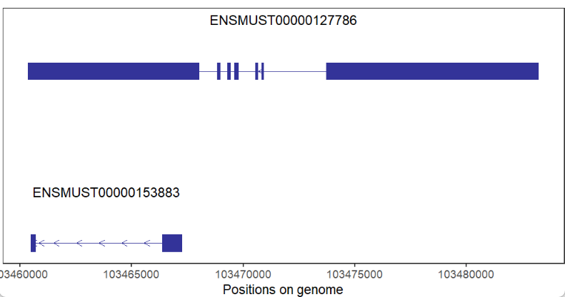
Plot protein-coding gene:
# coding gene
trancriptVis(gtfFile = gtf,
             gene = 'Nanog')
Change exon fill color:
# change fill color
trancriptVis(gtfFile = gtf,
             gene = 'Nanog',
             exonFill = '#CCFF00')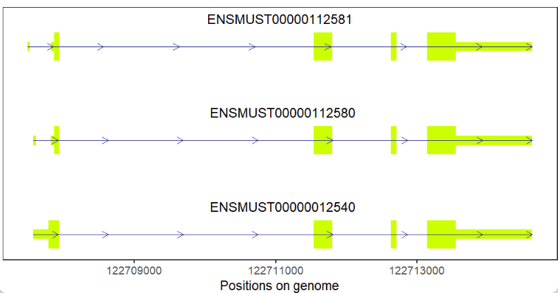
Change label size,color and position:
# change label size,color and position
trancriptVis(gtfFile = gtf,
             gene = 'Nanog',
             textLabelSize = 4,
             textLabelColor = 'red',
             relTextDist = 0)
Label with gene_name:
# aes by gene name
trancriptVis(gtfFile = gtf,
             gene = 'Nanog',
             textLabel = 'gene_name')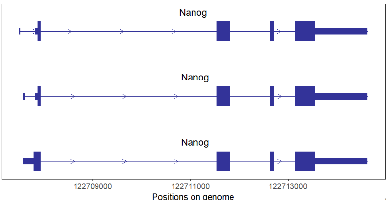
Fill color by transcript:
# color aes by transcript
trancriptVis(gtfFile = gtf,
             gene = 'Tpx2',
             exonColorBy = 'transcript_id')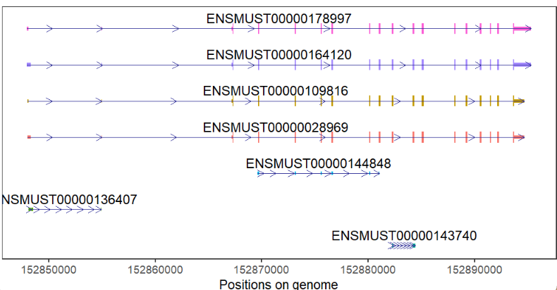
change arrow color and type:
# change arrow color and type
trancriptVis(gtfFile = gtf,
             gene = 'Nanog',
             arrowCol = 'orange',
             arrowType = 'closed')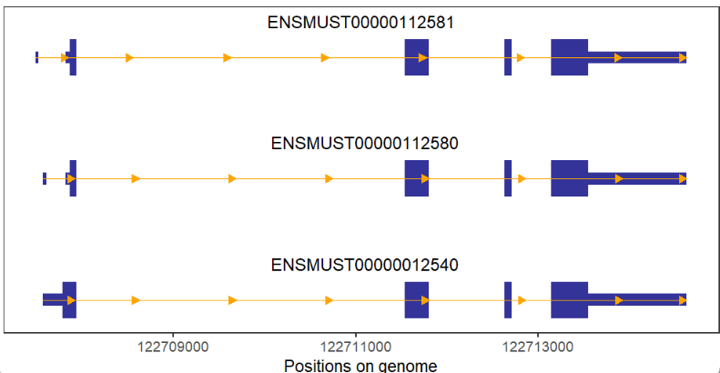
If no intron a gene, we can change arrow color to visualize easily:
# no intron gene and add arrow color
# change arrow color and type
trancriptVis(gtfFile = gtf,
             gene = 'Jun',
             textLabel = 'gene_name',
             arrowCol = 'white',
             arrowType = 'closed') +
  theme_void()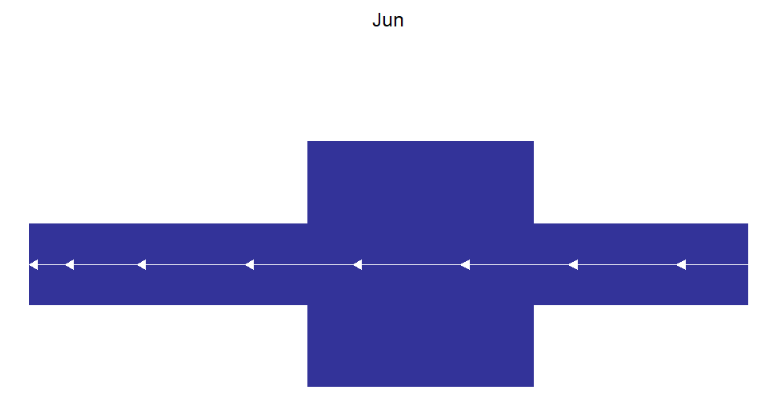
Add arrow numbers:
# add arrow breaks
trancriptVis(gtfFile = gtf,
             gene = 'Nanog',
             arrowCol = 'orange',
             arrowType = 'closed',
             arrowBreak = 0.1)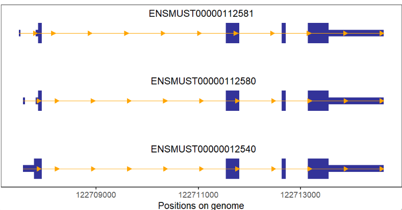
If you want to visualize some specific transcripts, you only need to supply transcript_id:
# draw specific transcript
p1 <- trancriptVis(gtfFile = gtf,
                   gene = 'Commd7')

p2 <- trancriptVis(gtfFile = gtf,
                   gene = 'Commd7',
                   myTranscript = c('ENSMUST00000071852','ENSMUST00000109782'))

# combine
cowplot::plot_grid(p1,p2,ncol = 2,align = 'hv')
Here I develop a new stype arrow which can be drawn on plot. Maybe you have seen this in some papers.
Let's make a contrast:
# add specific arrow
pneg <- trancriptVis(gtfFile = gtf,
                     gene = 'Gucy2e',
                     newStyleArrow = T)

ppos <- trancriptVis(gtfFile = gtf,
                     gene = 'Tex15',
                     newStyleArrow = T)

# combine
cowplot::plot_grid(pneg,ppos,ncol = 2,align = 'hv')
We can also remove normal arrows:
# remove normal arrow
trancriptVis(gtfFile = gtf,
             gene = 'Fat1',
             newStyleArrow = T,
             addNormalArrow = F)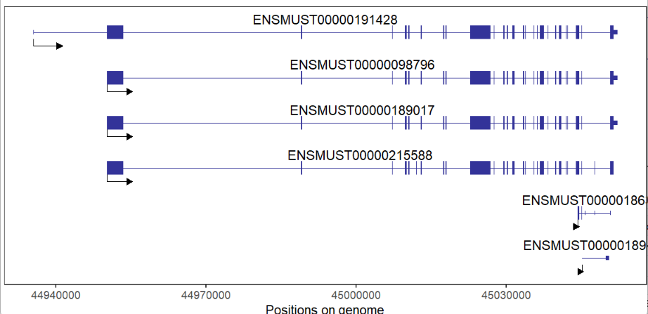
As you can see, the specific arrow length is proportional to each transcript length, we can set to the same length relative to the longest transcript:
# draw absolute specific arrow
trancriptVis(gtfFile = gtf,
             gene = 'Fat1',
             newStyleArrow = T,
             addNormalArrow = F,
             absSpecArrowLen = T)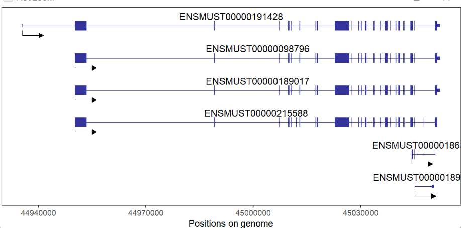
We can control arrow color,size and position:
# change position size color and height
trancriptVis(gtfFile = gtf,
             gene = 'Fat1',
             newStyleArrow = T,
             addNormalArrow = F,
             speArrowRelPos = 0.5,
             speArrowLineSize = 1,
             speArrowCol = 'red',
             speArrowRelHigh = 3)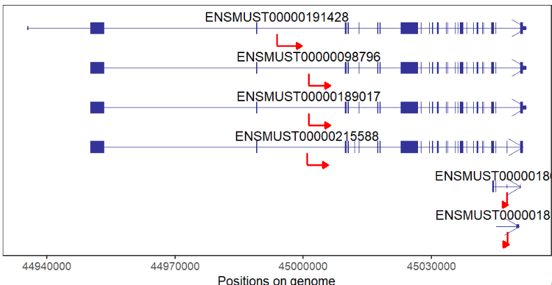
Besides we can draw cicular plot with this new style arrow:
# circle plot with specific arrow
trancriptVis(gtfFile = gtf,
             gene = 'F11',
             newStyleArrow = T,
             addNormalArrow = F,
             circle = T,
             ylimLow = -2)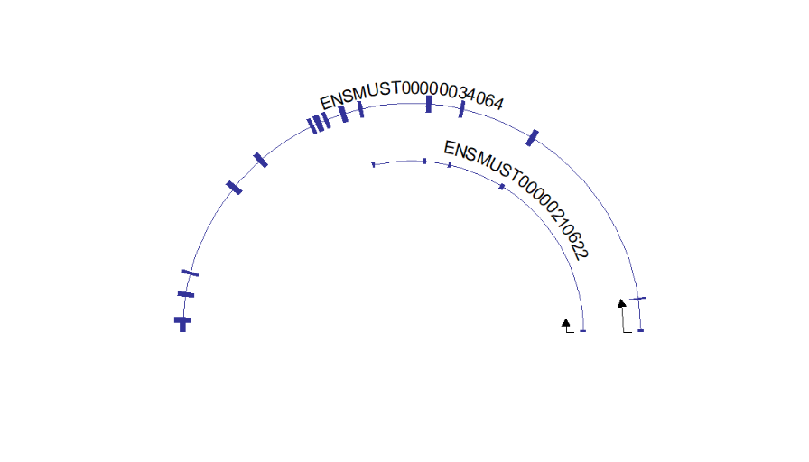
Circle plot with absolute specific arrow:
# circle plot with absolute specific arrow
trancriptVis(gtfFile = gtf,
             gene = 'F11',
             newStyleArrow = T,
             addNormalArrow = F,
             circle = T,
             ylimLow = -2,
             absSpecArrowLen = T)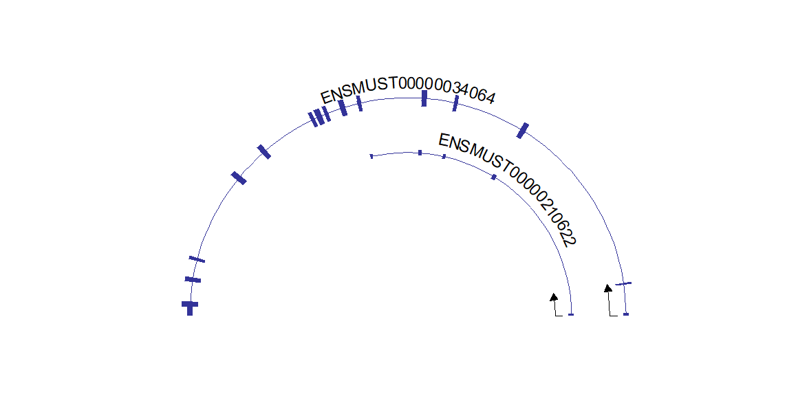
This package can draw multiple genes structures on plot, but you should keep in mind, multiple genes should on the same chromosome and close to each other. It does make sense with biological significance:
# support multiple gene
# should on same chromosome and close to each other
trancriptVis(gtfFile = gtf,
             gene = c('Trmt6','Mcm8','Crls1','Lrrn4','Fermt1'),
             textLabel = 'gene_name')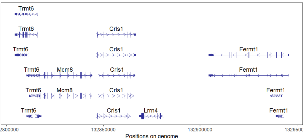
here shows the IGV plot with a little difference (because I use ensembl GTF file):

Color by gene and change arrow length:
# color by gene and change arrow length
trancriptVis(gtfFile = gtf,
             gene = c('Crls1','Fermt1'),
             textLabel = 'gene_name',
             exonColorBy = 'gene_name',
             newStyleArrow = T,
             speArrowRelLen = 1)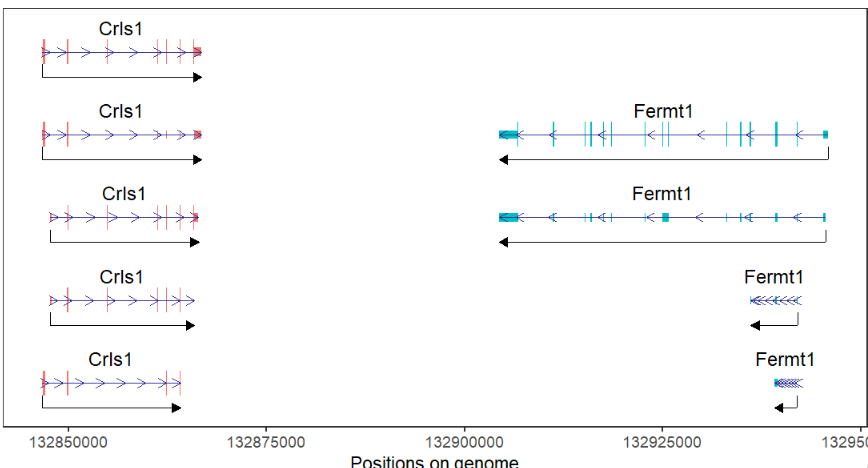
We can collpase multiple isoforms into one:
# collapse gene
trancriptVis(gtfFile = gtf,
             gene = c('Trmt6','Mcm8','Crls1','Lrrn4','Fermt1'),
             textLabel = 'gene_name',
             collapse = T,
             relTextDist = 0.2)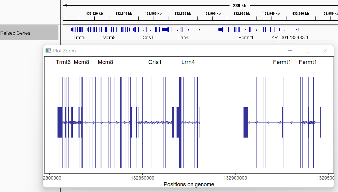
You can give a specific range including chr,start and end:
# support plot at a given region
trancriptVis(gtfFile = gtf,
             Chr = 11,
             posStart = 69609973,
             posEnd = 69624790)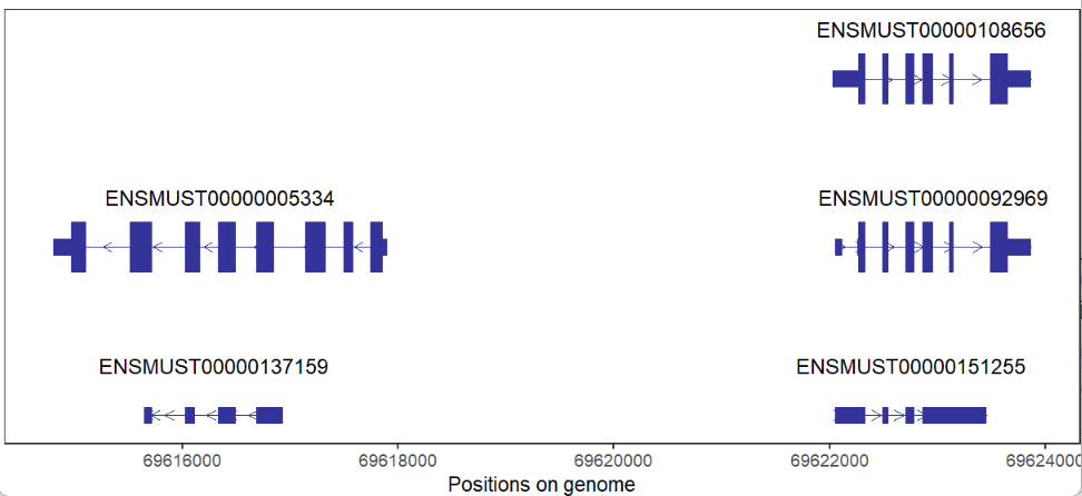
We can also draw gene structures with a circular layout format:
# draw circle structure
trancriptVis(gtfFile = gtf,
             gene = 'Gucy2e',
             textLabelSize = 4,
             circle = T)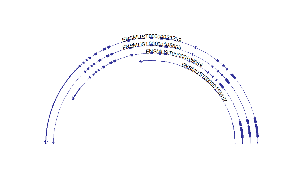
Making circle smaller:
# change circle small
trancriptVis(gtfFile = gtf,
             gene = 'Gucy2e',
             textLabelSize = 4,
             circle = T,
             ylimLow = 0)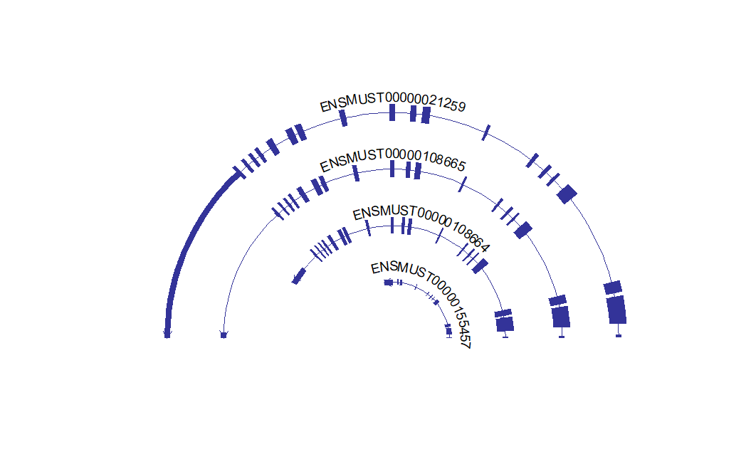
Change circle open angle:
# change circle angle
c1 <- trancriptVis(gtfFile = gtf,
             gene = 'F11',
             textLabelSize = 4,
             circle = T,
             ylimLow = 0,
             openAngle = 0)

c2 <- trancriptVis(gtfFile = gtf,
             gene = 'F11',
             textLabelSize = 4,
             circle = T,
             ylimLow = 0,
             openAngle = 0.2)

# combine
cowplot::plot_grid(c1,c2,ncol = 2,align = 'hv')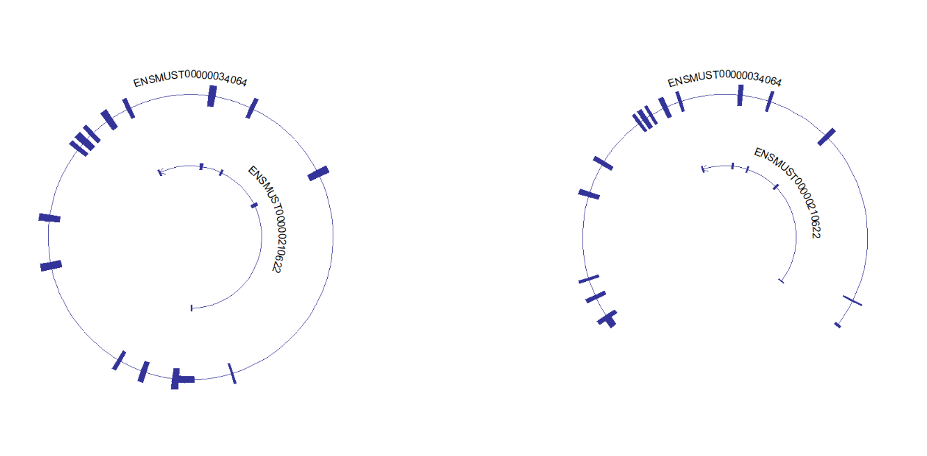
Exon fill color by transcript:
# chenge aes fill
trancriptVis(gtfFile = gtf,
             gene = 'Gucy2e',
             textLabelSize = 4,
             circle = T,
             ylimLow = 0,
             exonColorByTrans = T)
Change segment line color:
# change segment color
trancriptVis(gtfFile = gtf,
             gene = 'Gucy2e',
             textLabelSize = 4,
             circle = T,
             ylimLow = 0,
             exonColorByTrans = T,
             circSegCol = 'black')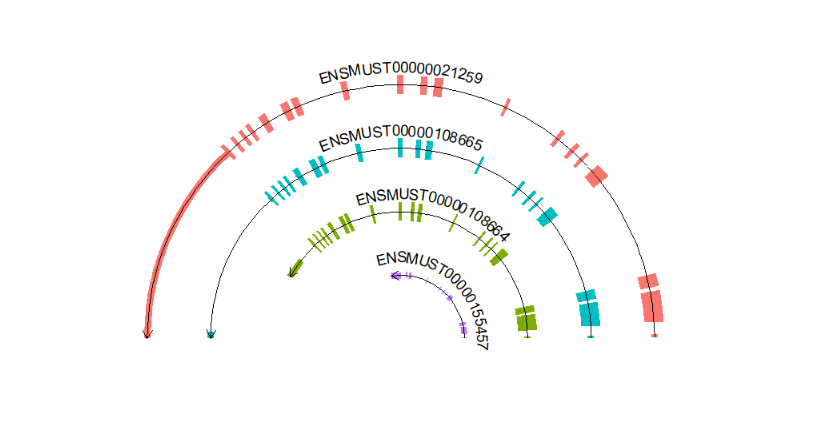
Add gene name:
# add gene name
trancriptVis(gtfFile = gtf,
             gene = 'Gucy2e',
             textLabel = 'gene_name',
             textLabelSize = 5,
             circle = T,
             ylimLow = 0,
             exonColorByTrans = T)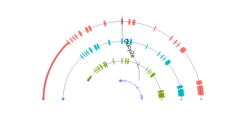
Remove connect line:
# remove line
trancriptVis(gtfFile = gtf,
             gene = 'Gucy2e',
             textLabel = 'gene_name',
             textLabelSize = 5,
             circle = T,
             ylimLow = 0,
             exonColorByTrans = T,
             text_only = T)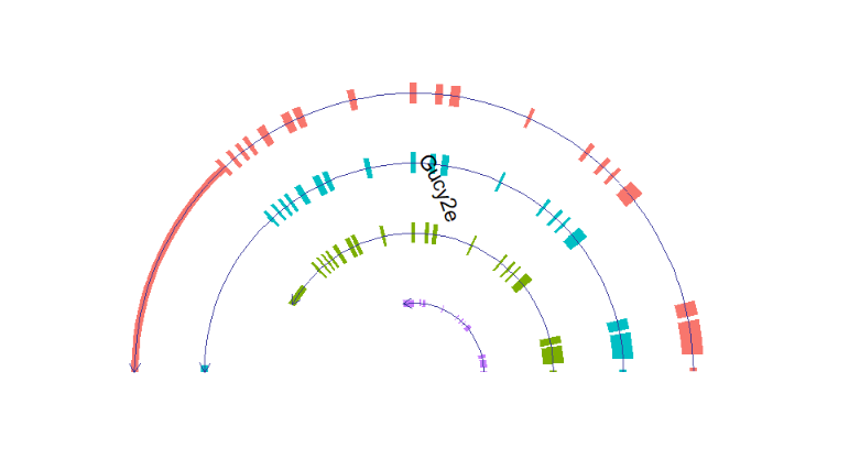
Draw multiple genes:
# multiple gene
trancriptVis(gtfFile = gtf,
             gene = c('Pfn1','Eno3','Spag7'),
             textLabel = 'gene_name',
             textLabelSize = 2,
             circle = T,
             ylimLow = -5,
             text_only = T,
             circSegCol = 'grey80',
             exonColorByTrans = T)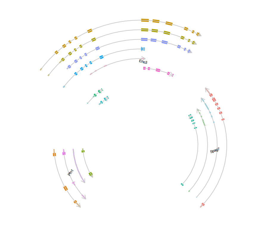
Label with transcript_name:
# textlabel with transcript_name
trancriptVis(gtfFile = gtf,
             gene = 'Gucy2e',
             textLabelSize = 4,
             circle = T,
             ylimLow = 0,
             textLabel = 'transcript_name',
             addNormalArrow = F,
             newStyleArrow = T)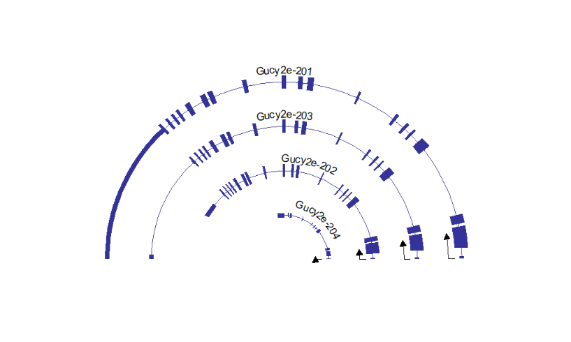
Imaging if you want to plot multiple genes which are far away from each other or located on different chromosomes which is not reasonable. Maybe you will get a strange figure, let's see three genes on the top/middle/end chromosome 1:
# single plot
lapply(c('Camk1g','Daw1','Oprk1'), function(x){
  trancriptVis(gtfFile = gtf,
               gene = x,
               textLabel = 'gene_name')
}) -> plist

# combine
cowplot::plot_grid(plotlist = plist,ncol = 3,align = 'hv')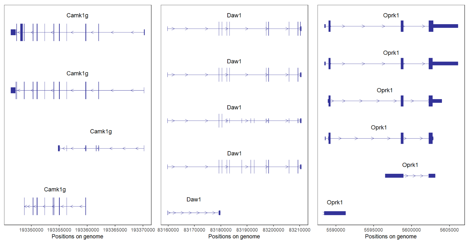
If you supply these genes with vectors:
# plot tegether
trancriptVis(gtfFile = gtf,
             gene = c('Camk1g','Daw1','Oprk1'),
             textLabel = 'gene_name')
It seems something wrong. Because their distance is to long, we can facet by gene:
# facet by gene
trancriptVis(gtfFile = gtf,
             gene = c('Camk1g','Daw1','Oprk1'),
             facetByGene = T)
We can remove normal arrow and add absolute arrow:
# add new arrow and remove normal arrow
trancriptVis(gtfFile = gtf,
             gene = c('Camk1g','Daw1','Oprk1'),
             facetByGene = T,
             newStyleArrow = T,
             absSpecArrowLen = T,
             speArrowRelLen = 0.1,
             addNormalArrow = F)
Plot three chromosome genes:
# for different chromosome genes
# chr1:Camk1g chr2:Duox2 chr3:Ttll7
trancriptVis(gtfFile = gtf,
             gene = c('Camk1g','Duox2','Ttll7'),
             facetByGene = T)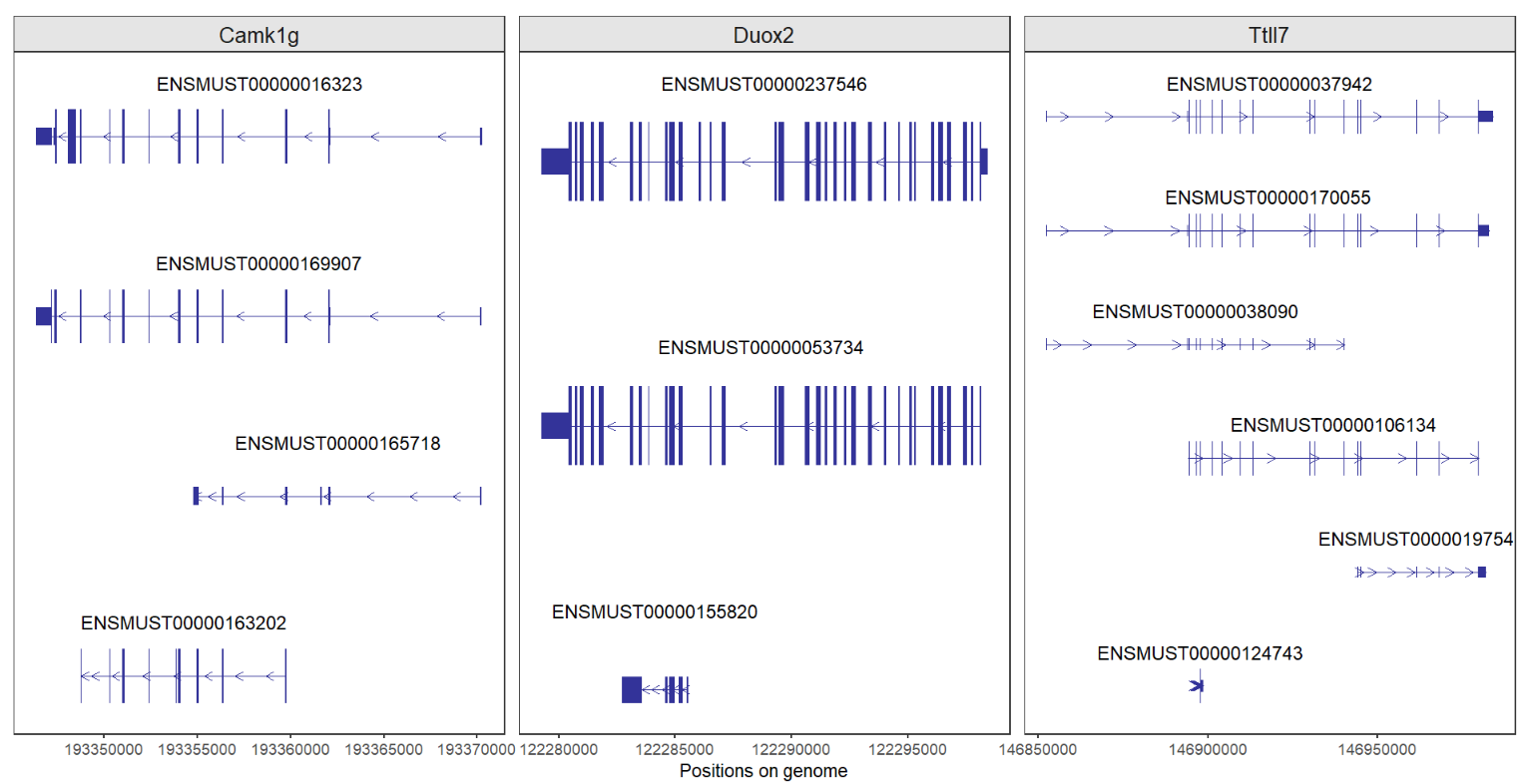
Good job!
As we can see, all figures were produced on the genome positions, sometimes you want to compare different transcripts with relative length, we can set each transcript start(plus strand)/end(negtive strand) as 0 to make them more comparable.
Set forcePosRel = T:
# transform relative position
trancriptVis(gtfFile = gtf,
             gene = c('Camk1g','Daw1','Oprk1'),
             facetByGene = T,
             newStyleArrow = T,
             absSpecArrowLen = T,
             speArrowRelLen = 0.1,
             addNormalArrow = F,
             forcePosRel = T)
Ajusted with other parameters:
# ajusted with facet parameters
trancriptVis(gtfFile = gtf,
             gene = c('Camk1g','Daw1','Oprk1'),
             facetByGene = T,
             newStyleArrow = T,
             absSpecArrowLen = T,
             speArrowRelLen = 0.1,
             addNormalArrow = F,
             forcePosRel = T,
             ncolGene = 1,
             scales = 'free_y',
             strip.position = 'left',
             textLabelSize = 2,
             exonColorBy = 'gene_name',
             textLabel = 'transcript_name',
             panel.spacing = 0)
Circular plot:
# cicular plot with relative position
trancriptVis(gtfFile = gtf,
             gene = 'Nanog',
             textLabelSize = 4,
             circle = T,
             ylimLow = 0,
             textLabel = 'transcript_name',
             addNormalArrow = F,
             newStyleArrow = T,
             exonColorBy = 'transcript_name',
             forcePosRel = T)
Here I supply a parameter to control negtive strand direction when you produce plot with relative position settings, revNegStrand = T can acheive this:
# reverse negtive strand
trancriptVis(gtfFile = gtf,
             gene = c('Camk1g','Daw1','Oprk1'),
             facetByGene = T,
             newStyleArrow = T,
             absSpecArrowLen = T,
             speArrowRelLen = 0.1,
             addNormalArrow = F,
             forcePosRel = T,
             revNegStrand = T)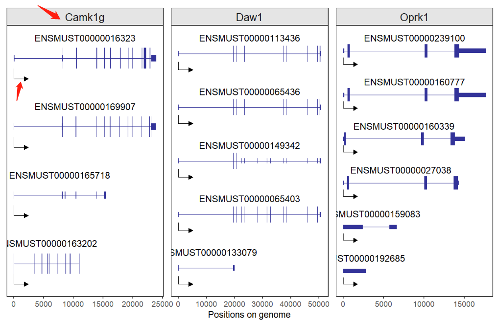
We know Camk1g gene is located on the negtive strand, here we force it to be same as plus strand gene and the new style arrow direction will also be changed.
Let's see another example:
# ajusted with facet parameters
p1 <- trancriptVis(gtfFile = gtf,
                   gene = c('Camk1g','Daw1','Oprk1'),
                   facetByGene = T,
                   newStyleArrow = T,
                   absSpecArrowLen = T,
                   speArrowRelLen = 0.1,
                   addNormalArrow = F,
                   forcePosRel = T,
                   ncolGene = 1,
                   scales = 'free_y',
                   strip.position = 'left',
                   textLabelSize = 2,
                   exonColorBy = 'gene_name',
                   textLabel = 'transcript_name',
                   panel.spacing = 0)

# reverse negtive strand
p2 <- trancriptVis(gtfFile = gtf,
                   gene = c('Camk1g','Daw1','Oprk1'),
                   facetByGene = T,
                   newStyleArrow = T,
                   absSpecArrowLen = T,
                   speArrowRelLen = 0.1,
                   addNormalArrow = F,
                   forcePosRel = T,
                   ncolGene = 1,
                   scales = 'free_y',
                   strip.position = 'left',
                   textLabelSize = 2,
                   exonColorBy = 'gene_name',
                   textLabel = 'transcript_name',
                   panel.spacing = 0,
                   revNegStrand = T)

# combine
cowplot::plot_grid(plotlist = list(p1,p2),ncol = 2,align = 'hv')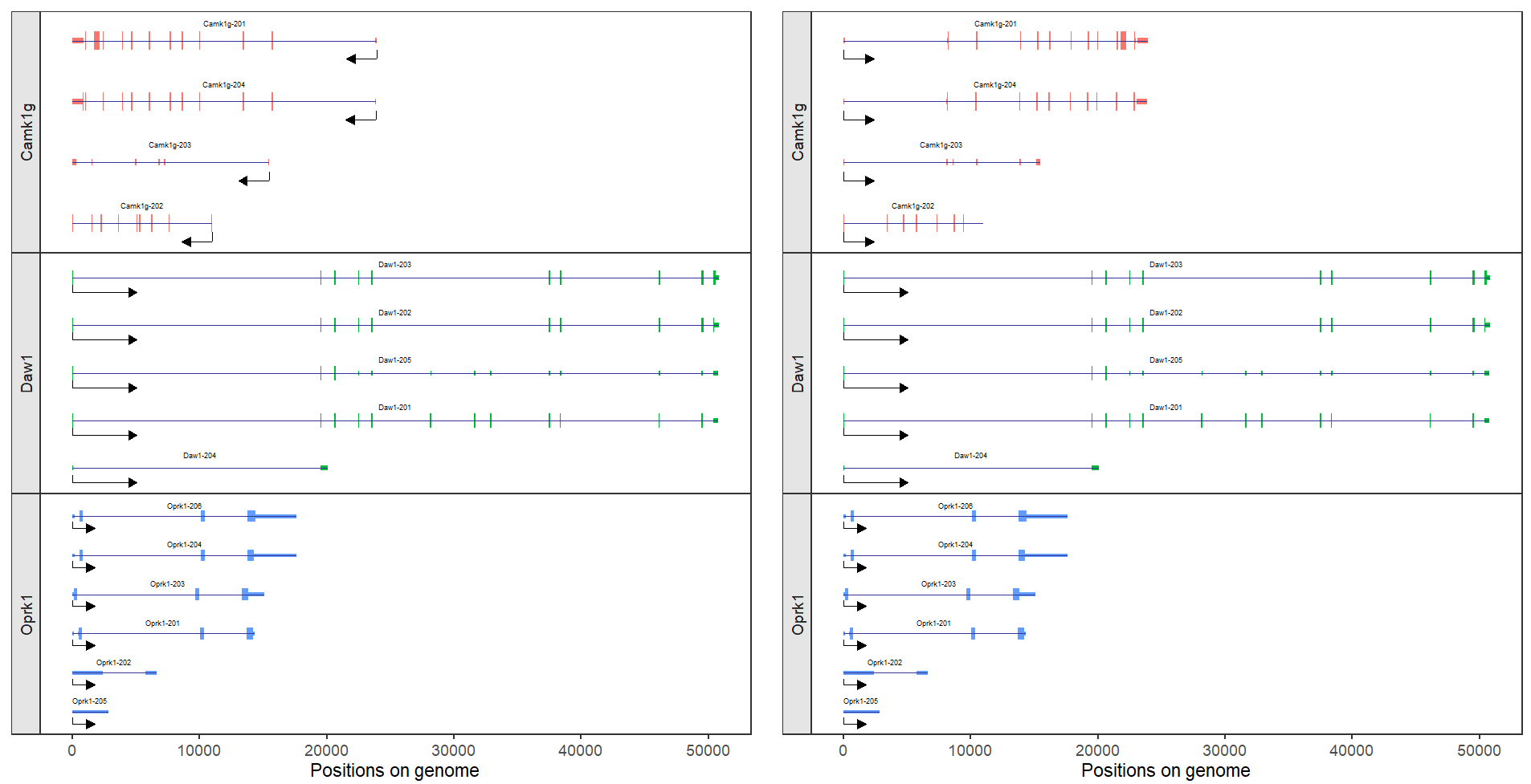
It seems that these different transcripts will be more comparable of multiple genes.
More parameters refer to:
?trancriptVis