TransPlot 0.0.3 documentation
here I introduced bedVis and trackVis functions to visualize peak files and bigwig files which work better with trancriptVis. You can use these functions to make a complex track plot with more ajustable parameters to control you graph produced.
Note:
all the test files can be downloaded from:
https://www.ncbi.nlm.nih.gov/geo/query/acc.cgi?acc=GSE211475
# install.packages("devtools")
devtools::install_github("junjunlab/transPlotR")
bedVis function can be used to visualize peaks data (bed format).
bed files:
file <- list.files(pattern = '.bed')
file
# [1] "H524-NeuroD1_peaks.bed"  "H524-Promoter_peaks.bed" "H82-NeuroD1_peaks.bed"
# [4] "H82-Promoter_peaks.bed"
choose the region and chromesome to be plotted:
# plot
bedVis(bdFile = file,
       chr = "chr19",
       region.min = 39875973,
       region.max = 39919857)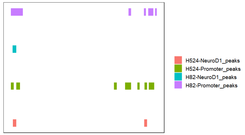
collapse the tracks:
# collapse tracks
bedVis(bdFile = file,
       chr = "chr19",
       region.min = 39875973,
       region.max = 39919857,
       collapse = TRUE)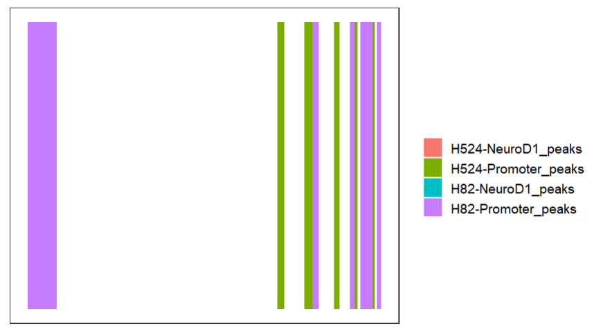
change color:
# change colors
bedVis(bdFile = file,
       chr = "chr19",
       region.min = 39875973,
       region.max = 39919857,
       fill = ggsci::pal_d3()(4))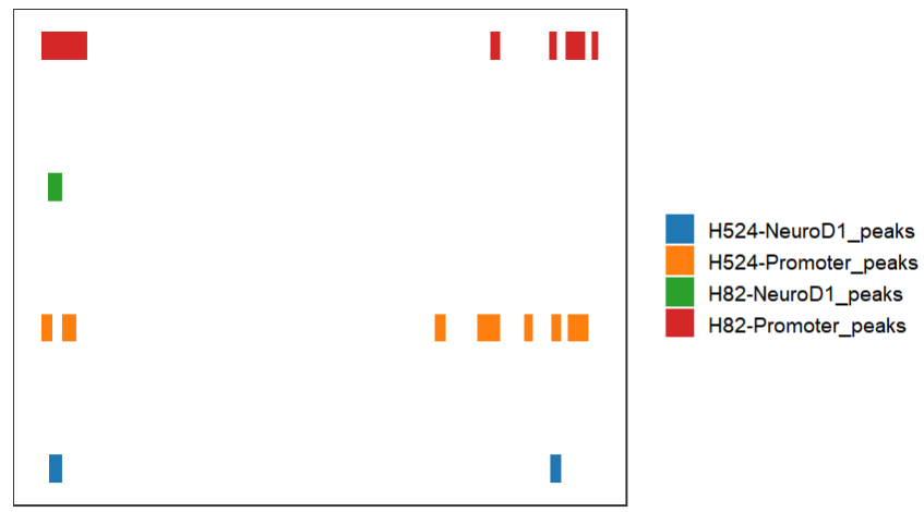
remove legend:
# change to grey50 and turn off legend
bedVis(bdFile = file,
       chr = "chr19",
       region.min = 39875973,
       region.max = 39919857,
       fill = rep('grey50',4),
       show.legend = FALSE)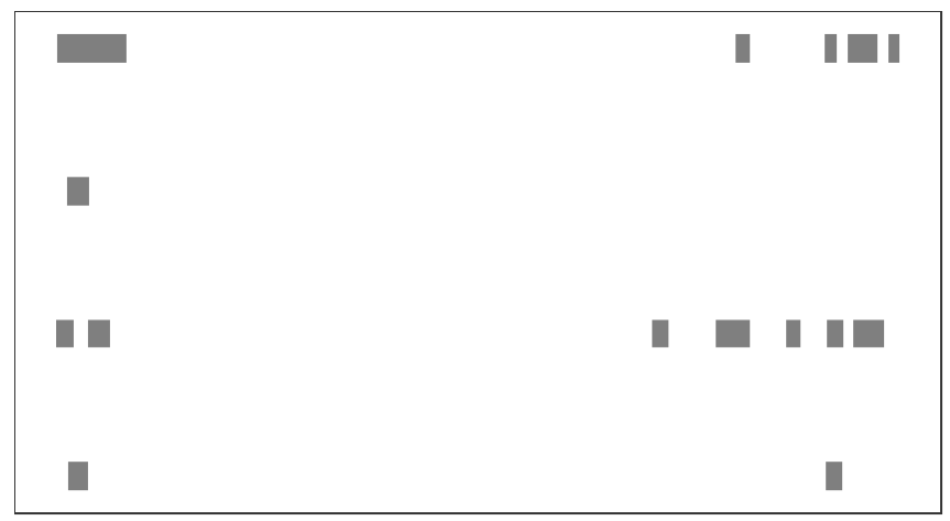
add peak name:
# add label
bd <-
bedVis(bdFile = file,
       chr = "chr19",
       region.min = 39875973,
       region.max = 39919857,
       add.label = TRUE,label.column = 'name')
bd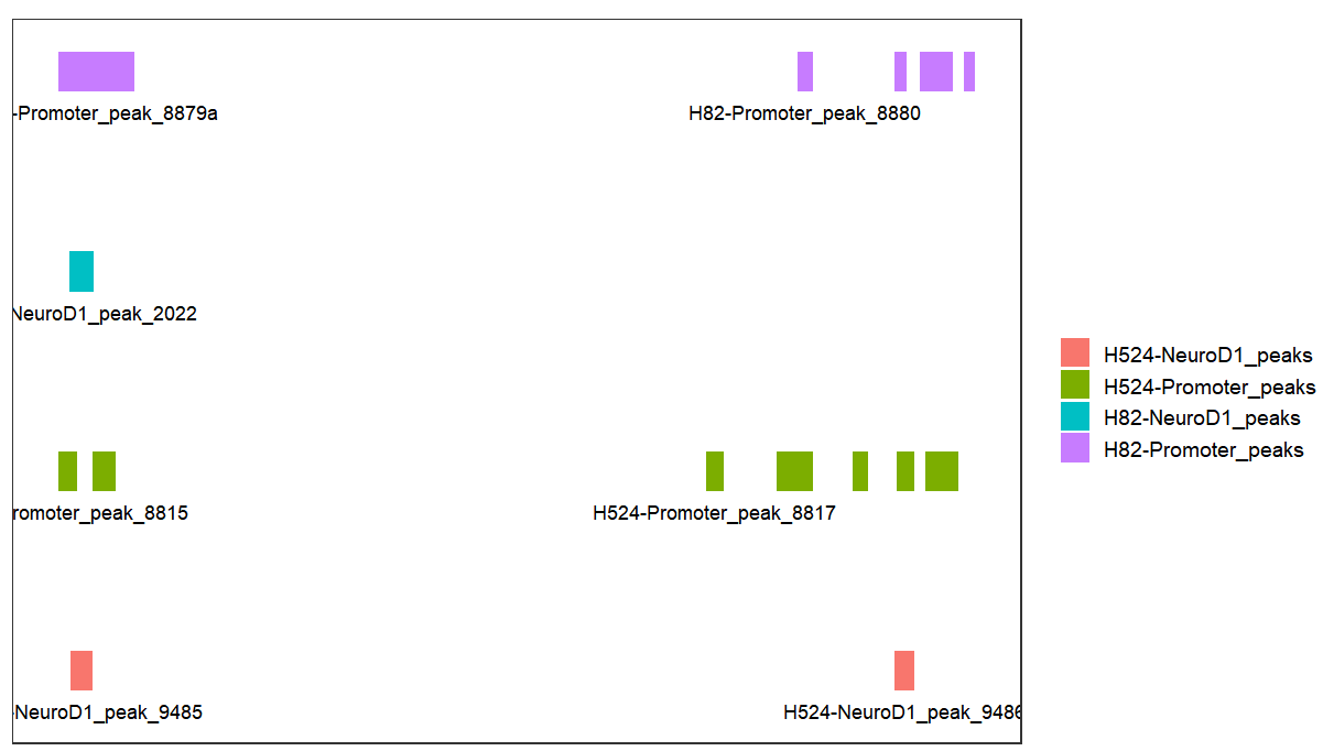
you can combine with trancriptVis function:
# combine
gtf <- import('hg19.ncbiRefSeq.gtf',format = "gtf") %>%
  data.frame()

p <-
  trancriptVis(gtfFile = gtf,
               Chr = "chr19",
               posStart = 39875973,
               posEnd = 39919857,
               textLabel = "gene_name")

# combine
p %>% insert_bottom(bd)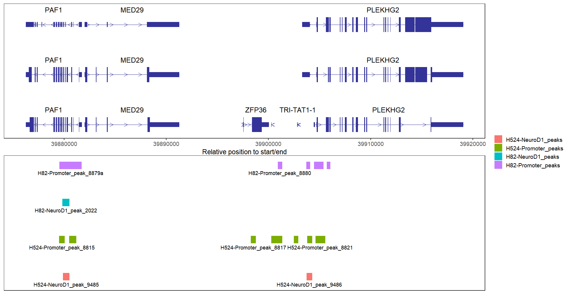
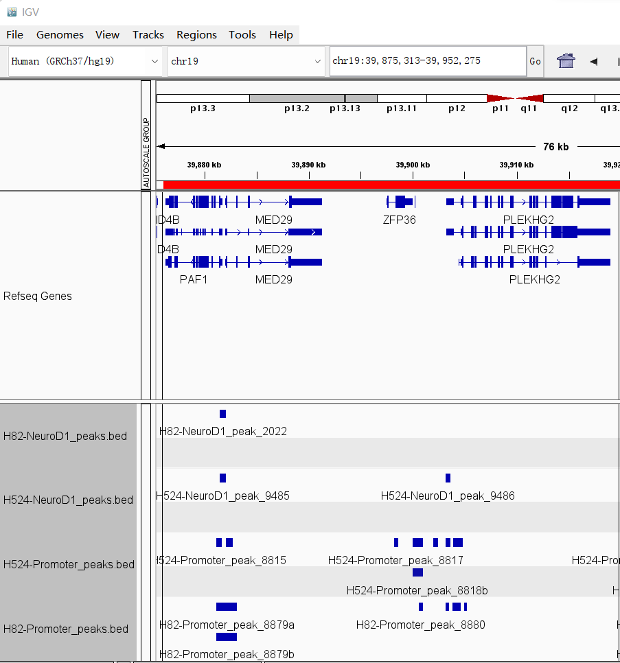
here we can show the results in IGV:
loadBigWig function will load bigwig files and transform them into data.frame format.
# test
file <- list.files(pattern = '.bw')
# [1] "H524-Input.bw"    "H524-NeuroD1.bw"  "H524-Promoter.bw" "H82-Input.bw"     "H82-NeuroD1.bw"
# [6] "H82-Promoter.bw"

# read file
mybw <- loadBigWig(file)

# check
head(mybw,3)
#   seqnames start   end width strand score   fileName
# 1    chr19 74845 74945   101      *     1 H524-Input
# 2    chr19 75000 75100   101      *     1 H524-Input
# 3    chr19 80776 80876   101      *     1 H524-Input
trackVis function can be used to visualize bigwig files in an elegant way. The trackVis will extend 3000bps upstream and downstream by defalut. You can set the extend.up/extend.dn to ajust a suitable value.
plot a region:
# load data
load('bWData.Rda')
mybw <- bWData

# plot with specific region
trackVis(bWData = mybw,
         chr = "chr19",
         region.min = 36226490,
         region.max = 36269673)
plot a specific gene:
# load gtf
gtf <- import('hg19.ncbiRefSeq.gtf',format = "gtf") %>%
  data.frame()

# plot with specific gene
trackVis(bWData = mybw,
         gtf.file = gtf,
         gene.name = "RAD23A")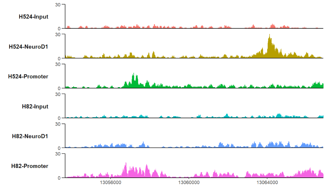
here we show the same results in IGV:

show the color legend:
# show legend
trackVis(bWData = mybw,
         chr = "chr19",
         region.min = 36226490,
         region.max = 36269673,
         show.legend = TRUE)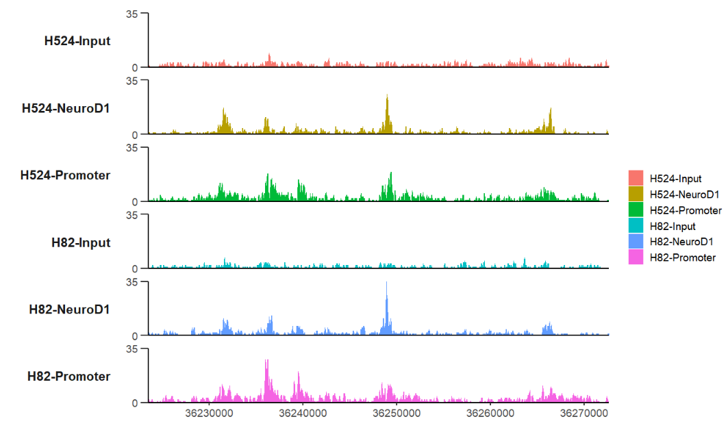
remove Y axis information:
# remove axis info
trackVis(bWData = mybw,
         gtf.file = gtf,
         gene.name = "RAD23A",
         xAxis.info = FALSE,
         yAxis.info = FALSE)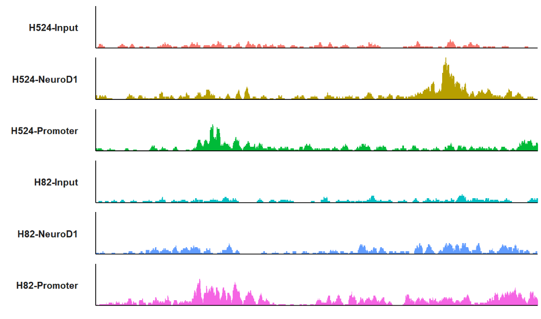
change a theme:
# change theme
trackVis(bWData = mybw,
         gtf.file = gtf,
         gene.name = "RAD23A",
         yAxis.info = FALSE,
         theme = "bw")
change scales and layout:
# free scales and draw two columns
trackVis(bWData = mybw,
         chr = "chr19",
         region.min = 36226490,
         region.max = 36269673,
         scales = "free",
         ncol = 2,
         label.angle = 90)
change track colors:
# change color
c1 <- trackVis(bWData = mybw,
               gtf.file = gtf,
               gene.name = "RAD23A",
               color = ggsci::pal_npg()(6))

c2 <- trackVis(bWData = mybw,
               gtf.file = gtf,
               gene.name = "RAD23A",
               color = rep('grey20',6))

c3 <- trackVis(bWData = mybw,
               gtf.file = gtf,
               gene.name = "RAD23A",
               color = jjAnno::useMyCol(platte = "stallion",n = 6))

# combine
cowplot::plot_grid(plotlist = list(c1,c2,c3),
                   align = 'hv',ncol = 3)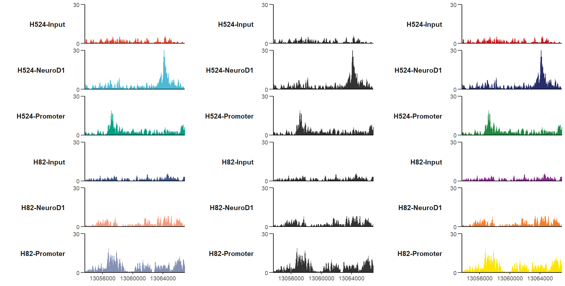
sometimes we want to highlight some regions like peak site or modification site et. trackVis can also achive this. You just need to supply a list object include
startandendcoordinates.
mark three regions:
# mark some regions
trackVis(bWData = mybw,
         chr = "chr19",
         region.min = 36226490,
         region.max = 36269673,
         mark.region = list(c(36230500,36235000,36247500,36265000),
                            c(36232800,36241000,36250000,36267000)))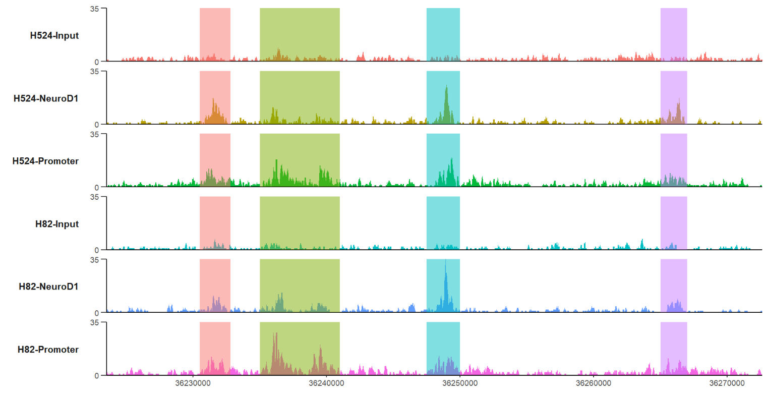
ajust the color alpha:
# change alpha
trackVis(bWData = mybw,
         chr = "chr19",
         region.min = 36226490,
         region.max = 36269673,
         mark.region = list(c(36230500,36235000,36247500,36265000),
                            c(36232800,36241000,36250000,36267000)),
         mark.alpha = 0.2)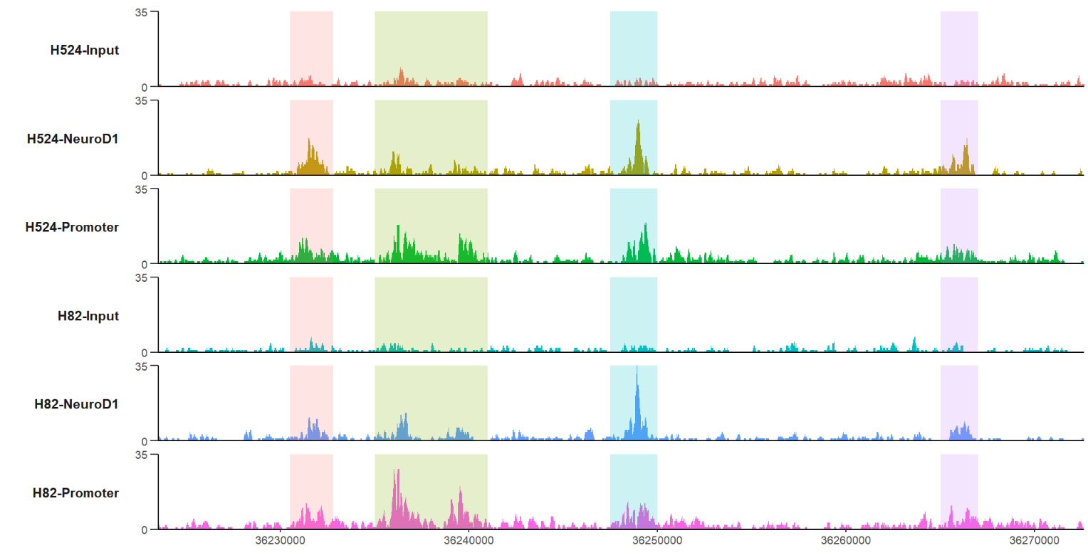
changing the marked regions color also is acceptable:
# change color
trackVis(bWData = mybw,
         chr = "chr19",
         region.min = 36226490,
         region.max = 36269673,
         mark.region = list(c(36230500,36235000,36247500,36265000),
                            c(36232800,36241000,36250000,36267000)),
         mark.alpha = 0.2,
         mark.col = ggsci::pal_aaas()(4))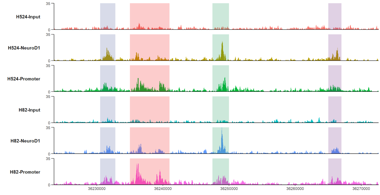
change a theme:
# change theme
trackVis(bWData = mybw,
         chr = "chr19",
         region.min = 36226490,
         region.max = 36269673,
         mark.region = list(c(36230500,36235000,36247500,36265000),
                            c(36232800,36241000,36250000,36267000)),
         mark.alpha = 0.2,
         theme = "bw",yAxis.info = FALSE)
giving a gene name to plot with marked regions:
# define gene name with mark region
trackVis(bWData = mybw,
         gtf.file = gtf,
         gene.name = "RAD23A",
         mark.region = list(c(13056500,13064000),
                            c(13058400,13065000)),
         mark.alpha = 0.2,
         label.face = 'plain')
here I provide a new style Y axis which often ocurrs in papers, you can try this style.
add a new style Y axis:
# add new y range
trackVis(bWData = mybw,
         chr = "chr19",
         region.min = 36226490,
         region.max = 36269673,
         mark.region = list(c(36230500,36235000,36247500,36265000),
                            c(36232800,36241000,36250000,36267000)),
         mark.alpha = 0.2,
         theme = "bw",yAxis.info = FALSE,
         new.yaxis = TRUE)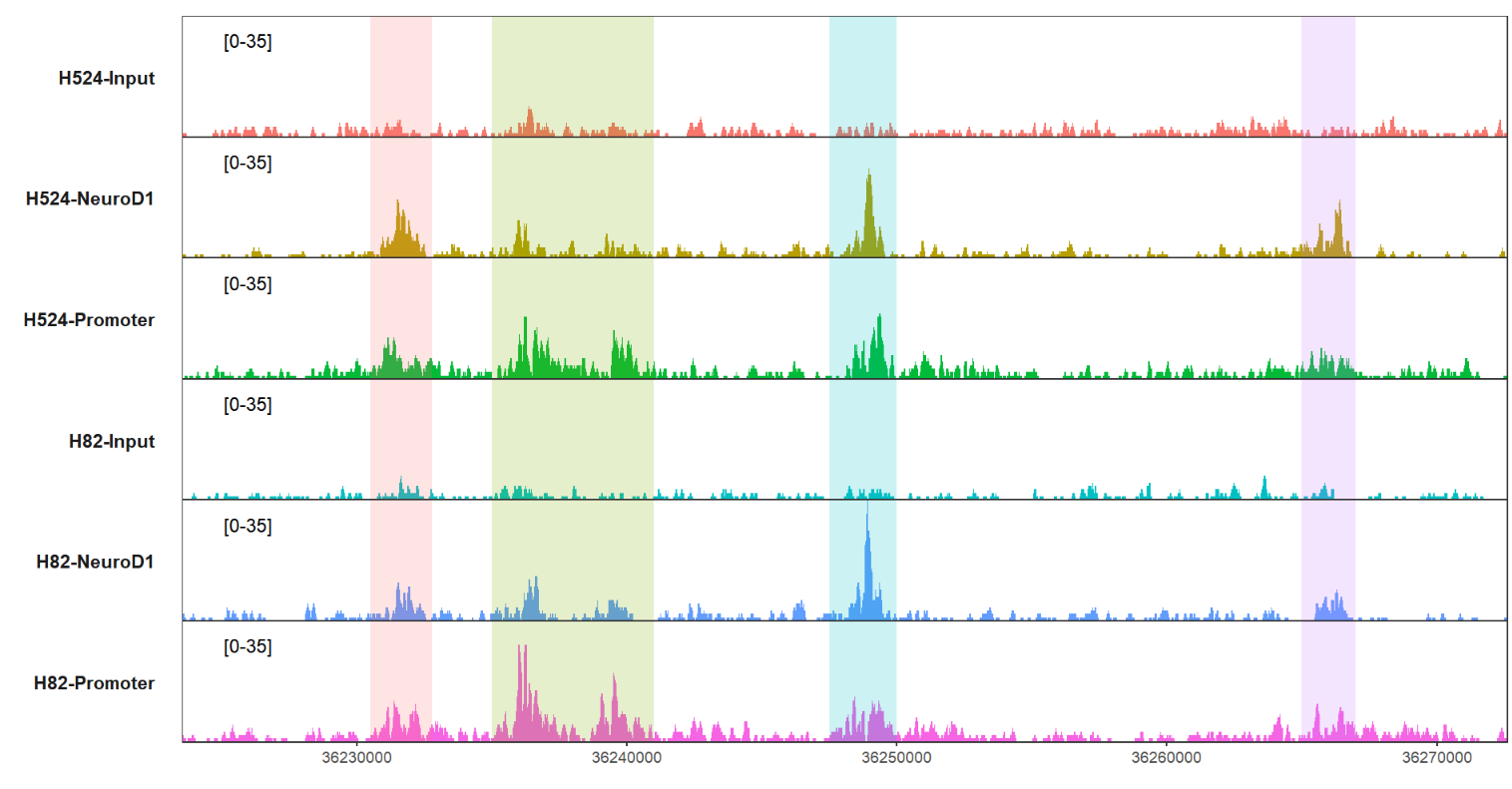
you can ajust the pos.ration arg to palace the label:
# ajust position
trackVis(bWData = mybw,
         chr = "chr19",
         region.min = 36226490,
         region.max = 36269673,
         mark.region = list(c(36230500,36235000,36247500,36265000),
                            c(36232800,36241000,36250000,36267000)),
         mark.alpha = 0.2,
         theme = "bw",yAxis.info = FALSE,
         new.yaxis = TRUE,
         pos.ratio = c(0.95,0.8))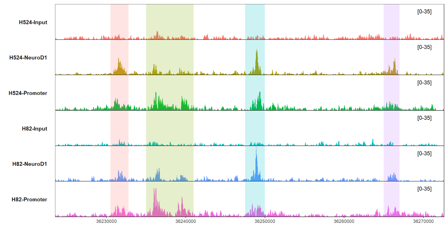
you can also change the plot orders through sample.order arg.
change the orders:
# ajust order
order <- c("H524-Input","H82-Input","H524-NeuroD1","H524-Promoter","H82-NeuroD1","H82-Promoter")

trackVis(bWData = mybw,
         gtf.file = gtf,
         gene.name = "RAD23A",
         mark.region = list(c(13056500,13064000),
                            c(13058400,13065000)),
         mark.alpha = 0.2,
         label.face = 'plain',
         sample.order = order)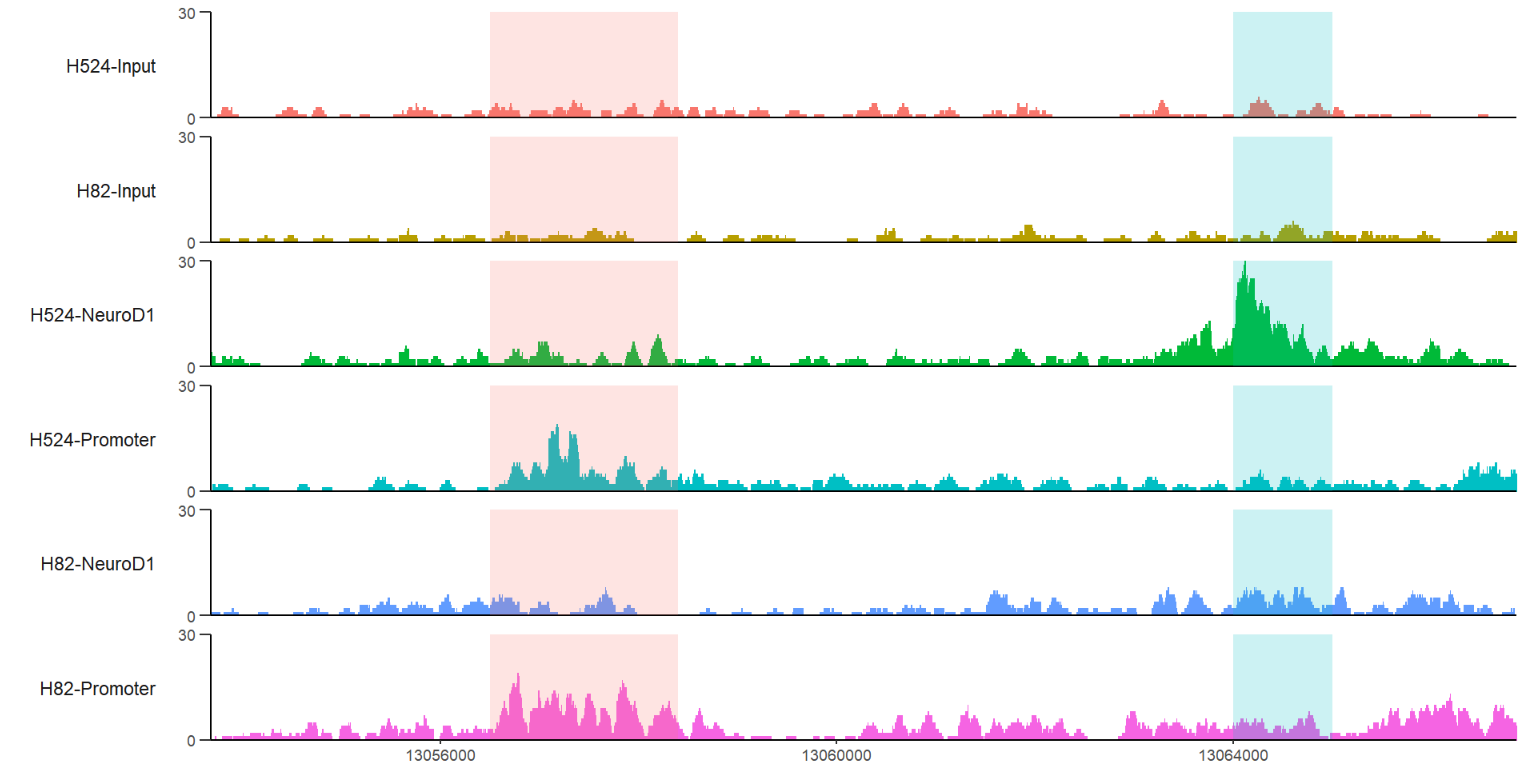
let's see some cases working with other functions.
ptrack <- trackVis(bWData = mybw,
                   chr = "chr19",
                   region.min = 36226490,
                   region.max = 36269673)

trans <-
trancriptVis(gtfFile = gtf,
             Chr = "chr19",
             posStart = 36226490 - 3000,
             posEnd = 36269673 + 3000,
             addNormalArrow = FALSE,
             newStyleArrow = T,
             absSpecArrowLen = T,
             speArrowRelLen = 0.2,
             textLabel = "gene_name",
             textLabelSize = 3,
             relTextDist = 0.5,
             exonWidth = 0.9)

# combine
ptrack %>% insert_bottom(trans,height = 0.75)
IGV:

collapse the gene structures:
trans <-
trancriptVis(gtfFile = gtf,
             Chr = "chr19",
             posStart = 36226490 - 3000,
             posEnd = 36269673 + 3000,
             absSpecArrowLen = T,
             speArrowRelLen = 0.2,
             textLabel = "gene_name",
             textLabelSize = 4,
             relTextDist = 0.2,
             exonWidth = 0.5,
             collapse = T)

# combine
ptrack %>% insert_bottom(trans,height = 0.1)
supply with gene name:
RAD23A <-
  trackVis(bWData = mybw,
           gtf.file = gtf,
           gene.name = "RAD23A",
           extend.up = 500,
           extend.dn = 1000,
           xAxis.info = F)

p <-
  trancriptVis(gtfFile = gtf,
               gene = "RAD23A",
               relTextDist = -0.5,
               exonWidth = 0.5,
               exonColorBy = 'transcript_id',
               textLabelSize = 4,
               addNormalArrow = FALSE,
               newStyleArrow = TRUE) +
  xlab('')

# combine
RAD23A %>% insert_bottom(p,height = 0.3)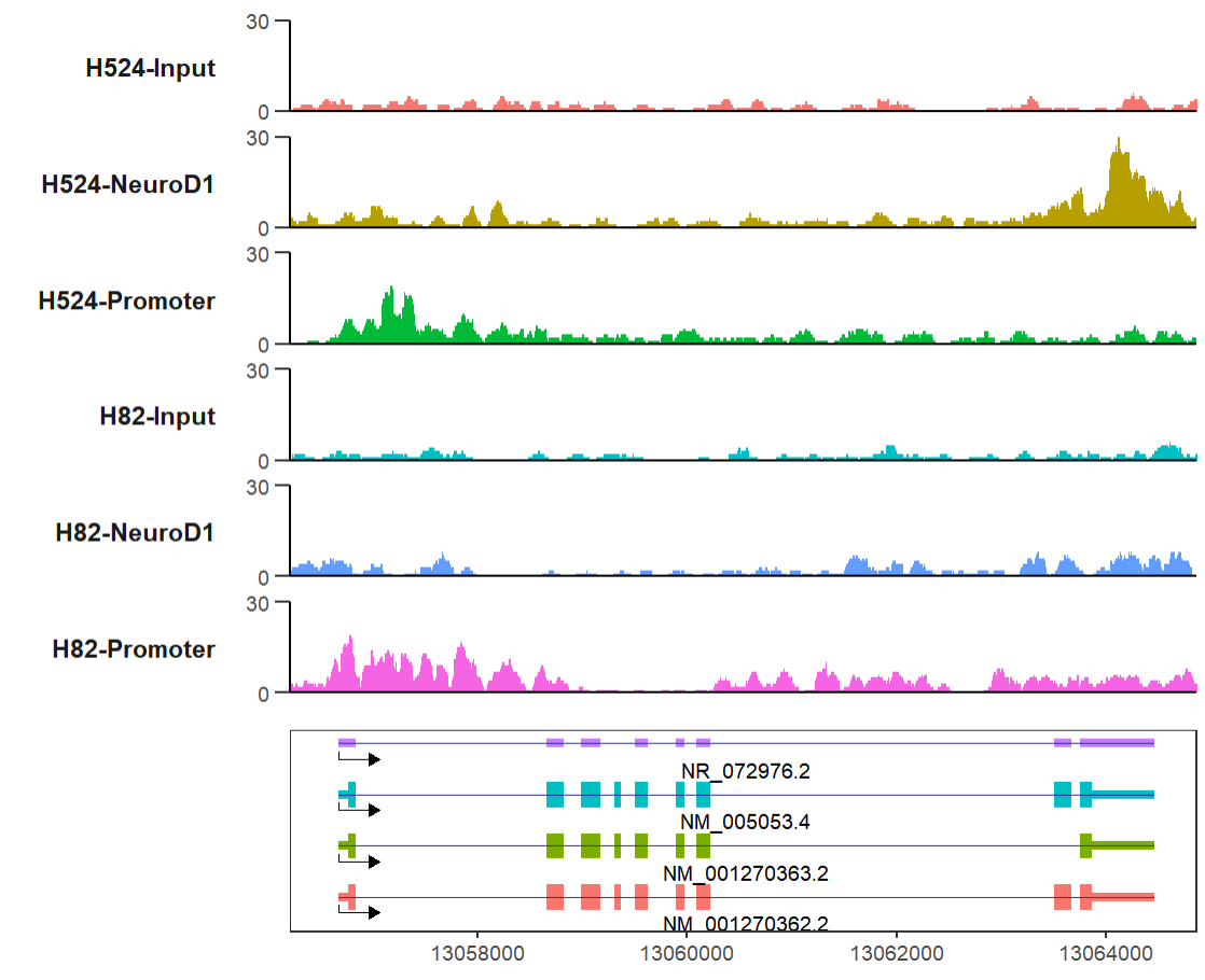
IGV shows:

change transcript colors:
# change transcript color
p <-
  trancriptVis(gtfFile = gtf,
               gene = "RAD23A",
               relTextDist = -0.5,
               exonWidth = 0.5,
               exonFill = 'black',
               arrowCol = 'black',
               textLabelSize = 3,
               addNormalArrow = FALSE,
               newStyleArrow = TRUE,
               xAxis.info = FALSE,
               textLabel = 'gene_name') +
  xlab('')

# combine
RAD23A %>% insert_bottom(p,height = 0.3)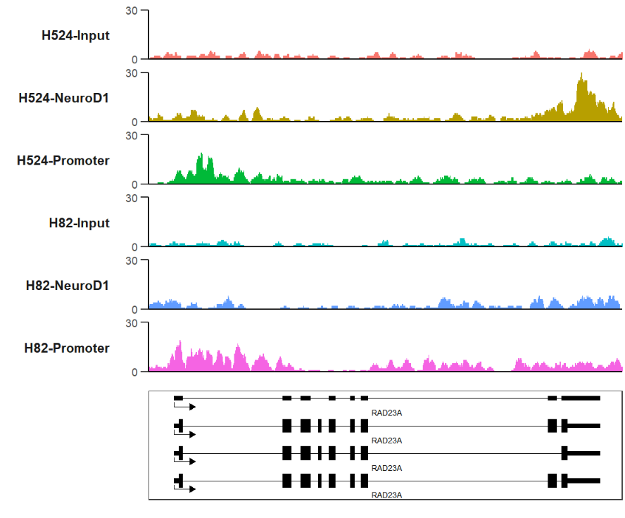
let's combine track, gene and peak:
# track + gene + peak
RAD23A <-
  trackVis(bWData = mybw,
           gtf.file = gtf,
           gene.name = "RAD23A",
           extend.up = 500,
           extend.dn = 1000,
           xAxis.info = F,
           theme = "bw",
           yAxis.info = F,new.yaxis = T,
           pos.ratio = c(0.06,0.8),
           color = jjAnno::useMyCol(platte = "stallion",n = 6))

# peak
bd <- bedVis(bdFile = file,
             chr = "chr19",
             track.width = 0.3,
             show.legend = T)

# combine
RAD23A %>% insert_bottom(p,height = 0.3) %>%
  insert_bottom(bd,height = 0.15)
linkVis can be used to visualize chromtin accessbility , peak correlation or modification site relation on the chromosome coordinate.
# load data
link <- read.table('link-data.txt',header = T)

# check
head(link,3)
#    chr  start    end   grou      val
# 1 chr1 714173 714486 group1  5.38023
# 2 chr1 714173 968410 group1 10.56281
# 3 chr1 714173 995186 group1 4.04307default plot:
# no facet
linkVis(linkData = link,
        start = "start",
        end = "end",
        link.aescolor = "black",
        facet = FALSE)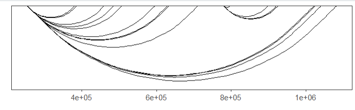
ajust the curvature:
# change curvature
linkVis(linkData = link,
        start = "start",
        end = "end",
        link.aescolor = "black",
        facet = FALSE,
        curvature = 0.2)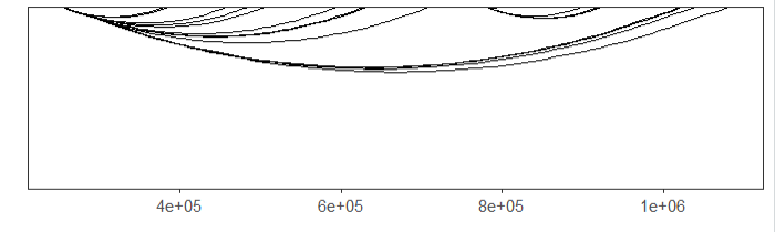
mapping color:
# mapping color
linkVis(linkData = link,
        start = "start",
        end = "end",
        link.aescolor = "grou",
        facet = FALSE)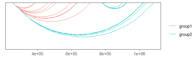
you can also change the color what you like:
# change color
linkVis(linkData = link,
        start = "start",
        end = "end",
        link.aescolor = "grou",
        facet = FALSE,
        link.color = c('orange','green'))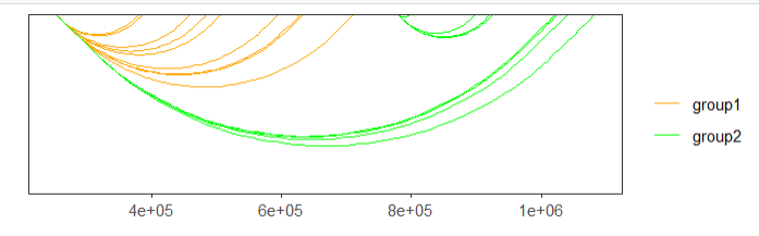
mapping with continues values:
# mapping continues value
linkVis(linkData = link,
        start = "start",
        end = "end",
        link.aescolor = "val",
        facet = FALSE)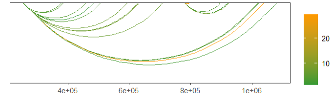
change color:
# change color
linkVis(linkData = link,
        start = "start",
        end = "end",
        link.aescolor = "val",
        facet = FALSE,
        link.color = c('grey80','red'))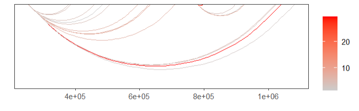
remove X axis information:
# remove x Axis info
linkVis(linkData = link,
        start = "start",
        end = "end",
        link.aescolor = "val",
        facet = FALSE,
        link.color = c('grey80','red'),
        xAixs.info = FALSE)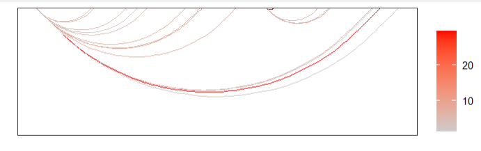
reverse direction:
linkVis(linkData = link,
        start = "start",
        end = "end",
        link.aescolor = "val",
        facet = TRUE,
        group = "grou",curvature = -0.5,yshift = -0.1)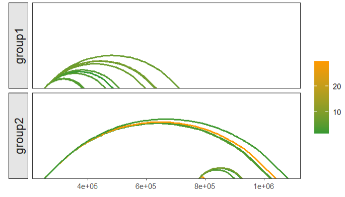
if you have multiple groups with links, you can plot them with facet plot.
facet:
# facet link
linkVis(linkData = link,
        start = "start",
        end = "end",
        link.aescolor = "grou",
        facet = TRUE,
        group = "grou")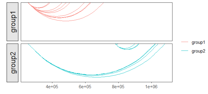
mapping with continues values:
# mapping continues value
linkVis(linkData = link,
        start = "start",
        end = "end",
        link.aescolor = "val",
        facet = TRUE,
        group = "grou")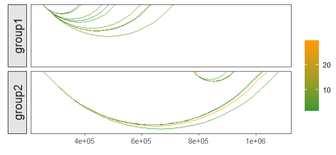
some facet settings:
# ajust facet settings
linkVis(linkData = link,
        start = "start",
        end = "end",
        link.aescolor = "val",
        facet = TRUE,
        group = "grou",
        facet.placement = "inside",
        facet.fill = "white",
        facet.text.angle = 0)
let's combine with gene structure and bigwig track:
load('bWData.Rda')

# combine track and link
track <- trackVis(bWData = bWData,
                  chr = "chr19",
                  region.min = min(link$start),
                  region.max = max(link$end),
                  show.legend = T)

# load gtf
library(rtracklayer)
gtf <- import('hg19.ncbiRefSeq.gtf',format = "gtf") %>%
  data.frame()

gene <-
  trancriptVis(gtf,
               Chr = "chr19",
               posStart = min(link$start),
               posEnd = max(link$end),
               arrowLength = 0.05,
               textLabel = 'gene_name',
               textLabelSize = 3,
               exonFill = 'black',
               arrowCol = 'grey80',
               exonWidth = 0.4,intronSize = 0.5,
               reverse.y = T,
               xAxis.info = F)

linkp <- linkVis(linkData = link,
                 start = "start",
                 end = "end",
                 link.aescolor = "val",
                 facet = TRUE,
                 group = "grou",
                 facet.fill = 'white',
                 facet.color = 'white',
                 facet.text.angle = 0,
                 curvature = 0.25,
                 line.size = 0.5,
                 xAixs.info = F)

# combine
track %>% insert_bottom(linkp,height = 0.5) %>%
  insert_bottom(gene)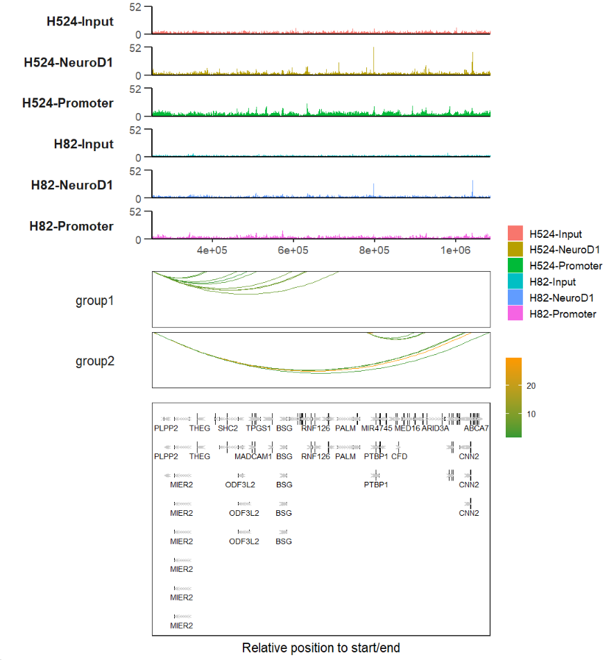
if you have any advice or douts please leave words on: