UI for Xamarin
Xamarin.Forms Checkbox
- Professionally designed Xamarin Checkbox control equipped with color and stroke width customization capabilities, different sizes, support for themes and commands, and much more.
- Part of Telerik UI for Xamarin together with other best-in-class native components for any mobile device.
- Includes support, documentation, demos, learning resources and more!

-
Overview
With the Telerik UI for Xamarin CheckBox control you can easily add checkboxes to your Xamarin based mobile application, enabling the end-users of your application to make a choice between two mutually exclusive options and represent it in a visually appealing way.

-
Classic and Nested CheckBoxes States
As a standard for all checkboxes, the CheckBox controls allows the user to switch between two mutually exclusive states – Filled and empty, but also offers an extra Indeterminate state. The indeterminate state is commonly used when you need to add nested checkboxes in your application.
-
Control over the CheckBox Size and Shape
Mobile application development requires the ability to adjust the UI of our apps to the various devices and screen sizes. By using the Stroke Width and Length properties, you can easily adjust the thickness of the borders and states symbols and also set a specific size for the checkbox itself.

-
Various Styling and Color Customizations
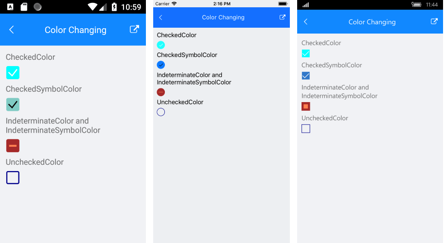
You can change the control’s appearance to fit the UI and color scheme of your application or the business/development requirements, by using one or more of the available options. These include changing the checkboxes and symbols colors and shapes in any of the three available states.

-
Theming Support
The control comes with built-in theming support and can be styled with the look and feel of a predefined theme to provide for a consistent and modern UI in your mobile application.
All UI for Xamarin Components
Navigation & Layout
Interactivity & UX
Data Visualization
Editors
Buttons
Document Processing
ChatBots
Editors
Document Processing
Notifications
Editors
Document Processing
