easy_popover 0.0.6  easy_popover: ^0.0.6 copied to clipboard
 nflabs.org
A Popover can be used to display some content on top of another.
easy_popover #

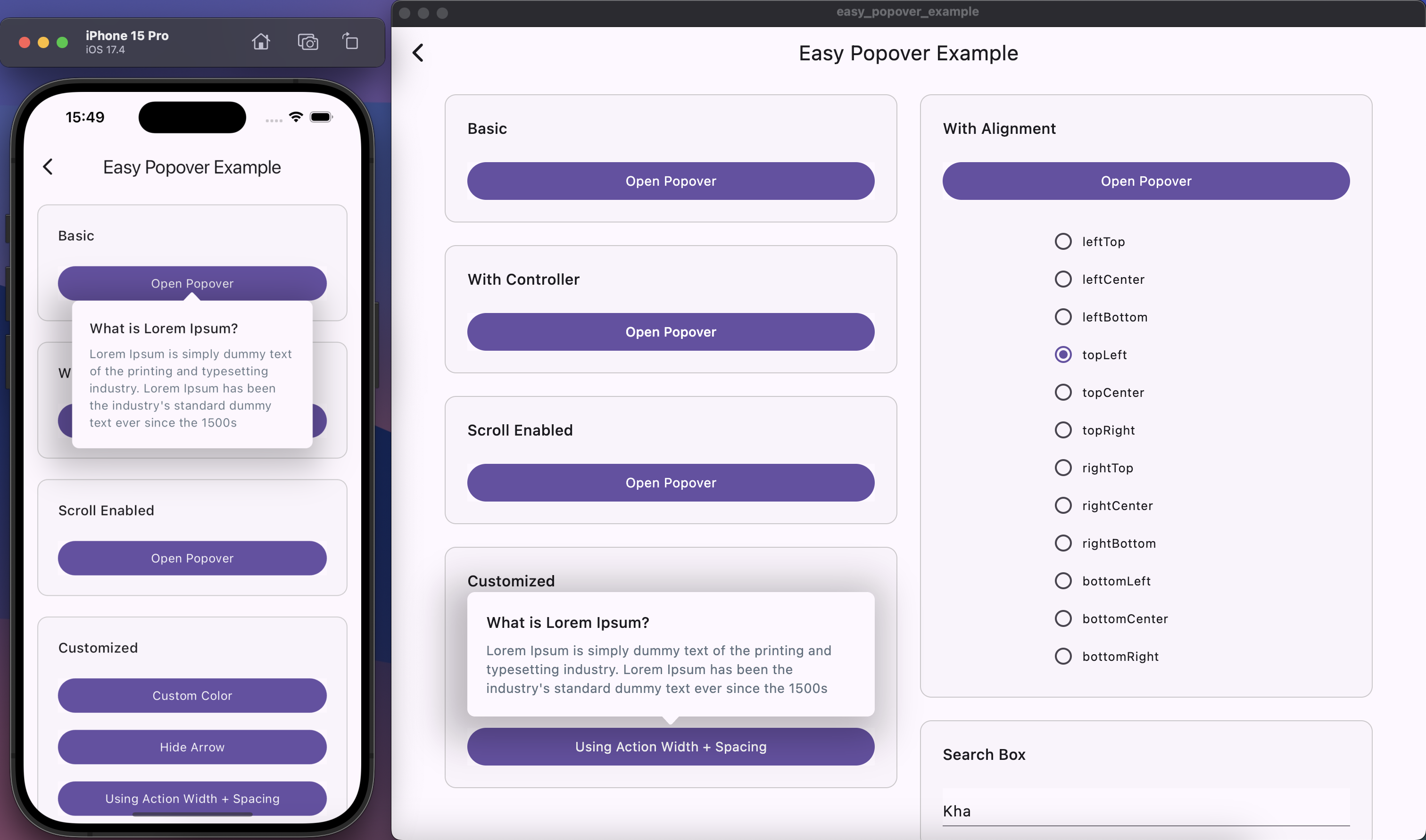
The Popover package provides a customizable popover widget for Flutter applications. It allows developers to display contextual content tied to a specific widget, with various alignment options, animations, and styles.
Demo #
https://github.com/user-attachments/assets/a2f0e849-bf3e-4f37-9fde-192eec692236
Table of Contents #
Features #
- ✅ Customizable alignment for the popover relative to the action widget.
- ✅ Optional arrow pointing to the action widget.
- ✅ Configurable dimensions, border radius, box shadow, and background color.
- ✅ Animation for showing and hiding the popover.
- ✅ Overlay support for capturing taps outside the popover to close it.
- ✅ Allow full-screen scrolling capability when opening the popover.
Installation #
flutter pub add easy_popover
API Reference #
- Popover - The main widget to display a popover.
- PopoverController - Controller to manage the state of the popover.
- PopoverAlignment - Defines the alignment of the popover relative to the action widget.
Examples #
Note: Wrapping Your App with Overlay for Popover Widget
- To utilize the
Popoverwidget in your Flutter application, it is essential to wrap your app with anPopoverOverlay. ThePopoverOverlaywidget allows thePopoverwidget to be inserted and displayed correctly on top of other widgets. Below is an example of how to wrap your app with anPopoverOverlay:
@override
Widget build(BuildContext context) {
  return const MaterialApp(
    debugShowCheckedModeBanner: false,
    title: 'Easy Popover Example',
    home: PopoverOverlay(
      child: PopoverExampleScreen(),
    ),
  );
}
- See Example for details
- Or run the example app included with this package:
- Clone the repository from GitHub:
git clone https://github.com/axnguyenit/easy-popover.git
- Navigate to the example directory:
cd example
- Ensure dependencies are installed:
flutter pub get
- Run the app:
flutter run
This will launch the example app demonstrating various uses of the Popover widget.
Contributing #
Contributions are welcome! Please fork the repository and submit a pull request with your changes. Ensure that your code follows the existing style and includes tests for new features or bug fixes.
Issue Tracker #
If you encounter any issues or have suggestions for improvements, please feel free to open an issue on GitHub.
License #
This project is licensed under the MIT License - see the LICENSE file for details.
Metadata
Publisher
Metadata
A Popover can be used to display some content on top of another.
Repository (GitHub)
View/report issues
Documentation
License
 MIT (license)