Page MenuHomePhabricator

Checkbox, Radio: Enable custom input
Closed, ResolvedPublic3 Estimated Story Points

Description

Background

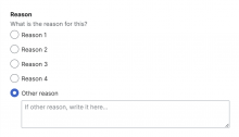
A common use case across products is a checkbox or radio that, when checked, displays a text input or text area to capture further user input. This is included in our form guidelines:

image.png (628×1 px, 55 KB)

Given the prevalence of this use case, and that we want to standardize its design, we should build this into the Checkbox and Radio components. Note that we may want this for other components in the future as well (e.g. for "select or other" fields, something that exists in HTMLForm and is being used on Special:Block).

Known use cases

Captura de pantalla 2024-04-25 a las 11.27.56.png (1×562 px, 112 KB)
Trust & Safety Product Team (Figma).
Captura de pantalla 2024-06-03 a las 11.30.43.png (868×2 px, 233 KB)
Expiration field in Multiblocks T359684

Others:

  • In Adiutor, there's a checkbox that shows a text input field when checked. I will note that it's not styled according to our designs (see screenshot)
  • In ReportIncident, there's a checkbox that shows a text area when checked. I don't have this installed locally and am unsure of whether it's in production anywhere, but hopefully the code can help

Design spec

Guidelines

Implementation

We will want to add a new slot to Checkbox and Radio called custom-input. The Checkbox and Radio templates will need to be updated to display this input (perhaps conditionally), and appropriate styles will be added. Finally, we'll need tests and demos.


Acceptance criteria

Design

Code

  • A custom-input slot is added to the Checkbox and Radio components
  • The custom input is styled in line with the Figma designs
  • The new functionality is covered by unit tests
  • A new demo is added to each component's demo page showing the new functionality
  • Design Review is done by the assigned designer
Event Timeline

There are a very large number of changes, so older changes are hidden. Show Older Changes
Restricted Application added a subscriber: Aklapper. · View Herald Transcript

Some notes:

  • We'll need to add a design spec to this task
  • If this task is implemented by someone outside the Design System Team, we can talk about splitting up the acceptance criteria to make the work more manageable. For example, a Codex volunteer could implement the functionality, but then someone from the Design System Team could add the new demos
CCiufo-WMF subscribed.

Just to confirm, is this a hard blocker to T362583?

@AnneT provided some examples of similar UI:

  • In Adiutor, there's a checkbox that shows a text input field when checked. I will note that it's not styled according to our designs (see screenshot)
  • In ReportIncident, there's a checkbox that shows a text area when checked.

{F48839978}

Hi @CCiufo-WMF

Yes that's correct, it's not a hard blocker.

If you are happy to, then the contractors can develop a version for now and work to update it with the Codex component when ready?

In the meantime I will work on the design spec with Bárbara's guidance.

Just to confirm, is this a hard blocker to T362583?

@AnneT provided some examples of similar UI:

  • In Adiutor, there's a checkbox that shows a text input field when checked. I will note that it's not styled according to our designs (see screenshot)
  • In ReportIncident, there's a checkbox that shows a text area when checked.

{F48839978}

Hi @CCiufo-WMF

Yes that's correct, it's not a hard blocker.

Perfect, thank you!

If you are happy to, then the contractors can develop a version for now and work to update it with the Codex component when ready?

That sounds good. Let us know if they run into any issues. To confirm: are the contractors also open to upstreaming this to Codex? That might be faster than waiting for us to develop it.

Implementation

We will want to add a few new props to Checkbox and Radio (prop names are open for debate)

  • showOther: a boolean prop that, when true, will add a TextInput or TextArea
  • otherComponent: a prop that can either be 'text' or 'textarea', defaulting to 'text' (the name of these strings is also up for debate. This could also be a boolean prop like useTextArea or something)
  • otherValue: the value of that input, bound with v-model:otherValue

The Checkbox and Radio templates will need to be updated to conditionally show the TextInput or TextArea, and appropriate styles will be added.

The proposed implementation seems a little clunky to me, and also inflexible. If we need to go back and later add support for a Select or Combobox component in the same way, we'd have to do additional work. Also, what if someone wants more custom markup beneath the text area (like a link to docs or a privacy policy)?

For a use case that is potentially very open-ended, I think we are better off handling this as a slot. Maybe we'd call it something like #customValue. This slot could hold arbitrary content inside an element that appears inline with the checkbox/radio button (unlike the #description slot content, which appears beneath). The user could take care of binding the value themselves. We could provide an example of how to set this up similar to our custom dialog examples.

I poked at this a little bit while looking at T359684, and I think the best way to implement this would be something like the following:

  • As Eric says, add a new slot, so that the user can put their own form components in there. But don't make it inline with the checkbox/radio, but it below the label and description.
  • Doing this causes the input to appear next to the label instead of below it, because the root element of the Radio/Checkbox component has display: flex. Fix this somehow, either by wrapping the label + custom input slot in a div (not ideal because of CSS-only components, but could be workable if the div is optional when there is no custom input), or with some sort of flexbox magic.
  • Make the custom input appear horizontally aligned with the label (probably by wrapping it in a div and setting the same padding-left as the label has) and make its end edge align with the ends of other form fields (by setting its total width, including padding, to @size-4000).

Curious if this would/should/could support a lookup as well? That is a use case (https://phabricator.wikimedia.org/T366325) that may needed for metrics platform

Screenshot 2024-06-14 at 11.28.28 AM.png (542×1 px, 54 KB)

I'm also curious if the text input should be disabled until "Other" is selected.

{F55319259}

Curious if this would/should/could support a lookup as well? That is a use case (https://phabricator.wikimedia.org/T366325) that may needed for metrics platform

@mwilliams thanks for passing this along - I do think we should support Lookups, and this may be another reason to support @egardner's idea of using a slot for the other field rather than enabling configuration of it via props. With a slot, the user could pass in any component to use as the other field.

I'm also curious if the text input should be disabled until "Other" is selected.

There are a few different UIs we could enable here:

  • Selection or other: only show/enable the "other" field when the "other" option is selected
    • Hide until other: Don't show the "other" field until the "other" option is selected
    • Disable until other: Disable the "other" field until the "other" option is selected
  • Selection and other: always show/enable the "other" field. This supports use cases where the user will select an option/options but then always have the opportunity to fill out the "other" field as well

We should probably support both the "or" and "and" UIs, but perhaps we should choose only one for the "or" variation to avoid confusion?

We decided that we should implement this by adding a new slot named custom-input. We also decided that we should support both the "or other" and "and other" UIs. We'll have a design guideline recommending that if there is only one option with a custom input at the end of the list, the custom input should always be visible; but if there are multiple options with a custom input or there's an option in the middle of the list with a custom input, the custom input should be hidden and only become visible when the associated radio/checkbox is selected.

I see three potential ways we could achieve this:

  1. Pass a parameter to the custom-input slot that indicates whether the radio/checkbox is selected, and make the user show/hide things based on that. This also allows people to implement the "disable until other" approach if they want.
  2. Use two different slot names depending on which behavior is desired. (But then what do we do if both slots are passed in?)
  3. Add a boolean prop to Radio/Checkbox that controls whether the custom input is hidden unless selected.

Here's the code a user would write for each of these:

<!-- Option 1: Radio with custom input that is always visible -->
<cdx-radio ...>
    Label
    <template #custom-input>
        <cdx-text-input ... />
    </template>
</cdx-radio>
<!-- Option 1: Radio with custom input that is only visible when the radio is selected -->
<cdx-radio ...>
    Label
    <template #custom-input="{ selected }">
        <cdx-text-input v-show="selected" ... />
    </template>
</cdx-radio>

<!-- Option 2: Radio with custom input that is always visible -->
<cdx-radio ...>
    Label
    <template #custom-input-always-visible>
        <cdx-text-input ... />
    </template>
</cdx-radio>
<!-- Option 2: Radio with custom input that is only visible when the radio is selected -->
<cdx-radio ...>
    Label
    <template #custom-input>
        <cdx-text-input ... />
    </template>
</cdx-radio>

<!-- Option 3: Radio with custom input that is always visible -->
<cdx-radio custom-input-always-visible ...>
    Label
    <template #custom-input>
        <cdx-text-input ... />
    </template>
</cdx-radio>
<!-- Option 3: Radio with custom input that is only visible when the radio is selected -->
<cdx-radio ...>
    Label
    <template #custom-input>
        <cdx-text-input ... />
    </template>
</cdx-radio>
bmartinezcalvo renamed this task from Checkbox, Radio: Enable "other" text field to Checkbox, Radio: Enable custom input.Jun 21 2024, 8:46 AM

I've completed in T367099 the Figma spec sheet and Guidelines for the Radio/Checkbox with custom input (linked all them in the task description).

These are the decisions we've made about this custom-input addition:

  • We will implement this by adding a new slot named custom-input.
  • This new slot will support both type of display: the "or other" (custom-input displayed by default) and "and other" (custom input displayed just if the Radio/Checkbox is selected). The default behavior will be the "or other" with the custom-input displayed by default (not hidden), and this custom-input will be enabled just if the corresponding Radio/Checkbox is selected.
    Captura de pantalla 2024-06-27 a las 18.49.40.png (261×1 px, 22 KB)
  • Allowed components within this new slot can include Combobox, ChipInput, and Lookup. Nesting another group of Radios, Checkboxes, or ToggleSwitches is not recommended.
  • More than one input within the same Radio/Checkbox can be included.
    Captura de pantalla 2024-06-21 a las 11.53.50.png (536×1 px, 42 KB)
  • Error state: The Radio/Checkbox, the custom input, or both can enter an error state. Conditions triggering an error state for the custom input differ from those affecting the Radio. If an error message needs to be displayed below the custom input, wrap the input in a Field component.
    Captura de pantalla 2024-06-21 a las 11.53.03.png (408×1 px, 50 KB)

From an accessibility perspective, we need to ensure that the change in DOM (specifically with the 'show'/'hide' functionality) is exposed to assistive technology (AT). From this perspective with its parent>child connection and also from a usability POV with problematic move of all elements underneath a suddenly showing component, I'd advise to strongly emphasize the "or other" version.
For technical clarification: All nodes that aren't part of the DOM/accessibility tree after page load have to be specifically marked up with aria-hidden, aria-live and role="alert" or role="status".
The correct exposure of "and other" in AT would be an acceptance criteria for me to resolve this task successfully.

CCiufo-WMF triaged this task as Medium priority.Jul 4 2024, 5:00 PM

We decided that we will disable the custom input when the corresponding radio/checkbox is not selected, and that showing/hiding the custom input based on the selection will be possible but not recommended or demonstrated.

I think we should make the user (developer) responsible for wiring up the disabled state to the selected state, rather than trying to automate it (because I don't think that's possible). I think we should use a scoped slot for this. The usage would look like this:

<cdx-radio>
    Radio label
    <template #custom-input="{ selected }">
        <cdx-text-input :disabled="!selected" ... />
    </template>
</cdx-radio>

We will not add an example for how to hide the input when the radio is not selected, but it would be pretty straightforward, and something that readers can probably figure out: instead of :disabled="!selected", set v-show="selected".

For automatically focusing the first input: consider refactoring out and reusing the focusFirstFocusableElement function from the Dialog component. We may also need await nextTick() to wait for the input being un-disabled in response to the radio/checkbox being selected, before trying to focus it.

...actually I changed my mind, I think it might be better to use the "computed disabled" feature to automatically disable child components of the Radio when the Radio is not selected. Then we don't have to use a scoped slot at all, and usage would simply look like this:

<cdx-radio>
    Radio label
    <template>
        <cdx-text-input ... />
    </template>
</cdx-radio>

All we'd have to do to make this work automatically (for the textinput to magically be disabled when the Radio is not selected) is something like this:

// Figure out whether the radio is selected or not
const isSelected = computed( () => props.modelValue === props.inputValue );
// Determine whether the custom input should be disabled
const customInputDisabled = computed( () => computedDisabled.value || !isSelected.value );
// Send that information to the child components, using the same key that the Field component uses
provide( DisabledKey, customInputDisabled );

Since this uses the same key as Field, any child component using useFieldData (which is most form field-like components) will automatically disable/enable itself when customInputDisabled changes.

Ok, the newer approach looks more simple for users.

One follow-up task could be exporting the focusFirstFocusableElement() function as a composable and using it in Dialog, Checkbox, and Radio.

Change #1053365 had a related patch set uploaded (by LWatson; author: LWatson):

[design/codex@main] Radio: add custom input

https://gerrit.wikimedia.org/r/1053365

lwatson changed the task status from Open to In Progress.Jul 18 2024, 3:55 PM
lwatson updated the task description. (Show Details)

Change #1055418 had a related patch set uploaded (by Bmartinezcalvo; author: Bmartinezcalvo):

[design/codex@main] docs: include guidelines for custom input within Radio and Checkbox

https://gerrit.wikimedia.org/r/1055418

Change #1055418 merged by jenkins-bot:

[design/codex@main] docs: include guidelines for custom input within Radio and Checkbox

https://gerrit.wikimedia.org/r/1055418

@lwatson I'm reviewing the Checkbox/Radio with custom input patch and the error should not automatically appear when selecting the Radio/Checkbox including the custom input but it should only appear if the user leaves the input empty and clicks outside the input.

Grabaciondepantalla2024-07-23alas11.47.48-ezgif.com-video-to-gif-converter.gif (375×600 px, 228 KB)

@bmartinezcalvo Thanks, I'm aware of this unwanted behavior and noted it in the Gerrit patch (comment). I'll have time this sprint to resolve the remaining issues. Let me know if you have more findings.

Change #1056999 had a related patch set uploaded (by LWatson; author: LWatson):

[mediawiki/core@master] Update Codex from v1.9.0 to v1.10.0

https://gerrit.wikimedia.org/r/1056999

We agreed to disable the custom input initially and enable it only when the Radio or Checkbox is selected. (Preview radio and checkbox on Sandbox page.)

I want to open the conversation to other ideas to reevaluate our current approach and question whether we should disable the custom input.

Options

Option 1: Disable the custom input initially. (This means we continue with the current design.)

  • Select the radio/checkbox to enable the custom input.
  • Codex or users handle the disabled state (undecided between engineers).

Option 2: Enable the custom inputs initially.

  • Clicking into the enabled custom input will automatically select the radio/checkbox.
  • Codex handles the enabled/disabled state automatically for the user.
  • Allow the flexibility to enable/disable the custom input initially as seen in Vuetify: inline text field
Open Questions
  1. What are your opinions on the options presented? (Feel free to add to the list.)
  2. Do you think Codex or users should be responsible for handling the disabled state?

Option 2 would be easier to implement (we ran into some problems with option 1). I personally think the UX makes a bit more sense that way as well. @AnneT makes a stronger argument for option 2 in https://gerrit.wikimedia.org/r/c/design/codex/+/1053365/comment/5e21a008_e16cce66/

Options

Option 1: Disable the custom input initially. (This means we continue with the current design.)

  • Select the radio/checkbox to enable the custom input.
  • Codex or users handle the disabled state (undecided between engineers).

Option 2: Enable the custom inputs initially.

  • Clicking into the enabled custom input will automatically select the radio/checkbox.
  • Codex handles the enabled/disabled state automatically for the user.
  • Allow the flexibility to enable/disable the custom input initially as seen in Vuetify: inline text field

In both options, could you clarify what it means for Codex or users to "handle the enabled/disabled state"? What about this is automated in Option 2?

The DST designers have already agreed on the disabled-by-default approach with the understanding that this would be easier (or even the only possible way?) to implement a CSS-only version. There were mixed opinions about the usability. One cited reason for going with the disabled-by-default approach is that enabling the checkbox upon interacting with the custom input could be an accessibility concern (https://www.w3.org/WAI/WCAG21/Understanding/on-input). The argument is that users might not expect a previous selection to change by interacting with a different element. I think in this situation it's debatable. If there's consensus amongst engineering that this is not the right approach, we can take it back to a DST design discussion.

@CCiufo-WMF We explored automating the input's disabled state in this comment from Roan. Using provide/inject, the input's disabled state is determined by the Field's disabled state. In this case, the disabled state is built into Codex and users wouldn't have to add any code to their application. On the other hand, the user would have to add code to set the disabled state.

@lwatson I've reviewed the first patch with the initial custom input and it looks good. This task is ready for Code Review.

Change #1053365 merged by jenkins-bot:

[design/codex@main] Radio, Checkbox: enable nested custom inputs

https://gerrit.wikimedia.org/r/1053365

Change #1060504 had a related patch set uploaded (by Eric Gardner; author: Eric Gardner):

[mediawiki/core@master] Update Codex from v1.10.0 to v1.11.0

https://gerrit.wikimedia.org/r/1060504

Test wiki created on Patch demo by EGardner (WMF) using patch(es) linked to this task:
https://patchdemo.wmcloud.org/wikis/e5da39d6d5/w

Change #1060504 merged by jenkins-bot:

[mediawiki/core@master] Update Codex from v1.10.0 to v1.11.0

https://gerrit.wikimedia.org/r/1060504