Showing posts with label Canada. Show all posts

Thursday, December 05, 2024

North America's Shrinking Railways

animated GIF of a map showing passenger rail lines in 1980 and 2024 in the USA and Canada

Passenger rail services in 1980 and 2024 interactive map visualizes the Amtrak (red) and VIA Rail (blue) systems in 1980 and 2024, alongside independent railways and commuter services (green). The map highlights a notable decline in the availability of passenger rail services in both the USA and Canada over the last 44 years.

Using the map's slide control, you can easily switch between the rail services available in 1980 and those in 2024. This quick comparison starkly illustrates the reduction in passenger rail services in both countries. Additionally, the 1980 map includes notable routes (in grey) that were discontinued after 1976, revealing an even more dramatic decline when comparing the situation today to earlier years.

Canada: Passenger Rail Decline

In Canada, VIA Rail’s 2024 service levels have significantly decreased compared to 1980, especially in terms of the number of routes and trains available outside the core Quebec City-Windsor Corridor. The focus has shifted toward fewer but higher-quality services in high-demand areas, often at the expense of rural and remote connectivity.

USA: Amtrak’s Reduced Long-Distance Services

In the USA, Amtrak’s long-distance services are less frequent in 2024 than in 1980, with several routes entirely discontinued. The 1980 map also shows numerous additional routes (in grey) that were abandoned between 1976 and 1980. 

For a broader perspective, Vox’s animated map - the decline of passenger railway services in the US - illustrates the steady erosion of American rail since 1962. 

map of rail lines in Canada, the USA and Mexico

Freight vs. Passenger Rail in North America

It's important to recognize that while passenger rail has declined, the USA still possesses an extensive rail network. This is clearly shown on the National Rail Network map of Canada, the USA, and Mexico. However, this vast network is predominantly used for freight transportation rather than passenger rail.

The United States actually has one of the largest rail networks in the world, but freight railroads account for approximately 140,000 miles of track, while Amtrak operates on around 21,000 miles, most of which it does not own. Instead, Amtrak relies on agreements with freight railroads to use their tracks, often resulting in delays because freight trains are given priority.

Global Rail Network Comparisons

For a deeper comparison of the U.S. rail network with those of other countries, you can refer to OpenRailwayMap. This resource uses OpenStreetMap data to create a worldwide, open, up-to-date, and detailed map of global rail networks.

Monday, November 18, 2024

The Butterfly Superhighway

Every year, millions of Monarch butterflies undertake an epic journey across North America, traveling thousands of miles from their breeding grounds in the United States and Canada to their wintering habitats in central Mexico. In the spring, they then return to their northern locations in the United States and Canada.

What makes this migration even more astonishing is that no single butterfly completes the entire round trip. The Monarch migration is an extraordinary multi-generational journey, a relay race across generations, with each butterfly passing the baton to its offspring. The entire migration is too long for a single butterfly to complete in its lifetime and it takes multiple generations of Monarch butterflies to complete the journey north. Although a super-generation does make the entire return journey from North America to the wintering grounds in Mexico.

The Butterfly Superhighway invites you to join these incredible creatures on their long journey. The Butterfly Superhighway uses Google Earth and Google Street View to create a series of virtual Monarch butterfly migration journeys. By selecting one of the white route-line maps shown on the homepage, users can follow each incredible migratory journey across North America through a sequence of Street View panoramas and transitional 3D fly-overs captured on Google Earth.

I suspect there is no real map-coding involved in the Butterfly Superhighway. It seems that each migratory journey is simply a series of connected screen recordings made on Google Earth. Despite this, Butterfly Superhighway offers a visually engaging and accessible introduction to the Monarch butterfly's migration. However, "introduction" might be the operative word here, as the Butterfly Superhighway feels like a landing page for a broader website on Monarch butterflies - a website that has yet to be fully developed.

Via: Webcurios

Friday, November 08, 2024

The Indigenous Treaty Map

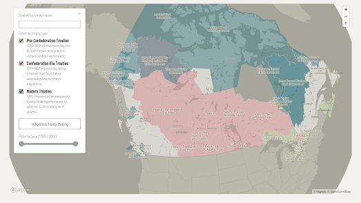
Map of Canada with land treaty borders

The Yellowhead Institute has released The Treaty Map, a comprehensive historical overview of land treaties "negotiated" between Indigenous Nations and the Canadian federal government (and previously, with colonial governments and the British Crown). The Institute aims to use the map to foster a deeper understanding of Indigenous land rights and the ongoing disputes surrounding these treaties.

The interactive Treaty Map includes an historical timeline control which can be used to filter the treaties by date (1725 – 2012). The treaties can also be filtered by type (or historical period):

  1. Pre-Confederation Treaties (1763-1867): Early agreements primarily focused on trade, peace, and military alliances between Indigenous Nations and European settlers, including the Peace and Friendship Treaties and the Royal Proclamation of 1763.

  2. Confederation-Era Treaties (1867-1921): Also known as the Numbered Treaties, these were agreements negotiated as Canada expanded westward, aimed at acquiring Indigenous lands in exchange for promises of land reserves, education, and other support.

  3. Modern Treaties (1975-Present): Often referred to as Comprehensive Land Claims Agreements, these address land rights in areas where historical treaties were not signed, including notable examples like the James Bay and Northern Quebec Agreement and the Nunavut Agreement.
Clicking on a treaty boundary on the map reveals a summary offering Indigenous perspectives on the treaty’s context, key negotiators, terms (often with differing interpretations), and subsequent events. These entries are informed by extensive research, with input from advisory committees of Indigenous treaty experts.
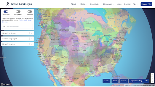
Native-Land map of North American indigenous territories
If you are interested in Indigenous nations and their lands then you might also want to refer to the Native-Land interactive map. This map visualizes information on Indigenous territories, languages, and treaties across the world.

The map is designed to increase awareness and education about Indigenous histories, territories, and the diversity of Indigenous cultures, encouraging users to consider the ongoing significance of land acknowledgment and Indigenous land rights.

Thursday, June 13, 2024

Mapping the Census

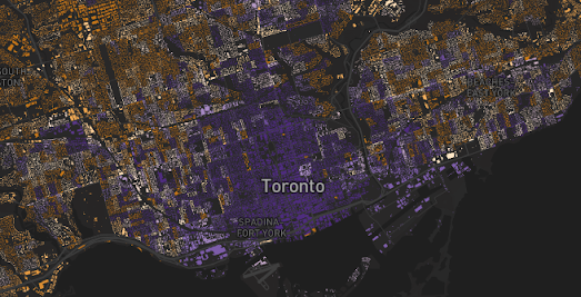
mapping showing percentage of 0-14 year olds in Toronto, revealing that ther are fewer families with young children in Toronto's city center than in the suburbs
percentage of 0-14 year olds

Jacob Weinbren has released an interactive map which allows you to explore data from the 2021 Canadian census by location. Using the map you can view the demographic and economic make-up of towns and cities across the whole of the country using over 2,500 different census variables. 

The Canadian Census map colors individual building footprints based on the results of the 2021 census, providing you with an incredibly detailed breakdown of the make-up of local communities. Just select a census variable from the drop-down menu to see that data overlaid on the map.

map of Toronto showing a higher percentage of people walking to work in the city center
percentage of the workforce walking to work

For example the screenshot above shows the population of the workforce who walk to work. The results suggest that people who live in the center of Toronto live far closer to their workplace than those who live in the city's suburbs. The screenshot at the top of this post shows the percentage of the population who are aged 0-14. As you can see there are fewer 0-14 year olds in the city center than elsewhere, suggesting that many people tend to move out of the city center to the suburbs once they have kids. 

You can explore the data for yourself in other Canadian towns and cities by simply changing the location on the Canadian Census map. You can also read more about the map and how it was made in the blog post Oh Canada - Census 2021.

Wednesday, April 10, 2024

Canada's Hidden Subterranean Rivers

map of Toronto's hidden rivers transitioning into an overhead video

Canadian cities, like many cities around the world, have a history of hiding waterways underground. As cities grow rivers can become obstacles to the movement of people, can be seen as wasted real-estate, and historically (when cities had poor sanitation) they often became open sewers. For these reasons cities often culvert and divert rivers underground.

In Discover Where Ancient Rivers Flow CBC has mapped out the hidden subterranean waterways of Toronto, Montreal and Vancouver. These maps are used to take the reader on a tour of each city's underground rivers. These story-map tours are filled with some wonderful transitions between the map and  overhead drone captured imagery. For example in the screenshot above CBC seamlessly transitions between the map and an overhead video of a multi-lane highway.

There is a growing movement in many cities around the world to "daylight" urban rivers, to return them to the surface. This can improve water quality, create recreational spaces, and reconnect people with nature in the city. CBC explores the argument that resurfacing urban waterways can help cities deal with "heat islands, flooding, pollution, and (the) loss of ecosystem diversity". 

If you live in Toronto, Montreal and Vancouver you might want to scroll to the end of Discover Where Ancient Rivers Flow where you can explore for yourself the locations of each city's underground hidden rivers on an interactive map.

Via: Datawrapper

Wednesday, June 07, 2023

Wildfires & Smoke Pollution

Wildfires in Quebec and Nova Scotia are causing high levels of unhealthy air conditions across much of eastern Canada and the northeastern United States. Over 400 fires were reported to be burning in Canada on Tuesday evening resulting in smoke pollution and dangerous levels of particulate matter 2.5 over large areas.

FireSmoke Canada has an interactive smoke forecast map which provides forecasts for the next few days. The current forecast shows that a large area of eastern Canada and the northeastern U.S. should expect dangerous levels of PM2 at times over the course of this week.

FireSmoke Canada forecasts are produced by the BlueSky Canada smoke modelling system, which is an ongoing research project at the University of British Columbia. The system uses satellite detections to locate fires, weather forecasts to predict how the smoke will move, and a dispersion model to calculate how smoke will be distributed in the atmosphere. The forecasts are updated every 6 hours and show the expected concentration of PM2.5, a type of particulate matter that can be harmful to human health, at ground level from wildfires.

AirNow's Fire and Smoke Map shows the Air Quality Index (AQI) levels across the United States and Canada. It allows you to view the current particle pollution air quality at your location. It can also give you information about fires and smoke plumes. The map currently shows high levels of air pollution in much of the state of New York. You can view AirNow's air quality forecasts for the next two days in New York regions on their New York air quality forecast page.

Friday, February 03, 2023

Speed Limited Travel Times

The City of Winnipeg is introducing new speed limits on local and collector roads in four neighborhoods. In this reduced-speed pilot program speed limits will be reduced from 50km/h to 40km/h in the neighborhoods of Worthington and Richmond West. In Bourkevale and Tyndall Park speed limits will be reduced to 30km/h.

The city's Travel Time Estimator Tool allows drivers to see how the new speed limits are likely to effect their journey times. Using the interactive mapping tool drivers can enter a starting point and destination in Winnipeg. The map will then calculate a route and estimate the increased travel time for the route with both a 30km/h limit on local and collector streets and with a 40km/h limit. 

The map is an incredibly useful tool for drivers as it provides a very accurate estimation of how the city's new speed limits will affect driving times. It is also a pretty effective tool for the city as the map demonstrates the relatively small effect the new speed limits will have on travel times, with most journey travel times being increased by less than a minute.

Thursday, December 02, 2021

Speaking French in Canada

In 1504 the first French fishing ship arrived in Newfoundland, where it discovered seas very rich in fish. In the next 30 years more and more French fishing ships ventured across the Atlantic and some even set up temporary settlements to dry cod, especially on the coasts of Newfoundland and Cape Breton Island. These fishermen were among the first ever French speakers in Canada.

French is now the mother tongue of around 20% of Canadians. It is, with English, one of the two official languages of the country. You can learn more about how the French language arrived and spread in Canada on the interactive map Voyages en Francophonie Canadienne. The map provides a chronological history of the establishment and spread of the French language in Canada from the 16th Century until the present day. 

A timeline runs along the bottom of the map which allows you to explore the historical entries by date. Follow the timeline and you can learn more about the first French colonies established in Canada and the explorations of the country made by French catholic missionaries. The map also explains a little about the establishment of French colonies elsewhere on the continent, for example in New Orleans and elsewhere in Louisiana. 

If you select the period '2000...' you can learn more about the present state of the French language in Canada and its future in the country. This includes sections on what is being done to support the immigration of French speakers, the health of Francophone schools and the efforts to ensure the French language continues to be supported by all Canadian institutions.


You can discover more about the current mother tongues spoken in Canadian homes on the interactive dot map Langues Maternelles 2016. On this map Canadian company Anagraph has plotted the languages spoken by all 34,504,810 Canadians. On the Langues Maternelles 2016 dot map you can see the mother tongue languages spoken in every neighborhood in Canada, according to the 2016 census.

The map reveals how in most Canadian cities people with the same languages often live in the same neighborhoods. For example in Montreal French speakers dominate in the northern districts. English speakers tend to live in southern and south-eastern neighborhoods. Chinese speakers can mostly be found in Brossard and there appears to be a fair number of Italian speakers in north-eastern Montreal.

You can find out the proportion and numbers of Canadians who speak French and English on the Canadian census website. In Update of the 2016 Census Language Data you can view a table showing the percentage of mother tongue speakers of French and English and the total number of the population who speak the two languages. In 2016 there were 19,460,855 people with English as their mother tongue, 7,166,700 with French as their mother tongue and 7,321,060 whose mother tongue was neither French nor English. 

Tuesday, September 21, 2021

Canadian Election Maps


Justin Trudeau's Liberal Party has won a third term as a result of Monday's election in Canada. The Liberals will probably win 156 seats overall, which is one less than in the 2019 election and some way short of the 170 seats needed to form a majority government. For the second election in a row it looks like the Conservative Party has won the popular vote but won fewer electoral districts than its main rival.

The Globe and Mail's Live Updates page includes an interactive map which colors electoral districts based on the party currently winning in the count. If you click on a riding on the map then you can view the total number of votes cast for each candidate and their percentage of the overall vote.

The Globe and Mail's map is a pretty good example of how a geographical map of Canadian election results can be very visually misleading. On this map large rural electoral districts distort the overall picture. For example despite having won only 25 seats the NDP seem to be the largest party in Canada (because they are the most popular party in many of the largest rural electoral ridings). Conversely the Liberal Party (who have won the most seats but predominantly in the geographically smaller urban electoral districts) on this map appear to have done very poorly. 

This visual distortion of the results is also apparent on the Toronto Star's Live Results interactive map. Like the Globe and Mail map the Star's map is great if you want to check the results in an individual electoral district but isn't so great at representing the overall picture of the 2021 Canadian election. This is also true of the election results map on CBC's Federal Election Results page.

A better way of visualizing the Canadian election results could be by using a cartogram. The Electoral Cartogram of Canada provides a fantastic overall view of election results in Canada (although at the time of writing they haven't yet added this year's election results). This map represents each electoral district as an equal sized hexagon. The advantage of using a cartogram is that this map doesn't visually exaggerate the results of large rural electoral electoral areas with low population densities over smaller urban ridings with much higher population densities.

This cartogram view much more clearly shows the overall picture of an election. For example the Liberal Party's narrow win in 2019 is far more legible on this map than on the Globe and Mail's 2021 electoral map. 

Wednesday, September 08, 2021

The Battle of Medusa Map

Operation Medusa was one of the most significant land battles ever fought by NATO. The 2006 battle was a Canadian-led offensive during the war in Afghanistan (which has very recently ended with the withdrawal of  American-led troops). The Battle of Medusa led to NATO establishing government control over the area of Kandahar Province west of Kandahar city.Although the operation was a success it also resulted in the deaths of 12 Canadian soldiers and 14 British military personnel.

The Operation Medusa interactive map includes a number of map layers. The Objectives layer highlights on the map a number of villages in the Arghandab River valley which were a Taliban stronghold. The IED Heat Map layer and the IED Strikes and Finds layer highlight on the map the improvised explosive devices encountered by the Canadian troops during the battle. 

The Operation Medusa interactive map also includes a map overlay which appears to be satellite map which (judging by the numbered labels and colored annotations) appears to have been used to plan the battle operations. I can't be sure if this satellite map was actually part of NATO's resources for the battle. This is because the Operation Medusa map is critically missing an 'About' section. The result of this omission is that the Operation Medusa map desperately needs a written introduction to the battle, an explanation of how it progressed and an overview of the outcome of the battle.

Interactive military maps don't appear too often on Maps Mania. However I did post a very good map of the The Battle of Hong Kong 1941 last week. This map recounts the story of the Japanese capture of Hong Kong in the Second World War. The timeline control and text in this map provide a great example of how the context of a complex battle can be explained on an interactive map. 

You can view more military related maps using the military label on Maps Mania.

Thursday, July 22, 2021

Canada's Interactive Energy Map

About 67% of Canada’s electricity comes from renewable sources. The vast majority of that (61%) comes form hydroelectricity. Canada is the third largest hydroelectricity provider in the world.The next largest source of electricity in the country is nuclear, which contributes around 15% of Canada's electricity production. 

You can learn more about the different types of electricity source in Canada, including where they are generated and how they are transmitted around the country on Canadian Geographic Education's Interactive Energy Map. The map plots the locations of Canada's significant energy production sites, the major fuel pipe & electricity transmission lines, and Canada's energy processing facilities. The interactive map includes filter controls which allow you to explore each energy sector individually, which allows you to see where the different energy sources in Canada are located in the country.

The Interactive Energy Map paints a rather rosy picture about Canada's contribution to fossil fuel consumption. Although 67% of Canada's own electricity use comes from renewable sources the map doesn't reflect that Canada is also a huge exporter of oil and gas. The Government of Canada for example says that hydroelectricity actually only contributes around 4.5% of Canada's primary energy production. Oil and gas on the other hand make up 57% of the country's primary energy production.


You can explore how America generates power on the U.S. Power Plants map. U.S. Power Plants is an interactive map showing the locations, size and type of America's electric power plants. The map is a great way to see where different types of power plant are located, how much each type of energy source contributes to the country's power supply and how much each source contributes to CO2 emissions.

The number of map filters on U.S. Power Plants means that the map can provide lots of different insights into American power supply. For example the individual fuel filters allow you to see where different power sources are concentrated in America. Select hydro-power and you can see that hydro-power plants are concentrated in the north-west and north-east of the country. While solar power plants are mainly located in California.


Esri's Atlas of Electricity is another great way to explore where the USA gets its electricity from and how it distributes this power across the country. At the heart of an Atlas of Electricity is an interactive map plotting the location and size of the grid's power plants and transmission cables. This map allows you to explore the location and capacity of the country's electricity producing power plants and how they connect to the national grid.

As well as mapping the physical infrastructure of the electricity grid this story map examines the primary energy sources used to generate electricity in the USA. It maps the size and capacity of coal-fired power plants, natural gas power plants and petroleum power plants. Alongside these fossil-fuel sources of power An Atlas of Electricity plots the size and capacity of the U.S.'s nuclear power plants, hydroelectric power plants and solar & wind power plants.

Wednesday, July 21, 2021

The Smoke Forecast Map

The devastating wildfires burning in Canada and the USA are contributing to poor air quality conditions, sparking air quality advisories in large areas of both countries.  The Smoke Forecast map allows you to view a forecast of where in Canada smoke pollution is likely to occur over the next two days.

On the interactive Smoke Forecast map the areas colored brown are forecast to experience high levels of smoke. The darker the color on the map then the higher the ground level concentration of particulate matter is expected to be. The map includes an animation control which allows you to view the smoke forecast for the next 48 hours animated on the map or to select a specific hour to view its smoke forecast.


You can also view the extent of the smoke across north America on NOAA's Smoke Forecast map. NOAA's High-Resolution Rapid Refresh Smoke Interactive map identifies locations with intense fires and forecasts how smoke is likely to disperse based on the latest weather forecasts. The smoke forecast map is experimental. It is prone to errors from cloud cover preventing satellite detection of wildfires and to errors in weather forecasts.

Tuesday, June 29, 2021

Canada's Residential School Map

From the 19th Century until the end of the 20th Century Canada's Indian residential school system existed to separate Indigenous children from their families in order to remove them from the influence of their own culture and to 'assimilate' them into Canadian culture. The system existed for more than a century, during which time around 150,000 children were placed in residential schools nationally. The children were forced to convert to Christianity and were not allowed to speak or learn their own native languages.

CBC's Residential Schools map allows you to search for the residential school nearest to you. Enter a Canadian address into the map and it will show you the nearest residential school to that address and when the school was operational.

The last residential school was closed in 1996. However that doesn't mean things are now perfect for Indigenous people in Canada. From 2001 to 2015 the homicide rate for Indigenous women in Canada was nearly six times as high as the homicide rate for other women.

The Native Women's Association of Canada (NWAC) has published an interactive map of cases of missing and murdered Indigenous women and girls. The Safe Passage map includes over 300 locations where a missing Indigenous woman or girl was last seen or where remains have been found. The map is being used to collect data and help identify patterns of violence in geographic areas.

Individual cases are shown on the map using colored markers showing whether the case relates to a homicide, a missing person or a suspicious death. The map also includes a heat-map view showing where the number of cases of missing and murdered Indigenous women and girls are most dense.

Tuesday, April 13, 2021

Runnabilty Scores

Over the last few years a number of organizations have developed methodologies for ranking the 'walkability' of streets. Interactive maps of these walkability rankings tend to color streets based on how pleasant they are to walk, based on factors such as the amount of motorized road traffic and the levels of 'greenery'.

Scholars at the Simon Fraser University argue that walkability scores are not particular helpful for runners. In their paper 'Creation of a Rough Runnability Index' they maintain that runners have different goals than walkers and that there has been little attention into how the built environment facilitates running. For example city streets which disrupt momentum by requiring lots of starting and stopping may not be a major deterrent for walkers but will deter runners keen on maintaining speed and momentum.

Aateka Shashank, Nadine Schuurman, Russell Copley and Scott Lear have therefore devised three new runnabilty indices which rank streets based on how conducive they are to runners. They have then used these indices to map the runnability of the city of Surrey in British Columbia, Canada. 

The Rough Runnability Indices interactive map colors the sidewalks of Surrey to show how suitable they are for running. The darker the colour of a sidewalk the lower the runnability score. The lighter the colour of a street then the higher the runnability score. You can select to view any of the three different runnability indices ('Runnability Index Safety', 'Runnability Index PM' and 'Runnability Index Generic') from the map sidebar.

You can learn more about the methodologies used to rank the runnability of sidewalks in each of the three developed indices in the paper Creation of a rough runnability index using an affordance-based framework

If you are interested in how 'walkable' or 'bikeable' a city is then you might like Walk Score, which ranks US cities based on how conducive they are for walking and / or cycling.

Wednesday, March 10, 2021

Putting Women on the Map

Yesterday, in honor of International Women's Day, Canada's Minister of Natural Resources announced the release of a new interactive map which highlights all the roads, towns and other locations in the country which have been named for women. The Recognizing Women with Canadian Place Names interactive map shows 500 locations in Canada which have been named for women from lots of different backgrounds.

All the locations named for women are shown on the map using colored markers. The colors of these markers reflect the different backgrounds of the women honored, such as royalty, politics, science or the arts.Click on a marker on the map and you can read a short story behind the woman being honored with her own place-name. 

I have a little problem with the Recognizing Women with Canadian Pace Names map. I think they made a strange choice to show place-names on the map using map markers rather than the customary map labels. I can't help feeling that using map labels would be more in keeping with the purpose of the map. Using map markers instead of place-name labels almost feels as if the map has actually removed these women's names from the map rather than honoring them. 

Geochicas has been at the forefront of efforts around the world to reveal the under-representation of women in place-names. Their Las Calles de las Mujeres is an interactive map which reveals all the streets named for men and women in a number of cities in Spain, Argentina, Mexico, Bolivia, Cuba, Paraguay, Peru and Uruguay. 

A number of other interactive mapping projects have explored the sexist culture of naming streets in cities around the world: 

Street Names in Vienna visualizes all the streets named for men and women in the Austrian capital.
EqualStreetNames: Belgrade is an interactive map which colors the streets of the capital of Serbia based on whether they are named for men or women. 
EqualStreetNames.Brussels is a similar map looking at the number of streets named for men and women in the capital of Belgium. 
From Pythagoras to Amalia analyzes 5,400 Amsterdam street names - including exploring how many are named for women compared to the number named after men.

Friday, February 05, 2021

Covid-19 School Tracking Maps

The Canada COVID-19 School Tracker is an interactive map which is plotting COVID-19 outbreaks in schools across Canada. The map is designed to provide parents, communities and students with the information to make important decisions about school openings. 

In Canada decisions about school openings are being made at the province level. Unfortunately for parents and students information about Covid-19 cases in schools is not always readily available and some provinces are better than others in reporting outbreaks in schools.

The Canada Covid-19 School Tracker map shows schools which have reported cases of Covid-19. On the map individual schools are represented by colored markers. Yellow markers show where a school has reported individual unlinked cases of Covid-19. Red circles indicate where there have been outbreaks and purple circles show clusters. The size of the circles indicate the total number of reported cases in a school.

The map includes filters which allow you to adjust the schools shown by the number of cases and by date. You can therefore, for example,  use the 'days' filter to only show schools which have reported cases in the last two weeks.

In the UK the School Covid Map takes a different approach. Rather than map the number of Covid-19 cases reported in individual schools the UK School Covid Map shows the number of positive cases reported in the neighborhoods around schools. 

Currently in the UK most schools are closed except for the children of essential workers (e.g. the children of doctors and nurses). The National Education Union has released the School Covid Map to help provide information on whether it is safe to reopen school and colleges. 

The map shows the numbers of Covid-19 cases over the last week in the areas around individual schools and whether the trend in reported cases is rising or falling. The map also shows the watchlist status of the local authority and a link to any local restrictions that are in place.

Tuesday, December 29, 2020

How Coronavirus Spread in Canada

CBC / Radio-Canada has published a story map which compares the latest surge of Covid-19 cases in Canada with the first wave of the pandemic earlier this year.

At the heart of Two Parts of a Pandemic: How the Coronavirus Spread in Canada is a 3D interactive map visualizing the number of coronavirus cases across Canada during the two periods of the year which saw dramatic surges. On top of this 3D map case 'spikes' show the number of Covid-19 cases in each of the country's health regions. The higher a region's spikes then the more Covid-19 cases (per 100,000 people) were recorded in the region. 

As you progress through CBC's story the map rotates and zooms to show regions which experienced dramatic surges during the first and second waves. CBC defines the first wave as happening from March 11 to July 28 and the second wave as occurring from July 29 to December 15. Using the map CBC shows how during the first wave coronavirus spread rapidly through central Canada. However west of Ontario regions managed to avoid the worst of the first wave of the pandemic. 

Unfortunately many of these health regions west of Ontario suffered a high number of cases during the second wave. In the east the 'Atlantic bubble' also largely avoided a pandemic in the Spring. This area was also unable to avoid the pandemic during the second wave. However, although in the whole of Canada the second wave saw three times as many Canadians testing positive as in the first wave, knowledge about the virus and improvements in patient care ensured that only half as many Canadians died during the second wave as died during the Spring wave.

Tuesday, November 24, 2020

Canada's 15 Minute Cities

Because of the current global epidemic I have not traveled more than three miles from my home in over seven months. I do not own a car and at the moment I am reluctant to use public transport. Consequently my world has become a lot smaller. 

Luckily, however, I live in a '15 minute city'. Which means that all my essential needs can be accessed in 15 minutes from my home by foot or by bike. The concept of the 15 Minute City was developed by Professor Carlos Moreno of the Sorbonne. Moreno's new approach to city planning wants to make urban living more livable and sustainable by ensuring that all the essential needs of individuals can be accessed without having to get in a car or use public transport.

The importance of this concept has become much more apparent to many people during the current global epidemic. Many more of us now work from home and many more of us are restricted in how far we can or are willing to travel. 

If you live in Canada then you refer to The Globe and Mail's 15 Minute City article to discover whether you live in a 15 minute city or not. The newspaper has used Statistics Canada data to see how close people in Canada's major cities live to essential amenities, such as grocery stores, pharmacies, schools and libraries.

According to The Globe and Mail's analysis Canada's most amenity dense city is Vancouver. 72% of the residents of Vancouver live in neighborhoods which are 'amenity-dense'. At the other end of the scale less than 4% of people living in St. John's have easy access to essential amenities.

You can also explore your access to local amenities for yourself by using Statistics Canada's Proximity Measures Data Viewer. This map allows you to explore how close you live to a number of different amenities. 

The amenities which you can explore on the map include public transit, grocery stores, health care, education, libraries and parks. If you select one of these amenities you can view a choropleth map showing the proximity of each census block to this amenity. Select a census block on the map and you can also view a table which outlines the block's proximity to each type of amenity and gives the block an overall score for its 'amenity density'.


If you live in the United States then you can answer the question Do you live in a “15-minute” city? by using HERE's interactive map. Enter your address or zip-code into the map and it will show you all the Groceries, Medical Facilities, Cultural Sites, Educational Facilities, Transit Stops and Leisure Facilities within a 15 minute walk of your home. The map will also tell you if your address qualifies as a 15 Minute City or not

Thursday, May 14, 2020

Melting Borders


The border between Alberta and British Colombia is moving. This shifting border has nothing to do with any territorial dispute between the two Canadian provinces. It is moving because it lies across the Haig glacier. And the Haig glacier is melting.

The boundary between Alberta and British Colombia is determined by the hydrological divide, that is "the spot where a raindrop at the highest point either falls west into B.C. or east into Alberta". However as the glaciers melt the hydrological divide can shift, so that runoff which once flowed in one direction will now flow in another direction as rock formations, preciously covered by ice, are revealed.

This process is beautifully visualized in CBC News' How a melting glacier could redefine the Alberta–B.C. border. Using a 3d map of the Haig glacier CBC shows how the glacier is melting and causing a shift in the border between B.C. and Alberta. Of course this shift in the boundary is pretty insignificant but it does provide a gripping introduction into the real story about how global heating is causing Canada's glaciers to melt. The Haig glacier is losing about a metre a year and is projected to completely disappear in the next 80 years.

A shrinking glacier can have a dramatic impact on those living nearby. For example Calgary relies on glacier melt to provide up to 20% of its water supply during times of drought. Across the border in B.C. hydro-electric power stations also depend on water flow determined by the Haig glacier.

Thursday, February 20, 2020

The Migratory Patterns of Birds


The Cornell Lab of Ornithology is running the largest citizen science project in the world. For fifteen years bird watchers across the globe have been reporting their observations to eBird. The result is a huge database of over 750 million observations, recording dated sightings of thousands of species of birds.

The eBird Science team has used the observations made in North America to create animated migration and seasonal abundance maps for 610 bird species. The maps visualize the abundance of each species across North America and allow you to observe their migratory patterns over the course of each year.

The abundance maps show where each bird species is most common across the continent. These maps use different colors to show the relative abundance of a bird species at different times of the year. The migratory maps allow you to view the migratory patterns of whole populations of bird species across the whole continent of North America. For example in the map above you can observe the abundance of waterfowl in different locations over the course of a year. Note how in the winter the Mississippi River Valley shows up on the map as thousands of waterfowl visit.