[](https://travis-ci.org/Clay McIlrath/FlourishUI)
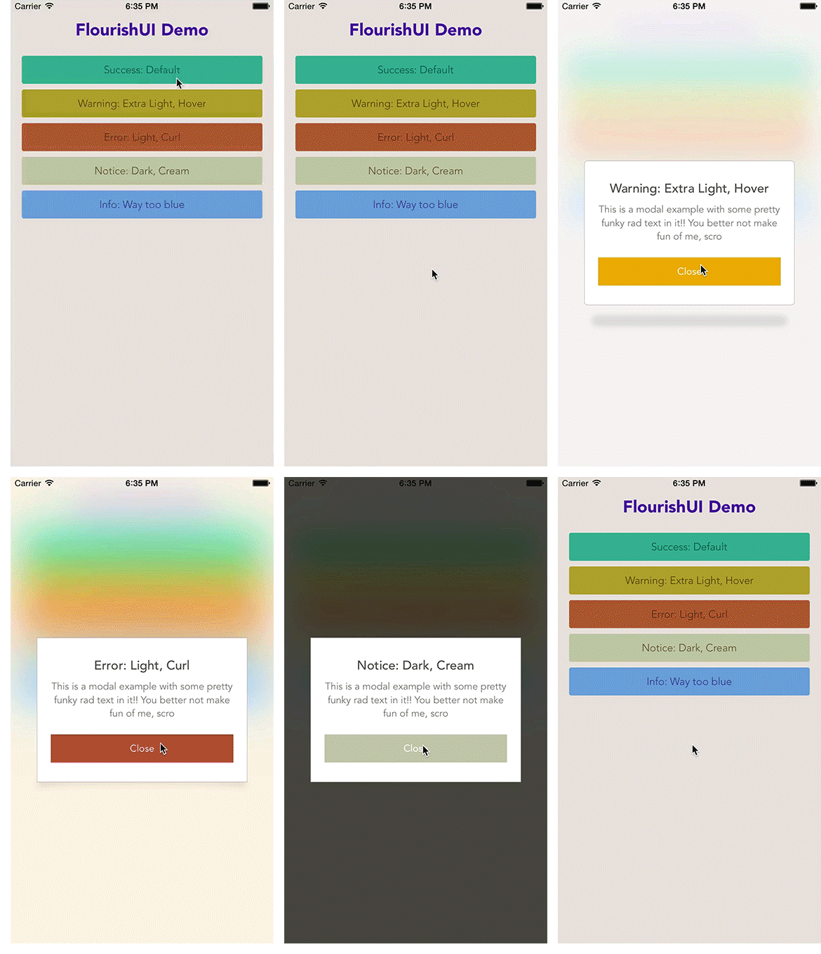
We absolutely love beautiful interfaces! As an organization named Unicorn, we are obligated to be unique and majestic. That is why we have made this highly configurable, out-of-the-box-pretty, User Interface library/kit thingy. It has a minimal set of UI components now, but already packs quite a punch with the UIColor extension, animated Material-inspired buttons, and modal views.
To run the example project, clone the repo, and run pod install from the Example directory first.
Release Notes
Master contains the latest bleeding edge code. Currently master is supporting Swift 3.0 but there are releases for older versions of Swift.
This library was built on iOS 8.x, but does offer decent backwards compatibility. We haven't tested older devices thoroughly however, so if you find a breaking issue, please file an issue on the repo or submit a pull request!
This library was hand-written, but borrowed from concepts in ZFRipple, SLCAlertView and Material. We'd like to thank them for paving the way for some cool concepts and for contributing their code as MIT. Following suit, we have also made this open source and completely void of copyright or restrictions. Just use it already, and make your apps look like sexy unicorns!
FlourishUI is available through CocoaPods. To install it, simply add the following line to your Podfile:
pod "FlourishUI"Or if you prefer to skip cocoapods, you can simply drag and drop the source files directly into your Xcode project.
Most of the code should be pretty self documenting. FlourishUI uses structs and enums heavily to make an easy-to-read and highly meta approach. Future updates will probably keep the API mostly the same, but switch to a better underlying infrastructure of getters and setters.
The Button class is ready to go with Interface Builder and IBDesignable, just inherit! You can check the demo to see this configured with IB.
Modals are heavily based on configurations, and thus, are built and called in code. We plan on making them more robust in time, but for now, you'll want to simply treat them like you would an AlertView.
Modal.Overlay.blurStyle = .ExtraLight
Modal.Dialog.shadowType = .Hover
Modal.Dialog.shadowRadius = CGFloat(5)
Modal.Dialog.shadowOffset = CGSize(width: 0, height: 0)
Modal.Dialog.shadowOpacity = 0.1

Modal(title: sender.titleLabel?.text, body: body, status: .Warning).show()Flourish UI supports Toggle Switches as of 3.x and up! These are drawn entirely with core graphics and animated with UIKit, giving you vector scale and full customization.
//
// Customizing toggle switches
//
let greenColor = UIColor(hex: "#3D8C8E")

let toggle2 = ToggleSwitch()
toggle2.frame = CGRect(x: 20, y: view.frame.height - 100, width: view.frame.width - 40, height: 24)
toggle2.label.setTitle("Custom styled toggle", for: .normal)
toggle2.active = true

// Customize the label associated with the toggle switch
toggle2.label.frame.size.width = 200
toggle2.label.titleLabel?.textColor = .black

// Customize the background which the toggle button slides across
toggle2.slide.activeBackgroundColor = greenColor.adjustValue(percentage: 1.4)
toggle2.slide.activeBorderColor = greenColor.adjustValue(percentage: 1.0)
toggle2.slide.disabledBackgroundColor = UIColor(hex: "#99896F")
toggle2.slide.disabledBorderColor = UIColor(hex: "#99896F").adjustValue(percentage: 0.5)

// Customize the round toggle button
toggle2.button.activeBackgroundColor = greenColor.adjustValue(percentage: 1.3)
toggle2.button.activeBorderColor = greenColor.adjustValue(percentage: 1.1)
toggle2.button.disabledBackgroundColor = UIColor(rgba: [153, 137, 111, 0.8])
toggle2.button.disabledBorderColor = UIColor(rgba: [153, 137, 111, 0.8]).adjustValue(percentage: 0.5)

view.addSubview(toggle2)// Create colors with hex value in string
let red = UIColor(hex: "#ff0000")
// Darken or lighten the value (lightness)
// 1 = 100% therefore > 1 is lighter and < 1 is darker
red.adjustValue(percentage: 1.5)FlourishUI is available under the MIT license. See the LICENSE file for more info.

