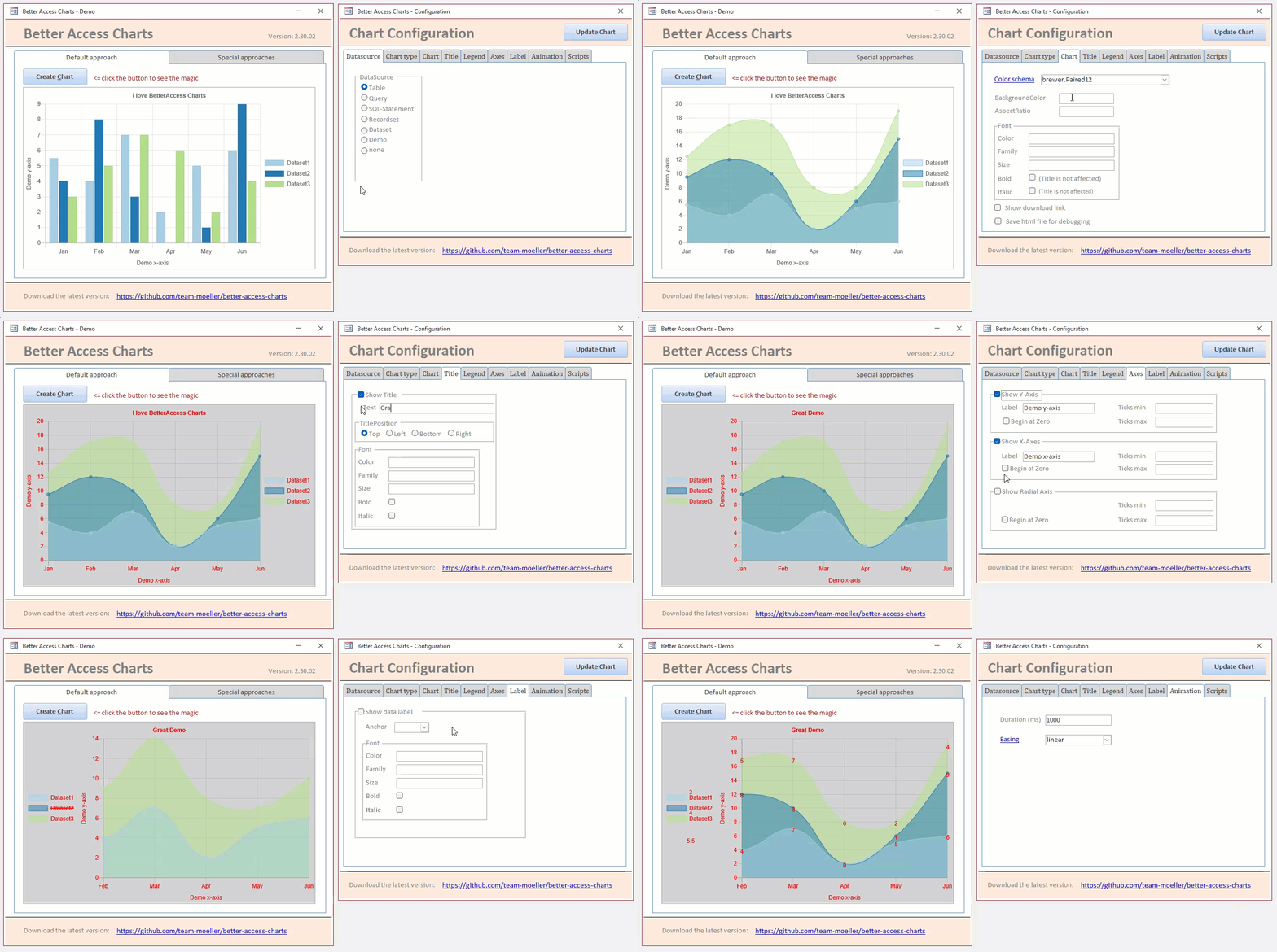
Better charts for Access with charts.js
Microsoft Access badly needs modern charts. The original charts in MS Access date from the 90s of the previous century. Microsoft has given the charts in Access a lift. They called it "Modern Charts".
There are countless JavaScript libraries on the world wide web that you can use to create cool charts. This project makes use of this. We create charts using the Chart.js library and display them in the edge browser control. The whole logic is hidden in some class modules.
Take a look at the demo and let yourself be inspired by the possibilities.
- Download the latest release
- Unpack the files to a trusted folder
- Run the database
- Push the button: "Create Chart"
1. Import of the class modules
First, all modules with the name "BAC_*" must be imported from the demo database into your Access database.
2. Insert edge browser control on form
The second step is to add an edge browser control to display the chart on a form. It is best to give the control a meaningful name. This is required later in the VBA code. I like to use the name "ctlEdgeBrowser" for this.
3. First lines of code for the basic functionality
The best thing to do is to add another button. In the click event, paste the following code:
Dim myChart As BAC_Chart
Set myChart = BAC.Chart(Me.ctlEdgeBrowser)
myChart.CreateChart - In line 1 a variable of the type BAC_Chart is declared.
- In line 2 a new instance of this class is created and the edge browser control is assigned to the class module.
- The chart is created in line 3.
When you run this code, you will see a chart with some data. At the moment no data source is assigned. In such a case, Better-Access Charts simply shows a standard data source with 6 entries. This is particularly practical for our example. We have now done a quick test and fundamentally implemented the chart.
4. Add a data source and define the chart type
In order for the chart to show something, it needs a data source. You can use the DataSource.ObjectName property for this, for example. Enter the name of a table or a query that contains the data to be displayed.
You can specify one or more field names using the DataSource.DataFieldNames property. If you specify multiple field names, a data series is drawn for each field. You use the DataSource.LabelFieldName attribute to specify the field from which the names of the data points are taken.
Finally, use the ChartType property to select which of the nine possible chart types should be created.
The necessary VBA code could look like this, for example:
myChart.DataSource.ObjectName = "tbl_DemoData"
myChart.DataSource.DataFieldNames = Array("Dataset1", "Dataset2", "Dataset3")
myChart.DataSource.LabelFieldName = "DataLabel"
myChart.ChartType = chChartType.Line- In line 1, the table "tbl_Demo_Data" is specified as the data source.
- Line 2 names three fields for three data series.
- Line 3 defines the name of the label field.
- In line 4, a line chart is selected as the chart type.
5. Set further attributes for the chart
The next step is to adapt the chart to your own needs. For example, you can define a title, label the axes or adjust the default font size.
The project currently has 21 subclasses with lots of properties. You can see all of them in the documentation on the Wiki. I have also presented the individual progress in the blog.
As you can see, there are a multitude of sources. Take a look around and make use of the options provided.
