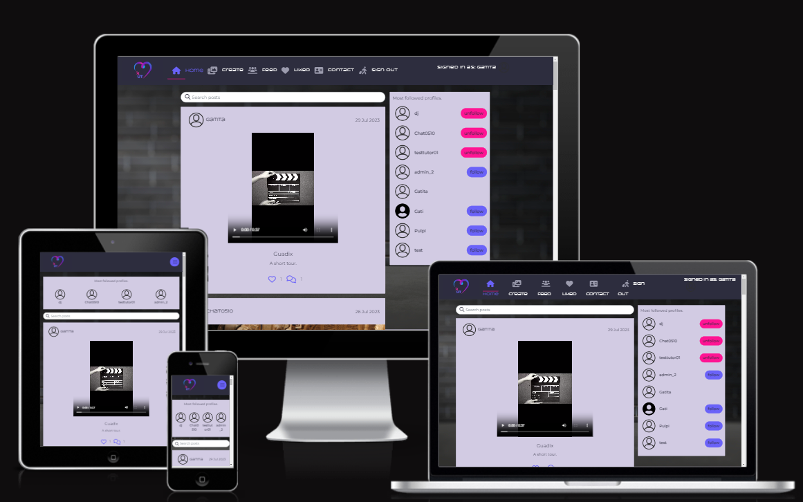
UrbanTrip is a content sharing platform for city trip lovers. Among the main features users can share pictures and videos of their favorite cities, comment on posts, follow other users and more.
The website is responsive in the most common screen devices (smartphone, tablet, laptop and desktop) and within the following width categories:
- 320 x 480px
- 768 x 1024px
- 1280 x 802px
- 1600 x 992px
Please visit the deployed site by clicking on Urbantrip.
The project was developed using the Kanban Agile management methodology and the MoSCoW prioritisation technique.
It was put in place using different functionalities in GitHub:
- Issues, for EPICS and user stories;
An epic covers the development of an existing feature in the web application.
User stories were linked to the epic to keep track of the progress with the tasks.
- Milestone (without due date), for the product backlog;
Ready-for-development epics were stored in the product backlog before starting a sprint.
- Milestone (WITH due date), for each iteration;
I worked 1 epic x sprint. User stories that couldn't be completed were placed back in the product backlog and on "No status" category of the project for eventually being included in a next sprint.
- Project, for the Kanban board.
You can access the project here. This project holds epics of 2 repositories: Urban-drf (the backend repo) and Urbantrip (the frontend repo).
Both, the Urban-drf and Urbantrip repositories, were linked to the same project: Urbantrip-PP5.
Labels were used to identify epics and user stories of each repo.
Epics were assigned to the "To-do" status and move to "In progress" or "Done" status as the tasks in the user stories were completed.
UrbanTrip follows the database schema as its backend API, Urban-drf.
You can review it here, in the corresponding repository.
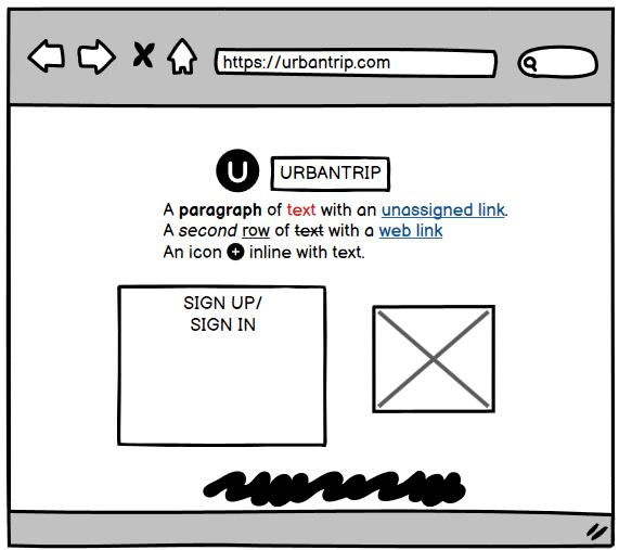
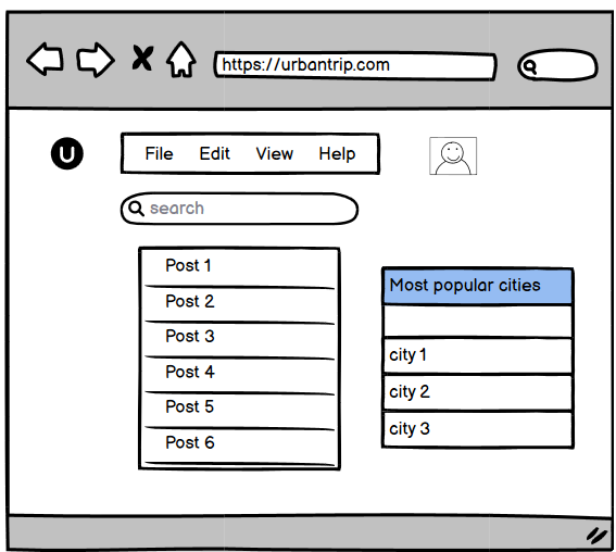
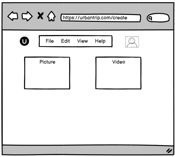
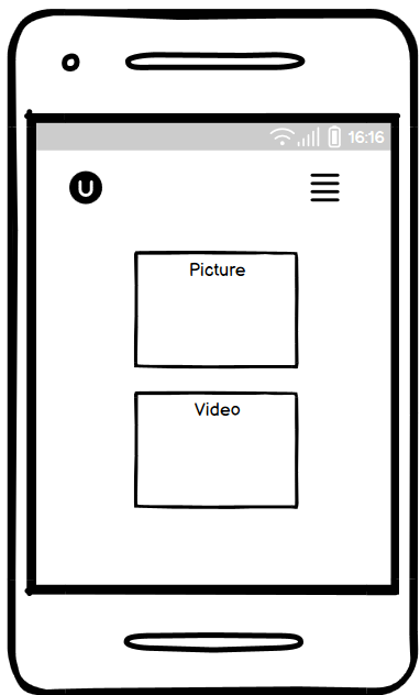
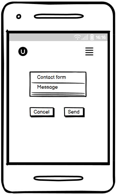
Wireframes are created for sketching the UI ideas.
The final project may be slightly different. The wireframes of this project are:
-
Landing web page
-
Landing mobile app
-
Home web page
-
Home mobile app
-
Create web page
-
Create mobile app
-
Contact web page
-
Contact mobile app
The font combination for the project was chosen in this blog article: https://connectivewebdesign.com/blog/best-google-font-combinations
This combination goes well with the intrinsic modern look of this project as well with photographies which are at the heart of this web application.
The colour palette was chosen for its contemporary style.
The palette was created using the Canva’s color palette generator and one of the avatars from the unDraw illustrations collection at iconduck.
Canva used the hues in the avatar to create the palette.
React applications are made up of components.
A component is a JavaScript file that handles one functionality, for instance, a navigation bar, a sign in page etc. And can be nested inside other components for more complex situations e.g in this project the ServiceDetail, ServiceContactDetails and the ReviewsPage components are nested in the ServicePage component for rendering in the UI a service offering including the offerer contact details and the users reviews and ratings.
Components can also be reused within the same application or in external applications.
These components were reused for developing this project:
- Avatar.js, which displays the user's profile image. This component can be found nested in:
- the NavBar component, for the stating the user's status
for showing the ownership of post, comment, service and review in: - Post.js
- Comment.js
- Service.js
- Review.js
- ControlsDropdown.js, used for displaying the edit and delete options in:
- posts (Post component)
- comments (Comment component)
- in the user profile through the use of the ProfileEditDropdown function
- in services (Service component)
- Asset.js, that is used to display a spinner, an image and/or a message in different situations:
- while fetching data from the backend, e.g, in the PostsPage and ServicesPage components
- nested within the NotFound component for displaying an image and appropiate message, e.g in the feed page when the authenticated user doesn't follow any other user
- DeleteConfirmation.js, which has been used in the same components as the ControlsDropdown component (except in the Profile one as profiles can't be deleted from the UI). More about this component in the "Credits" section.
These other components could be easily used in other applications:
- NavBar.js
- ContactCreateForm.js
- Profile.js
- ProfileEditForm.js
- UsernameForm.js
- UserPasswordForm.js
Thus, each existing feature in UrbanTrip was built creating, developing and reusing components.
Below I'll present and explain each of them:
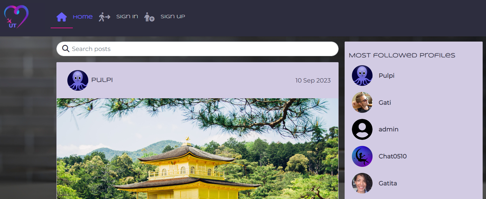
When users navigates to the UrbanTrip's url, they arrive to the home page for unauthenticated users.
This page corresponds to the PostsPage component. Three other components are nested within: the Post, the PopularProfiles and the Asset component.
They will be explained separately later.
As rendered in large devices:
Here users can see the most popular profiles, the existing posts and scrolldown to keep loading posts.
The navigation bar and the search bar are available as well.
Unauthenticated users can perform searches, visit profiles listed in "Most popular profiles" and read the existing comments on a post.
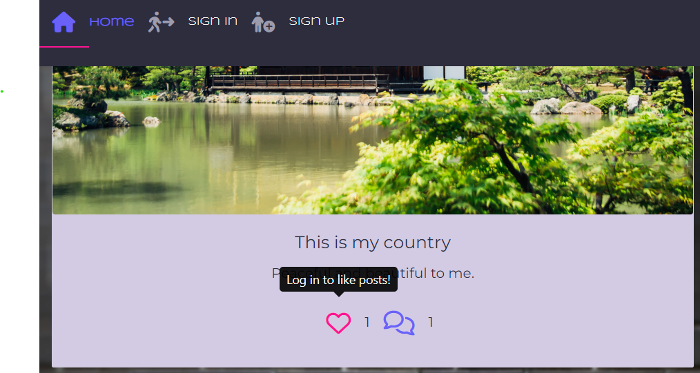
In this home page, posts display its number of "likes" next to a heart icon and its number of comments next to a conversation icon. The liking and commenting functionalities however are reserved to authenticated users. One is informed about it thanks to displayed tooltip when hovering over the "Like" icon and the absence of form for "Comments" when visiting the PostPage (clicking on a post).
The navigation bar is available in all pages except in the authentication pages. Its content changes according to the user status.
For unathenticated users, the navigation bar shows the UrbanTrip logo,which has a link to the home page, and the sign in and sign up links. The current page is highlighted to the user:
On small devices the navbar collapses into a hamburguer icon:
For authenticated users, the content of the navigation bar, besides the logo and home link, is as follows:
- Create
- Feed
- Liked
- Services
- Contact
- Sign out
- Signed in as (so the current status of the user is evident)
By clicking on the sign in link and/or the sign up link redirects the user to the corresponding page.
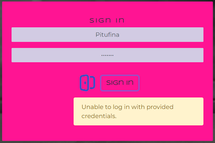
If there is any error in the provided credentials, the user is informed so he/she can take action:
Similar alerts are available in all the forms of the application to provide feedback to the user whenever provided input is wrong.
After successful signed in, users are redirected to the home page.
Users can find the same elements as prior to the sign in, but the functionality of some of them is extended:
-
the navigation bar displays more links as previously mentioned
-
the "Most followed profiles", which displays the content of the PopularProfiles component, has now the "Follow" and "Unfollow" buttons for the following functionality
-
liking and commenting are now enabled
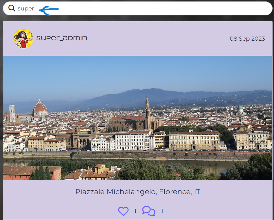
Authenticated or unauthenticated users can research posts by city, country, title and username.
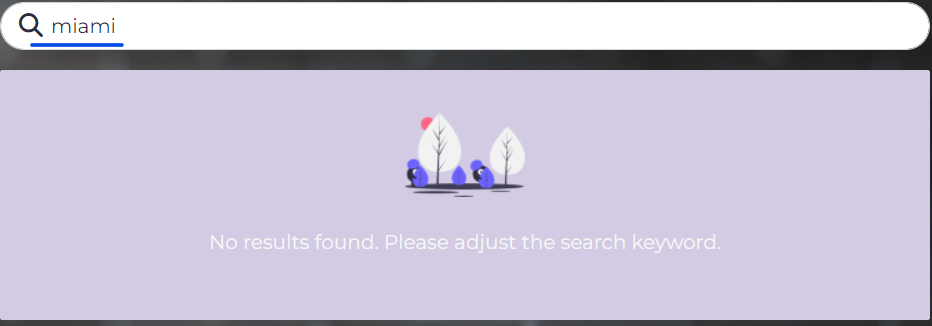
if there isn't any corresponding result, the Asset component, nested in the PostsPage, is rendered to give feedback to the user:
This nested component brings to the UI the result of a filter set in the backend: profiles in descendent order of the number of followers.
In small screen devices the number of displayed popular profiles is 4.
Recalling,the home page renders the PostsPage component: all the existing posts are rendered here.
A post is the content of the Post component, also nested in the PostsPage, and displays:
- the Avatar component, which provides the profile_image of the post owner
- the username of the post owner
- the date of the last update of the post
- the image/video uploaded by the user
- the title of the post
- the description/content about the post
- the number of likes and comments
Posts behaves differently depending on if the user is the owner or not of the post. For owners, the 3 dots menu is available in the post (PostPage), but not for the other users. If a user that isn't the owner tries to reach the posts/:id/edit page via the url, he/she will be redirected to the home page.
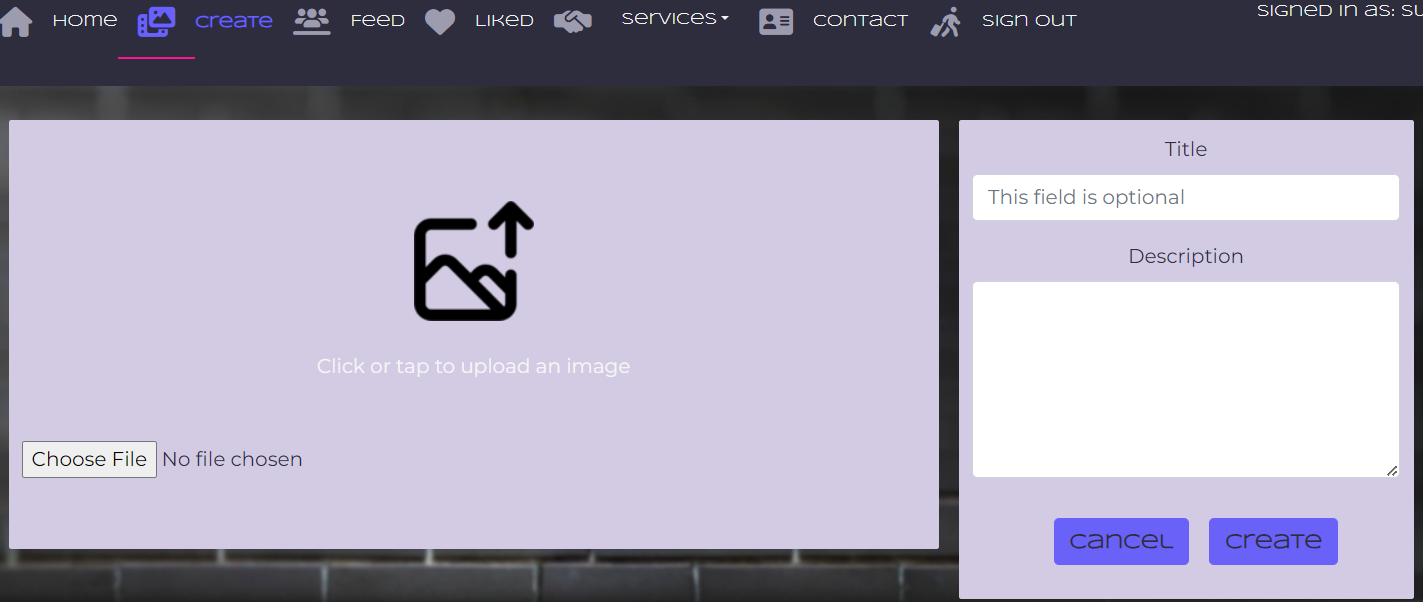
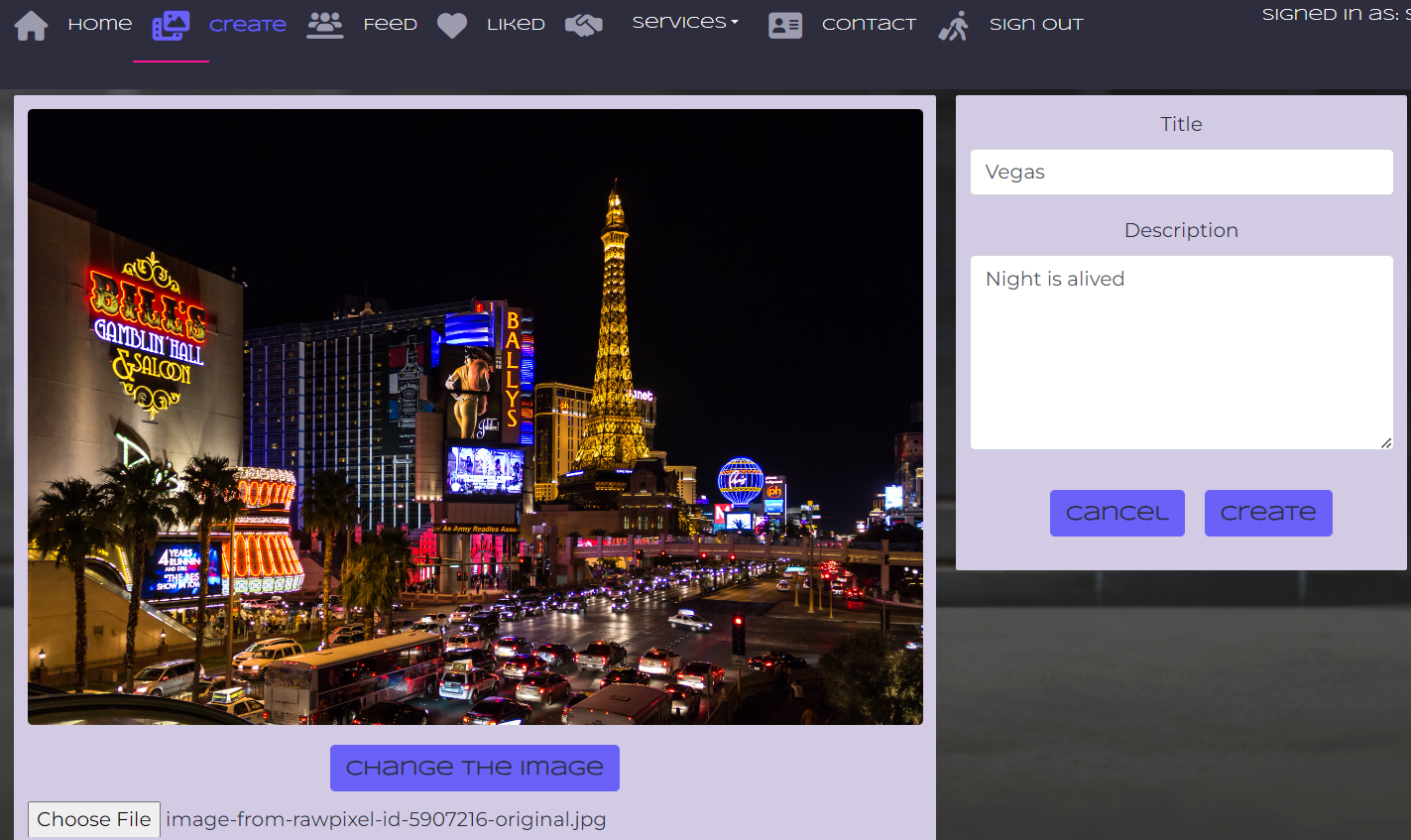
Clicking on the "Create" link on the navigation bar renders the PostChooseMedia component.
After clicking on the kind of post of his/her choice, a form for creating the post is rendered to the user: PostCreateFormPicture.js or PostCreateFormVideo.js.
As both components are pretty similar, this section will explain only the one for uploading a picture.
After uploading the image, a "Change the image" button is available in case the user would like to change for another file.
By hitting "Save" the post is created, the number of post is incremented by 1 in the ProfilePage and the PostPage component displays the newly created post.
Only owners of a post can edit/delete a post.
Click the menu to display the options.
When editing, the PostEditForm component is rendered. All fields of the form can be updated: image/video (files can be replaced only by the same type of file), title and content.
When deleting, the DeleteConfirmation component is called.
User can abort the deletion by clicking on "cancel", he/she will be redirected the last visited page, or proceed by clicking on "confirm deletion", in which case the user is redirected to the home page. Deleting a post decreases the number of posts by 1 in the ProfilePage component.
This page is rendering again the PostsPage component, but filtering the post by those of the users followed by the authenticated user. If he/she doesn't follow any other user, the Asset component is displayed with a message explaining that the user should follow another.
This page is rendering again the PostsPage component, but filtering the post by those of the users have got a like by the authenticated user. If he/she hasn't liked any post, the Asset component is displayed with a message explaining that the user should like a post.
This page renders in the UI the reusable ContactCreateForm component.
After clicking on "Send" a modal pop-ups to give feedback to the user.
A user can follow another by simply clicking on the "Follow" button. The button will then be changed to "Unfollow" to let the user stop following the other user.
Following a user increases by 1 the number of his/her followers; at the same time the number of following increases by 1 for the user that follows. The count of followers and of following are available in the user profile.
Inversely, unfollowing a user decreases by 1 the number of his/her followers and the number of following for the user that follows. As mentioned earlier, these counts are part of filters set in the backend that are used for displaying posts in the feed page and in the PopularProfiles.js file.
A user can like a post by simply clicking on the "Like" icon. This action changes the icon from a regular to a solid heart and like this gives feedback to the user about the fact that he/she has already liked the post. Besides the displayed number of likes increases by 1.
Inversely, unliking a post decreases by 1 the displayed number of likes and restore the icon from a solid to a regular heart. As mentioned earlier, the likes counts is part of filters set in the backend that are used, in this case for displaying posts in the liked page.
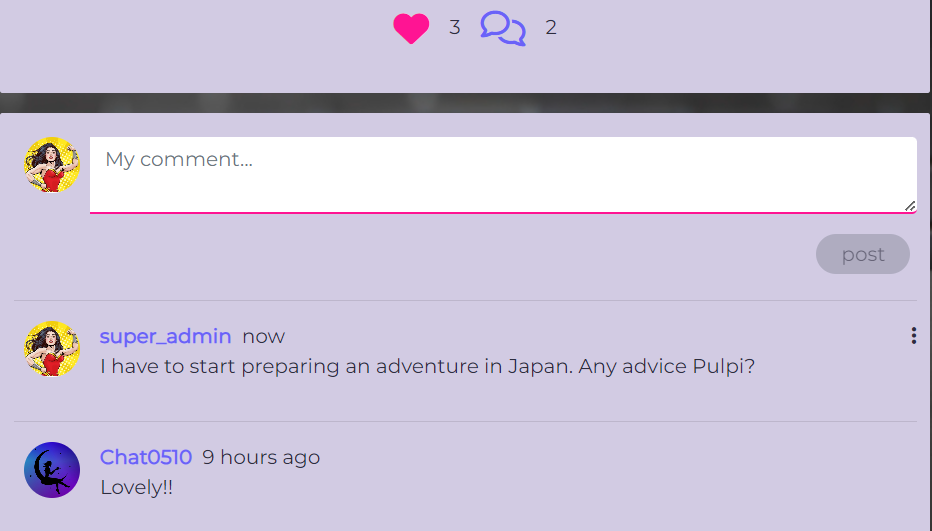
User can comment on any post. Clicking on the conversation icon, in the PostPage component, will redirect the user to the form for creating the comment (the CommentCreateForm component) which is available in the PostPage component (posts/:id page).
The comment count is increased by 1 and the newly created comment (stored in the Comment component) is listed with any other existing comment under the comment form.
Owner of the comment has the 3 dots menu available on the comment for edit/delete. Clicking on edit will redirect to the form (the CommentEditForm component)
If the delete option is clicked the DeleteConfirmation component is called. User can abort the deletion by clicking on "cancel", he/she will be redirected the last visited page, or proceed by clicking on "confirm deletion", in which case the user is redirected to the home page. Deleting a comment decreases the count by 1 in the PostPage component.
Profiles are created from the backend at user registration and are stored in the Profile component (Profile.js) holding the username and a default profile image. The Avatar component is nested in Profile.js for displaying the profile image in the UI. The ProfilePage component can be visited by clicking on the avatar or username. It displays:
- the avatar and user name.
- the "full name" field.
- profile stat's: count of posts, count of user who follows that profile (followers), count of profiles followed by the owner of the ProfilePage (following).
- other information about the user in the "Get to know me" section: location, favorite cities and wharever else the user wants to type about himself/herself.
- posts of the owner of the ProfilePage.
But only the owner will have the 3 dots menu available to him/her for editing the profile.
Other components related to the profile and available only to the profile's owner are:
- the UsernameForm, for changing the user name.
- the UserPasswordForm, for changing the password.
In order to create a service users can click on the "Add a service" link in the Services dropdown menu available in the the navigation bar. The ServiceCreateForm component will display a form for adding a picture related to the service and other important information (category, location, etc).
The ServicesPage component is available by clicking on the "Find a service" link, also in the Services dropdown menu. The Asset component is nested here for displaying a spinner while services are fetched from the backend.
Similar to the PostsPage, this component renders in the UI all the existing service offers. A search bar is available too for filtering the posts by service category, country and city.
A service offer is displayed thanks to the Service component (Service.js) and includes:
- the avatar and username of the owner
- the last update date of the service offer
- the service image
- name of the offerer
- the service category and location of the offer (country and city)
- the average rating represented by star icons
- the number of reviews left by users
- the "Leave a rate" button (not displayed for the owner of the service)
- the "Contact details" button for getting that information about the service
- the 3 dots menu for editing/deleting the service offer (available only to the owner of the service)
The ServicePage component was built using 3 more components:
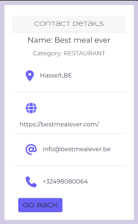
- the ServiceContactDetail, for rendering the contact details of the service which includes a "Go back" button to leave the ervicePage
- the ServiceDetail, for the image, the 3 dots menu, category, location, rate and reviews
- the ReviewsPage, for displaying the existing reviews and rates left by users
Owners of a service can edit/delete by choising one of this option in the 3 dots menu. Edit brings the ServiceEditForm component which works just as any of the other forms in the application.
If the delete option is clicked the DeleteConfirmation component is called. User can abort the deletion by clicking on "cancel", he/she will be redirected the last visited page, or proceed by clicking on "confirm deletion", in which case the user is redirected to the home page.
Users can add reviews and rates to a service offer through the ReviewCreateForm component that is available by clicking the "Leave a rate" button on the ServicePage.
In the form, the rate can be set by hovering over the star icons, which has a customized tooltip related to a number of stars e.g "Terrible" for 1 star up to "Perfect" for 5 stars.
Review can be entered similarly as in the CommentCreateForm component. The save button registers the rate and reviews, the average rate is recalculated, then it's displayed in the ServicePage where the user is redirected. Review is listed under the ServicePage together with any previously created review. Reviews are displayed in descendant order (the newest on top).
Edit and Delete functionalities for reviews aren't available in the UI, but for the admin super users in the backend.
In the future, I'd like to improve this web application by:
- Adding the "Password forgotten" feature.
- Adding different choices of avatar for the profile (man, woman, pride, etc).
- Displaying the profile image and username in the "Like" feature and not only the number of likes.
- Displaying the profile image and username in the "Followers" and "Following" stats in the profile.
- Adding notifications to be sent to the user when their posts have been liked/commented.
The application was developed using React and the code was written using the JSX syntax.
Below you can find the list of the libraries used for the development of this project:
- React-Bootstrap, for styling support.
- React-Router, for enabling "client side routing".
- axios,for fetching and posting data in the Urban-drf backend API.
- React infinite scroll, for loading post automatically as the user scrolls down.
- React Select Country list, for letting the user to select his/her location while editing profile.
- React Toastify, for adding toasts and providing feedback to user after actions, e.g, signing up.
- jwt-decode, for decoding JWTs token.
- Favicon.io, for generating the favicon of the project.
- Canvas, for designing the logo and creating the color palette.
- Balsamiq Wireframes for Desktop, for creating the mockups.
Follow this link for the documentation related to tests
The site was created using GitPod as editor and pushed to Github to the remote repository urbantrip.
The web site was early deployed at the beginning of the development following these steps:
- Create an empty repository (with no template) in GitHub and name it using lowercase letters as this is required for React apps.
- In the repository, click the "GitPod" button to create a new workspace.
- In the workspace, create a React app using the command npx create-react-app with a space and full stop at the end as shown: npx create-react-app . This will ensure to create the app in the root directory.
- Run the command npm start to check that the app is working.
- Commit and push the code to GitHub.
- In your Heroku dashboard, click on the "New" button in order to create a new app.
- Name your app and select a region according to your location place.
- Click on the "Create app" button.
- In your newly created Heroku app, click on the "Deploy" tab.
- Between the deployment methods, click on "GitHub", enter the name of your repository
If found, a link to the repository will be displayed. Click the "Connect" button. - For automatic deployments after each push to GitHub, scroll down the page and click on the "Enable automatic deploys" button.
- To finish, click on the "Deploy branch" button.
The app was successfully deploy at first attempt.
The Urbandrf backend API should accept requests from the Urbantrip application. In order to achieve that the following steps were taken:
- In the urbandrf app on Heroku, click on the "Settings" tab and scroll down to the Config Vars section.
- Click on "Reveal Config Vars" and create two variables: CLIENT_ORIGIN and CLIENT_ORIGIN_DEV.
- Assign values for each variable as:
- CLIENT_ORIGIN: the Heroku app url of the React app;
- CLIENT_ORIGIN_DEV: the GitPod url of the React app;
- In order for React to send requests to the API, install the axios library.
- In the src folder, create the api folder and then an axiosDefaults.js file inside it.
- Import axios at the top of the file.
- Define the baseURL, which will be the url of the urbandrf API.
- Set the content-type header to multipart/form-data as the application will be dealing with images as well as text in its requests.
- Set withCredentials to true for avoiding any CORS errors when sending cookies.
- Finally, export the axiosDefaults.js file to the App.js component.
The backend, urbandrf, and the frontend, urbantrip, got connected since the first attempt.
These are the steps to follow for the final deployment of the application:
-
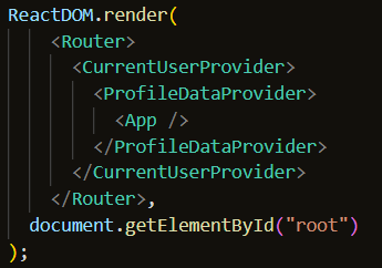
In index.js, remove the <React.StrictMode> component as this is only need during development.
IMPORTANT: Keep the comma after the Router component: -
In package.json, in the scripts section, add this command:heroku-prebuild: npm install -g serve.
-
Create a Procfile on the root directory and add the web command:web: serve -s build
-
Save all changes and push your code to GitHub.
-
In Heroku, as the automatic deploys were enabled during the early deployment, check that the app has been deployed.
-
Click on the "Open app" button.
The application was succesfully deployed at first attempt.
Most commonly, forks are used to either propose changes to someone else's project or to use someone else's project as a starting point for your own idea.
-
Navigate to the GitHub Repository you want to fork.
-
On the top right of the page under the header, click the fork button.
-
This will create a duplicate of the full project in your GitHub Repository.
Cloning is used to create a local copy of the repository created in GitHub. Both, the local copy and the remote are syncronized.
-
Navigate to the GitHub Repository you want to clone.
-
Above the list of files, click Code.
There are 3 possibilities for copying the URL of the repository: HTTPS, SSH key and GitHub CLI. I'll develop the one that I use.
-
Click the HTTPS tab and copy the URL.
-
On your machine, open your text editor, go to the Command palette and click on Git Clone.
-
Past the URL, hit enter and choose a folder to save the repository.
-
My mentor helped me to refine the code for the contact form.
-
Code for hiding the nav bar in the Sign up and Sign in pages was inspired from this article: https://stackoverflow.com/questions/74277306/show-hide-navbar-or-footer-in-routes-with-react-router-dom-v6
-
DeleteConfirmation modal was inspired on these articles:
-
https://christopher-dent.medium.com/adding-a-delete-confirmation-to-your-react-app-55221701daa6
-
https://codemoto.io/coding/react/react-delete-confirmation-modal
Thanks to Kelz_Alumni for pointing me in this direction.
-
-
Upload video inspired on: https://www.upbeatcode.com/react/how-to-play-video-in-react/
- Icons come from uxwing and fontawesome
- Images come from rawpixel
