
A more flexible and powerful version of Flutter's ColorScheme.fromSeed. Use this package instead of ColorScheme.fromSeed and get around its limitations. The replacement SeedColorScheme.fromSeeds has the following additional capabilities:
- Optionally use separate seed key colors for all palettes the
ColorSchemeis based on, to customize the seed-based tonal palettes for primary, secondary, tertiary as well as error, neutral and neutral variant colors used by theColorScheme. - Change and customize the chromacity (colorfulness) used in the seed strategy for tonal palette generation in the Google HCT (Hue-Chroma-Tone) color space.
- Customize tonal palette tones to
ColorSchemecolor mappings. - Remove color tint from all surface colors and make them monochrome.
- Use the new Material-3 design
ColorSchemevariants likefidelity,contentandmonochromethat arrived in Flutter SDK v3.22.2, with the twist that you can now also use multiple seed colors with them.
Add the flex_seed_scheme package to pubspec.yaml:
dart pub add flex_seed_scheme or flutter pub add flex_seed_scheme
You can try a web version of the package example and demo app here.
Import the package to use it:
import 'package:flex_seed_scheme/flex_seed_scheme.dart';Define seed key colors that will be used to compute your seed generated ColorScheme.
// Define your seed colors.
const Color primarySeedColor = Color(0xFF6750A4);
const Color secondarySeedColor = Color(0xFF3871BB);
const Color tertiarySeedColor = Color(0xFF6CA450);
With FlexSeedScheme you make a seed generated ColorScheme using SeedColorScheme.fromSeeds. It works like ColorScheme.fromSeed, but instead of only accepting a single seed color, it can use six key colors as seed colors. One for each main color (primary, secondary and tertiary) group in ColorScheme.
You can even customize the seed generated error color, typically there is no need to do so, but if your primary color is of a red hue, that conflicts with the error color, then adjusting the error color is a possibility.
You can also use custom key colors to seed generate the neutral and neutral variant palettes, that are used to define all the surface and background colors in ColorScheme. We recommend sticking to the default that uses primary key color's hue with very low chroma.
Chroma limits that differ from Material-3 defaults for tonal palette generation, can also be
defined. Additionally, tone mapping, that defines which tone is used by a ColorScheme color, can be customized. Both are done via FlexTones passed in to tones.
Typically, you would use the same key colors and tones setup to produce the ColorScheme for light and dark theme mode. This guarantees that the light and dark theme use identical generated tonal palettes, and only vary based on which tones are used for what color in light and dark mode. This results in matching light and dark theme colors. This is just the norm though, feel free to experiment.
    // Make a light ColorScheme from the seeds.
    final ColorScheme schemeLight = SeedColorScheme.fromSeeds(
      brightness: Brightness.light,
      // Primary key color is required, like seed color in ColorScheme.fromSeed.
      primaryKey: primarySeedColor,
      // You can add optional key colors as seeds for secondary and tertiary colors.
      secondaryKey: secondarySeedColor,
      tertiaryKey: tertiarySeedColor,
      // Tone chroma config and tone mapping is optional, if you do not add it
      // you get the config matching Flutter's Material 3 ColorScheme.fromSeed.
      tones: FlexTones.vivid(Brightness.light),
    );

    // Make a dark ColorScheme from the same seed colors.
    final ColorScheme schemeDark = SeedColorScheme.fromSeeds(
      brightness: Brightness.dark,
      primaryKey: primarySeedColor,
      secondaryKey: secondarySeedColor,
      tertiaryKey: tertiarySeedColor,
      tones: FlexTones.vivid(Brightness.dark),
);You can use separate key colors as seeds to generate the primary, secondary and tertiary tonal palettes. If no key color for secondaryKey and/or tertiaryKey are provided, they use primaryKey color as their seed color value.
If you only specify primaryKey color as seed, and no custom tones configuration, an identical ColorScheme to ColorScheme.fromSeed is produced.
The default chroma limits in the HCT color space used for seed generated colors for secondary and tertiary colors in ColorScheme.fromSeed have quite low chroma values. This makes the colors muted or pastel like. This is most obvious with secondary colors. This is by design in the standard Material-3 color palette. You can tune this behavior by passing in a custom FlexTones configuration to tones. There are pre-made configurations you can use, above FlexTones.vivid was used. It is also easy to make custom configurations. Look in source code for FlexTones and use the pre-made definitions as inspiration for your own configs.
Using the above configuration, the following core palettes are generated, in order from top to bottom:
- Primary tonal palette
- Secondary tonal palette
- Tertiary tonal palette
- Error tonal palette
- Neutral tonal palette
- Neutral variant tonal palette
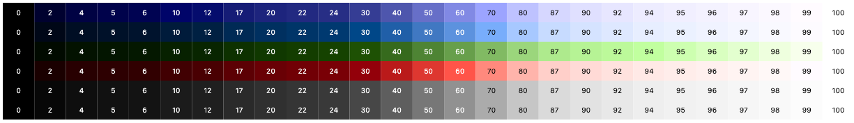
The color tones in the above palettes are then mapped to ColorScheme colors. Mapping is different for light and dark theme mode to create a color scheme with suitable contrast. With the example FlexTones.vivid setup used in tones, the light ColorScheme is mapped as shown below:
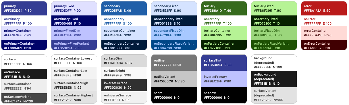
And the dark ColorScheme becomes:
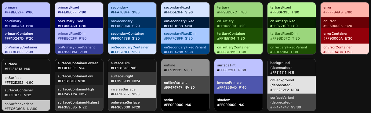
We can, for example, see that in light mode, the primary tone 30, is assigned to ColorScheme.primary color and tone 90 to primaryContainer. In dark mode they get tones 80 and 20. Similar assignments are repeated for secondary, tertiary, error colors and all the surface and background colors. It is this mapping that FlexTones gives you control over.
If you want to use the same scheme seed generation variants DynamicSchemeVariant, that Flutter SDK introduced to ColorScheme.fromSeed version 3.22.2 and later, then use SeedColorScheme.fromSeeds with the variant property of enum type FlexSchemeVariant.
If the variant FlexSchemeVariant style is one that is also provided by Flutter SDK, it has FlexSchemeVariant property isFlutterScheme set to true.
The FlexSchemeVariant also include the predefined FlexTone based variants. You can use the variant option as a way to select ColorScheme seed generation variant that is based on both the in Flutter 3.22.2 new SDK dynamicSchemeVariant and the FlexSeedScheme predefined FlexTones tones based seed generation options.
Starting with FlexSeedSeed scheme version 3.0.0, when using SeedColorScheme.fromSeeds with a variant that is based on MCU and Flutter SDK DynamicSchemeVariant, you can use all the same seed key as with FlexTones based schemes using the tones property. You are no longer limited to using only your primary or main brand color as seed color, even when using the Flutter SDK DynamicSchemeVariant based variants. In previous versions of FlexSeedScheme, you could only use a single seed color with the dynamicSchemeVariant based variants. FSS uses a custom fork of MCU to enable this feature.
    // Make a light ColorScheme from a seeds using variant style fidelity.
    // This is a variant that is available in Flutter SDK stable 3.22.2 or later.
    final ColorScheme schemeLight = SeedColorScheme.fromSeeds(
      brightness: Brightness.light,
      primaryKey: primarySeedColor,
      secondaryKey: secondarySeedColor,
      tertiaryKey: tertiarySeedColor,
      variant: FlexSchemeVariant.fidelity,
    );
    // Make a dark ColorScheme from a seeds using variant style fidelity.
    final ColorScheme schemeDark = SeedColorScheme.fromSeeds(
      brightness: Brightness.dark,
      primaryKey: primarySeedColor,
      secondaryKey: secondarySeedColor,
      tertiaryKey: tertiarySeedColor,
      variant: FlexSchemeVariant.fidelity,
);In your MaterialApp you define your light and dark mode themes using the seed
generated ColorSchemes just as you would with any other ColorScheme. For example:
  @override
    Widget build(BuildContext context) {
      return MaterialApp(
      debugShowCheckedModeBanner: false,
      title: 'SeedColorScheme.fromSeeds Demo',
      themeMode: ThemeMode.system,
      theme: ThemeData(colorScheme: schemeLight),
      darkTheme: ThemeData(colorScheme: schemeDark),
      home: HomePage(),
    );
}All colors in the seed produced ColorScheme can be overridden by providing each color property in SeedColorScheme.fromSeeds a given override color value. This feature is equivalent to the one that exists in ColorScheme.fromSeed.
This is typically used to assign a given color value to primary color, which is often used as the brand color. When the brand color is used as primaryKey seed color, it typically does
not end up as the primary color in the seed generated ColorScheme. Having a given brand color as
primary color is often desired. To get the seed color as your primary brand color, assign the
color used as primaryKey to primary color as well.
    // Make a light ColorScheme from the seeds.
    final ColorScheme schemeLight = SeedColorScheme.fromSeeds(
      brightness: Brightness.light,
      // Use a "brand" seed color as primary color in the result.
      primary: primarySeedColor,
      primaryKey: primarySeedColor,
      // Additional brand colors used as seed keys.
      secondaryKey: secondarySeedColor,
      tertiaryKey: tertiarySeedColor,
      tones: FlexTones.vivid(Brightness.light),
    );
This strategy works well for the light mode ColorScheme, since the prominent brand color a company has defined is typically intended to be printed on white paper. If you have secondary brand colors that are to be used, using them as seeds for secondaryKey and tertiaryKey will work too. How well they will fit and match the Material 3 color system, if assigned to secondary and tertiary directly as colors in SeedColorScheme.fromSeeds, will vary depending on what colors they are.
If your brand color(s) for light mode are light, so that they require dark text for good contrast, instead of light or white text, you will also have to override the contrast colors for them if you overrode them by giving the seed colors to primary, secondary and tertairy. You then have to manually also assign suitable contrast colors to onPrimary, onSecondary and onTertairy.
Companies rarely have brand colors suited for good contrast in dark theme mode. In that case prefer only using the same light mode brand colors as key colors to seed the dark mode ColorScheme. If they do have dark mode specifications, and the colors are of same hue as light mode, consider still using the light mode colors as the seed source, and only applying the appropriate dark mode colors to primary, secondary and tertiary as needed.
If there is a spec that calls for completely different main colors in dark mode, with different hues, then seeding from them in dark mode and also setting primary, secondary and tertiary to these color values is appropriate.
In the above example, we used a predefined tone mapping and chroma setup ColorScheme generation strategy called FlexTones.vivid. There are currently eleven predefined FlexTones configurations available:
FlexTones.material, default and same as Flutter SDK M3 setup in Flutter 3.22.0 and later.FlexTones.material3Legacy, same as Flutter SDK M3 default setup in Flutter before 3.22.0.FlexTones.soft, softer and earthier tones than M3 FlexTones.material.FlexTones.vivid, more vivid colors, uses chroma as defined by each given key color.FlexTones.vividSurfaces, likevivid, but with more color tint in surfaces and backgrounds.FlexTones.highContrast, can be used for more color-accessible themes.FlexTones.ultraContrast, for a very high-contrast theme version.FlexTones.jolly, for a more "jolly" and colorful theme.FlexTones.vividBackground, likevividSurfaces, but with less tint in surface color and a slightly darker surface color than default in dark mode.FlexTones.oneHue, a balanced chromatic setup. It is called oneHue because When only primary color is used as seed, it does not rotate its hue value to make a computed hue for tertiary tonal palettes, but uses the same hue. This makes it possible to make seed-generated color schemes from a single color. In such themes, all colors are based on the same hue, but using different chroma and tones.FlexTones.canyPop, A high contrast color scheme, useful for accessible themes, with colors that pop like candy. Keeps the background and surface white in light mode, and only a slight tint in dark mode. Neutrals have very low chroma.FlexTones.chroma, use it to create a color scheme that follows chroma of each used seed color. Useful for manual control of pop or low chromacity. It uses low surface tint and neutrals with medium chroma.
You can also define custom tones mapping and chroma limitation setups with FlexTones. Prefer using the FlexTones.light and FlexTones.dark constructors as base for custom definitions. By using them, you only need to override system defaults that you want to change.
// Example definition of light custom tones config.
const FlexTones myLightTones = FlexTones.light(
  primaryTone: 30, // Default is 40.
  onPrimaryTone: 96, // Default is 100
  onSecondaryTone: 96, // Default is 100
  onTertiaryTone: 96, // Default is 100
  onErrorTone: 96, // Default is 100
  primaryMinChroma: 55, // Default is 36
  secondaryChroma: 25, // Default is 16
  tertiaryChroma: 40, // Default is 24
  neutralChroma: 5, // Default is 6, avoid very high values in light mode.
  neutralVariantChroma: 10, // Default is 8
  paletteType: FlexPaletteType.extended, // Use extended palette type
);

// Example definition of dark custom tones config.
const FlexTones myDarkTones = FlexTones.dark(
  primaryTone: 70, // Default is 80.
  onPrimaryTone: 6, // Default is 20
  onSecondaryTone: 6, // Default is 20
  onTertiaryTone: 6, // Default is 20
  onErrorTone: 6, // Default is 20
  primaryMinChroma: 55, // Default is 36
  secondaryChroma: 25, // Default is 16
  tertiaryChroma: 40, // Default is 24
  neutralChroma: 7, // Default is 6, you can go higher in dark mode than light.
  neutralVariantChroma: 14, // Default is 8
  paletteType: FlexPaletteType.extended, // Use extended palette type
);
The extended palette type is the new default, if you are using Flutter 3.22, or later you should only use it. The common tones option is provided for backwards compatibility with older Flutter versions and older FSS versions.
By using paletteType with value FlexPaletteType.extended, you can create seed generated ColorSchemes that use and access new color tones that exists in the late 2022 revised ColorScheme for surface colors and even more colors for fixed and fixedDim main colors that arrived in the Material-3 design during later half of 2023.
The ColorScheme colors that use these new tones are now also available in Flutter 3.22 or later. For more information and the latest updates, see Material-3 color-roles specification.
The updated Material-3 color system adds tones [4, 6, 12, 17, 22, 24], they are used for new dark mode surfaces in revised Material-3 dark surface colors. Likewise, the added tones [87, 92, 94, 96, 98] are for light mode surfaces in the updated Material-3 color system. By default paletteType of FlexTones.extended is now used to enable support for the tones in the updated specification and also adding three more custom tones [2, 5, 97]. The paletteType with value FlexPaletteType.extended is now default, it produces 27 tones [0, 2, 4, 5, 6, 10, 12, 17, 20, 22, 24, 30, 40, 50, 60, 70, 80, 87, 90, 92, 94, 95, 96, 97, 98, 99, 100].
To use the older classic setup you can still use FlexTones.common. It produces the legacy M3 tones with its own two additions [5] and [98] resulting in 15 tones [0, 5, 10, 20, 30, 40, 50, 60, 70, 80, 90, 95, 98, 99, 100]. Flutter versions before 3.22 do not yet use these new tones in its standard ColorScheme.
For backwards compatibility, when using type FlexPaletteType.common the chroma of high tones, meaning higher or equal to 90, are limited to maximum chroma of 40. This keeps the chromacity of tones 90 to 100 lower than or equal to 40. If the source seed color has higher chromacity than 40, there may be a sudden jump in chroma reduction at tone 90. This is the standard behavior for the original Material-3 tonal palette computation. The FlexPaletteType.common type is intended to be used when there is a need to follow the M3's original, now legacy, palette design.
When using the FlexPaletteType.extended type tones, there are not only new tones, but the chroma limit of tones >= 90 is also removed. This increases fidelity of higher tone when high chromacity is used.
You can use FlexTones to create a seed generated ColorScheme, that is based on same colors as the standard theme's light and dark scheme colors, but uses a chroma configuration and tone mapping setup that increases contrast further from standard light and dark theme setup.
There are two high contrast FlexTones configuration pre-made for this. They are called FlexTones.highContrast, a colorful high-contrast version, and FlexTones.ultraContrast, a less colorful version, a more dark on light in light theme mode, and light on dark in dark mode.
The FlexTones.canyPop also creates high contrast theme, with colors that are vibrant and pop, it can also be used for high contrast themes. Depending on seed color input values and its chroma value, FlexTones.chroma can also be very vibrant and high contrast. It can also be monochromatic, i.e., gray-scale if input seed colors have chroma value zero.
// Make a high contrast light ColorScheme from the seeds.
final ColorScheme schemeLightHc = SeedColorScheme.fromSeeds(
  brightness: Brightness.light,
  primaryKey: primarySeedColor,
  secondaryKey: secondarySeedColor,
  tertiaryKey: tertiarySeedColor,
tones: FlexTones.highContrast(Brightness.light),
);

// Make a ultra contrast dark ColorScheme from the seeds.
final ColorScheme schemeDarkHc = SeedColorScheme.fromSeeds(
  brightness: Brightness.dark,
  primaryKey: primarySeedColor,
  secondaryKey: secondarySeedColor,
  tertiaryKey: tertiarySeedColor,
  tones: FlexTones.ultraContrast(Brightness.dark),
);
If you define equivalent ThemeData based on those schemes as your standard MaterialApp, theme and darkTheme definitions, but assign them to highContrastTheme and highContrastDarkTheme, you get more accessible themed colors that are based on the same colors but with higher contrast, that are activated when users select high-contrast theme in device accessibility system settings. Changing to accessibility theme based on device system setting automatically, by using theme data defined on MaterialApp properties highContrastTheme and highContrastDarkTheme, is only supported on iOS devices in the current version of Flutter SDK. For other platforms, you need to use a user setting and toggle themes based on it.
    // Define accessibility high contrast versions using same color base.
    highContrastTheme: ThemeData(colorScheme: schemeLightHc),
    highContrastDarkTheme: ThemeData(colorScheme: schemeDarkHc),
Note
Since current versions of Android have system settings for contrast selection and also since Material-3 design spec supports three contrast levels, it is expected that Flutter will add support for this in the future. FSS already supports creating schemes with different contrasts, but there is no easy way in Flutter SDK yet to use such high contrast themes based on system settings. If you create high contrast themes with FSS, you will still have to use in-app settings to allow users to select them in your Android builds.
When using a variant that is based on the equivalent Flutter SDK DynamicSchemeVariant, indicated by that it has its FlexSchemeVariant property isFlutterScheme set to true, you can also provide a contrastLevel for the seed generation.
The contrastLevel parameter is used to indicate the contrast level between color pairs, such as primary and onPrimary. The value 0.0 is the default normal contrast; -1.0 is the lowest; 1.0 is the highest. From Material Design guideline, the medium and high contrast, correspond to 0.5 and 1.0 respectively. The contrastLevel is used to adjust the contrast between the main color and its on color pair. The contraslLevel must be from -1.0 to 1.0.
    // Make a light high contrast ColorScheme from a seeds using variant style fidelity.
    final ColorScheme schemeLight = SeedColorScheme.fromSeeds(
      brightness: Brightness.light,
      primaryKey: primarySeedColor,
      variant: FlexSchemeVariant.fidelity,
      contrastLevel: 1.0,
    );
    // Make a dark high contrast ColorScheme from a seeds using variant style fidelity.
    final ColorScheme schemeDark = SeedColorScheme.fromSeeds(
      brightness: Brightness.dark,
      primaryKey: primarySeedColor,
      variant: FlexSchemeVariant.fidelity,
      contrastLevel: 1.0,
    );
The contrast level provides a quick way to vary the contrast, but it can only be used with the DynamicSchemeVariant based variants, not with the FlexTones based variants. However, with tones based FlexTones scheme generation, you can create custom tones with even more flexibility in seed generation to make schemes with higher or less contrast. Two pre-configured high contrast tones exist for this purpose FlexTones.highContrast and FlexTones.ultraContrast. You can use them as they are, or as examples of how to make your custom versions.
Another way to modify FlexTones configurations for contrast and accessibility, is by forcing all main contrasting on colors and all surfaces on colors to only use black and white contrasting colors. If we do not use the Material-3 guide's colored contrasting color mappings, we can improve color accessibility and contrast on any FlexTones configuration with a few simple modifiers.
Note
If you use the variant property to make your seed generated ColorScheme, you cannot use the below presented tones modifiers, as they are modifiers used on the input FlexTones configurations provided in tones. In the package main example app you can find a demonstration of how to use tones as input for FlexTones based variants, and variant being effective only when using variants that are Flutter SDK and MCU based.
We can use black and white contrasting colors with the FlexTones modifying methods onMainsUseBW(), for main on colors and with onSurfacesUseBW() for the surface on colors. These modifiers automatically make their corresponding contrasting colors black or white, depending on if the corresponding main color is light or dark.
The main colors are:
primary,primaryContainersecondary,secondaryContainertertiary,tertiaryContainererror,errorContainer
The on colors made black or white by onMainsUseBW() are:
onPrimary,onPrimaryContaineronPrimaryFixed,onPrimaryFixedVariantonSecondary,onSecondaryContaineronSecondaryFixed,onSecondaryFixedVariantonTertiary,onTertiaryContaineronTertiaryFixed,onTertiaryFixedVariantonError,onErrorContainer
The surface on colors made black or white by onSurfacesUseBW() are:
onSurfaceonSurfaceVariantonInverseSurfaceonBackground(deprecated in Flutter 3.22)
Here is a usage example, using both these modifiers. You can use them individually too, and you don't have to use them in both light and dark mode.
// Make a Material 3 seeded light ColorScheme,
// but with always black and white contrasting onColors.
final ColorScheme schemeLightOnBW = SeedColorScheme.fromSeeds(
  brightness: Brightness.light,
  primaryKey: primarySeedColor,
  secondaryKey: secondarySeedColor,
  tertiaryKey: tertiarySeedColor,
  tones: FlexTones.material(Brightness.light)
        .onMainsUseBW()
        .onSurfacesUseBW(),
);

// Make a Vivid dark ColorScheme,
// but with always black and white contrasting onColors.
final ColorScheme schemeDarkOnBW = SeedColorScheme.fromSeeds(
  brightness: Brightness.dark,
  primaryKey: primarySeedColor,
  secondaryKey: secondarySeedColor,
  tertiaryKey: tertiarySeedColor,
  tones: FlexTones.vivid(Brightness.dark)
          .onMainsUseBW()
          .onSurfacesUseBW(),
);
Note
When it comes to FlexTones modifiers, if they impact the same colors, their order matters. The last one applied will be the one that is used for conflicting value changes.
Another FlexTones modifier is surfacesUseBW(). This modifier will make the surface and background colors plain white in light mode and true black in dark mode.
The surface colors made black or white by surfacesUseBW() are:
surfacebackground(deprecated in Flutter 3.22)
This modifier can be used for great effect in light mode, as you can remove the colored background surfaces from any of the FlexTones seeding strategies. Some designs may prefer plain white, for backgrounds in light mode, for a more platform-agnostic design.
In dark mode surfacesUseBW() can be used create seeded color schemes with full black background and surface colors, but you may prefer to keep the primary seed color based slightly primary color tinted backgrounds in dark mode.
This modifier will make the surface color and still also the deprecated background color plain white in light mode and full black in dark mode.
// Make a Material 3 seeded light ColorScheme, but with always
// black and white contrasting onColors and ensure that background
// and surface colors are always white.
final ColorScheme schemeLightOnBW = SeedColorScheme.fromSeeds(
  brightness: Brightness.light,
  primaryKey: primarySeedColor,
  secondaryKey: secondarySeedColor,
  tertiaryKey: tertiarySeedColor,
  tones: FlexTones.material(Brightness.light)
          .onMainsUseBW()
          .onSurfacesUseBW()
          .surfacesUseBW(), // Make light surface and background white
);A new FlexTones modifier in FSS version 3.0.0 is monochromeSurfaces(). It can be applied to any predefined or custom FlexTones to make all the surface colors monochrome and use pure greyscale for the neutral and neutral variant tonal palettes. Surface colors will then have no color tint from their own key color or from the primary seed key color. For those tired of tinted surface colors in Material-3, this is a useful helper.
The surface colors made monochrome by monochromeSurfaces() are:
surface,onSurface,surfaceContainer,onSurfaceVariantsurfaceContainerHighest,surfaceContainerHigh,surfaceContainerLow,surfaceContainerLowestsurfaceDim,surfaceBright,inverseSurface,onInverseSurfaceoutline,outlineVariantbackground,onBackground,surfaceVariant(deprecated in Flutter 3.22)
// Make a vivid Material 3 seeded light ColorScheme, where all surface colors
// are monochrome with no tint in them, they are based on pure greyscale values.
final ColorScheme schemeLight = SeedColorScheme.fromSeeds(
  brightness: Brightness.light,
  primaryKey: primarySeedColor,
  secondaryKey: secondarySeedColor,
  tertiaryKey: tertiarySeedColor,
  tones: FlexTones.vivid(Brightness.light).monochromeSurfaces(),
);By setting useExpressiveOnContainerColors to true in SeedColorScheme.fromSeeds you can opt in on using the new Material expressive on-colors specification for none surface on-container colors in light theme mode.
Opting in changes the light mode color tone for the colors onPrimaryContainer, onSecondaryContainer, onTertiaryContainer and onErrorContainer from 10 to 30, making them more color expressive, but they then also have less contrast. The accepted min contrast curve is now ContrastCurve(3, 4.5, 7, 11) instead of ContrastCurve(4.5, 7, 11, 21) for the on-container colors. Meaning normal contrast of 4.5 is now accepted when it was 7 before.
This option is only available when using MCU based DynamicScheme variants and not when using FlexTones based tones and variants based on FlexTones. It thus only applies to variants that are based on MCU's DynamicScheme and have their isFlutterScheme set to true.
Prior to MCU version 0.12.0 the MaterialDynamicColors used an older M3 spec. Flutter stable 3.22.x and Flutter master 3.23.x still use MCU versions lower than 0.12.0 and default to the older color tones 10 in light mode. This will be changed in Flutter SDK when Flutter is updated to use MCU 0.12.0 or later. With FSS 3.0.0, you can opt in on using the new spec already now. FSS still defaults to the older spec with more contrast. When Flutter stable changes to use the new spec, FSS will also change to use it as default. While Flutter and MCU will then no longer offer the older higher contrast version, FSS will continue to do so.
The optional usage of the expressive colors for on-container colors is a customization of MCU features in the forked version. We see value in being able to offer both the higher contrast older, still current, version and the new more color expressive one.
    // Make a light ColorScheme from a seeds using variant style vibrant.
    final ColorScheme schemeLight = SeedColorScheme.fromSeeds(
      brightness: Brightness.light,
      primaryKey: primarySeedColor,
      variant: FlexSchemeVariant.vibrant,
      // Use the coming new standard. It does nothing in dark mode,
      // so no point in using it there and it defaults to false.
      useExpressiveOnContainerColors: true,
    );
    // Make a dark ColorScheme from a seeds using variant style vibrant.
    final ColorScheme schemeDark = SeedColorScheme.fromSeeds(
      brightness: Brightness.dark,
      primaryKey: primarySeedColor,
      variant: FlexSchemeVariant.vibrant,
    );
The variants fidelity and content have their own algorithm for the on colors that useExpressiveOnContainerColors impacts that are already expressive. Thus, the flag does nothing to their on-colors. Likewise monochrome is excluded from the expressive on colors feature, as it is intended to be monochrome. However, even for these variants the useExpressiveOnContainerColors will change the onErrorContainer color, to be more expressive in light mode.
The tones configuration class FlexTones can also use modifier expressiveOnContainer(). It can be applied to any predefined or custom FlexTones to make a returned FlexTones instance where the tones for light mode on container tones are set to 30 for more color expressive container text and icons on none surface containers.
This modifier only impacts none surface on-container tones that are dark and thus only has any impact on the light theme mode on-container colors. The impacted on container colors are onPrimaryContainerTone,onSecondaryContainerTone, onTertiaryContainerTone and onErrorContainerTone.
This feature brings optional light mode expressive on-container colors to any predefined or custom FlexTones configuration. The expressive on-color in light mode containers are a new coming change to Material Design 3 ColorScheme. This modifier is equivalent to setting the SeedColorScheme.fromSeeds and its useExpressiveOnContainerColors property to true, when using MCU dynamic scheme variant based seeded color schemes.
// Make a Material 3 seeded light ColorScheme, but with always
// black and white contrasting onColors and ensure that background
// and surface colors are always white.
final ColorScheme schemeLightOnBW = SeedColorScheme.fromSeeds(
  brightness: Brightness.light,
  primaryKey: primarySeedColor,
  secondaryKey: secondarySeedColor,
  tertiaryKey: tertiarySeedColor,
  tones: FlexTones.material(Brightness.light)
          .onMainsUseBW()
          .expressiveOnContainer(),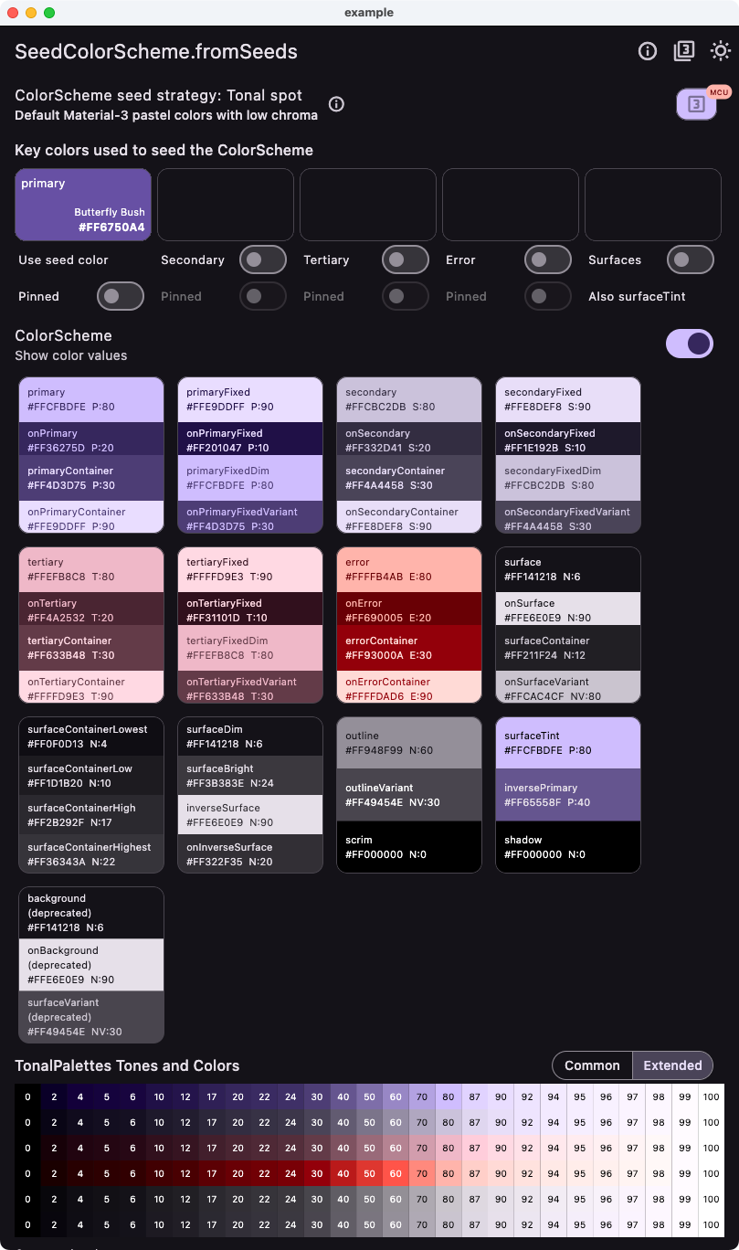
);The included example application uses above color seeding and custom tone mapping. You can also choose any of the built-in pre-configured tone mappings as used seeding strategy. When you select seeding strategy, basic info about is displayed.
You can try a web version of this example for version 3 of FSS here in V3 demo. The older demos for version 1 and 2 of FSS are still available here in V1 demo and here in V2 demo
You can choose to use secondary and primary seed colors as additional keys to generate the color schemes. You can also toggle keeping contrasting onColors black & white, or force background and surface colors to be white in light mode and true black in dark mode. You can change the seed colors with a color picker by tapping on the seed colors. You can also modify the default error seed color.
With the app we can compare results from SeedColorScheme.fromSeeds, to using the single seed color
based ColorScheme.fromSeed seed generated default Material-3 ColorScheme available in Flutter.
Both can use a single key color as their primary seed color, but ColorScheme.fromSeed can only use it as its single seed color, we cannot use hues from our secondary and tertiary key colors for the seed produced tonal palettes, nor change how and its tones are mapped to the generated ColorScheme.
With ColorScheme.fromSeed we can also not customize the colorfulness (chromacity) of its seed generated secondary and tertiary colors, other than using the predefined DynamicSchemeVariants. With SeedColorScheme.fromSeeds we can use both DynamicSchemeVariant and FlexTones configurations. The tonal palette tones to ColorScheme color mappings can be modified with SeedColorScheme.fromSeeds and its different mappings in each FlexTones seeding strategy. You can create custom FlexTones configurations to create your own tonal palettes and mapping of its tones to ColorScheme colors.
The seed generated tonal palettes are also displayed in the example application.
Below some example color schemes made with FlexSeedScheme using SeedColorScheme.fromSeed using different FlexTones seed generation strategies.
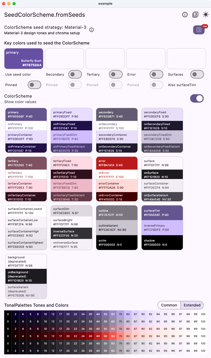
This example shows the default Material-3 seed-based scheme, using a single primary seed color and the default ColorScheme.fromSeed variant tonalSport versus the tones strategy FlexTones.material. Both are the same as using Flutter's default ColorScheme.fromSeed with its default dynamicSchemeVariant = DynamicSchemeVariant.tonalSpot. We also show the same with the FlexTones.material3Legacy variant, which is slightly different from the default Material-3 setup in Flutter 3.22.0 and later.
Flutter's default seed generation in Flutter 3.22.0 and later.
| Light from single seed - Material 3 default | Dark from single seed - Material 3 default |
|---|---|
 |
 |
Replicates the Flutter default using FlexTones instead of MCU DynamicScheme.
| Light from single seed - Material 3 | Dark from single seed - Material 3 |
|---|---|
 |
 |
Replicates the Flutter Material default as it was before Flutter 3.22. You can use this if you need the legacy M3 seed generated scheme style in Flutter used before Flutter 3.22.
| Light from single seed - Material 3 legacy | Dark from single seed - Material 3 legacy |
|---|---|
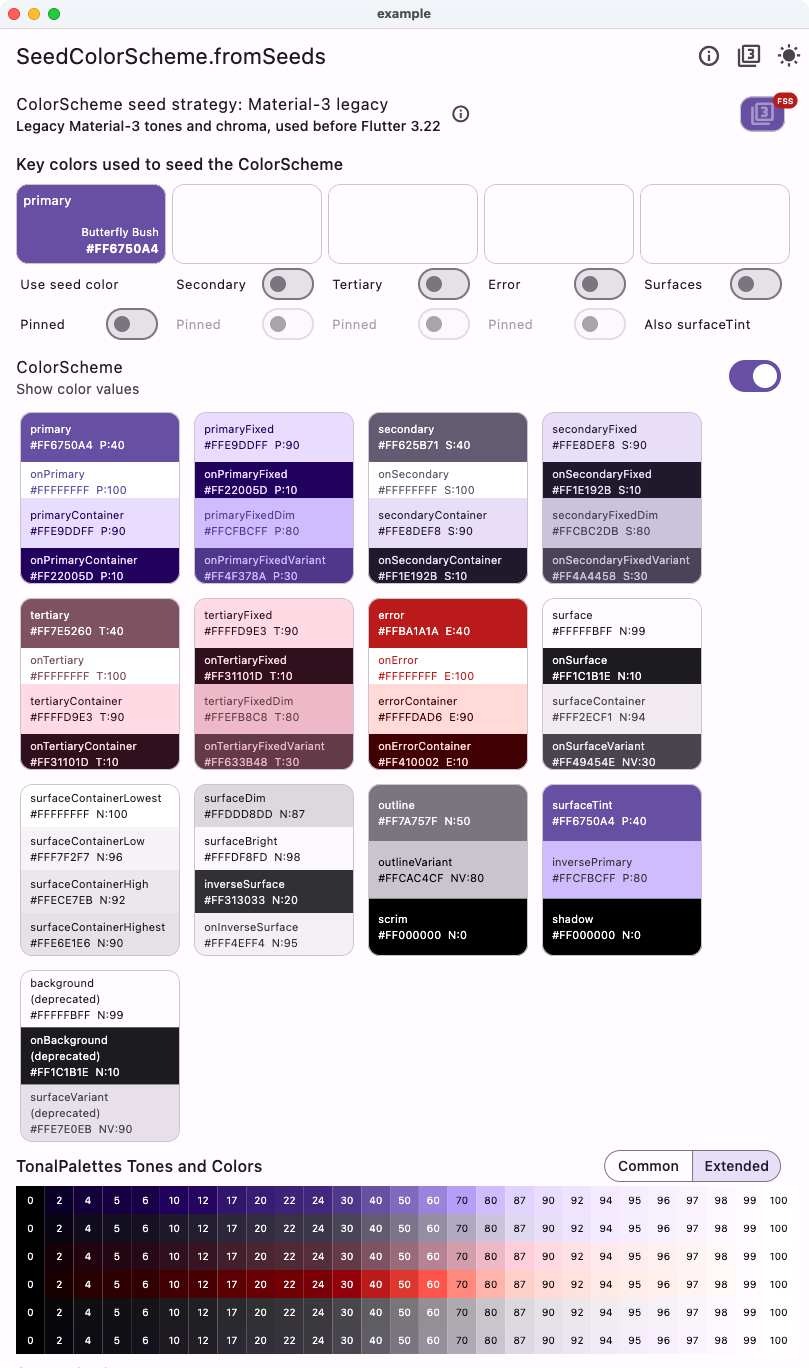 |
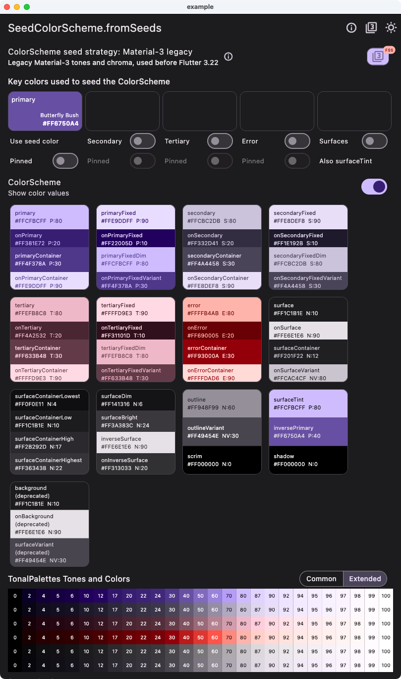 |
This example using tones strategy FlexTones.candyPop shows the difference when using the same single seed color, as in the above case with the default Material-3 seed strategy. We can observe that the colors are brighter and have more candy like pop to them.
| Light from single seed - Candy pop tones | Dark from single seed - Candy pop tones |
|---|---|
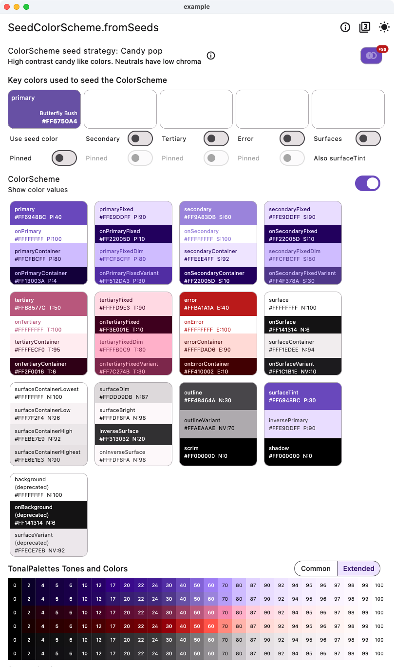 |
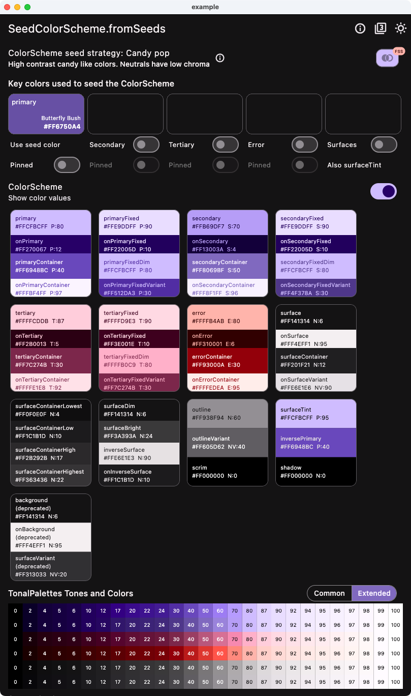 |
This example shows how to use four seeds colors, including a custom error seed color, using the same CandyPop seed strategy.
| Light from four seeds - Candy pop tones | Dark from four seeds - Candy pop tones |
|---|---|
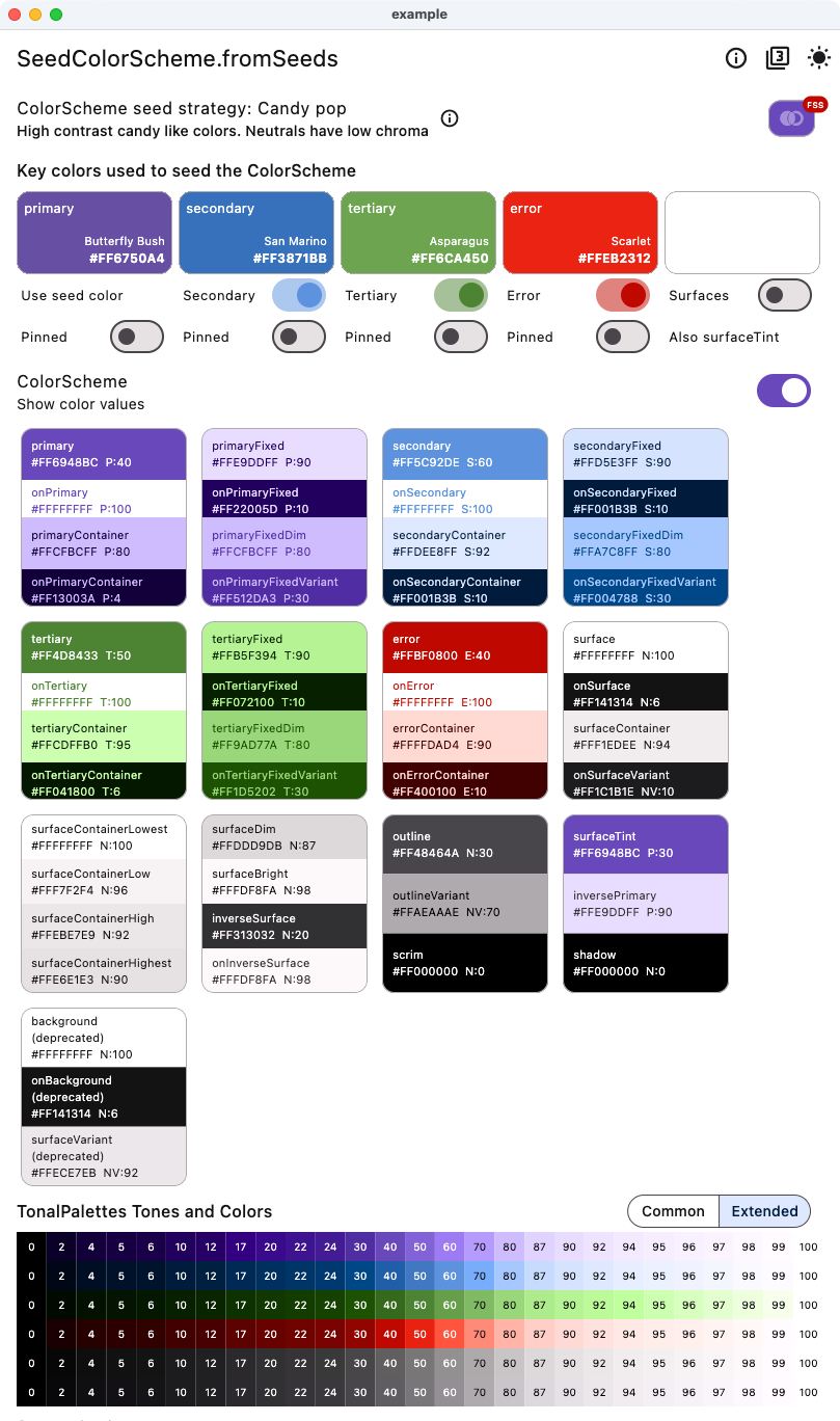 |
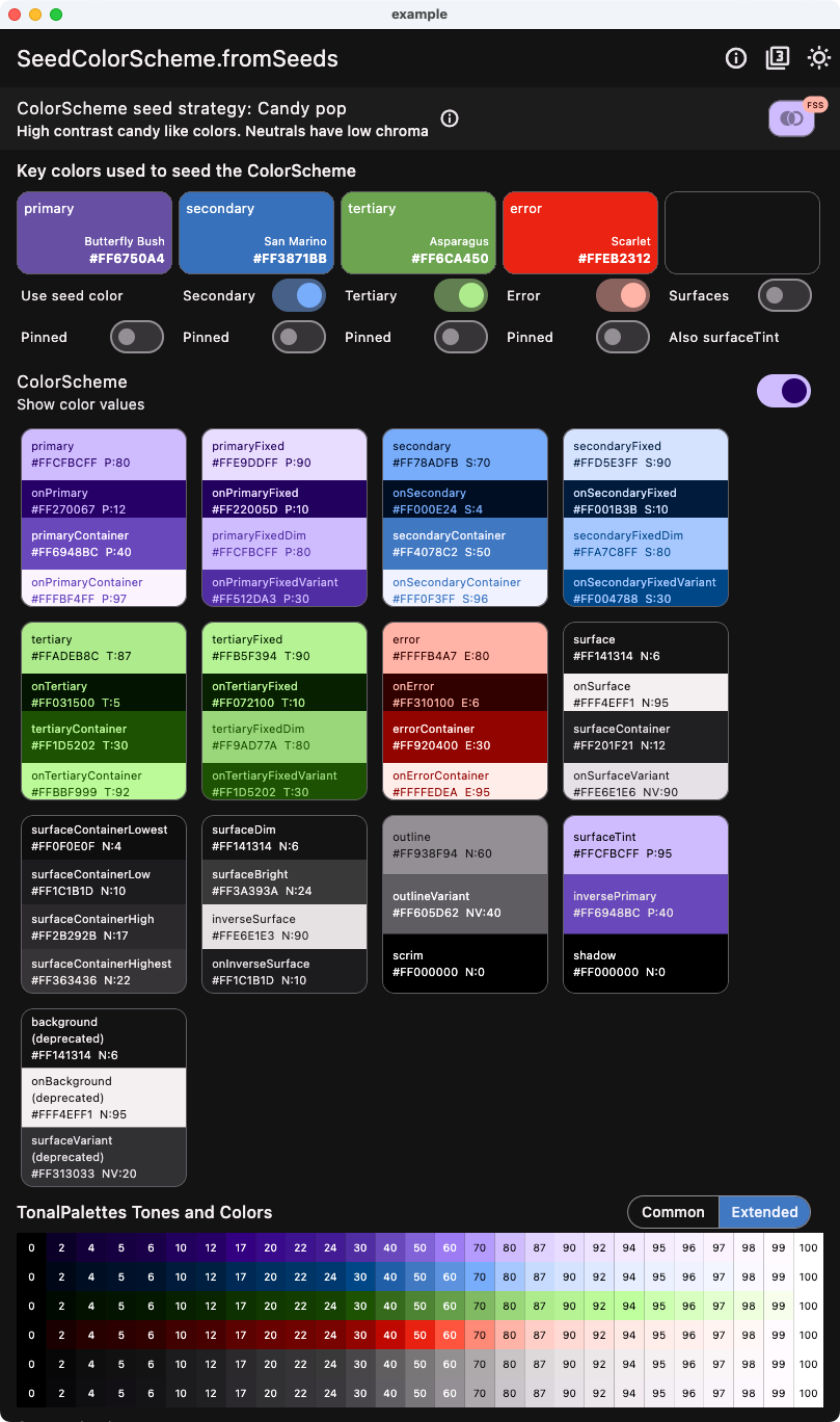 |
This example shows the light and dark version of the tones strategy called oneHue.
In some cases, you may want to create a color scheme based on a single brand color and pin it as your primary color in the seed produced light ColorScheme. A brand color intended for white paper is usually a good fit for the primary color in light mode. It can be used as both as seed and pinned to primary in light mode to guarantee that the brand color is present in the produced color scheme. In this example, we are using a strong blue brand color called "Governor Bay" as the seed color and when using it as override for primary is SeedColorScheme.fromSeeds in light mode. This happens when we select "Pinned" option in the demo example app. In code, you would do this:
    const Color brandBlue = Color(0xFF2539B0); // Governor Bay blue
    // Make a light ColorScheme from the seeds.
    final ColorScheme schemeLight = SeedColorScheme.fromSeeds(
      brightness: Brightness.light,
      // Use a "brand" seed color as primary color and pin it to primary.
      primaryKey: brandBlue,
      primary: brandBlue,
      tones: FlexTones.oneHue(Brightness.light),
    );
In dark mode, a brand color intended for use on white paper rarely fits on primary color in a dark mode scheme, but it usually works well pinned to primaryContainer. In this example, we use this when "Pinned" is selected in the demo app. In code, you would do this:
    // Make a dark ColorScheme from the seeds.
    final ColorScheme schemeDark = SeedColorScheme.fromSeeds(
      brightness: Brightness.dark,
      // Use a "brand" seed color as primary color and pin it to primary.
      primaryKey: brandBlue,
      primaryContainer: brandBlue,
      tones: FlexTones.oneHue(Brightness.dark),
    );
You should typically use the same seed color in light and dark mode to get the same matching tonal palettes for your light and dark mode. You can often still use different token colors as pinned override color values in light and dark mode seed generation, to get your brand colors into fitting ColorScheme colors. Do make sure it fits with its contrasting on-color and course also with the other colors in the scheme.
A key feature with the oneHue seed strategy is that it does not invent any new hues for any tonal palettes, but uses the same hue as the primary seed color for all the tonal palettes. This makes it possible to create a color scheme from a single color all based on the hue in source brand color. The oneHue strategy is useful when you have a single brand color and want to create a color scheme based on its color, and not get any other color hues in your resulting ColorScheme.
| Light from seed - One hue | Dark from seed - One hue |
|---|---|
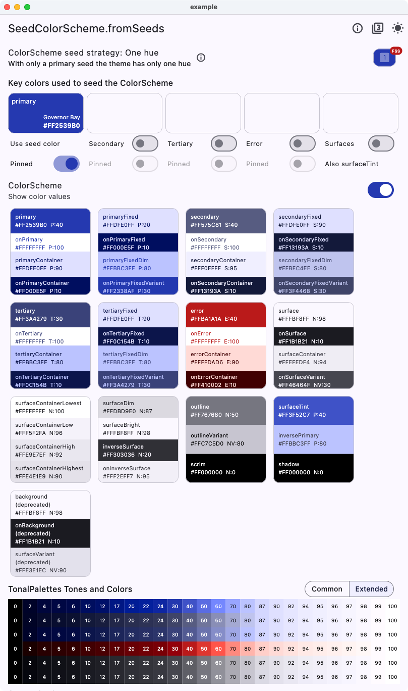 |
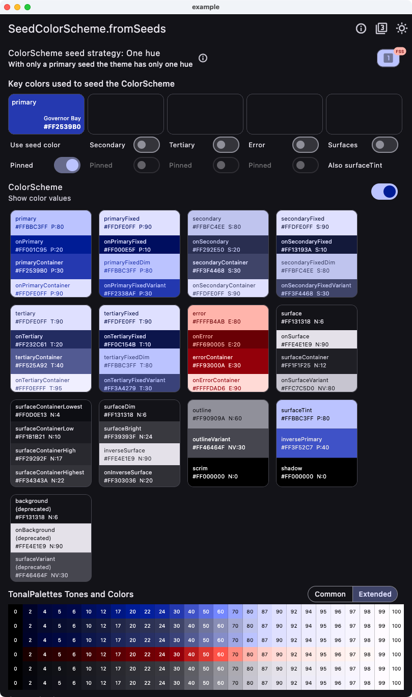 |
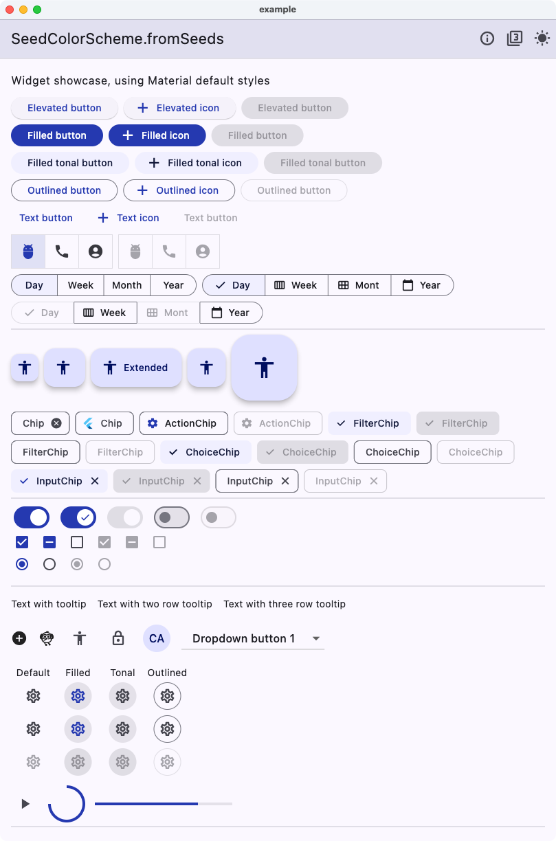
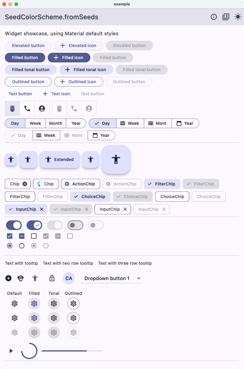
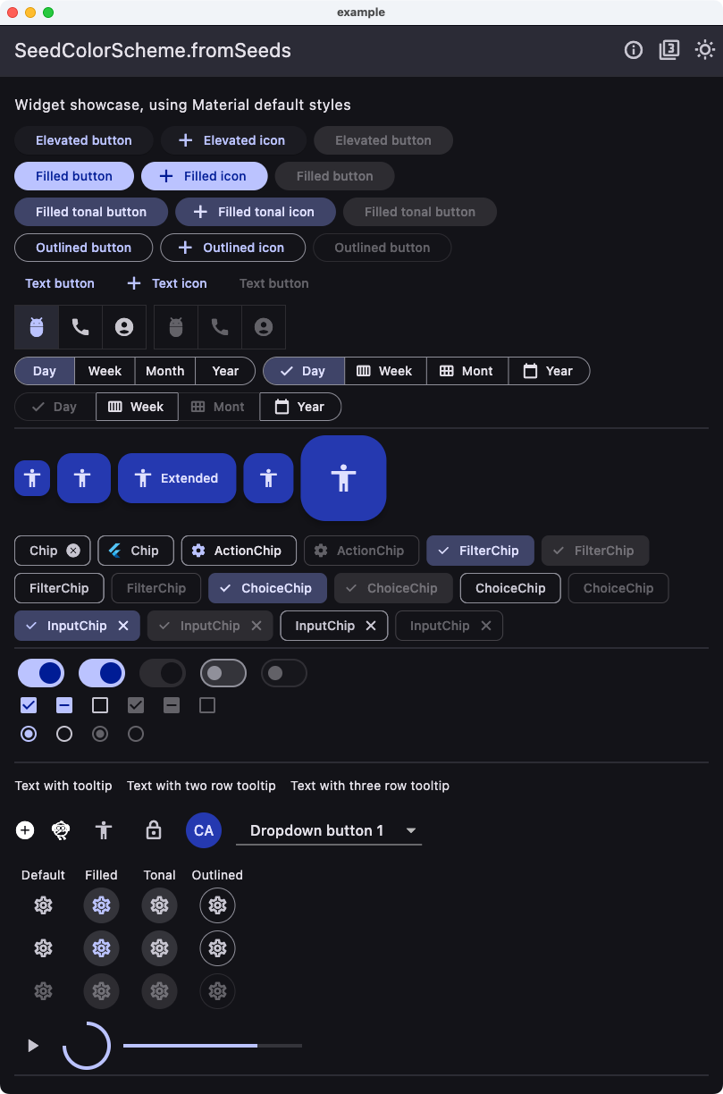
Below an example of Material widgets using the theme created using the oneHue strategy versus the Flutter default one, using the same brand color seed color.
| Light from brand - One hue | Light from brand - Flutter default |
|---|---|
 |
 |
Same for dark mode.
| Dark from brand - One hue | Dark from brand - Flutter default |
|---|---|
 |
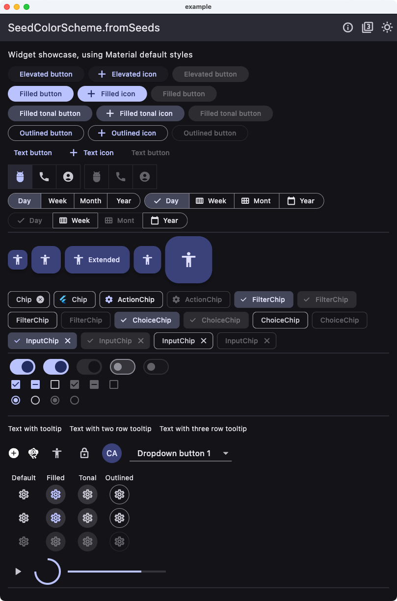 |
As we can see, there is more pop and colorfulness in the One hue version. We can also notice that most common widgets only use colors based on primary and secondary and their shades. The tertiary colors that get a different hue are rarely used in common widgets when using their default ColorScheme mappings. We can find it if we compare e.g. the DatePicker result.
| Pickers from brand - One hue | Pickers from brand - Flutter default |
|---|---|
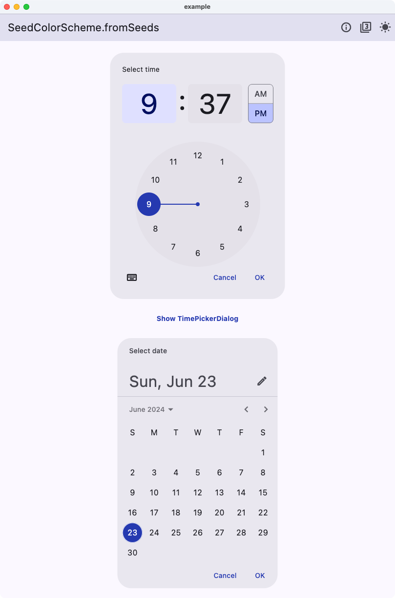 |
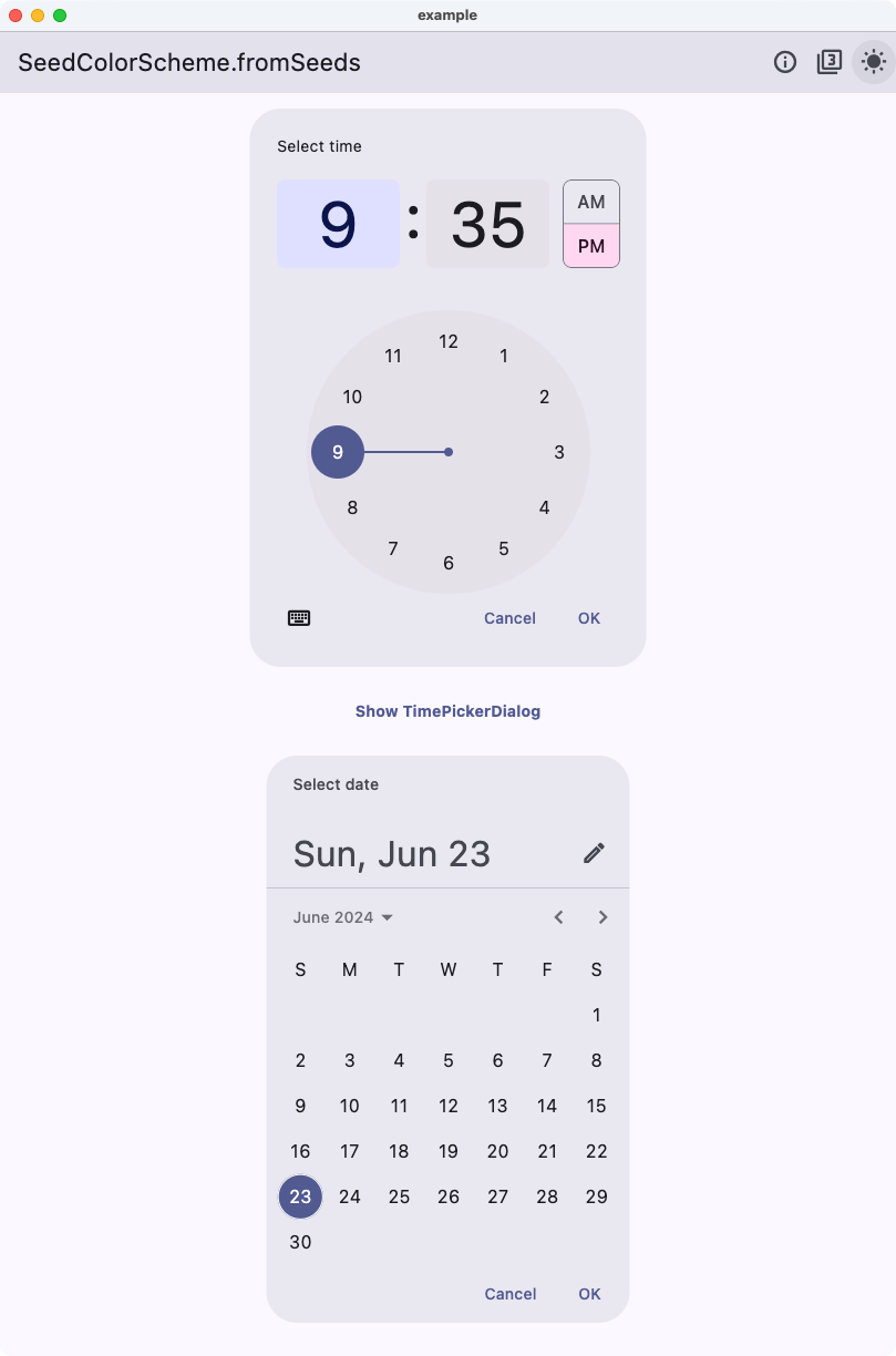 |
Now we see that the DatePicker no longer has the pink color it got from its default tertiaryContainer color. Instead, it uses the same blue hue related color as the primary color. This is because the oneHue strategy uses the same hue for all tonal palettes. This makes it possible to create a color scheme from a single color all based on the hue in the source brand color, without using tedious component color scheme re-mappings.
This package was extracted from the customizable color scheme seeding engine in the FlexColorScheme (FCS) package to its own package.
This allows developers to use the same customizable ColorScheme seeding algorithms used by
FlexColorScheme, without using the FlexColorScheme package.
Starting with FlexColorScheme version 6 and later, FCS depends on this package instead.
If you use FlexColorScheme version 6 or later, you do not need to add FlexSeedScheme to use its features, FlexColorScheme exports its API as well.
If you use FlexColorScheme, you typically do not even need to use FlexSeedScheme directly, its usage is baked in and used based on how you configure FlexColorScheme.