I built a web app to visualize high velocity real-time Kakfa data stream and it mocks real world IoT projects.
Kafka, Socket.io, Node, ReactJS, FusionCharts and ECharts
- I have high velocity data (like IoT sensor data). How do I visualize on my browser without loosing a single event?
- How difficult it is to plot a real time chart for high velocity streaming data?
- What will be the refresh interval of the page/chart? Problems with too small or too big intervals are quite evident.
- Will the chart crash if the data is collected at very high speed? like in milli seconds?
This is the article for you. I will tell you how I approached this kind of data visualization problem with some theory and a practical example. Also, I will help you understand the architecture behind plotting real-time data using some charting library successfully. By the end of this article, I will show you a working project that you can run on you system locally.
My name is Pooja Karande and I am a Computer Science and Business Analytics graduate. I've been working in the IoT domain since last 4.5 years. Big data, analytics and high intensity/high velocity data processing are the areas of my core interest.
So, what is the importance of real-time data visualization?
I will give you two important examples from different domains where analyzing high speed real time data is crucial.
During my initial years in the field of IoT, I was working on a project where the customer's focus was to analyze the quality of electricity supplied to the rural residential areas and understand if there is a need for improvement. Since the faults and serious damages to humans as well as the appliances running can be caused by bad quality electricity in terms of low frequency, low voltages, fluctuating supply etc. can happen within a blink of an eye, it is important to keep a track of each and every data point that is sent to the engine. This shows that real-time observation ensures smooth operation of supply networks, detects anomalies and failures which ultimately helps improving the quality of electricity.
Real time Stock market analysis by visualization plays important role in stock market trading. Investers make decisions based on the latest stock prices.
While I was studying Business Analytics, I was selected to work on a research project in collaboration with Mayo clinic that was working on monitoring and analyzing real time ECG data of the patients to predict decompensated heart failure. Real time visualization can be helpful in cases where the patients can't reach the doctors or the hospital urgently due to certain limitations or restrictions. There, the doctors can remotely monitor the live health status of the patient using this technology.
Collecting event data and storing it into streams or databases is a vast field. There are numerous ways to build stream of data eg. setup Apache Kafka, Confluent's cloud, Azure event Hub, AWS Kinesis data streams, etc.
Also there many open source charting libraries available out there. But plotting a realtime chart for streaming data is quite a task given the speed at which that data is collected from various sources.
In this experiment we will plot streaming data from Kafka topics directly onto browser using Fusion Charts and ECharts.
The problem can be sloved in two ways:
-
Refresh the chart after a set interval to get the latest event from server. After each interval, the historic data is fetched. The problem with this apporach is the appropriate interval selection. If it is too small then unnecessary frequent calls to server to fetch data are made. If it is too large, then there it is no more a real time data chart.
-
Create socket between API server and browser for real time and event based communication. Every event that the server emits to the socket is captured by the browser and added to the chart.
Clearly approach 2 is what every one wants. Hence, I will be explaining the second approach i.e. using sockets.
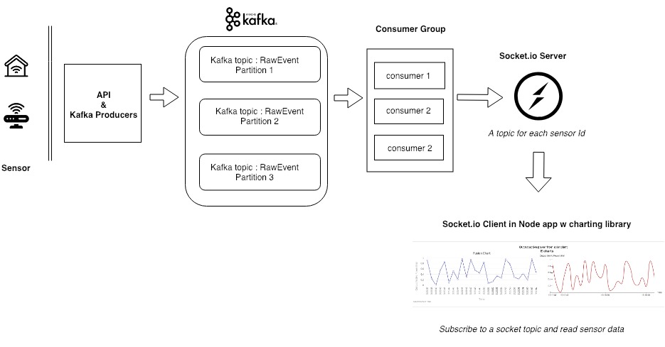
- The source of the data are sensors on the field, which send data to server via API calls. These can be any kind of sensors (temperature, pressure, speed, flow etc.)
- These APIs act as a Kafka producer and insert data into the Kafka topics.
- A group of Kafka consumers then reads data from the topic, filters it(optional) and sends it to a socket which act as a publisher of the data to the browser.
**One of the easiest way to create sockets is with the help of the Socket.IO library. It is best for realtime bidirectional communication with the browser and server. You can read more about it here https://socket.io/docs/
- At the subscriber end, we have NodeJS and React app which subscribe to the socket topic of interest and plots event as they are received. For the purpose of experiment I have used both Fusion Charts and ECharts.
I've created a Github repo for you to use and try doing it on your own.
Please download/install the followin on your local machine:
- Download Confluent : https://www.confluent.io/download/
- Install Node.js and npm (use node version manager)
- Clone my repo : https://github.com/poojaKarande13/streaming-data
- Start Kafka
$CONFLUENT_HOME/bin/confluent start
- Start the Kafka producer and the consumer (which is also the Socket publisher)
node producer.js

node consumer.js
- Start the node app
npm start
Once the client is compiled, you will see the link in your terminal (e.g. http:https://localhost:3000) where the application is currently running. Use your browser to navigate to that link.
If everything works as epxpected, you should be able to see a real-time chart with high speed data flowing in! Don’t forget to have an eye on the CPU usage in the task manager while doing so.
Kafka consumer config : enable.auto.commit https://medium.com/@danieljameskay/understanding-the-enable-auto-commit-kafka-consumer-property-12fa0ade7b65
