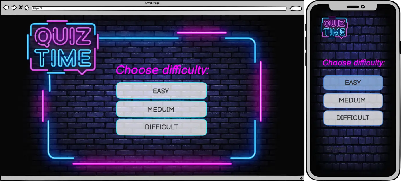
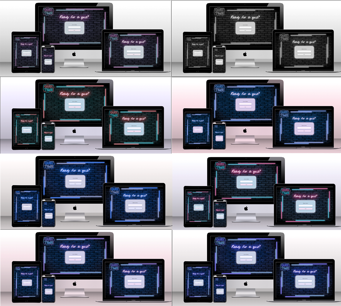
This project is a dynamic website - trivia quiz Quiz Time. The game provides different levels of difficulty and includes a random fun fact feature between games. The data is sourced from external APIs, which guarantee a variety of questions and fun facts. Therefore, it keeps the player amused for multiple game sessions. The game stores data about all games ever played, this way providing a real competition between all the players over time.
The core purposes of the website:
- entertain players with a trivia quiz.
- educate via facts after a game session.
- provide real competition.
The website is built using HTML, CSS, JavaScript and Google Apps Script as a Milestone Project#2 for the Code Institute's Full Stack Developer course.
The live website is available here
- I want to understand easily the purpose of the website and how to use it.
- I want to be able to play the game easily.
- I want to be able to navigate easily.
- I want to be amused.
- I want to have different questions without repetitions.
- I want to have a choice of difficulty to be able to progress.
- I want to play multiple games.
- I want to compare my results with other players to see how I am performing.
- Helps the user to understand what kind of game it is.
- Invites to enter a name and start the game.
- Grabs the user's attention and grips it with bold design.
- Understand the main purpose of the website.
- Easily navigate and interact with the website.
- Be amused.
- Interest and engage the user.
- Allows choosing difficulty level.
- Allows the user to play the game.
- Displays high scores at the end of the game.
- Take a quiz.
- Be amused.
- Compare their result with other players.
- Entertain the user with the quiz.
- Initiate future engagement, such as returning to beat the top score or make sure nobody has beaten yours.
- Provides a random interesting fact to entertain the user and extend their knowledge.
- Offer scenarios of further actions, such as "play again" or "change name and play again".
- For the first-time player this page is a surprise.
- Be amused.
- Choose the way to continue playing.
- Entertain and educate the user.
- Offer further engagement.
- Informs the user about a problem and offers further actions to keep the user on the website.
- Understand what to do in case of an error.
- Keep the user on the website.
- Make an unpleasant event of getting an error fun for the user.
- Home Page
- Difficulty Area
- Question Area
- High Scores Area
- Fun Fact Page
The project's design springs from the aesthetics of gaming machines and God's Own Junkyard art space. One of the reasons is that setting a quiz in more obvious pub settings seemed not acceptable for some groups of potential players. A pub setting does not seem very appropriate for younger players and some religious groups. To make it appealing to the broader audience, a more neutral solution was chosen
 Neon signs inspired a colour scheme and neon glowing effects used throughout the website. Shades of magenta and blue are bold and cheerful, balanced with deep black-blue and pastel light blue and grey.
#f8f8f8 - is used for neon glow effect and spreading light effect.
#B9D3E8 - is used for background in the blocks with text content.
#45C0FD - is used for neon glow effect and spreading light effect.
#FF00FE - is used for neon glow effect, animated glowing, spreading light effect and glowing headings.
#181B3B - is used for shadows and typography.
#181B3B - is used for background, background merging with background image and shadows.
Nothing You Could Do is used for headings. It is nonchalant, whilst legible, and works well with glowing effect.
Oxygen was chosen for the body text. It is neutral, soft and easy to read even on smaller screens.
God's own junkyard is used for the Fun Fact page. As this page is a surprise for the first-time user, it was decided to use slightly different styling. As the page has plenty of free space, I thought it could be an opportunity to implement the most stereotypical neon font for aesthetic purposes, as it looks good only in bigger sizes.
The images in this project were sourced from ShutterStock. They were specifically selected to set up the vibe of the website and increase the aesthetic impact of the design.
As the Home Page consists of the form with two input elements, a text field and a submit button, it was important to add volume and make them more appealing to engage, especially with such bold and vibrant surroundings with plenty of neon glowing.
The logo was sourced from a Shutterstock image, edited by me to maintain the colour palette. Also, it inspired the CSS neon frame.
Initially, the neon frame was a part of the background image, but it turned out to be not a very clever solution, considering the required responsiveness. The responsive neon frame was implemented to address the problem. The neon glowing effect was created by multiple box shadows in CSS, and the frame was set up with Grid.
There are two types of buttons: game buttons and navigation buttons. Game buttons offer a hover-over effect: it changes the inset shadow colour to invite the user to engage and demonstrate that the elements are interactive. Navigation buttons have subtle glowing animation at all times, as well as changing colour when being hovered over with the mouse.
An animated glowing pulsating effect is used for headings and navigation buttons to create neon aesthetics. The glowing is very subtle, so it does not compromise legibility. Keeping in mind that it might cause accessibility issues, the website includes a media query for people who prefer reduced motion.
All pages are fitted with loaders(magenta dots on black background) because at many points the website interacts with external APIs and awaits the data, which might take some time. Thus it was decided to implement a loader to inform the user that something is in progress and the website is not broken. Moreover, the slow fadeout effect provides a smooth aesthetical transition between pages even if the user does not see the loader animation running.
When the high scores modal appears, it is celebrated with a confetti burst created with Confetti JS library.
When the score increments, it is accompanied by a little burst of particles around the changing number. The effect is created with Mo JS JS library.
For all elements that can be clicked, a custom cursor appears when being hovered over with the mouse.
- Logo (Home Page)
The Logo, which is a link to the Home page, is present on all pages throughout the website (apart from one page where it is not intended for a reason). The user can navigate back to the Home page at any moment of the game. It has a title to help the users understand that the logo is a link.
- Input Form (Home Page)
The input form is the main feature of the Home page. It invites the user to enter a name and start the game. The type of the game is clear from the logo and the heading, so additional explanations are not needed.
- Popup Alert (Home Page)
The popup alert appears if the user provides invalid input, such as an empty string or a string that consists only of spaces.
- Difficulty Area
This section is the first thing the user sees starting the game. It allows choosing the difficulty level of the quiz. The difficulty section maintains the same layout and design as the Home Page.
- Question Area
The question area is the primary area of the game. There are the Current Score (which increments according to the difficulty) and the Top Score (taken from the API that stores results of all the games ever played by all users) at the top. It displays 20 questions from the API according to the chosen difficulty. API includes thousands of questions, which makes repetitions very rare, so the game is gripping, and users might be tempted to play multiple games and return. The user chooses the answer and receives a clear colour-coded response if the answer is correct. The navigation is clear and straightforward because the game is linear.
- Highscores Modal
At the end of the game, the high scores modal window appears. It displays the player's current result and top 8 results for all the history of the game. The results are stored in Google Spreadsheets, and the app, written by me, processes requests - it allows the game to access and write the data. There is a button Play again at the bottom of the window.
- Funfact Page
This page is a secret treat, which appears after the game when the user clicks Play again. It has a different layout and does not have the logo on it - to make it stand out from the main game flow and, at the same time, create an atmosphere of secrecy, somewhat a special mode with a limited access impression. The absence of the logo will not compromise the website navigation because one of the buttons below the fact takes the user to the home page anyway.
The page is meant to be a reward after the game, and there is no other way to get to this page. It displays a random fun fact from the API, the facts are brief and interesting. I believe everyone who loves quizzes would appreciate this little treat. This page offers the user possible scenarios: play again (navigates to the difficulty section) or change the name (if the user decides to contribute to the fun names collection) and play again (navigates to the home page).
- Error Pages
Error pages inform the user that something went wrong without giving the impression that the user has left the website. They offer alternative scenarios to keep the user on the website.
- Loader
The loader signals to the user that something is happening, and the website is not broken if it can't respond to the user's actions immediately.
- Orientation alert
To provide a better user experience, the landscape orientation for mobile devices was disabled - if the user attempts rotating a device, the game displays a message and offers to rotate the device back to continue the game. This feature was implemented because in the landscape orientation it was not possible to fit all elements of the game into one screen, and it included a lot of unnecessary scrolling.
- Google Spreadsheets API
To be able to store the data about all the games played, provide real competition and motivate users to return to beat the top score or make sure nobody has beaten them, the Google Sheets API was created. It is very simple, it does not include authorisation because the data is not sensitive. It stores a score, a name and a date of each game ever completed. The code is available here. Interaction with the API is performed via old-school jQuery AJAX requests.
- External APIs
To provide a variety of questions for the quiz and amusing fun facts, two external APIs are used:
- Open Trivia DataBase for the trivia questions.
- Random Fact Database for the facts for the Fun Fact page.
To interact with external APIs the fetch() method is used. I intentionally used two different types of API calls out of learning curiosity. I wanted to explore different ways to conduct API calls. I researched the difference between them, and, having read quite a lot, I could not find a definite answer. One of the articles suggested that "both alternatives are interesting, and it’s worth knowing them in detail!" I decided to follow this advice and look into both - the most basic and old-school and the most modern. I want to observe their behaviour as the Score data grows. If the performance gets slower, I switch to the most advantageous way. For now, I could not notice much difference, perhaps because the amount of data is not so significant.
The site is designed to be flexible, fluid, responsive and aesthetically enjoyable on all screen sizes and resolutions starting from 375px (based on statistics for 2022). The neon frame is turned off for the mobile version to ensure a better visual experience on mobile devices.
The choice of breakpoints was based on different aspects, such as typical devices' screen sizes and the intention to provide the best possible presentation of the content for all screen sizes. 768px breakpoint is meant to hit the iPad mini; 992px is quite common to signify the transition to laptops, and, content-wise, it proved to be reasonable. 1446px is not a typical choice, but it was preferred based on the content layout. The way I see quiz games, they are supposed to be played on large screens, as it is easier to read, possibly with a group of people.
The main game frame is based Grid, with Flex used for the content inside the grid, which allows the website to expand and shrink responsively to a device screen size providing each page's design integrity. Elements must maintain their respective position (or change if intended for better user experience), not overlap or misalign, and the content does not overflow.
Currently, every game consists of 20 questions.
It could be interesting to keep track of statistics for each question, such as how many people answered it and the percentage of correct answers.
- HTML, CSS, JavaScript
- Gitpod IDE to develop the website.
- GitHub to host the source code and GitHub Pages to deploy and host the live site.
- Git to provide version control (to commit and push code to the repository).
- Google Spreadsheets API to store scores data.
- Google Apps Script to write an app to process requests to Spreadsheets.
- jQuery(JS library) for additional functionality.
- Confetti(JS library) to create a burst of confetti animation.
- Mo JS(JS library) to create particles animation.
- Google Fonts for typography.
- Google Chrome Dev Tools for debugging, inspecting pages' elements and testing layout.
- Open Trivia DataBase - API used for the trivia questions.
- Random Fact Database - API used for the facts for the Fun Fact page.
- Vitest for unit testing.
- TinyJPG to optimise images for readme.
- Favicon.io to create the website favicon.
- Coolors to source colour palette from image.
- Balsamiq to design wireframes.
- Techsini to create the Mockup image in this README.
- Google Chrome's Lighthouse to assess accessibility.
- Screen Reader for Google Chrome to assess screen-reader accessibility.
- W3C HTML Markup Validator to validate HTML code.
- W3C Jigsaw CSS Validator to validate CSS code.
- Markdown Tables Generator to generate tables for the readme file.
- Code Institute's Gitpod Template to generate the workspace for the project.
This project was deployed to GitHub pages. The steps to deploy are as follows:
- Log into GitHub.
- Select
quiz-timefrom the list of repositories. - Select
SettingsFrom the Repositories sub-headings. - In the left side menu select
Pagesfrom theCode and automationsection. - Under the
Sourceheading in the dropdown menu selectmain. - A second drop-down menu should remain with the default value
/(root). - Press
Save. - A message that the website is ready to be deployed will appear, refresh the page and the link to the deployed site will be available in a green sub-section on the top of the page.
- Click on the link to go to the live deployed page.
The live link can be found here.
- Clone the repository
- Navigate to the GitHub Repository
oks-erm/quiz-time. - Click the
Codedrop-down menu. - Click the
HTTPSsub-heading under theCloneheading. - Copy the link.
- Open an IDE of your choice (VSCode, Atom, Komodo, etc).
- Open a terminal in the directory of your choice, type
git cloneand paste the link. - A clone of the repository will now be created on your machine.
- Download the repository manually
- Navigate to the GitHub Repository
oks-erm/quiz-time. - Click the
Codedrop-down menu. - Click
Download ZIP. - Locate the ZIP file and extract it to a folder where you want the repository to be stored.
- Open an IDE of your choice (VSCode, Atom, Komodo, etc).
- Navigate to the directory where the repository was extracted.
- Now you will have the contents of the project available offline on your machine.
| Expectations | Realisation |
|---|---|
| As a first time user: | |
| I want to easily understand the main purpose of the website and how to use it. |
1. On the Home Page, the user is presented with the logo, explaining the type of the game, the rules of which are clear from the name. 2. The user is invited to enter a name and start the game. It is clear what to do, and there are no distracting elements. |
| I want to be able to play the game. | 1. The game flow is linear; the headings include instructions and calls to action, and buttons guide the user through the game. |
| I want to be able to navigate easily. | 1. Navigation is simple: the buttons are clearly seen and there are never more than 2 options to choose from. 2. From any point of the game, the player can return to the Home Page. |
| I want to be amused. | 1. Neon vibe. 2. Variety of questions that don't repeat. 3. A surprise-page Fun Fact, where the user can learn something new in a few seconds. If you like quizzes, you would love learning something new. |
| As a returning and frequent user: | |
| I want to have different questions without repetitions. | 1. The questions are taken from the API with thousands of questions, so repetitions are extremely rare. |
| I want to have a choice of difficulty to be able to progress. | 1. There are three levels of difficulty to provide different players with appropriate levels or allow progress. |
| I want to play multiple games. | 1. The game flow is looped, and the user will always be offered one more game. 2. With a variety of questions, the user will not get bored too soon. |
| I want to compare my results with other players to see how I am performing. |
1. The High scores modal displays the player's current result, and the player can compare their result with the top scores. 2. The user can see results of all the games ever played, so they are motivated to play again to get to the top or beat the high score. |
| All users: | |
| All users want to be able to access and comfortably view the website on mobile devices. |
1. The website is fully responsive on all screen sizes and resolutions starting from 375px. 2. The mobile version has a different layout to ensure that mobile users receive a quality experience. |
Design was tested manually in three browsers:
- Chrome,
- Firefox,
- Safari,
on multiple devices:
- mobile devices
- iPhone 12,
- iPhone XR,
- Samsung Galaxy S20,
- tablets
- iPad Air
- laptops
- MacBook Air 13',
- MacBook Pro 16',
- +desktop screen 24'.
Certain minor differences were detected, but no issues affected the overall performance.
-
For one of the Android devices, the website was flickering with a whole screen instead of CSS animation. I was not able to approach it because I was not able to replicate it on my devices.
-
Sometimes when the orientation alert is displayed, the page, even though it's 100vh, would stick out from under the orientation alert. The problem was solved by setting max-height to 100vh and overflow:hidden for html in the respective media query.
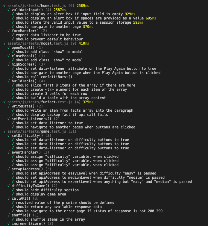
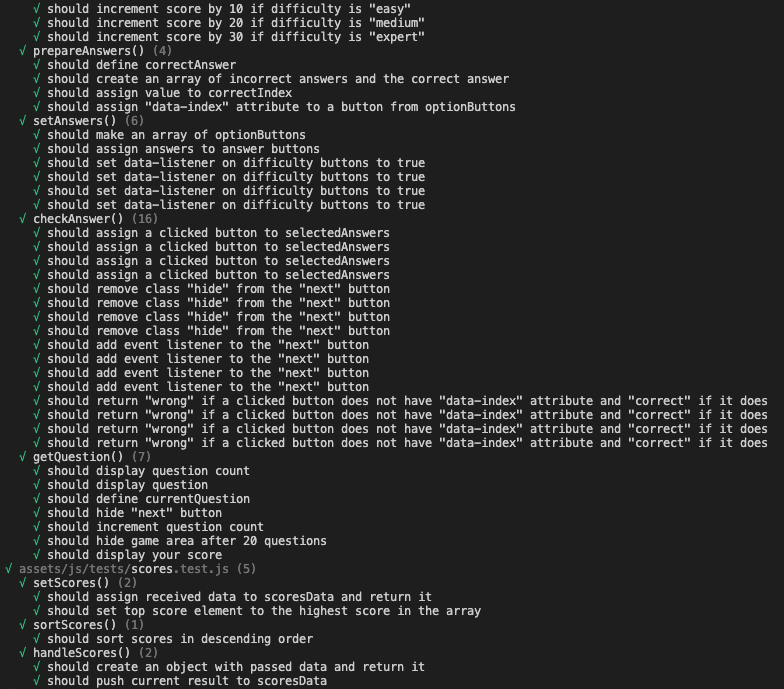
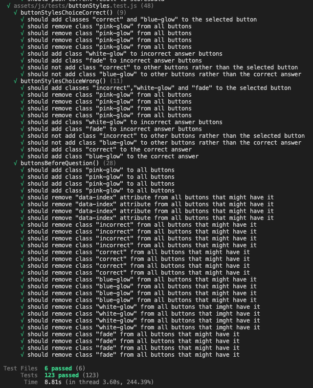
Feature testing was performed through automated unit testing using Vitest.
To run the tests: install the project's dependencies (npm install) and use the command npm test in the terminal.
Find the screenshots below:
- W3 Markup Validation - HTML Validation
All pages were run through HTML Validator. No errors were detected.
- W3 Jigsaw - CSS Validation
CSS Stylesheet was run through CSS Validator. No errors were detected.
Warning: auto is not defined by any specification as an allowed value for pointer-events, but is supported in multiple browsers.
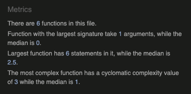
All pages were run through JS Hint. No errors were detected.
animation.js
buttonStyles.js
funfact.js
game.js
gatfact.js
home.js
modal.js
preset.js
scores.js
scoresapi.js
Home Page
Mobile
Desktop
Game Page
Mobile
Desktop
Fun Fact Page
Mobile
Desktop
500 Error
Mobile
Desktop
404 Error
Mobile
Desktop
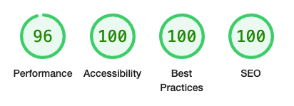
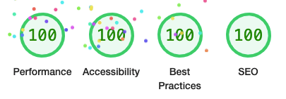
The website was tested with Screen Reader for Goggle Chrome. No issues arose.
All the pages were run through all the modes of color-blindnes.com. No issues were detected.
Home
Difficulty
Question
High Scores
Fun Fact
Error
- Open Trivia DataBase - API used for the trivia questions.
- Random Fact Database - API used for the facts for the Fun Fact page.
- wallbg.webp is by @littlehenrabi from ShutterStock.
- favicon.ico was created by me.
- Code snippet to fix the 100vh bug for mobile devices is taken from CSS Tricks.
- Code snippet for cresting neon glowing animation is taken from CSS Tricks and modified.
- Code snippet for sending data to Google Spreadsheet is taken from here and modified.
- Code snippet for turning google spreadsheets into a rest API is taken from here and modified.
- Understanding of modals was obtained from here.
- Guidance on JavaScript and common conventions were obtained from Mozilla's Web Documentation.
- Understanding of ways to shuffle an array and code snippet is taken from here.
- Understanding of event listeners was obtained from here.
- Understanding of local storage was obtained from here.
- Knowledge of unit testing was obtained from Udemy.
- Understanding of asynchronous functions was obtained from freecodecamp.org.
I would like to thank the CI tutoring team and my mentor, Ronan McClelland, for guidance, moral support and patience.


