The data is provided by Monash University Data Analytics Bootcamp.
The data set included with the assignment is based on 2014 ACS 1-year estimates. It includes data on rates of income, obesity, poverty, etc. by state. MOE stands for "margin of error."
-
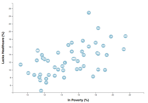
Create a scatter plot between two of the data variables such as
Healthcare vs. PovertyorSmokers vs. Age. -
Using the D3 techniques, create a scatter plot that represents each state with circle elements.
-
Include state abbreviations in the circles.
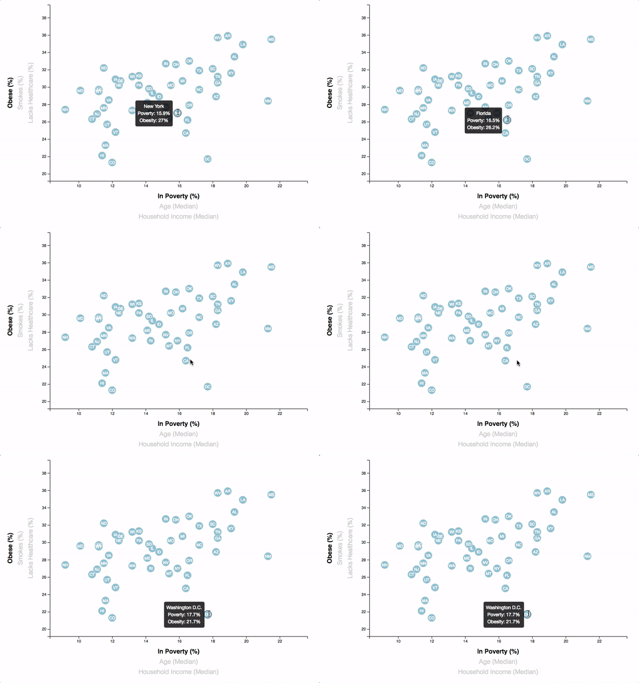
Place additional labels (total three for each axis) in the scatter plot and give them click events so that users can decide which data to display. Animate the transitions for the circles' locations as well as the range of the axes.
Using the d3-tip.js plugin developed by Justin Palmer, add tooltips to the circles and display each tooltip with the data that the user has selected.
Contact:
Email: [email protected]


