Skip to content
This repository has been archived by the owner on Mar 13, 2024. It is now read-only.

MM-22894/MM-23046/MM-24274/MM-24375 Quick wins bucket list 5 #5353

Merged
merged 27 commits into from
May 1, 2020
Merged

MM-22894/MM-23046/MM-24274/MM-24375 Quick wins bucket list 5 #5353

merged 27 commits into from
May 1, 2020

Conversation

asaadmahmood
Copy link
Contributor

@asaadmahmood asaadmahmood commented Apr 19, 2020

Summary

Quick wins bucket list 5
Escape to close the expanded RHS is not in, as there are a lot of corner cases around that.

Ticket Link

https://mattermost.atlassian.net/browse/MM-22894
https://mattermost.atlassian.net/browse/MM-23046
https://mattermost.atlassian.net/browse/MM-24375

Screenshots

localhost_8065_mattermost_channels_town-square
Screenshot 2020-04-19 at 2 58 17 PM

@asaadmahmood asaadmahmood added 1: PM Review Requires review by a product manager 1: UX Review Requires review by a UX Designer labels Apr 19, 2020
@asaadmahmood asaadmahmood added this to the v5.24.0 milestone Apr 19, 2020
@esethna esethna added the Setup Cloud Test Server Setup a test server using Mattermost Cloud label Apr 19, 2020
@mattermod
Copy link
Contributor

Creating a new SpinWick test server using Mattermost Cloud.

@mattermod
Copy link
Contributor

Mattermost test server created! 🎉

Access here: https://mattermost-webapp-pr-5353.test.mattermost.cloud

Account Type Username Password
Admin sysadmin Sys@dmin123
User user-1 User-1@123

@esethna
Copy link
Contributor

esethna commented Apr 19, 2020

Nice!

  1. We can probably remove this text now:
    image

  2. Channel name in the RHS header is missing a click effect

  3. Do we want to include the changes to the "Add comment" button in this PR?

  4. 0/5 on the changes to the RHS expanded state in terms of the UI? If you think we can do better, feel free to change what was written in the ticket

  5. Can we allow "ESC" to collapse the expanded RHS?

  6. Remove the expand button in mobile web view
    image

  7. The channel name button doesn't work in mobile web view
    image

@asaadmahmood
Copy link
Contributor Author

asaadmahmood commented Apr 19, 2020

  1. Done
  2. Done
  3. We should do that globally in a separate PR.
  4. I am concerned about the full opacity channel header at the top not vertically aligning with the full opacity RHS below it. I'll see what others think before making any changes.
  5. That may have a bunch of corner cases, so I would avoid doing that in this PR.
  6. Done.
  7. Do we want it to close the sidebar? We already have another way to close the sidebar on mobile. For most cases, a user will already be in the current channel, unless he is jumping from the search bar, in which case, he can jump to the channel from the search results, or we can also add Jump to be very explicit. I don't want it to function in different ways on mobile and desktop, with it closing it on mobile, but not on the desktop app. Especially since its not clear that clicking it will close the sidebar and you will lose the thread you were viewing. You would have to either search for it again from search, or manually search for it in the channel.

@mattermod
Copy link
Contributor

Test server creation failed. See the logs for more information.

Copy link
Contributor

@matthewbirtch matthewbirtch left a comment

Choose a reason for hiding this comment

The reason will be displayed to describe this comment to others. Learn more.

Looks great @asaadmahmood. Thank you!

  • Love that we've animated the transition from compact to expanded state on the RHS. This really helps a lot. Nice call on that.
  • For the hover state of the channel name in the Thread RHS header, can we darken the actual text on hover as well? Maybe we follow the same convention for the icons, so go with 56% center channel color as a default state, 72% center channel color as a hover state? I'll update the design files if we're aligned to that.
  • The expanded state of the RHS header has a rounded top-left corner. Is that intentional? I see that was requested in the ticket, but it feels a little odd to me since no other corners for the panel are rounded
  • For the expanded state of the RHS, I wonder if we should have a max-width set on it? On a large screen it's so wide. I'm thinking something like 960px wide as a max.
  • As per the note from @esethna, it looks like the expand button is still there in mobile webview, but the close button is now gone. Can we remove the expand button and bring back the close?

@asaadmahmood
Copy link
Contributor Author

@matthewbirtch I did update that, both the close button and the expand button aren't there, and we don't have a close button because the RHS is closed in the mobile web view with the back button at the top beside the search bar.

The PR just did not update automatically, which is why you can't see it right now.

@asaadmahmood
Copy link
Contributor Author

asaadmahmood commented Apr 20, 2020

@matthewbirtch

  1. Cool.
  2. Done.
  3. Wasn't a fan of that, so removed it.
  4. Done. Good idea.
  5. As mentioned above.

@matthewbirtch
Copy link
Contributor

Thanks @asaadmahmood. I think you may have tagged the wrong github user in your comment above :)

Things are looking good. However, I noticed now that we've added a max-width on the expanded state of the RHS, I think it messed up the animation :(

@asaadmahmood
Copy link
Contributor Author

@matthewbirtch Will fix that.

@esethna
Copy link
Contributor

esethna commented Apr 20, 2020

Do we want it to close the sidebar? We already have another way to close the sidebar on mobile. For most cases, a user will already be in the current channel, unless he is jumping from the search bar, in which case, he can jump to the channel from the search results, or we can also add Jump to be very explicit. I don't want it to function in different ways on mobile and desktop, with it closing it on mobile, but not on the desktop app. Especially since its not clear that clicking it will close the sidebar and you will lose the thread you were viewing. You would have to either search for it again from search, or manually search for it in the channel.

@asaadmahmood I think either we keep the button and it should close the sidebar and take the user to that channel or we just make it not clickable in the mobile view. 0/5

Also I think there's a bug with expanding: https://i.gyazo.com/284db4c3a1fc0ee5599e6a8e8b3fd2dc.gif

@mattermod
Copy link
Contributor

Test server creation failed. See the logs for more information.

@asaadmahmood
Copy link
Contributor Author

@esethna I feel like we can make it not clickable. I don't want people to accidentally click it and lose the RHS, as it does not close it right now.
In the case of the user opening the reply thread from a post in the center channel, he would always remain in that channel, as one can't easily navigate to a different channel with the RHS open, so I think its fine.

@esethna
Copy link
Contributor

esethna commented Apr 20, 2020

@matthewbirtch @asaadmahmood 0/5, but if we are adding a max width to the RHS expanded state, which is a great idea, do we need the channel sidebar to have an overlay? I'm imagining that if a user switches channels we can just switch the center pane and shrink the RHS back to normal size?

@asaadmahmood
Copy link
Contributor Author

@esethna Removed the click on mobile.
And for the RHS overlay. It's a good way to collapse it right now. If we remove that, then the user would have to manually collapse it, or redirect himself to a different channel to do so.

Plus, if we are removing the overlay, then I would imagine we should also squish the center channel based on the space available, so the user can interact with it, but that may pose challenges on most normal browser screen as the width would be quite small.

@esethna
Copy link
Contributor

esethna commented Apr 20, 2020

@asaadmahmood I'm referring to removing the overlay on the channel sidebar, not the center pane. If we do that I don't think we need to squish the center pane

@asaadmahmood
Copy link
Contributor Author

@esethna Hmmm, yeah I think we can try that.

@asaadmahmood
Copy link
Contributor Author

asaadmahmood commented Apr 20, 2020

Or maybe it may not look as good. It would look like this.
localhost_8065_mattermost_channels_this-is-a-really-long-channel-name-like-really-really-long

@asaadmahmood
Copy link
Contributor Author

With the overlay, its clear that clicking the sidebar would collapse it, but without it, its not as clear.

@asaadmahmood
Copy link
Contributor Author

Also, having the sidebar collapse on channel switch might be something we can consider for a different ticket, as that would be adding some extra functionality on a global level, so the channel sidebar can close it.

utils/utils.jsx Outdated
const ownPostBg = blendColors(theme.centerChannelBg, theme.centerChannelColor, 0.05);
const hoveredPostBg = blendColors(theme.centerChannelBg, theme.centerChannelColor, 0.08);
const hoveredPostBgLight = blendColors(theme.centerChannelBg, theme.centerChannelColor, 0.05);
const ownPostBg = theme.centerChannelBg;
Copy link
Member

Choose a reason for hiding this comment

The reason will be displayed to describe this comment to others. Learn more.

Instead of just changing the colour here, could you remove the logic that refers to ownPostBg? This part of the code is really complicated, so removing that case would simplify it a fair bit.

@hmhealey hmhealey changed the title Quick wins bucket list 5 MM-22894/MM-23046/MM-24375 Quick wins bucket list 5 Apr 20, 2020
@andrewbrown00
Copy link

andrewbrown00 commented Apr 20, 2020

@asaadmahmood things look great here 🎉

A few items to resolve/consider:

  • We should use the permalink highlight pattern after a user clicks on the channel name in the Thread header. Right now, clicking the channel name in the Thread header opens the channel (unless it's already open); but we don't provide the user with an affordance to where the thread is in the channel.
    2020-04-20 16 27 12

  • 0/5 and open to feedback, but something feels off with the timing when clicking to expand the RHS. I think it's because the overlay comes in faster than the RHS slides out. I like the animation on the RHS but wonder if we can tie them together?
    2020-04-20 16 30 41

  • 0/5 but something feels off with leaving a sliver of the center channel showing when the RHS is expanded; it's create a stepped/staggered visual. Maybe it won't appear this way once the overlay is removed from the LHS.
    image

  • @esethna should we add tooltips to the expand and close icons. We need to define the rules for when we do/do not want to introduce tooltips for icon buttons.
    image image

  • The overlay sits on top of the Thread view when reducing the view down to mobile.
    2020-04-20 16 35 55

@esethna
Copy link
Contributor

esethna commented Apr 20, 2020

@andrewbrown00

That's a really great idea to permalink to the root post in the center pane - looks like that's what slack does also. We should do this for sure.

Re tooltips, already have a ticket completed for that by community: https://mattermost.atlassian.net/browse/MM-22876


@asaadmahmood I don't mind this but I'm 0/5, I've leave it up to you guys and @andrewbrown00 on what's the best UI for the expanded state. Wonder if we can find some examples in other products

localhost_8065_mattermost_channels_this-is-a-really-long-channel-name-like-really-really-long

@mm-cloud-bot
Copy link

New commit detected. SpinWick will upgrade if the updated docker image is available.

@mm-cloud-bot
Copy link

Mattermost test server updated with git commit 15806433e2e6291c798e0a0a572bc0299f3c4205.

Access here: https://mattermost-webapp-pr-5353.test.mattermost.cloud

@hmhealey hmhealey removed the 2: Dev Review Requires review by a core commiter label Apr 30, 2020
@lindy65
Copy link
Contributor

lindy65 commented May 1, 2020

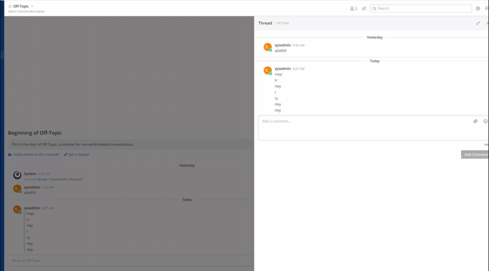
Thanks @asaadmahmood - pshew, this is a hectic PR to review - so many comments! ;)

I tested via the Jira tickets linked at the top of this PR, our DM where you gave me the high level changes and also from design and PM comments above. Hope I did not miss anything!

1. In RHS thread view, the "<" (back arrow) is misaligned with "Thread". This is visible after a search is performed and "reply" is hit on one of the search results.

image

2. In RHS thread view, where the channel name is clickable:
- This doesn't seem very "obvious" to me as a user (there is a grey hover state and mouse pointer changes to a hand but just looking at the channel name doesn't say to me "hey, you can click here to open the channel in the center pane"). Is it possible to show the channel name in a "link colour" (e.g. blue) so it looks like a link you can click on (both on hover and without hover over)? Similar to the "Help" link below "Add a comment" in this screenshot...

image

3. In expanded RHS view:
- I do not see a drop shadow on the LHS bar?
- The top left corner is not rounded (but not sure whether this was implemented as it has a question mark next to it on the Jira ticket
- ESC is not working (to close the expanded RHS)

image

@asaadmahmood
Copy link
Contributor Author

@lindy65

  1. Fixed.
  2. I agree, however, with the pattern we are developing, with the icons in the header, or the post menu icons, it is consistent. Gray, gray and background on hover, and then button bg on click and hover. So we'll probably keep it that way, and maybe add an icon next to the name in the future.
  • There isn't supposed to be, we removed it.
  • We went with not rounding it off.
  • Yeah, that was not done in this PR.

@mm-cloud-bot
Copy link

New commit detected. SpinWick will upgrade if the updated docker image is available.

Copy link
Contributor

@lindy65 lindy65 left a comment

Choose a reason for hiding this comment

The reason will be displayed to describe this comment to others. Learn more.

Thanks @asaadmahmood - sounds good to me 👍

Please help update the Jira tickets linked to this PR to reflect changes that actually made it in to the PR? Thanks!

@lindy65 lindy65 added 4: Reviews Complete All reviewers have approved the pull request QA Review Done and removed 3: QA Review Requires review by a QA tester Setup Cloud Test Server Setup a test server using Mattermost Cloud labels May 1, 2020
@mm-cloud-bot
Copy link

Test server destroyed

@mm-cloud-bot
Copy link

Test server creation failed. See the logs for more information.

@asaadmahmood asaadmahmood added the Do Not Merge Should not be merged until this label is removed label May 1, 2020
@asaadmahmood asaadmahmood removed the Do Not Merge Should not be merged until this label is removed label May 1, 2020
@asaadmahmood asaadmahmood merged commit ba7358a into mattermost:master May 1, 2020
@asaadmahmood asaadmahmood deleted the quick-wins-5 branch May 1, 2020 17:15
@amyblais amyblais added Changelog/Not Needed Does not require a changelog entry Docs/Not Needed Does not require documentation labels May 14, 2020
Sign up for free to subscribe to this conversation on GitHub. Already have an account? Sign in.
Labels
4: Reviews Complete All reviewers have approved the pull request Changelog/Not Needed Does not require a changelog entry Docs/Not Needed Does not require documentation QA Review Done
Projects
None yet
10 participants