Proportioned, responsive, tile grids for Bootstrap 3 in SCSS
This library provides helper classes that, when used in conjuction with standard bootstrap column classes, enable you to create balanced grids with control over width and height in pure CSS. It weighs in at < 12KiB, minified, or < 1.5KiB if also gzipped.
No CSS3 is used, giving better device coverage. This system avoids the fragile maths of other, fixed-width grids and ensures reliable display, even in fluid-width layouts. Built against Bootstrap v3.3.5, but simple enough that it could be adapted to work with 2.x with minimal translation.
The default base tile aspect is square, which may be altered. A tile's form is
determined by the number of columns and grid rows (not .rows) it spans.
Download and <link> to the minified stylesheet after your main Bootstrap CSS,
or @import 'stiles'; in your SASS.
Stiles class names have a similar pattern to, and are used in conjuction with, standard column classes. Thus, you can rearrange or disable tile grids for smaller screens. Each (content-containing) tile must only directly contain a single child element. Further elements may be placed inside that child. Begin your Stiles grid like so:
<div class="container stiles-md">
	<div class="row">
		<div class="col-md-4 stile-md-3"><aside></aside></div>
		…
	</div>
</div>
This tile will span 3 rows. You can use a .row container to hold each new row
of tiles, as with standard columns, if your arrangement suits. However, for
tile configurations that change at breakpoints, you must use only one .row
containing all tiles inside it and dynamically start new rows with a
stile-zz-row class (where zz is a size like sm) on the first tile of each
row. A tile will no longer start a row when you add any size class for a wider
breakpoint, e.g. col-md-6 stile-md-6 stile-md-row col-lg-4 stile-lg-4. Even
though your grid may look okay without stile-zz-row classes, sub-pixel
rounding errors can easily ruin your layout at random widths, and they're
different in each browser.
Irregular grids (where any tile has a horizontal edge that is incongruent with
other tiles in its row) must ‘tuck’ the bottom of taller tiles up to make room
for subsequent rows. A tile row contains only tiles that share a congruent top
edge. Use .col-zz-offset-n classes to push tiles over into the gaps between
overhanging tiles, e.g.:
<div class="container stiles-md">
	<div class="row">
		<div class="col-md-4 stile-md-3"><aside>1</aside></div>
		<div class="col-md-4 stile-md-5 stile-md-tuck-2"><aside>2</aside></div>
		<div class="col-md-4 stile-md-3"><aside>3</aside></div>
		<div class="col-md-4 stile-md-row stile-md-5 stile-md-tuck-3"><aside>4</aside></div>
		<div class="col-md-4 col-md-offset-4 stile-md-5 stile-md-tuck-3"><aside>5</aside></div>
		<div class="col-md-4 col-md-offset-4 stile-md-row stile-md-3"><aside>6</aside></div>
	</div>
</div>
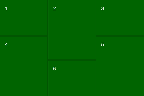
This would render like so:
Such grids may have an element order slightly off of visual reading order but they're pretty close. Use correctly, you can dynamically add tiles (preferably with consistent width) to an infinte scrolling grid by calculating only offsets and tucks.
Using a preprocessor, the _stiles.scss include makes it easy to override the
number of horizontal tile grid divisions, the tile spacing, the base aspect
ratio, etc., by setting defaults before you @import. These defaults are all
listed at the top of the include. You may also disable the default grid styles
and manually call the mixins as needed, reducing the compiled output to only
what you're using.
Some examples:
// spacing between tiles (pixel values are best since the standard grid uses them)
$stiles-gutter: 10px;
// a 5×5 grid
$stiles-cols: 5;
// rows to columns ratio (this limits the maximum span of single tiles, not total grid height)
$stiles-rows-ratio: 1;
// change the aspect ratio of the base tile
$stiles-aspect-ratio: 16 / 9;
// give your settings a name to distinguish the classes from the defaults (this would make classes like stiles-sm-tv and stile-lg-tv-tuck-2)
$stiles-name: tv;
