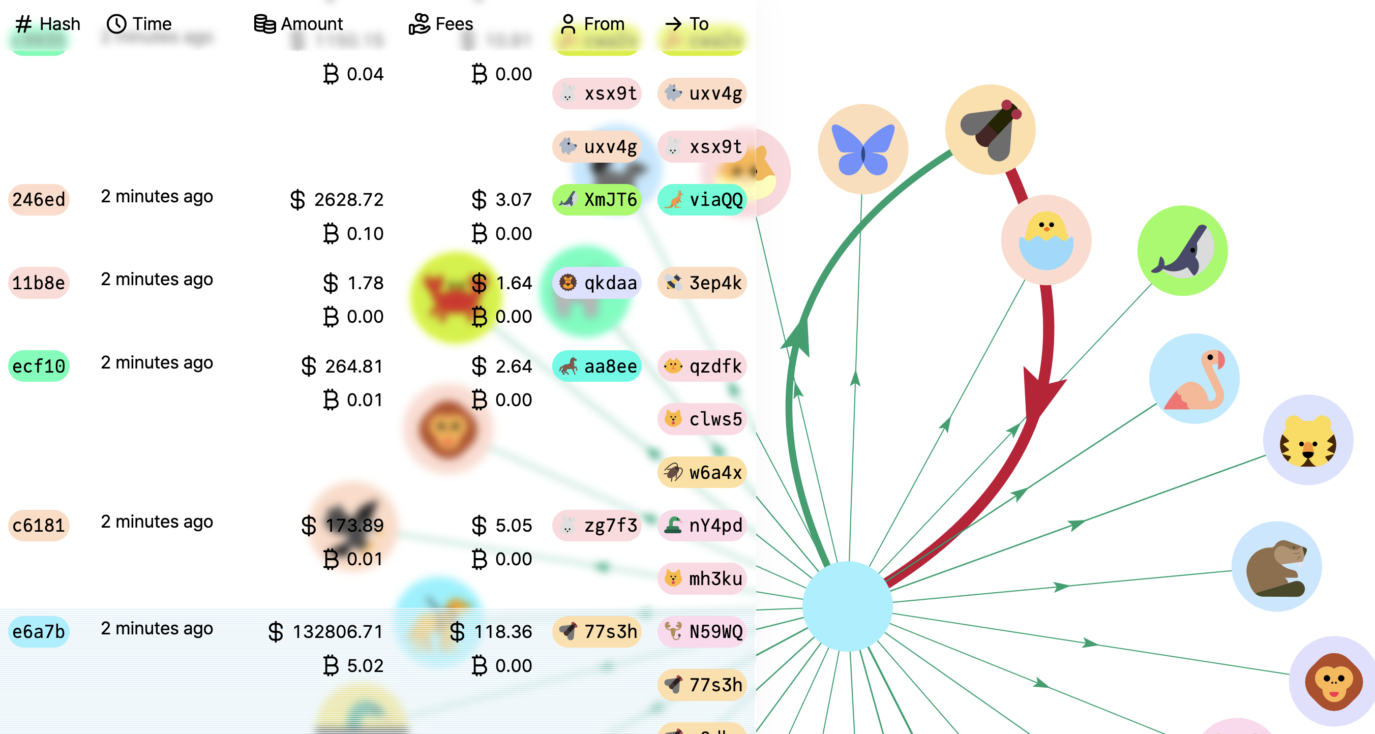
Real-time bitcoin dashboard – Demo
This is an experimental real-time bitcoin dashboard built in two days.
This uses pnpm as the package manager. Please follow the installation instructions here, then run:
pnpm install
pnpm devThis runs the local development server at http:https://localhost:5173/. You can also run the test suite in watch mode with pnpm test.
pnpm test run && pnpm buildThe build can be found in the dist folder.
I begin with the end in mind: making the goal explicit creates a metric for success. Here, I want to visualise the latest transactions on the bitcoin network. Among what we may want to see:
- The hash and timestamp: whether the transaction is the one we are looking for
- The amount and fees: how much is being transferred and paid
- Inputs and outputs: who is sending and receiving the money
Both (1) and (2) require a fixed space, and are best represented as a table. (3) has a variable length, and another visualisation is needed.
Here, we want to see, in the blink of an eye, who contributes the most. A pie/bar chart would be possible, but it would then separate an address if it sends and receives money within the same transaction. A node graph would be more appropriate, as it can show the flow of money, and maximises the use of space.
Addresses are a long string. It takes time to read it, and mistakes easily happen. I decomposed an address using other ways of communicating information:
-
Colour: an address is hashed deterministically to obtain a number, which is the hue of the colour. Using the novel HCT colour space, we can maintain a constant lightness and saturation for maximal readability.
-
Shape: the shape is chosen among geometric emojis, which are easy to recognise at a small scale and match the style of the typeface. I limited the emojis to animals, like the icons of Google users when editing a document, because seeing a cake sending money to a foot might be more puzzling.
Note: the colour scheme is facultative for colour-blind persons. The arrows, coloured according to the Natural Colour System, show their direction with their arrows.
The main challenge is to display a lot of information in a small space. I used the following techniques:
-
Contextual information: since two addresses can have the same hash, I still display the last 5 characters, and hovering shows the full address / transaction hash. Similarly, a lot of information can be displayed through tooltips: the bitcoin price at the time of the transaction, the absolute time, etc. I decided to show both the USD and BTC amounts at all times, as I expect the user to often want to see the price in one of the currencies without moving the mouse.
-
Glass: blurred backgrounds show what is behind, and can still be read. Here, we can still see the transactions under the table.
-
Responsive sizes: on small screens, the interactive part of the graph might be too small. I decided to make the size of the interface proportional to the width of the screen.
-
Performance: here, we are limited by the Floating UI library. It is the biggest performance cost according to the performance trace (rows with
@floating-ui): for 8000 rows, 92.3% of the total computation! At each update, each potential tooltip callsgetBoundingClientRect. Currently, I display only the 500 latest transactions. Possible improvements here: since only one tooltip is displayed at a time, we could calculate the bounding rectangle only once. We could also virtualise the table. -
User-friendliness: currently, new entries displace suddenly all the other entries, and the user must scroll down to find the old ones. Worse: if the mouse was hovering over a particular transaction, after the displacement, it may hover over another transaction, and the old one would be lost. The current CSS trick to anchor the scroll position does not work in Safari, and only works when the user has already scrolled. Ideally, the table would retain the scroll position.
-
Graph aesthetics and features: the graph library draws on a canvas instead of using SVG and HTML elements. Every feature must go through (and is limited by) the interface it exposes. We cannot customise its tooltip, for example. It works for the purposes of this experiment, but it would be better to use a more flexible library.
-
Minor features: mobile and dark modes, a way to filter the transactions, etc.

