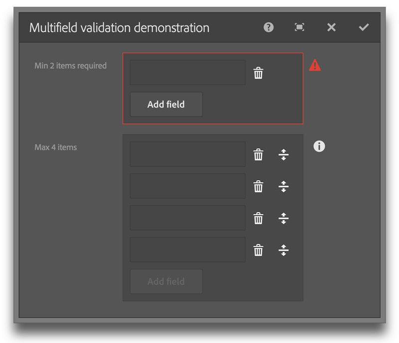
This project provides enhanced validation and functionality for Adobe Experience Manager 6 Granite dialogs.
The project uses all out-of-the-box components and clientlibs without overlays. This library is a simple clientlib that you can add or remove without affecting the rest of your project. The clientlib is in the cq.authoring.dialog category making it immediately available in authoring mode.
See https://www.nateyolles.com/blog/2016/02/aem-touch-ui-custom-validation for a detailed description regarding the principles used to create these custom validators.
- Add enhanced validation while behaving in a completely unobtrusive manner.
- Provide validation in a consistent style as out-of-the-box validation using the familiar red notification icon; no alerts, modals or prompts.
The following documents the added functionality which does not include the provided AEM validation. See the documentation at https://docs.adobe.com/docs/en/aem/6-1/ref/granite-ui/api/jcr_root/libs/granite/ui/components/foundation/index.html.
min
type: {Long}
description: The minimum number of multifield items
default: Not active
max
type: {Long}
description: Limits the maximum number of multifield items as opposed to validating.
default: Not active
required
type: {Boolean}
description: Makes the field required
default: false
allowNonRootPath
type: {Boolean}
description: Allows a path that is not bound by the root path
default: false
allowNonExistingPath
type: {Boolean}
description: Allows a path that is not a node in the JCR
default: false
Note:
Use allowNonRootPath in conjunction with allowNonExistingPath to allow the
user the option of selecting a page within AEM or typing in an external URL.
minlength
type: {Long}
Description: Minimum number of characters allowed
default: Not active
activeValidation
type: {Boolean}
Description: Validation updates as the user types instead of waiting until the field loses focus.
default: false
pattern
type: {Regex|String}
Description: A named regular expression pattern or a regular expression (e.g. ^\\d+$).
default: Not active
Named regex patterns:
phone, email, url, number, dateISO, alpha, alphaNumeric, integer, systemKey
required
type: {Boolean}
description: Makes the field required
default: false
required
type: {Boolean}
description: Makes the field required
default: false
required
type: {Boolean}
description: Makes the field required
default: false
This project was built and tested with AEM 6.1.
If you have a running AEM instance you can build and package the whole project and deploy into AEM from within the /src folder with:
mvn clean install -PautoInstallPackage
- Navigate to https://localhost:4502/editor.html/content/aem-touch-ui-validation/en.html
- Open the component dialogs and test the various included Touch UI components.
The main parts of the source project are:
- ui.apps: contains the /apps and /etc parts of the project, ie JS & CSS clientlibs, components and templates. The validation library is under /etc/designs/aem-touch-ui-validation
- ui.content: contains sample content using the components from the ui.apps.
A package is provided in the /package folder. Install it with Package Manager at https://localhost:4502/crx/packmgr/index.jsp or you can copy the /aem-touch-ui-validation folder into your project.
The project is licensed under Apache License 2.0.
