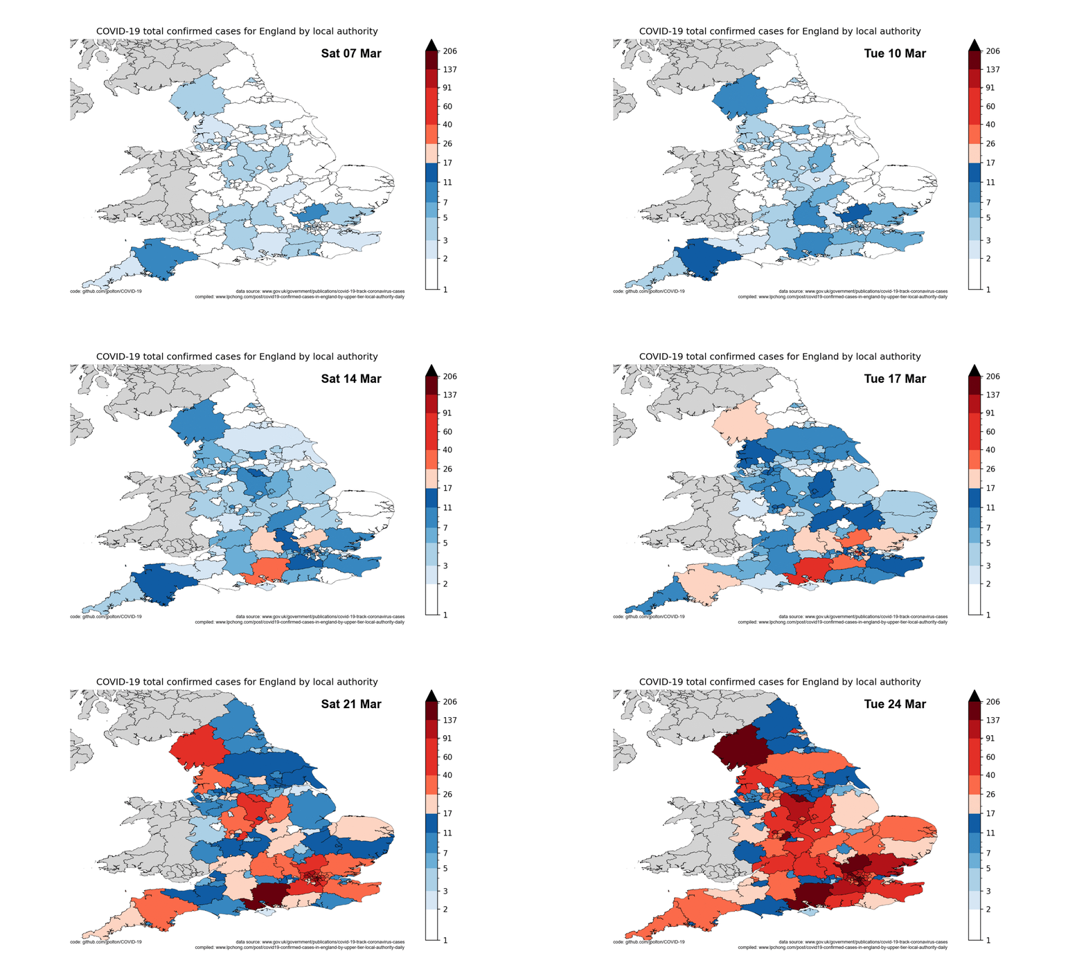
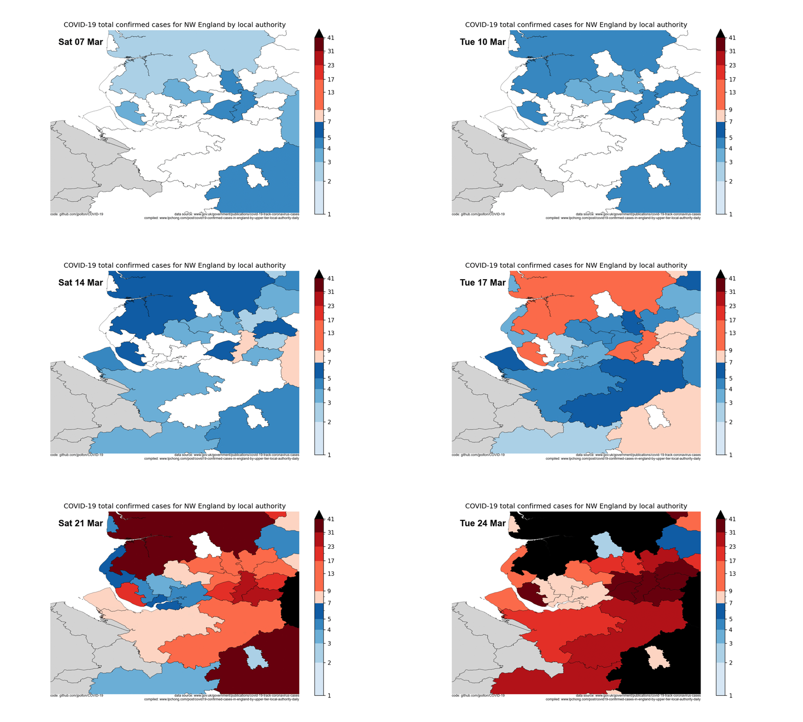
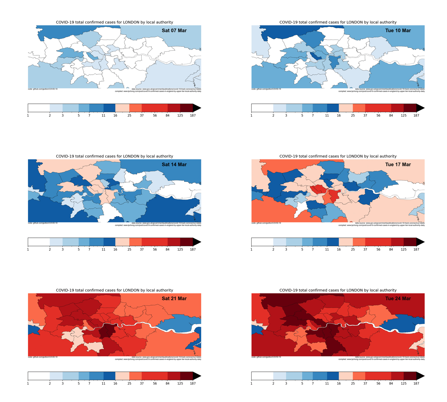
The motivation was to learn how to do geospatial data handling and plotting in Python, here geopandas. COVID-19 confirmed cases by region seemed like a suitable dataset to learn on. But perhaps to many the image outputs are of more interest than the methods used...
Anticipating some good news in the data in the coming week(s) I started to wonder how would it be possible to detect it. The key might be spotting a slowing in the growth rates of cases or deaths. Spotting trends in reported cases would be ideal, since they are precursor to trends in death rates. However we anticipate the number of daily tests to vastly increase and I don't know how that will effect change the biasing of that data. So I conclude death rates are fairly robust a measure to look at.
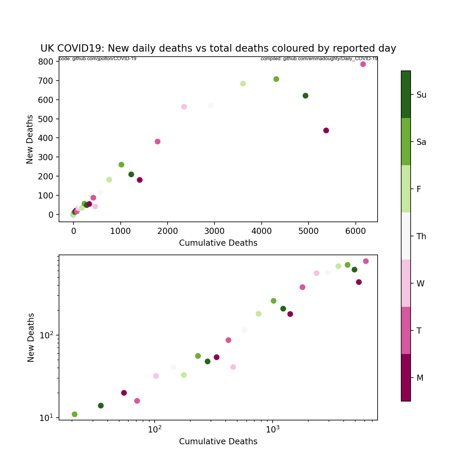
Here reported daily death data are shown on linear and log scales. New reported deaths against total reported deaths for the UK. Simple exponential growth would give straight lines + scatter. The linear axes show is large recent downturn in reported cases. However plotted this on a log scale perhaps suggests that this recent downturn is just scatter about the trend? This scatter also appears to vary with the day of week reported. Can there be a weekend effect in reported deaths? Covid19 data compiled by @Emma_L_Doughty
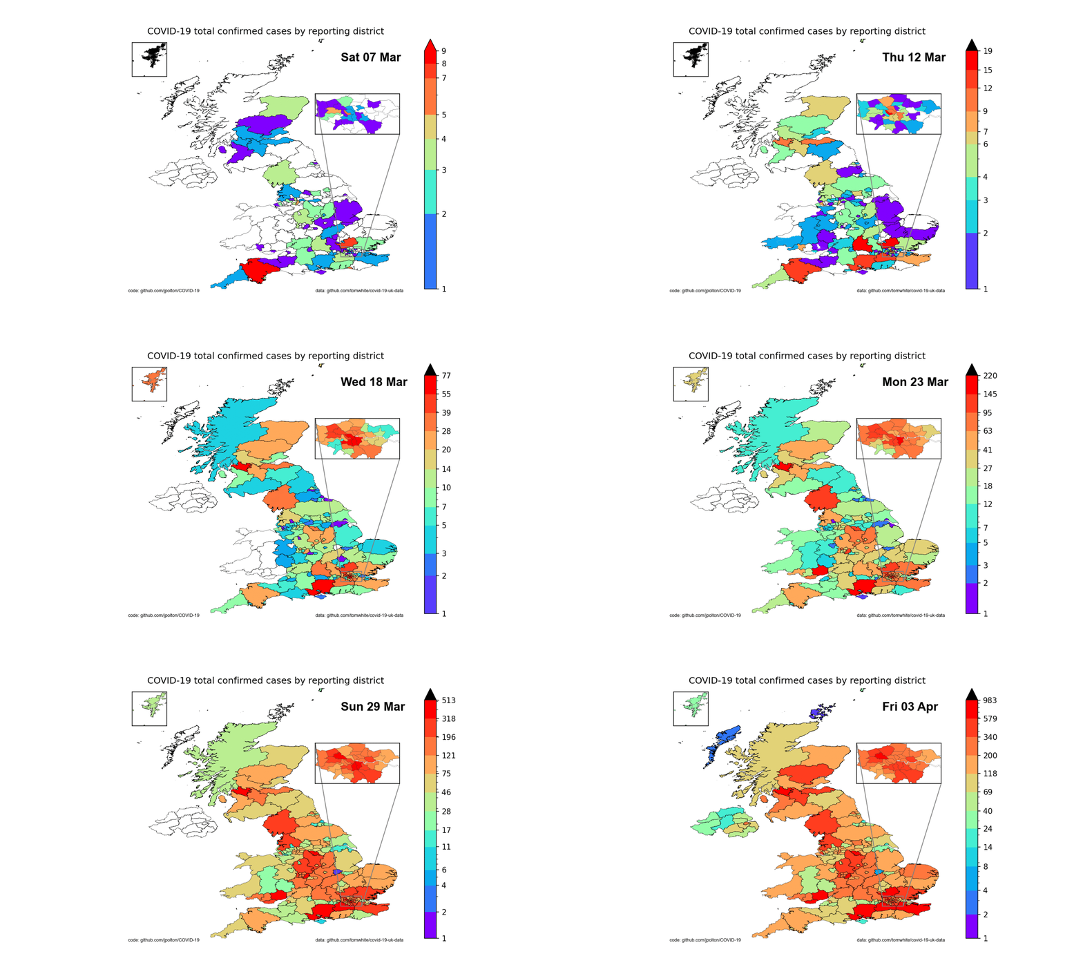
Plotting the confirmed cases for England, Wales and Scotland. Collated and recorded by tom white. Here the colour scale changes with the day to show how the 'hot spots' evolve from isolated regions into "something for everyone". The coding advance here was to switch to class instances for each region and to recover the England and Wales regional geometries via ONS API requests (NI and Scotland geometries come from static files). Code need some tidying test.py
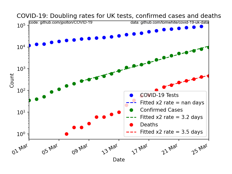
(Previously, 4 days ago, when I fitted a curve to the data much of the data was for counts less than 100. This gives a spuriously high growth rate. Now I can now fit a curve to the portion of data that exceeds 100. This produces a much more credible doubling rate of 3 days, which matches the growth rate of confirmed cases.) Plotting on a log scale gives straight lines for exponential growth. The slope gives the doubling period. Here doubling periods are: 7.7 days (Testing); 3.1 days (Confirmed Cases); and (3.0 days) Deaths.
It is interesting how fitting an exponential function to too few cases gives a spuriously high growth rate. I have no doubt this is known in the field. I imagine that the effect arises because with relatively few cases (i.e. <100) they are from different origins (outside the counting region) and not in any way timing linked to each other. It is only when cases are generated internally, within the counting district that fitting exponential growth rates makes any sense.
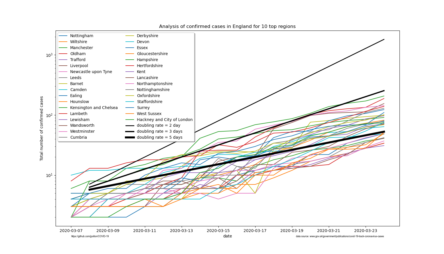
Pragmatic criteria for testing result in under reporting for actual cases. Nevertheless it is interesting to look at the growth rate of confirmed cases. Plotting the total number of confirmed cases on a logarithmic count scale, against day, will give a straight line if the data are doubling at a steady rate. The steeper the line the faster the rate. Here I plot the data for the reporting districts in England with the largest number cases (hence least noisy data):
In black 3 lines are drawn to show the expected slopes for data that doubles every 2, 3 or 5 days.
-
shapefiles:
- Local Authority Districts (December 2017) Super Generalised Clipped Boundaries in Great Britain
https://geoportal.statistics.gov.uk/datasets/local-authority-districts-december-2017-super-generalised-clipped-boundaries-in-great-britain/geoservice(This effectively masks non-metropolitan regions in the PHE covid19 data, as they report over larger regions in the non-metropolitan places.) - Local Authority Districts (December 2019) Boundaries UK BUC at 500m
https://geoportal.statistics.gov.uk/datasets/local-authority-districts-december-2019-boundaries-uk-buc?geometry=-3.947%2C53.302%2C-0.591%2C53.872(This matches the PHE reporting regions for all but a couple of the reporting regions).
- Local Authority Districts (December 2017) Super Generalised Clipped Boundaries in Great Britain
-
Public Health England:
https://www.gov.uk/government/publications/covid-19-track-coronavirus-casesUTLA cases table.
Might also look at the for following for tabulated, in time, data:
https://github.com/emmadoughty/Daily_COVID-19/blob/master/COVID19_by_LA.csvhttps://docs.google.com/spreadsheets/d/129bJR5Mgcr5qOQNc96CBWKFfjODToWKRiVKDEg5ybkU/edit#gid=1952384968https://github.com/tomwhite/covid-19-uk-data/
- Some of the regions may not be accurately drawn if local authority boundaries have moved I.e. shapefile slightly out of date.
Aim: Try out geopandas to colour shapefile polygons by field values. Here load a UK county council boundary shape file and tables of COVID-19 confirmed cases and plot.
To get this code to work I build a bespoke python environment:
conda create -n geo_env conda activate geo_env conda config --env --add channels conda-forge conda config --env --set channel_priority strict conda install python=3 geopandas jupyter matplotlib numpy seaborn pysal pandas
Then
conda activate geo_env
Or, trying the following to get Spyder working conda create --override-channels -c conda-forge -n covid19 python=3 geopandas jupyter matplotlib numpy seaborn pysal pandas spyder conda activate covid19
But this didn't work for me. I couldn't get Spyder to work with geopandas :-(
author: jpolton
date: 11 March 2020
