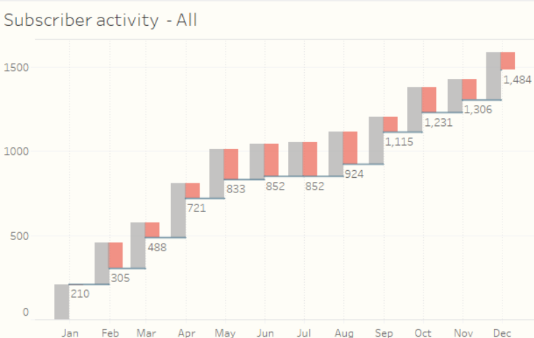
Combining my passion for coding and data, I wanted to recreate a data visualization in Tableau that I saw while reading and working on a SQL data analysis training course. This relates to having a view of a company's churn rate in relation to its subscribers.
You can visit the article: "The Churn Dashboard Explained" at www.datarevelations.com where the author Steve Wexler explains how he created the Churn Dashboard visualization in Tableau.Churn rate visualizations in Python

Figure 1. Original visualization proposed in Steve Wexler's article
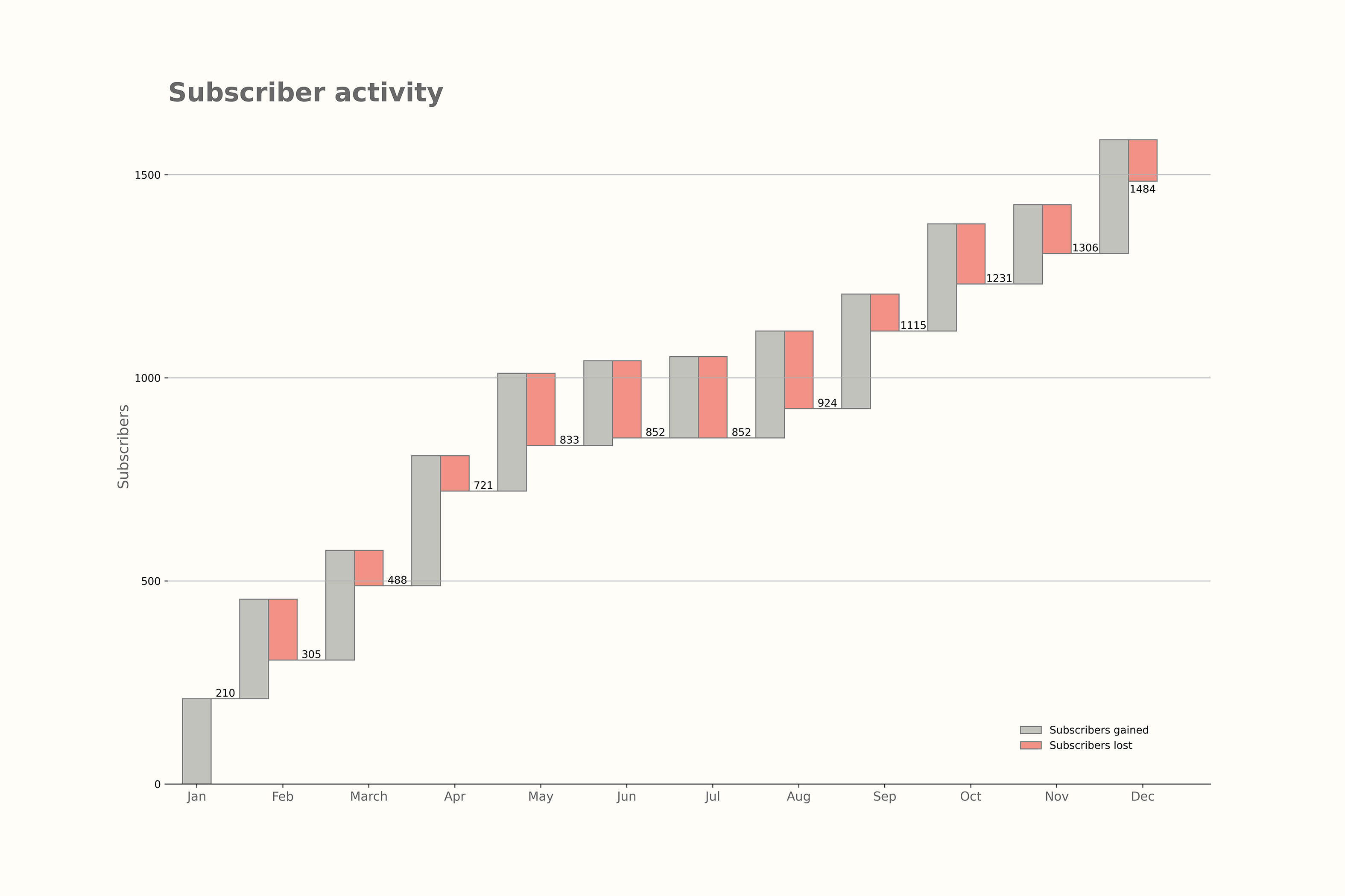
In this article, I will share with you the code and the result for the proposed waterfall/line chart visualization so as not to make the article too long.
At the end of the article, you can check both codes on my GitHub page and also the nbviewer links for the Jupyter notebooks.
Keep in mind that the code can certainly be improved, but I would like to share it in case someone like me wants to plot similar charts and could use this as a starting point, as I did not find too many examples online when I searched for this topic.
Let us take the same data from the reference to create the visualization for the churn rates from the reference. This is fictitious data on subscriber gain and loss over the course of a year, assuming that the company starts acquiring subscribers in January.

Table 1. Fictitious data on subscriber gain and loss
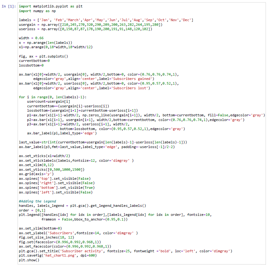
I used a couple of Numpy arrays to input the data. Due to the amount of data for the example, it is not necessary to read from .csv or other files.
From the code we will get the author's preferred visualization of the running totals.
I only added a few extras like the legend and some axis information, but I tried to replicate Steve's visualization in Tableau with a few lines in Python.
The power of Python in creating data visualizations is well known and here we can see it. I hope you enjoy this brief explanation of my code and find it useful. If you would like to see both examples, here are the GitHub links and the nbviewer links to the notebooks.
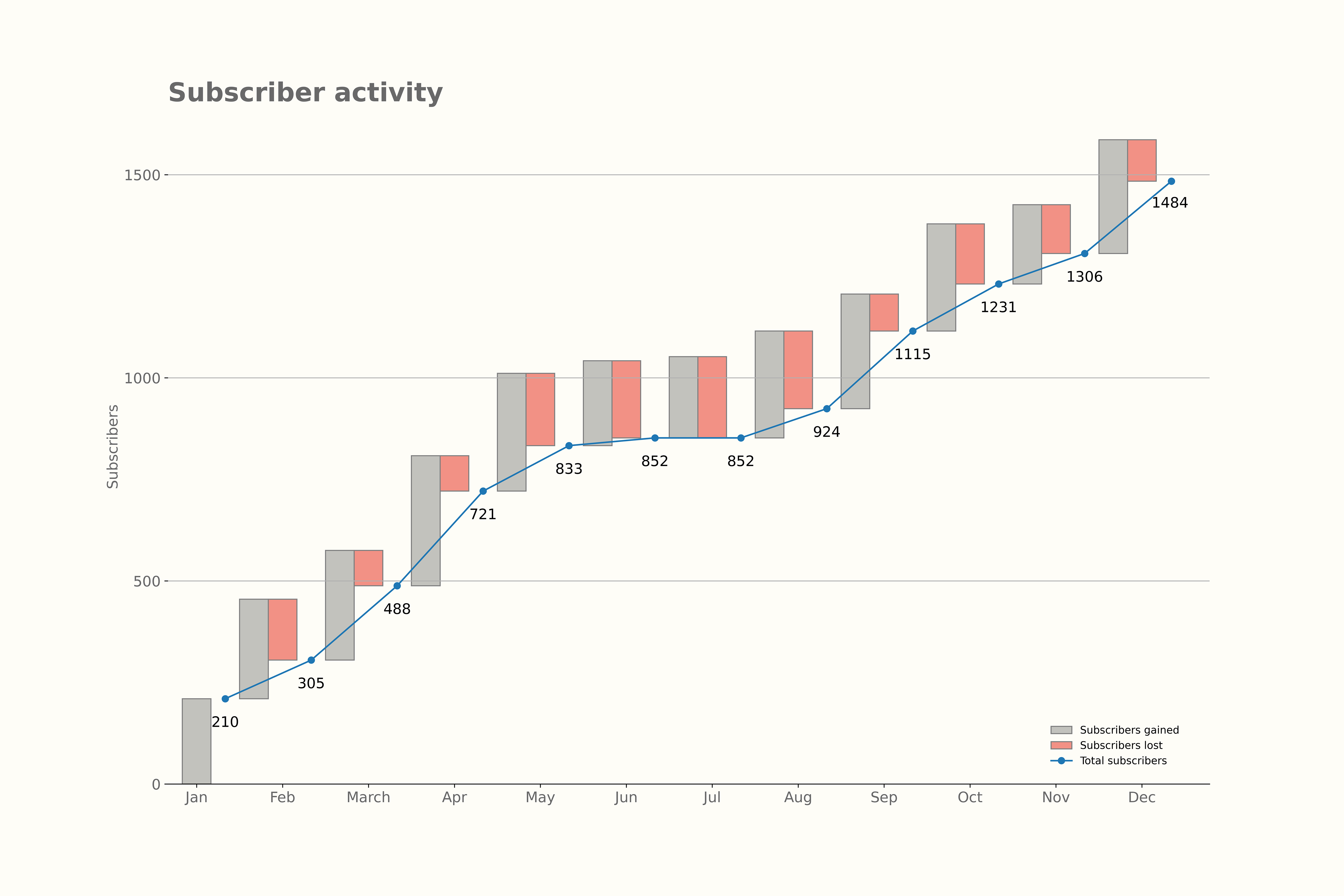
As a second option, I also checked the possibility of displaying a line chart for running totals, as shown below:

Figure 4. Second option for visualization
Please let me know in the comments if you enjoyed the article or found it interesting in any way..


