- What's New
- Component Description
- Installing
- Component Properties
- Events
- Procedures/Functions
- Link Tag
- Tab Tag
- Literal tag character
- Transparency (why not?)
- Formatted Message Dialog Component
-
02/21/2019
- Changed events to support Link display text.
⚠️
- Changed events to support Link display text.
-
02/11/2019
- Include auto install app
-
02/08/2019
-
Component renamed. Please full uninstall previous version before install this version.
⚠️ The component was renamed because of other commercial component conflict.
-
-
02/07/2019
- Add Win64 support (library folders changed!)
⚠️
- Add Win64 support (library folders changed!)
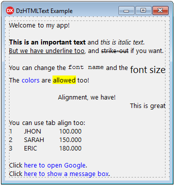
This visual component allows you to specify a formatted text in a label, using almost the same syntax used in HTML code.
Here are all possible tags you can use in text:
<A[:abc]></A> - Link
<B></B> - Bold
<I></I> - Italic
<U></U> - Underline
<S></S> - Strike out
<FN:abc></FN> - Font Name
<FS:123></FS> - Font Size
<FC:clColor|$999999></FC> - Font Color
<BC:clColor|$999999></BC> - Background Color
<BR> - Line Break
<L></L> - Align Left
<C></C> - Align Center
<R></R> - Align Right
<T:123> - Tab
<TF:123> - Tab with aligned break
The tags notation is case-insensitive, so you can use
<B>Text</B>or<b>Text</b>.
Note about color notation: When you use
FCorBCtags, the color in hexadecimal value is specified by 6 digits, like in HTML notation. If you are getting color from Delphi, please remove the first two zeros of the beginning of color code.
Close Delphi IDE and run CompInstall.exe app to auto install component into Delphi.
- Open DzHTMLText package in Delphi.
- Ensure Win32 Platform and Release config are selected.
- Then Build and Install.
- If you want to use Win64 platform, select this platform and Build again.
- Add sub-path Win32\Release to the Library paths at Tools\Options using 32-bit option, and if you have compiled to 64 bit platform, add sub-path Win64\Release using 64-bit option.
Supports Delphi XE2..Delphi 10.3 Rio
AutoHeight: Boolean = Auto set height of control when Text property changed
AutoWidth: Boolean = Auto set width of control when Text property changed.
If you are using AutoWidth, the text never wraps to a new line unless a line break is specified at text or there is a value specified in MaxWidth property.
AutoOpenLink: Boolean = Open links automatically on click over, without set event OnLinkClick.
This property calls ShellExecute method.
Color: TColor = Background color of control
Font: TFont = Determines the base font. When no tag is specified on text, this base font is used.
Lines: Integer = Returns the total lines of text, according to the bounds of control. This property is read-only.
MaxWidth: Integer = Specify the maximum width of text, when using AutoWidth property.
StyleLinkNormal: TDHStyleLinkProp = Properties to format a link when is not selected by mouse.
StyleLinkHover: TDHStyleLinkProp = Properties to format a link when is selected by mouse.
Text: String = The text you want to show at label control. You can use <BR> tag to break lines. The Windows default Line Break (#13#10) breaks lines either.
TextHeight: Integer = Returns the total text height. This property is read-only.
TextWidth: Integer = Returns the total text width. This property is read-only.
procedure OnLinkEnter(Sender: TObject; LinkID: Integer; LinkData: TDHLinkData);This event is fired when the mouse enters a link area
procedure OnLinkLeave(Sender: TObject; LinkID: Integer; LinkData: TDHLinkData);This event is fired when the mouse leaves a link area
procedure OnLinkClick(Sender: TObject; LinkID: Integer; LinkData: TDHLinkData; var Handled: Boolean);This event is fired when a link is left-clicked by the mouse. You can use Handled var to by-pass the AutoOpenLink property (the handled value is False at method start).
procedure OnLinkRightClick(Sender: TObject; LinkID: Integer; LinkData: TDHLinkData; var Handled: Boolean);This event is fired when a link is right-clicked by the mouse. You can use Handled var to by-pass the AutoOpenLink property (the handled value is False at method start).
function IsLinkHover: Boolean;This function returns true when the mouse is over a link
function SelectedLinkID: Integer;This function returns the ID of the selected link. This ID is auto generated according by the links sequence in the text. The ID is used to get the target string, that is stored in a internal TStringList.
function GetLinkData(LinkID: Integer): TDHLinkData;Returns TDHLinkData object of the link id. The ID is auto generated according by the links sequence in the text.
function GetSelectedLinkData: TDHLinkData;Returns TDHLinkData object of the selected link. A link is selected when the mouse is over it.
There are two ways to use link tag:
-
Declaring internal link and the text do display:
<a:www.google.com>Open Google Search</a>This will display: Open Google Search
-
Just using the display text:
<a>www.google.com</a>This will display: www.google.com
You can use any text as internal link code. Then you can handle this code at OnLinkClick / OnLinkRightClick / OnLinkEnter / OnLinkLeave events, reading
LinkDataparameter.
This object stores the information about a link.
Properties:
-
Target: String= The link target specified at<a:target>tag -
Text: String= The link display text specified at<a:target>Display Text</a>tag
You can retrieve this object using OnLinkClick / OnLinkRightClick / OnLinkEnter / OnLinkLeave events. Also you can call GetLinkData or GetSelectedLinkData.
There are two tab tags you can use:
-
<t:nnn>= Allow you to positioning text exactly on "nnn" position in pixels starting on the left border of component. If the text wraps to a new line, it will be return aligned at left border of component. -
<tf:nnn>= The same as above, but if the text wraps to a new line, it will be aligned in the same position as the first line which the tab started. This tag will produce a better visual text alignment.
If you want to display characters < and > in the text, just type the HTML code:
<=<>=>
The transparency option is not available for this component, because the text painted on canvas is not static. This means the canvas needs to change eventually, when mouse is over links. So this causes a lot of flickering. Because of that, the transparency is not available at this time.
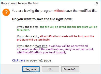
Please, take a look at my Message Dialogs Component that uses this HTML Component to display formatted messages. The component will make much more easy to manage your application messages.
https://github.com/digao-dalpiaz/Dam
Message Dialog Example:


