Note⚠️ : Updates have been stopped, and the original version of the jcenter library can continue to be used. It is recommended to directly download the source code and introduce the module into your own project for modification.


Precautions, detailed usage, update log, etc., please check Wiki Document
Wiki document, Wiki document, Wiki document!~ Say important things three times
If you have any questions or optimization suggestions on use, please join the QQ group to discuss and exchange technical issues.
Communication group 1: 387051294 (full)
Communication group 2: 219962328 (full)
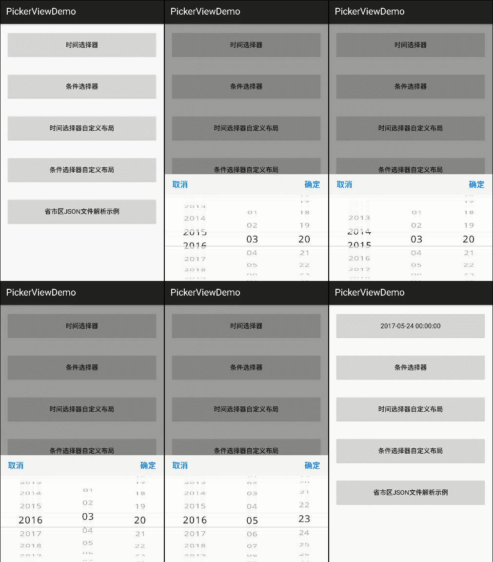
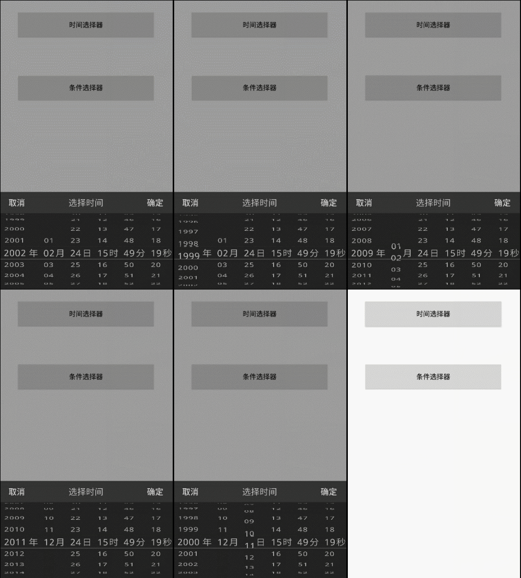
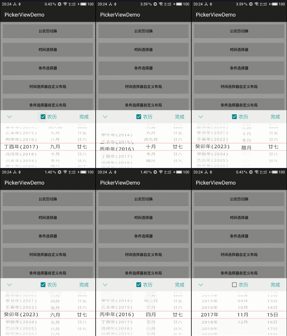
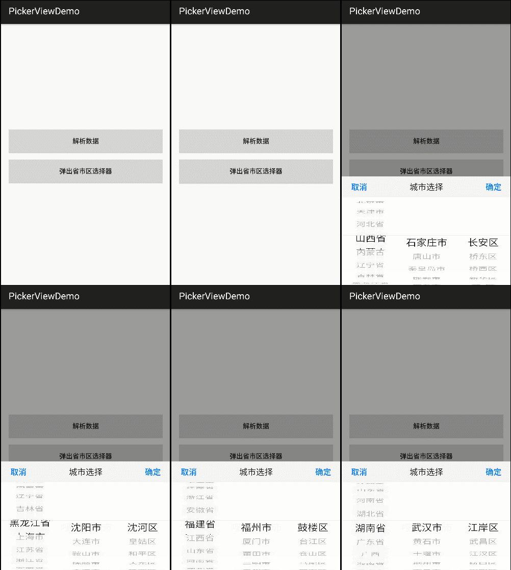
This is an iOS-like PickerView control with a time selector and option selector. The detailed features of the new version are as follows:
——TimePickerView time picker, supports year, month, day, hour and minute, year, month, day, year, month, hour and minute and other formats. ——OptionsPickerView option selector supports first, second and third level option selection, and can set whether to be linked.
- Support three-level linkage
- Set whether to link
- Set loop mode
- Support custom layout.
- Support item separator setting.
- Support item spacing setting.
- Time selector supports start and end date settings.
- Supports the display, hiding and customization of unit (label) options such as "year, month, day, hour, minute, second", "province, city, district" and other options.
- Support custom text, color, text size and other attributes
- When the text length of the Item is too long, the text will be adaptively scaled to the length of the Item to avoid the problem of incomplete display.
- Support Dialog mode.
- Support custom settings container.
- Real-time callback.
If you are interested in studying the implementation mechanism of the 3D scroll wheel effect and want to thoroughly study the source code, you can read this blog:
-
Note: When we set the starting position of the time, we need to pay special attention to the setting of the month.
-
Reason: The months inside the Calendar component start from 0, that is, 0-11 represents the months from January to December.
-
Incorrect use cases: startDate.set(2013,1,1); endDate.set(2020,12,1); *Correct use case: startDate.set(2013,0,1); endDate.set(2020,11,1);
- Fixed: The problem of lunar day occasionally crossing the boundary.
- Optimization: Fixed the problem of default capitalization in English and Chinese in the display layout.
- New: The maximum number of visible items provides API for developers to set. (setItemVisibleCount())
- Newly added: The transparency of the scroll wheel gradually changes from the middle to both sides, and provides switch API settings. (isAlphaGradient(true))
- New: Selected item circular dividing line style. (DividerType.CIRCLE)
- Update the gradle version, and change the wheelview basic library from compile to api dependency to avoid being unable to be introduced in gradle 5.0+ version.
- Fixed setTextXOffset assignment problem.
- Fixed the problem that when WheelView is initialized, the data is empty, resulting in height=0, causing it to not be displayed.
- Added a click event listening entry for the cancel button.
- Parameter annotations are added to standardize data types.
- The setBackgroundId method is abandoned and the updated method is named setOutSideColor.
For more historical version details, please check: [Update Log (4.x version)](https://github.com/Bigkoo/Android-PickerView/wiki/Update Log (4.x version))
For method names and parameters, please refer to: [Method name and parameter description document](https://github.com/Bigkoo/Android-PickerView/wiki/%E6%96%B9%E6%B3%95%E5 %90%8D%E4%B8%8E%E5%8F%82%E6%95%B0%E8%AF%B4%E6%98%8E%EF%BC%883.x%E7%89%88%E6 %9C%AC%EF%BC%89)
compile 'com.contrarywind:Android-PickerView:4.1.9'or
<dependency>
<groupId>com.contrarywind</groupId>
<artifactId>Android-PickerView</artifactId>
<version>4.1.9</version>
<type>pom</type>
</dependency>
//time selector
TimePickerView pvTime = new TimePickerBuilder(MainActivity.this, new OnTimeSelectListener() {
                            @Override
                            public void onTimeSelect(Date date, View v) {
                                Toast.makeText(MainActivity.this, getTime(date), Toast.LENGTH_SHORT).show();
                            }
                        }).build();
//Conditional selector
OptionsPickerView pvOptions = new OptionsPickerBuilder(MainActivity.this, new OnOptionsSelectListener() {
@Override
public void onOptionsSelect(int options1, int option2, int options3,View v) {
//Return the selected positions of three levels respectively
String tx = options1Items.get(options1).getPickerViewText()
+ options2Items.get(options1).get(option2)
+ options3Items.get(options1).get(option2).get(options3).getPickerViewText();
tvOptions.setText(tx);
}
}).build();
pvOptions.setPicker(options1Items, options2Items, options3Items);
pvOptions.show(); Calendar selectedDate = Calendar.getInstance();
Calendar startDate
= Calendar.getInstance();
//startDate.set(2013,1,1);
Calendar endDate = Calendar.getInstance();
//endDate.set(2020,1,1);
//Correct setting method Reason: Notes are explained
startDate.set(2013,0,1);
endDate.set(2020,11,31);
pvTime = new TimePickerBuilder(this, new OnTimeSelectListener() {
@Override
public void onTimeSelect(Date date,View v) {//Selected event callback
tvTime.setText(getTime(date));
}
})
.setType(new boolean[]{true, true, true, true, true, true})//Display all by default
.setCancelText("Cancel")//Cancel button text
.setSubmitText("Sure")//Confirm button text
.setContentSize(18)//Scroll wheel text size
.setTitleSize(20)//Title text size
.setTitleText("Title")//Title text
.setOutSideCancelable(false)//Click the screen and click on the outside range of the control, whether to cancel the display
.isCyclic(true)//Whether to scroll cyclically
.setTitleColor(Color.BLACK)//Title text color
.setSubmitColor(Color.BLUE)//Determine the button text color
.setCancelColor(Color.BLUE)//Cancel button text color
.setTitleBgColor(0xFF666666)//Title background color Night mode
.setBgColor(0xFF333333)//Scroll wheel background color Night mode
.setDate(selectedDate)//If not set, the default is system time*/
.setRangDate(startDate,endDate)//Start and end year, month and day setting
.setLabel("Year","Month","Day","Hour","Minute","Second")//The default setting is year, month, day, hour, minute and second
.isCenterLabel(false) //Whether to only display the label text of the middle selected item, if false, each item will have a label.
.isDialog(true)//Whether it is displayed as a dialog box style
.build();pvOptions = new OptionsPickerBuilder(this, new OptionsPickerView.OnOptionsSelectListener() {
@Override
public void onOptionsSelect(int options1, int option2, int options3,View v) {
//Return the selected positions of three levels respectively
String tx = options1Items.get(options1).getPickerViewText()
+ options2Items.get(options1).get(option2)
+ options3Items.get(options1).get(option2).get(options3).getPickerViewText();
tvOptions.setText(tx);
}
}) .setOptionsSelectChangeListener(new OnOptionsSelectChangeListener() {
@Override
public void onOptionsSelectChanged(int options1, int options2, int options3) {
String str = "options1: " + options1 + "\noptions2: " + options2 + "\noptions3: " + options3;
Toast.makeText(MainActivity.this, str, Toast.LENGTH_SHORT).show();
}
})
.setSubmitText("OK")//OK button text
.setCancelText("Cancel")//Cancel button text
.setTitleText("City Selection")//Title
.setSubCalSize(18)//Determine and cancel text size
.setTitleSize(20)//Title text size
.setTitleColor(Color.BLACK)//Title text color
.setSubmitColor(Color.BLUE)//Determine the button text color
.setCancelColor(Color.BLUE)//Cancel button text color
.setTitleBgColor(0xFF333333)//Title background color Night mode
.setBgColor(0xFF000000)//Scroll wheel background color Night mode
.setContentTextSize(18)//Scroll wheel text size
.setLinkage(false)//Set whether to link, default is true
.setLabels("Province", "City", "District")//Set the selected third-level unit
.isCenterLabel(false) //Whether to only display the label text of the middle selected item, if false, each item will have a label.
.setCyclic(false, false, false)//Cycle or not
.setSelectOptions(1, 1, 1) //Set the default selected items
.setOutSideCancelable(false)//Click external dismiss default true
.isDialog(true)//Whether it is displayed as a dialog box style
.isRestoreItem(true)//Whether to restore when switching, set the first item to be selected by default.
.build();
pvOptions.setPicker(options1Items, options2Items, options3Items);//Add data source // Note: In the custom layout, the layout with the ID of optionspicker or timepicker and its sub-controls must be present, otherwise a null pointer will be reported.
// For details, please refer to the two custom layouts in the demo
pvCustomOptions = new OptionsPickerBuilder(this, new OptionsPickerView.OnOptionsSelectListener() {
@Override
public void onOptionsSelect(int options1, int option2, int options3, View v) {
//Return the selected positions of three levels respectively
String tx = cardItem.get(options1).getPickerViewText();
btn_CustomOptions.setText(tx);
}
})
.setLayoutRes(R.layout.pickerview_custom_options, new CustomListener() {
@Override
public void customLayout(View v) {
//Control initialization and event handling in custom layout
final TextView tvSubmit = (TextView) v.findViewById(R.id.tv_finish);
final TextView tvAdd = (TextView) v.findViewById(R.id.tv_add);
ImageView ivCancel = (ImageView) v.findViewById(R.id.iv_cancel);
tvSubmit.setOnClickListener(new View.OnClickListener() {
@Override
public void onClick(View v) {
pvCustomOptions.returnData(tvSubmit);
}
});
ivCancel.setOnClickListener(new View.OnClickListener() {
@Override
public void onClick(View v) {
pvCustomOptions.dismiss();
}
});
tvAdd.setOnClickListener(new View.OnClickListener() {
@Override
public void onClick(View v) {
getData();
pvCustomOptions.setPicker(cardItem);
}
});
}
})
.build();
pvCustomOptions.setPicker(cardItem);//Add dataPlease click me to view the demo code
6. If you only need the WheelView basic control to extend the implementation logic by itself, you can directly add the basic control library, Gradle depends on:
compile 'com.contrarywind:wheelview:4.1.0'xml layout:
  <com.contrarywind.view.WheelView
             android:id="@+id/wheelview"
             android:layout_width="match_parent"
             android:layout_height="wrap_content" />
Java code:
WheelView wheelView = findViewById(R.id.wheelview);

         wheelView.setCyclic(false);

         final List<String> mOptionsItems = new ArrayList<>();
         mOptionsItems.add("item0");
         mOptionsItems.add("item1");
         mOptionsItems.add("item2");

         wheelView.setAdapter(new ArrayWheelAdapter(mOptionsItems));
         wheelView.setOnItemSelectedListener(new OnItemSelectedListener() {
             @Override
             public void onItemSelected(int index) {
                 Toast.makeText(MainActivity.this, "" + mOptionsItems.get(index), Toast.LENGTH_SHORT).show();
             }
         });
Rendering (They use my library for the condition selector in the "Pocket Life" of China Merchants Bank Credit Card, you can use it as a reference for actual projects)
- WheelView
- androidWheelView
Copyright 2014 Bigkoo
Licensed under the Apache License, Version 2.0 (the "License");
you may not use this file except in compliance with the License.
You may obtain a copy of the License at

    http:https://www.apache.org/licenses/LICENSE-2.0

Unless required by applicable law or agreed to in writing, software
distributed under the License is distributed on an "AS IS" BASIS,
WITHOUT WARRANTIES OR CONDITIONS OF ANY KIND, either express or implied.
See the License for the specific language governing permissions and
limitations under the License.


