Skip to content
New issue

Have a question about this project? Sign up for a free GitHub account to open an issue and contact its maintainers and the community.

By clicking “Sign up for GitHub”, you agree to our terms of service and privacy statement. We’ll occasionally send you account related emails.

Already on GitHub? Sign in to your account

Heatmap: hue gradient instead of saturation #5864

Closed
7 tasks
davidak opened this issue Jan 26, 2019 · 43 comments
Closed
7 tasks

Heatmap: hue gradient instead of saturation #5864

davidak opened this issue Jan 26, 2019 · 43 comments
Labels
issue/confirmed Issue has been reviewed and confirmed to be present or accepted to be implemented topic/ui Change the appearance of the Gitea UI

Comments

@davidak
Copy link

davidak commented Jan 26, 2019

  • Gitea version (or commit ref): 1.7
  • Git version:
  • Operating system:
  • Database (use [x]):
    • PostgreSQL
    • MySQL
    • MSSQL
    • SQLite
  • Can you reproduce the bug at https://try.gitea.io:
    • Yes (provide example URL)
    • No
    • Not relevant
  • Log gist:

Description

GitHub is perfect.

Screenshots

Gitea

screenshot from 2019-01-26 17-44-33

GitHub

screenshot from 2019-01-26 17-44-53

GitLab

screenshot from 2019-01-26 17-45-23

@zeripath
Copy link
Contributor

I'm not sure. I've never quite been able to understand GitHubs hue gradient - saturation seems intuitive to me.

@davidak
Copy link
Author

davidak commented Jan 27, 2019

@zeripath darker color means more activity. I think that's commonly used for visualization.

The current implementation seems too simple in that space.

It looks too dark and feels depressing to me. It should have the bright green of the logo included.

@0x5c
Copy link
Contributor

0x5c commented Jan 27, 2019

Ah yes, that's the problem that I was having with it, without knowing what it was.

I might be able to make a palette today.

@0x5c
Copy link
Contributor

0x5c commented Jan 27, 2019

Okay, so I took a look at the three palettes, and they all are gradient on hue, saturation, and value.
What seems to be different is the curves done on the colour-picker; GitHub and GitLab both do a curve towards the saturated/high-value corner, while Gitea does a curve in the opposite direction.

@0x5c
Copy link
Contributor

0x5c commented Jan 27, 2019

I've done some work on colouring

Current palette

Proposed palette n°1

Partial, not really suitable as-is.

Proposed palette n°2

Those proposition only contain 5 colours; it is assumed that the first one is the current (#F4F4F4).
The Gitea colour (#609926) is included in both, at the before-last position.
Feel free to modify or expand on these.

@davidak
Copy link
Author

davidak commented Jan 27, 2019

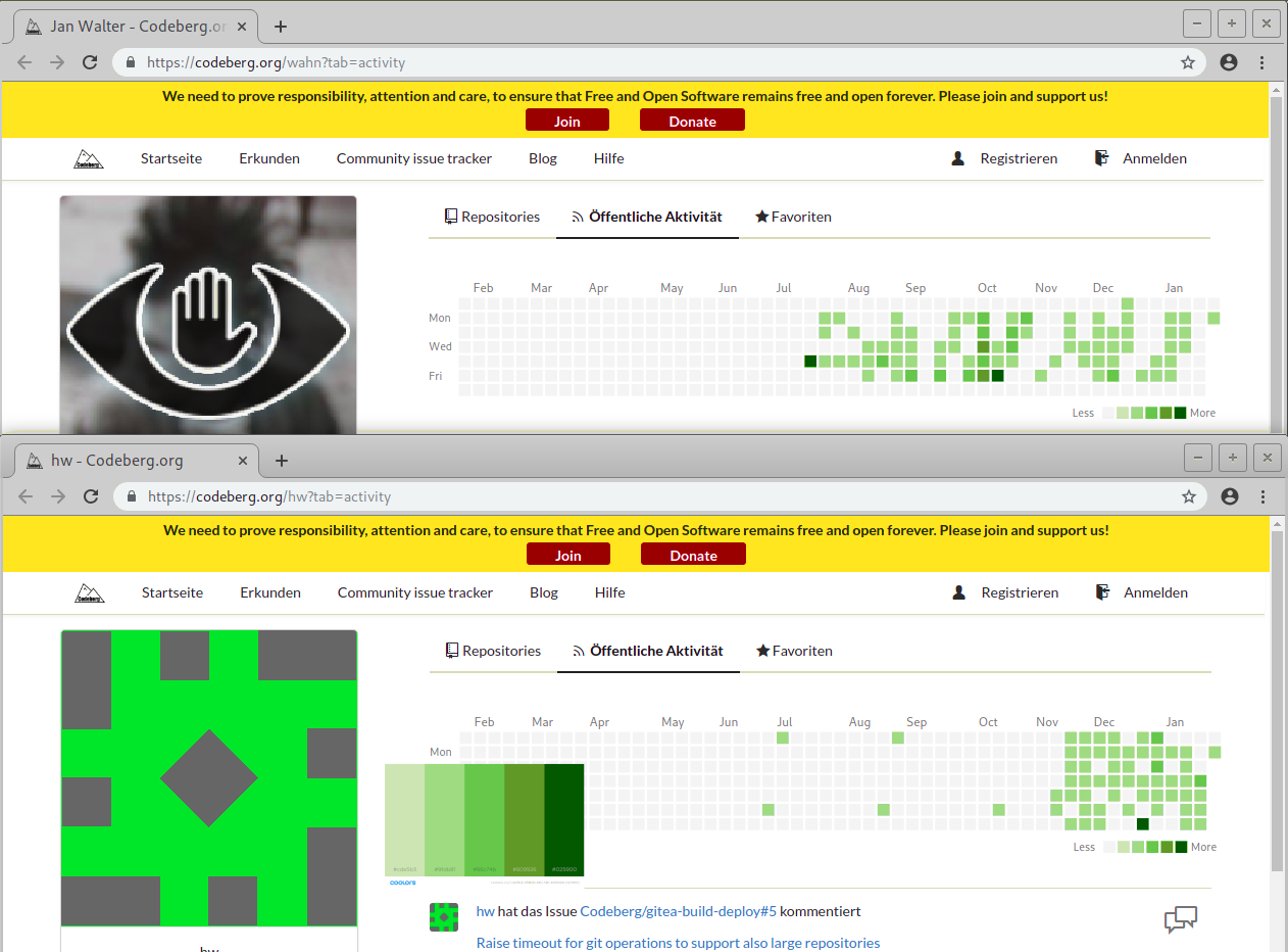
@0x5c thank you!

The gradient in the first palette looks a bit hard. The color in the middle looks very unnatural. Maybe that is what you mean with "not suitable as-is".

The seconds palette looks great! Could you try it out with the actual heatmap in the browser?

Here are profiles i found with actual activity:

https://codeberg.org/hw?tab=activity
https://codeberg.org/wahn?tab=activity

@0x5c
Copy link
Contributor

0x5c commented Jan 28, 2019

No problem!
I'll try it, and maybe tweak prop2 a slight bit.
As for prop1, this is exactly what I meant, but I included it as a possible starting point for someone else, as it's what I used as a base for prop2.

@0x5c
Copy link
Contributor

0x5c commented Jan 28, 2019

Ewwwwww
So the boxes are not coloured by CSS styles, which means I'll have to manually replace the colours.

@davidak
Copy link
Author

davidak commented Jan 28, 2019

@0x5c maybe just take a screenshot and replace color with gimp or so...

@0x5c
Copy link
Contributor

0x5c commented Jan 28, 2019

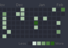
I have not yet been able to try recoloring, but I suspect that it will cause problems as the squares are somehow anti-aliased (why?).

I was able, however, to create this 3rd version, which now follows an entirely convex curve.

Proposed palette n°3

@davidak
Copy link
Author

davidak commented Jan 28, 2019

@0x5c 3. looks good!

I just used GIMPs replace color tool on a screenshot. Looks perfect!

screenshot from 2019-01-28 17-55-32

When it's this small and i go back 1 meter from the display, the contrast is not that high. I can hardly tell a difference between the 2. and 3. color. I think it's a little better on GitHub since it's a different color tone.

@0x5c
Copy link
Contributor

0x5c commented Jan 28, 2019

Oh nice!
I see what you mean for colour 2/3, but I don't think that it would be that much of a problem?
I could try a slight variation on colour 2 (one in the palettes).

@0x5c
Copy link
Contributor

0x5c commented Jan 28, 2019

Palette proposition v4

Slightly tweaked the first one from #cde5b3 to #d8efbf.
(actual first is still #f4f4f4)

@davidak
Copy link
Author

davidak commented Jan 28, 2019

Yeah, it might not be a problem. Already a huge improvement to the current colors.

@0x5c
Copy link
Contributor

0x5c commented Jan 29, 2019

Welp
The colours are auto-generated by cal-heatmap, which seems to have no concept of humans are supposed to see this.
It takes two colours, and then proceeds to create the most eye-stabbing gradient possible. It's also the reason why the heatmap squares have fudgy edges, even on the showcase site.

I do not see how, using this library, the colours of the heatmap could be fixed.

Edit:
Note that github uses absolute and defined values (the ones in the legend) for the colours.

@davidak
Copy link
Author

davidak commented Jan 29, 2019

@0x5c so, when there is no better library we have to submit bugreports upstream and maybe find someone who can fix it. It could optionally be possible to set the colors manually.

@zeripath
Copy link
Contributor

Looking at the upstream if we just don't set the legendColors we should be able to use the .q1-.q5 css to set the colors

@0x5c
Copy link
Contributor

0x5c commented Jan 29, 2019

Seems to be an issue of how thing are done (upstream, that is).
As for better libraries, I think that the issues is of actually choosing, as there seems to be a ton of heatmap libraries that use the exact same dataset (would only need changes on the client side).

@0x5c
Copy link
Contributor

0x5c commented Jan 29, 2019

Nice of the upstream documentation to making this clear 😅.

@zeripath
Copy link
Contributor

Actually I think it's not q1 but in here:

.heatmap-color-0 {

@0x5c
Copy link
Contributor

0x5c commented Jan 29, 2019

If the palette I proposed is liked, I'd like to attempt making a PR, although I could need pointers on how to tackle Gitea's code.

@zeripath
Copy link
Contributor

So simply changing those 6 classes should do it?

@zeripath
Copy link
Contributor

zeripath commented Jan 29, 2019

@0x5c I think would be a quite simple PR - just change the less code, commit and put up a pr with screenshots of what it used to look like and what it now looks like.

@0x5c
Copy link
Contributor

0x5c commented Jan 29, 2019

That's if changing the values is actually possible.
Still looking at the docs

@zeripath
Copy link
Contributor

Changing the values in the less file, then run make generate-stylesheetsshould do it afaics

@0x5c
Copy link
Contributor

0x5c commented Jan 29, 2019

Okay, so

Each colors correspond to a CSS class, formatted like .q{n}.

That's clearly definable in CSS, which means that

@zeripath
Copy link
Contributor

At least in master we're actually using the vue-calendar-heatmap module rather than that cal-heatmap package.

@0x5c
Copy link
Contributor

0x5c commented Jan 29, 2019

What? Where is the PR for that?

@jolheiser
Copy link
Member

#5401

@davidak
Copy link
Author

davidak commented Jan 29, 2019

You can also change it via CSS: https://github.com/go-gitea/gitea/pull/5401/files#diff-55ceecf712d36e64d0cc61b96617263aR609

@zeripath
Copy link
Contributor

Those are actually less files so you then need to generate-stylesheet but yes.

@0x5c
Copy link
Contributor

0x5c commented Jan 29, 2019

Simple PR then :)
Would setting up a dev environment be required? Edit: When I think, things become clear: TESTING

@zeripath zeripath added the topic/ui Change the appearance of the Gitea UI label Jan 29, 2019
@cdlm
Copy link
Contributor

cdlm commented Feb 11, 2019

Please take care of reversing the palette in the dark theme, so that higher contrast to the background color (more visual pop) signifies more contributions. I've just updated to 1.7.1 and it's backwards :-)

gitea arc-theme backwards heatmap gradient

@0x5c
Copy link
Contributor

0x5c commented Feb 11, 2019

The dark theme will need its own palette

@zeripath
Copy link
Contributor

How's things with this? Are you ready for a pr? I know the deadline for 1.8 is coming up so if want this change in 1.8 a PR is needed soon.

@0x5c
Copy link
Contributor

0x5c commented Feb 13, 2019

I had massive issues with my computer, but that is solved now. I will be working on that today.

@kolaente
Copy link
Member

kolaente commented Apr 9, 2019

@0x5c Any updates on this?

@stale
Copy link

stale bot commented Jun 8, 2019

This issue has been automatically marked as stale because it has not had recent activity. It will be closed if no further activity occurs during the next 2 weeks. Thank you for your contributions.

@stale stale bot added the issue/stale label Jun 8, 2019
@lafriks lafriks added the issue/confirmed Issue has been reviewed and confirmed to be present or accepted to be implemented label Jun 8, 2019
@stale stale bot removed the issue/stale label Jun 8, 2019
@0x5c
Copy link
Contributor

0x5c commented Jun 9, 2019

Oh damn, I had forgotten about this.

@MayMeow
Copy link
Contributor

MayMeow commented Oct 27, 2019

I have implemented this on https://kittyverse.co/may?tab=activity (you can check). Implemented is palette 4. If its ok i can make pull request. or implemetn any other palette. :)

@davidak
Copy link
Author

davidak commented Oct 27, 2019

@MayMeow looks good. please create a PR.

@0x5c
Copy link
Contributor

0x5c commented Oct 31, 2019

Oh damn, I had forgotten about this.

Thank you for making the PR :)

@MayMeow
Copy link
Contributor

MayMeow commented Nov 6, 2019

@0x5c @cdlm Sorry about that :) i didnt used dark theme so i didnt know

cdlm added a commit to cdlm/gitea that referenced this issue Nov 6, 2019
This uses the same colors as the updated palette in the base theme.

See go-gitea#8709 and go-gitea#5864, in particular [my comment showing the problem](go-gitea#5864 (comment))
sapk pushed a commit that referenced this issue Nov 6, 2019
* Theme arc-green: reverse heatmap colors

This uses the same colors as the updated palette in the base theme.

See #8709 and #5864, in particular [my comment showing the problem](#5864 (comment))

* Rebuild CSS

* Use link color as hot, interpolate between hot and cold colors

* Use color from a:hover
@github-actions github-actions bot locked as resolved and limited conversation to collaborators Nov 8, 2023
Sign up for free to subscribe to this conversation on GitHub. Already have an account? Sign in.
Labels
issue/confirmed Issue has been reviewed and confirmed to be present or accepted to be implemented topic/ui Change the appearance of the Gitea UI
Projects
None yet
Development

No branches or pull requests

9 participants