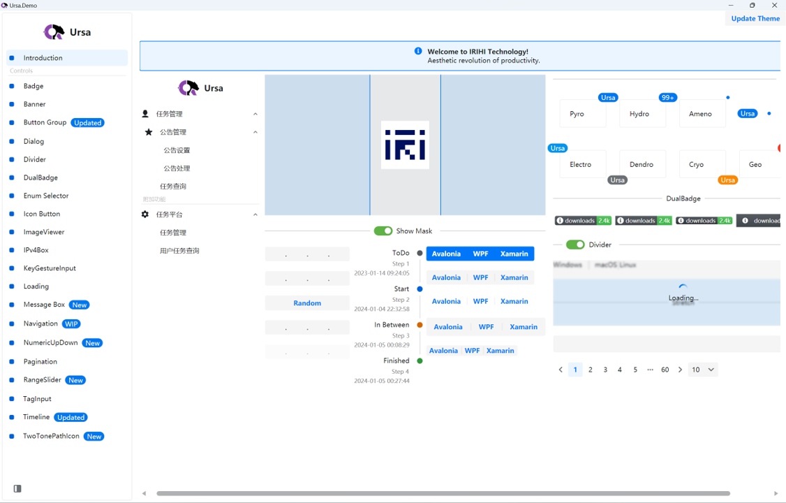
Ursa is a UI library for building cross-platform UIs with Avalonia UI.
- Ursa
Add nuget package:
dotnet add package Irihi.Ursa --version 0.2.0-beta20240129You can now use Ursa controls in your Avalonia Application.
<Window
    ...
    xmlns:u="https://irihi.tech/ursa"
    ...>
    <StackPanel Margin="20">
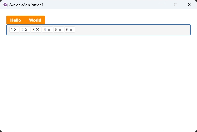
        <u:ButtonGroup Classes="Solid Warning">
            <Button Content="Hello" />
            <Button Content="World" />
        </u:ButtonGroup>
        <u:TagInput />
    </StackPanel>
</Window>- Ursa.Themes.Semi
To make Ursa controls show up in your application, you need to reference to a theme package designed for Ursa. Ursa.Themes.Semi is a theme package for Ursa inspired by Semi Design. You can add it to your project by following steps.
Add nuget package:
dotnet add package Semi.Avalonia --version 11.0.7
dotnet add package Irihi.Ursa.Themes.Semi --version 0.2.0-beta20240129
Include Styles in application:
<Application...
    xmlns:u-semi="https://irihi.tech/ursa/themes/semi"
    ....>

    <Application.Styles>
        <StyleInclude Source="avares:https://Semi.Avalonia/Themes/Index.axaml" />
        <u-semi:SemiTheme Locale="zh-CN"/>
    </Application.Styles>
