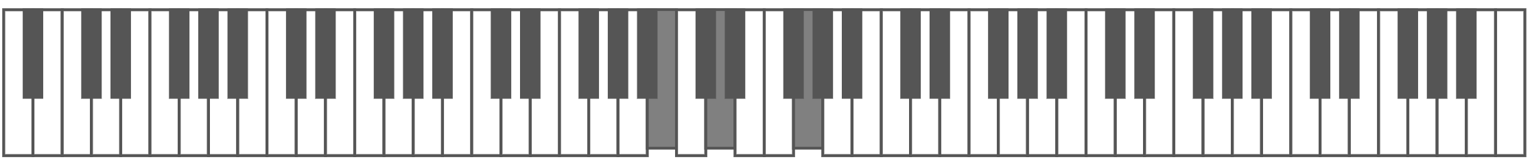
Piano Keys is a web component that renders a piano keyboard layout. It aims to be as flexible as possible, some of the things you can do with it are:
- Render any number of keys and any keyboard layout
- Programmatically trigger note up/down effects
- Click on a key to 'play' it
- Customize the component's look and feel
The keyboard is rendered as SVG so scales to work well at any size.
Refer to the full Examples & code samples to see the full range of what's possible.
To set up, all you need to do is import the script, you can then use the piano-keys tag
<script src="https://unpkg.com/[email protected]/dist/index.umd.min.js"></script>
<piano-keys layout="C" keys=61></piano-keys>To use with NPM simply add the module and then import it, you will then be able to use the component in your app.
# Install with yarn
yarn add piano-keys-webcomponent-v0

# Install with npm
npm install piano-keys-webcomponent-v0
import "piano-keys-webcomponent-v0";<piano-keys layout="C" keys=61></piano-keys>If you're using typescript and want to call methods on the component, you can import
the PianoElement interface and use it like so:
import {PianoElement} from "piano-keys-webcomponent-v0/dist/piano";
const piano = document.getElementById("piano") as PianoElement;
piano.setNoteDown("C", 4)The component supports the following HTML attributes
| Attribute | Default | Description |
|---|---|---|
| key-count | 88 | Number of keys to render. |
| keyboard-layout | A | Note to start rendering from |
| read-only | off | Set attribute to disable clicking on notes |
The component omits the following custom events
| Attribute | Detail | Description |
|---|---|---|
| note-down | note: string, octave: number | Key received mousedown event |
| note-up | note: string, octave: number | Key received mouseup event |
These methods are available after to call programmatically, i.e.
document.getElementById("piano").setNoteDown("C", 4);Sets the state of the note to pressed or not
setNoteDown(note: string, octave: number)Sets the state of the note to not be pressed
setNoteUp(note: string, octave: number)Styling can be overridden with CSS variables, simply apply them to the component like so:
piano-keys {
    --natural-key-color: blue
}| Variable | Description |
|---|---|
| --natural-key-color | Fill color of the natural keys |
| --natural-key-outline-color | Border color of the natural keys |
| --sharp-key-color | Fill color of the sharp keys |
| --sharp-key-outline-color | Border color of the sharp keys |
| --depressed-key-color | Color of keys when they are pressed |
| --depressed-key-transform | Transformation to run when key is pressed |