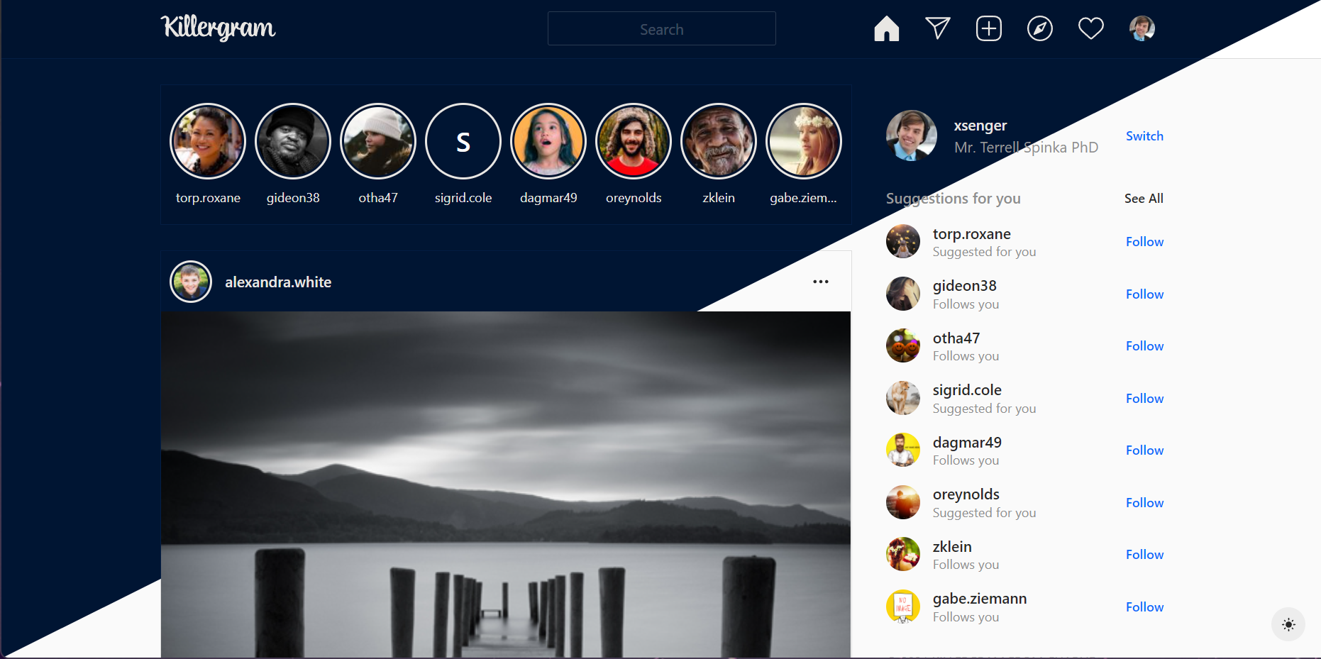
Killergram is simple clone of the Instagram UI, powered by React, Chakra-UI, and TypeScript.
- Clone the repository:
- SSH
git clone [email protected]:cpoliver/killergram.git - HTTPS
https://github.com/cpoliver/killergram.git
- SSH
- Install the dependencies:
cd ./killergram && yarn - Build and run the App
yarn start
- Build and run storybook
yarn storybook
- Node v14.17.6
- yarn v1.22.11
- Live App
- Live Storybook
- Storybook (via Chromatic)
- GitHub Repo
- Trello Board
- HedgeDoc
- LinkedIn Profile
- Chakra UI
- Accessibile by design
- Themeable
- Light wrapper around Flexbox/CSS Grid
- Pre-built and battle tested atomic components - why reinvent the wheel?
- Storybook
- Serves as "living documentation"
- Integrates with Chromatic for seamless visual regression testing
- Great developer experience. Work on one component in isolation
- Create React App
- Fast, first-party way to bootstrap a new React App
- React Query / Axios / Mock Service Worker
- nice APIs, caching, IE11 compatibility
- Accessible
- Chakra UI components
- Markup landmarks, aria-label, alt tags
- Keyboard navigation
- Theming
- Ensure consistency with design system
- Dark Mode (branded with Boolean colors)
- Code Quality Tooling
- Husky: pre-commit/pre-push hooks
- TypeScript
- Eslint (custom configuration pulled in via npm)
- Details
- Interactive reply field on posts
- Togglable like/save buttons on posts
- Icon svgs taken from Instagram
- Cursor hover states/text underlines matched to real Instagram site
- Loading skeleton components
- Deterministically generate avatars from the username for more variety
- Color mode-aware custom favicon (doesn't change with color mode switcher, uses the system color mode)
- Create Trello board
- Identify components to build
- Setup app and tooling
- Remove boilerplate
- Project structure
- Linting
- Pre-commit/pre-push hooks (husky)
- Add dependencies
- Add Storybook
- Mock API Data
- Create components
- Create/integrate app/views to API (or Mock API in Storybook)
- Publish
- Finish documentation (some was as I went along)
- Make the app fully-responsive. If this were a real project, I'd have built it mobile-first.
- Add tests (Not too many. Mostly integration.)
- Add translations for react-i18next - currently the i18n library is configured, but no translations have been added
- Structure app by feature - currently everything is in src/components, however Storybook groups the stories by feature
- Windows 11 (Home Insider Preview, build 22463.1000)
- Chromium (Brave, Edge, Vivaldi)
- Firefox
- macOS 11.6 (build 20G165)
- Chromium (Brave, Edge, Vivaldi)
- Safari
- Firefox
- Linux (Arch, rolling release, kernel version 5.13.13)
- Chromium (Brave, Edge, Vivaldi)
- Safari
- Firefox
