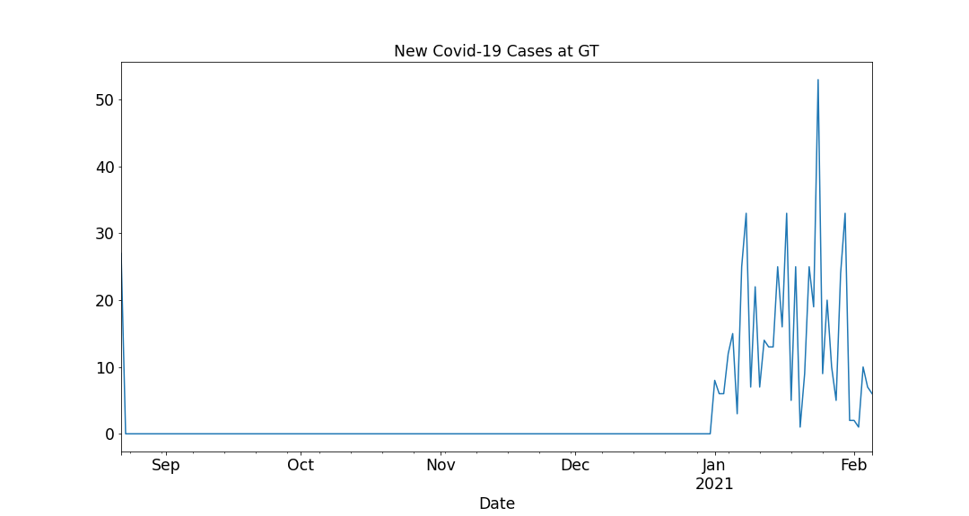
So I've been following http:https://health.gatech.edu/coronavirus/health-alerts to see how safe campus is, but it's kinda hard to actually see what's going on simply from the tables. Let's vizualize it! (Note these charts are automatically updated every 12 hours)
An intuitive way to gauge contagiousness on campus is by looking at the new daily new cases:
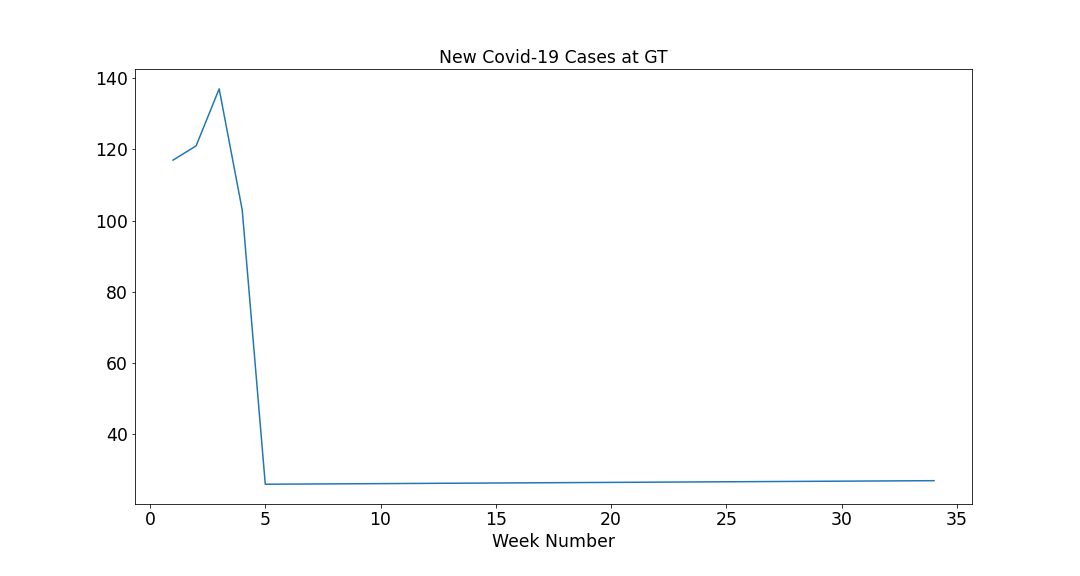
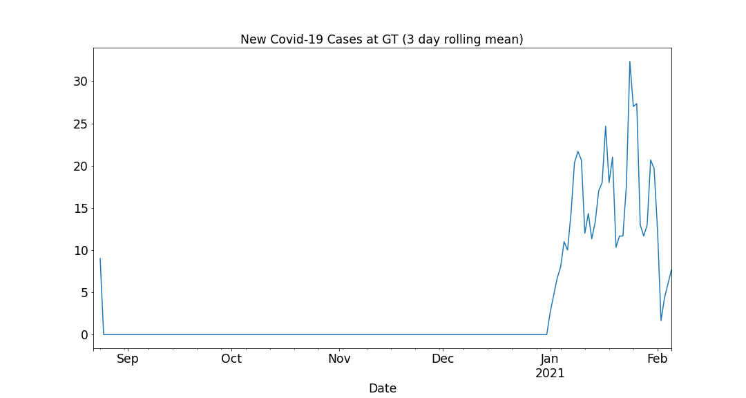
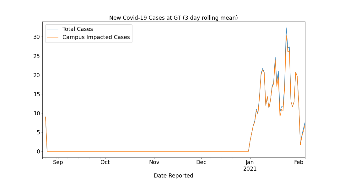
It's a bit noisy so we can smooth it out. Here's a 3-day moving average, as well as a weekly tally:
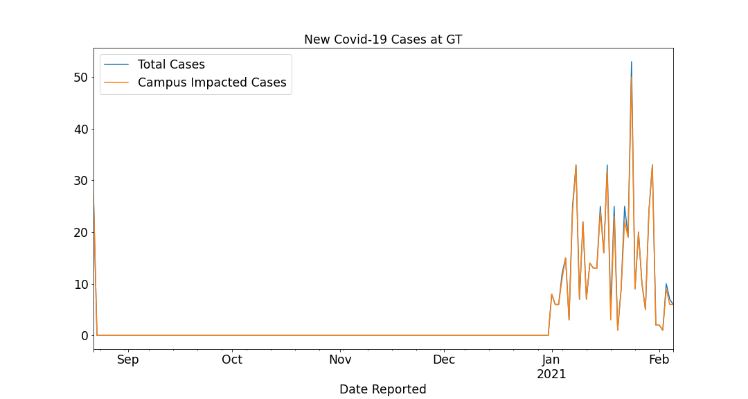
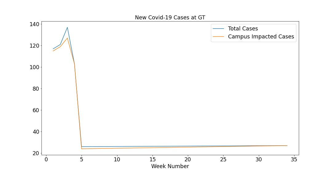
What really matters is campus impact. We can filter out all of the non-campus impacted (the heuristic of removing all cases where "impact" is in the "Campus Impact description works for now). Here are all of the above charts with the Campus Impact cases overlaid.
I'll be updating this later with more charts... If you have any suggestsions open an issue or send me an email at [email protected]