Hi guys,
I am Abdullah Baş. Today I will talk about some of the visualization techniques. But first let me start with the tradition.
Ulu çınarlar fırtınalı diyarlarda yetişir.-Cemil Meriç -"Great plane trees grow in stormy lands"
I will continue data visualization on deep learning models and medical images. Also I will publish MATLAB version of this repo soon
Let's start with the line plots. These are quite useful when trying to show the effects of something or changes among time or other streams. Nearly all of the plots are demonstrated on the iris dataset. All of the plots, codes that are shown, in the following and even more are present in this repo
Area plot is the one of the most using line plots.

Actually, this plot arguably the most used plot in history. FM, FIFA, PES, and many games have been widely used in this plot. Besides all of that this is the plot that I am most familiar with-of course because of FIFA- . I am sorry academia but this plot belongs to the gamers… Sad story..

Following visualization is for demonstration of subplots

You can see the lines that I focus are colored but the other ones are shaded.

#Violin Plot
These plots are very similar to box plots.
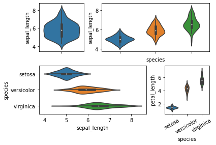
These plots are very useful plots on investigation of data summary.

These plots are very useful while investigating sequential features like DL model hyperparameters.


I want to give credit to the documentation of matplotlib seaborn and pandas.
Also I want to give credit to the python graph gallery WormHole to Graph Gallery and also Yan Holtz Linkedin