Enforce a default icon size to allow flex alignment + fix unaligned labels #9828
Conversation
|
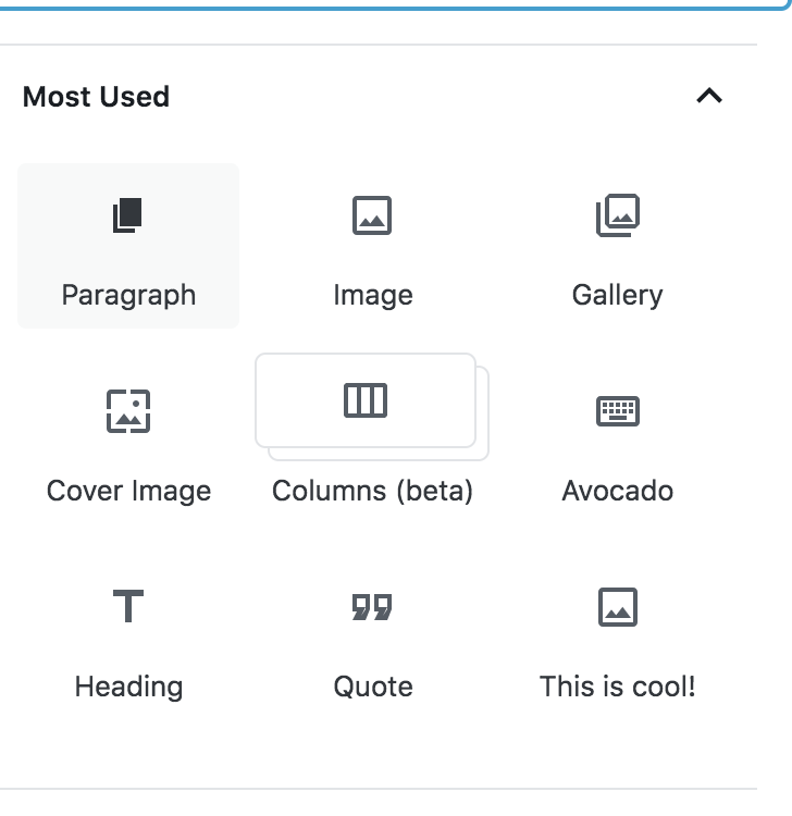
Here are a few "after" screenshots, although ideally the "after" is nearly identical to the "before" :)
|


 chrisvanpatten
changed the title
chrisvanpatten
changed the title
|
I also want to add, in the interest of full transparency, that we could technically make this work without allowing devs to add SVGs smaller than 24px. It would just mean modifying const appliedProps = {
...icon.props,
width: icon.props.width || 24,
height: icon.props.height || 24,
};
return <AccessibleSVG { ...appliedProps } />;to this: const appliedProps = {
...icon.props,
width: 24,
height: 24,
};
return <AccessibleSVG { ...appliedProps } />;That's genuinely the only difference: allowing a block to provide their own width/height, vs overriding it. Otherwise, there's nothing in the CSS that is there to explicitly support custom sized icons. So it is technically possible to accomplish the label alignment fix without fixing #9243. But the fix itself is so small, and doesn't impact CSS at all, and I couldn't resist adding it and testing the waters 😁 |
|
You present a solid, solid argument. PR is working amazingly well, btw:
I absolutely think this PR should be merged. Zero objections. The code seems solid to me (though might want to expand the review range to gutenberg/core for an extra sanity check). But yes, there is the aspect of icon sizing too ;) and I hope you'll think it's fair that I boil it down to this: should we be agnostic about what icons developers can use for their blocks? Or should we enforce icon sizes to encourage consistency? Let me ask a few quick questions:
You can see where I'm going with this. I'm not suggesting every icon should be a material icon, or even a gridicon. I'm not suggesting we should discourage 3rd party icon designs. I'm suggesting that we have a responsibility for the next ten years of WordPress to ensure some good ground rules that can encourage great block icons, and discourage abuse. What do you think? |
It will be downscaled to 24x24, but the same will actually happen in
I'm totally okay with this, and doing it would mean the 12x12 icon would be scaled up to 20x20! |
That works for me. Flagging for some additional design thoughts and then we have a path forward! Thanks for your patience and resilience. |
|
Thanks @jasmussen! I've updated the PR and also added a spot of inline documentation. (Also, where does one get the Avocado block? Sounds delicious… 🥑) One final thought is that with the SVGs it is possible that someone could add a custom class to their SVG and mess around with it via CSS. I don't think it's necessarily right for this PR to address that, but I think it would be theoretically possible to do what I did with width/height defaults for the |
Well, avocado is the key ingredient in guacamole. And I've recently been testing a PR by Riad that is so cool, I would call it holy guacamole. :D |
|
I've just updated this to accommodate the changes from #9687, and updated the new |
There was a problem hiding this comment.
This all looks good, but why bother with the tiny leeway (20px-24px) in this PR? Why not just make 24px the size and be done with it. The code complexity to accommodate a minor visual inconsistency when we could just say "icons are 24px" and be done with it seems too much.
I say we go for the "size everything down/up to 24px" approach. If a developer ships an icon smaller than 24px we'll upsize it and it might look blurry but at least it'll be consistent.
Otherwise the approach seems good though, so once we just go with 24px I'm cool to ship this.
|
@tofumatt because you can't size icons at 24px, that's the whole point. You need a 2px consistent padding/spacing around the icon, which material icons do by default, but most other icon systems don't. |
|
This is from the material design docs:
This is designed to make it easier to use an icon that was prepared without that spacing, which I think is onerous for all the reasons listed here. For further clarification, upsizing to 24px just isn't great because it removes that trim area that we expect to be there. So the icon just looks like it's taking up way too much space, and it looks wonky. This ensures that icons that are not properly prepared are only upsized to fill the live area, without also expanding into the trim area. |

| right: 6px; | ||
| margin-left: $grid-size-small; | ||
|
|
||
| // This gives the icon space on the right side consistent with the material |
There was a problem hiding this comment.
@tofumatt are there any standards documented around ideal line length for comments like this?
There was a problem hiding this comment.
No, sorry! Basically the rule is most of us set our visible tab length to two/four-width so I just made it work according to that size. I dunno, it probably was me being overly picky; I mostly just wanted to add the full-stop 😅
There was a problem hiding this comment.
@tofumatt No no it's totally fine! Truthfully I'm never sure and honestly go back and forth on this myself. I think it's worth trying to keep it standardised where possible. I work in a 120 col terminal though so this line length is totally fine.
There was a problem hiding this comment.
Indeed! I actually think we should have an editorconfig that makes explicit the tab width. The WordPress coding standards are quite deviant compared to most other JS projects, so we should make it easier for others to see how we work.
|
Okay, I just saw your explanation and now I understand this better. My apologies for not grokking it the first time! Tested locally, including in IE 11, and it all seems good. I say |
This PR fixes an icon size regression that was introduced in #9828. Basically SVG icons are _between 20 and 24px_.

If an SVG has an explicit width, it uses that width, within the boundaries of those extremes. But unfortunately it also means if the SVG _doesn't_ have an explicit width or height, it collapses to the min-width and min-height.

This PR updates documentation, and adds explicit dimensions for all block icons used.
This is an alternative to #10938 which for whatever reason I can't rebase. The purpose is the same: This PR fixes an icon size regression that was introduced in #9828. Basically SVG icons are _between 20 and 24px_. If an SVG has an explicit width, it uses that width, within the boundaries of those extremes. But unfortunately it also means if the SVG _doesn't_ have an explicit width or height, it collapses to the min-width and min-height. This PR updates documentation, and adds explicit dimensions for all block icons used. Before:  After: 
* Fix icon size regression. This is an alternative to #10938 which for whatever reason I can't rebase. The purpose is the same: This PR fixes an icon size regression that was introduced in #9828. Basically SVG icons are _between 20 and 24px_. If an SVG has an explicit width, it uses that width, within the boundaries of those extremes. But unfortunately it also means if the SVG _doesn't_ have an explicit width or height, it collapses to the min-width and min-height. This PR updates documentation, and adds explicit dimensions for all block icons used. Before:  After:  * Pretty up the code a bit.
* Fix icon size regression. This is an alternative to WordPress#10938 which for whatever reason I can't rebase. The purpose is the same: This PR fixes an icon size regression that was introduced in WordPress#9828. Basically SVG icons are _between 20 and 24px_. If an SVG has an explicit width, it uses that width, within the boundaries of those extremes. But unfortunately it also means if the SVG _doesn't_ have an explicit width or height, it collapses to the min-width and min-height. This PR updates documentation, and adds explicit dimensions for all block icons used. Before:  After:  * Pretty up the code a bit.
This is designed to fix a problem where blocks using dashicons have their labels misaligned, which you can see in these crude illustrations:
In order to fix this,
editor-block-iconneeds a consistent size set, and the<svg>inside needs to be centred within it.The right way to do this would be
.editor-block-icon { width: 24px; height: 24px; display: flex; align-items: center; }.The problem, however, is that SVGs that do not have width/height set inside a flex container disappear because their width/height is implicitly calculated by the browser as 0px.
I believe the best way to solve that problem, without CSS hacks, is to simply enforce width/height attributes inside the
<BlockIcon />component:For dashicons, I just used the Dashicon component's "size" attribute. This is set to 20 by default already, but I think the bit of explicitness in our code is a good thing.
Enforcing a width/height on the SVG allows us to use flexbox to position the SVG inside
.editor-block-icon, which is awesome. It meanseditor-block-iconcan be resized in any context, with the icons retaining their size.This required tweaks in the various places we present block icons: inserters/autocompleters, block inspector, transform toolbar button, etc. But in many of these cases, I was actually able to simplify or unify the CSS. The transform icon in particular has a lot of red in the diff; it's much easier to position the block icon and dropdown icon with flexbox than with absolute positioning.
On icon sizing
Okay, so I'll admit it: this also fixes #9243 and supplants #9263.
BUT… that wasn't originally the point of this, for real! It was genuinely designed to fix the label alignment, but I realised along the way that the only sane way to do that is with width/height attributes on the SVG. Positioning the icons with flexbox has so many benefits but it requires having explicit width/height attributes on the SVGs.
It's still totally fair to encourage block developers to prepare icons "correctly", and I think that it's worth creating some documentation around the icon expectations (20dp + 2dp "bleed").
I just don't want this to be necessarily perceived as being a PR about block icon sizing because that was genuinely a side effect, not the intention :)
Looking forward to getting eyes on this!