New User Experience (NUX) #6631
Conversation
 noisysocks
added
[Status] In Progress
noisysocks
added
[Status] In Progress
|
cc. @karmatosed |
| }, | ||
| preview: { | ||
| step: 3, | ||
| text: __( 'Click ‘Preview’ to load a preview of this page, so you can make sure you’re happy with your blocks. ' ), |
There was a problem hiding this comment.
Whitespace at the end of the sentence.
There was a problem hiding this comment.
Thanks, removed in 4b9ff4d.
|
Just a quick comment :) I'd love if the nux is built as a separate module to be reusable in all WP and not only the editor context. See #4173 for prior art. I started this module and put it on hold because of priorities :) |
Oh, nice. I didn't see your PR! It's reassuring that we both arrived at some of the same decisions e.g. rendering tips at the point where they're shown and giving each one a unique ID. A seperate module is a good idea—I'll move Unsure how flexible we want to make this module right now, though. My priority is to get something minimal merged ASAP. |
noisysocks
force-pushed
the
try/nux-tips
branch
6 times, most recently
from
9897c9c
to
ef9e3b7
Compare
noisysocks
added
[Type] Enhancement
|
This is in a reviewable state now—I've updated the PR description 🐶🌈✨ |
|
This is coming on well. I have some initial bits of feedback and then I think we can really move into polish.
A couple of things, I would like it to be a link not a button, the button to move to next tip. That was a link on purpose to make it more conversational than a required UI. I also would say let's iterate on what it says 'got it' feels a little too casual. @michelleweber what would you suggest for the words to move to next tip? |


|
To be super-clear, I'd probably go with "Next" or "What's next?" on a button. If you want it to be a text link instead, either "What's next?" or "Great! What's next?" or something like "Tell me more!" |
| @@ -30,7 +31,11 @@ function HeaderToolbar( { hasFixedToolbar, isLargeViewport } ) { | |||
| className="edit-post-header-toolbar" | |||
| aria-label={ __( 'Editor Toolbar' ) } | |||
| > | |||
| <Inserter position="bottom right" /> | |||
| <Inserter position="bottom right"> | |||
| <GuideTip guideID="core/editor" step={ 1 }> | |||
There was a problem hiding this comment.
Do we really want to step prop? I'm thinking these tips should be autonomous because I can see that some may show up where others not depending on different criterias:
- The blocks count
- Whether it's the first time we're using gutenberg
- Whether it's the "n" time we use gutenberg (more experienced tips)
- Whether we open a classic block's post (tip to indicate that it's a classic block that can be converted)
- ...
My idea is that tips have only ids, I can even see several tips showing at the same time some time.
I think we probably need guides too but I wonder if it's better to use props for this or another API like:
const guide = [ tipId1, tipId2];
wp.dispatch( 'core/nux' ).triggerGuide( guide ):
I'm just thinking out loud here, nothing very well thought.
There was a problem hiding this comment.
Agree that autonomous tips would be more future-proof—I'll have a play with something like triggerGuide().
|
Thanks @karmatosed! In 66ba2ac I've:
Let me know what you think.
Done! 👌
My issue with copy that contains the word 'next' is that, when you're on the last tip, there isn't a 'next tip' to go to. I've changed the copy to 'Tell me more!' for now but will work on making it so that we can have different copy for the button when it's the last tip. |
|
Trying this. I really like the design of the tips 👏 I was wondering what should happen when I dismiss the original "welcome tip". I personally expect the other tips to still show up (closed by default) when necessary while it seems that currently all the "guide" is dismissed. Going this road means we also need a "Dismiss all tips" link or preference somewhere. |
edit-post/components/layout/index.js
Outdated
| @@ -94,6 +95,7 @@ function Layout( { | |||
| } | |||
| <Popover.Slot /> | |||
| <PluginArea /> | |||
| <GuideTip.Slot /> | |||
There was a problem hiding this comment.
Any particular reason for requiring another Slot, why it's not using the Popover component instead?
There was a problem hiding this comment.
I moved away from Popover as there’s some differences in appearance and behaviour. We probably will want to extract common functionality into a shared component e.g. PopoverBase. I’m wary of introducing this abstraction while we’re experimenting with the NUX UI, though.
There was a problem hiding this comment.
I just made some adjustments to the Popover component and I think it's great in resolving all the positioning/size issues. I'd love to know what are those difference to see if we can bake them into the Popover component. From the screenshots it looks very similar to the popover component. I believe what's missing is the support of the "center" position in the yAxis. We only support it in the xAxis.
There was a problem hiding this comment.
I’ll check out your adjustments. When I last looked, the differences were:
- Blue dot instead of an arrow
- Should appear to the left or right of the anchor point instead of above or below
- Clicking outside shouldn’t dismiss
- Must appear above other popovers
There was a problem hiding this comment.
Blue dot instead of an arrow
The blue dot should be the anchor (outside the popover)
Should appear to the left or right of the anchor point instead of above or below
Yes, that's what's missing the "center" support for the yAxis. I believe we can add it.
Clicking outside shouldn’t dismiss
This should work, maybe a bug somewhere
Must appear above other popovers
Popovers take classNames, I believe we can adjust the z-index for nux popovers
There was a problem hiding this comment.
I'm adding a noArrow prop to this one that could also help #6911 (comment)
|
@noisysocks thanks for the updates, it's getting really solid - we're so close! I do have one adjustment that will effect all I see, can we have more space between the pulsing dot and area it's indicating? Here are some adjusted mocks - the last one in each group is the one I'd like to change to.
|

|
Thanks for the useful feedback @youknowriad! I've changed this to use Re-adding the In Progress label because I need to fix some mobile issues that I introduced when moving over to using |
Safari 11 has a weird bug when this property is used.
The first DotTip should receive focus when the page loads, and focus
should not be on the X button.

Also improve the note explaining our temporary position workaround.
Only display the first DotTip in the new user guide in the
DefaultBlockAppender that appears in a new post. This prevents the guide
from appearing in an existing post that contains empty blocks.
|
Thanks all! ❤️ |
|
Sorry for late reply:
Considering there's also the order issue:
moving the "X" button at the beginning of the DOM would solve it, as it would be the first focusable element, followed by the content. Should I open a separate issue? @noisysocks |
No need for an issue, I can do this in a follow-up PR 🙂 |
|
@afercia: Hm, the issue with moving the X button to the beginning of the DOM is that the tooltip is then shown when a new user opens Gutenberg for the first time:
That's a little jarring. Also, I think that we want the 'See next tip' button to be initially focused as it is the primary action that we want to encourage. That is, we want to encourage folks to advance through the tutorial and not dismiss the guide entirely. Does that sound right to you? Do you have any alternative suggestions? |

|
Hm @noisysocks well "visual order should match DOM order" it's part of a specific WCAG requirement "when navigation sequences affect meaning or operation". On the other hand, there may be different orders that reflect logical relationships in the content so I guess there may be different opinions. Reference: Understanding Success Criterion 2.4.3: Focus Order Making the DOM order match the visual order The important bit is that focus order should not appear to "jump around" randomly. That said, there's a technique for modals that can be used to make screen readers announce the content automatically using Of course the ID should be unique. Multiple elements can be referenced too: Aside: I've just noticed that pressing Escape navigates to the next tip, not sure why. The expected behavior is that it should close the tip. |
| > | ||
| <p>{ children }</p> | ||
| <p> | ||
| <Button isLink onClick={ onDismiss }> |
There was a problem hiding this comment.
Warning: validateDOMNesting(...): <button> cannot appear as a descendant of <button>.
    in button
    in p (created by DotTip)
There was a problem hiding this comment.
When do you see that warning, @aduth?
There was a problem hiding this comment.
I think it's with the default block appender Inserter tip, whose children are rendered within an IconButton:
gutenberg/editor/components/default-block-appender/index.js
Lines 60 to 64 in c6cbfb0
gutenberg/editor/components/inserter/index.js
Lines 60 to 70 in c6cbfb0
| role="dialog" | ||
| aria-label={ __( 'Gutenberg tips' ) } | ||
| onClose={ onDismiss } | ||
| onClick={ ( event ) => event.stopPropagation() } |
There was a problem hiding this comment.
Tips are often nested within buttons. We stop propagation so that clicking on a tip doesn't result in the button being clicked.
There was a problem hiding this comment.
Tips are often nested within buttons. We stop propagation so that clicking on a tip doesn't result in the button being clicked.
This reads perfectly as an inline code comment 😄 (We should be cautious about our use of stopPropagation. This is a reasonable one, though not clear to the future maintainer why it exists)
There was a problem hiding this comment.
😀 yep, you're right: #8339
Yes and since the tips contain buttons, and they're initially within buttons, as noted in #7510 this produces a |
|
Very weird that that warning happens. The React component is a descendent a React |
|
Not sure, maybe |
Important to note that It's possible this could be related to findings described at #6799, where there's an initial render of Popover without the slot portaling. Or, as @afercia mentioned, it may well be that React performs its analysis on the virtual shape, not necessarily what's rendered to the DOM. |
🕺 What this is
Closes #3670. Blocked by #7038.
This implements the NUX flow outlined by @karmatosed in #3670 (comment):
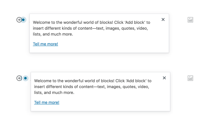
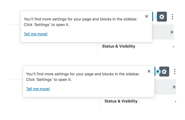
When a new user opens Gutenberg, they're presented with a guide that points out some useful page elements:
If they dismiss the guide, it won't ever show again:
🤔 How it works
DotTipcomponent renders a tip bubble independently of anything elsePopover, which now supports having itsyAxisset tomiddletriggerGuide()action lets you associate a series of tips into a single guideisTipVisible()andgetAssociatedGuide()selectors return information about which step in a guide the user is indismissTip()anddisableTips()actions control dismissing a single tip (and stepping through the guide) and disabling tips entirelynuxmodule with the intention that these components should be made available in other areas of the WP Admin📋 Testing
There's unit tests included. Manual testing can be done by:
✍️ Copy
I'm still waiting on the final copy for each tip. There was some discussion about this in #3670.