ShowcaseView library updated to v2.
Changes in the new version:
- Migrate to AndroidX
- Migrated to Kotlin
- Add Sequence
- Bug Fixes
- Add animations
- Update Sample
- Code cleared
- Add Builder pattern to ShowcaseView
| Showcase Example 1 | Showcase Example 2 | Showcase Example 3 | Showcase Example 4 |
|---|---|---|---|
 |
 |
 |
 |
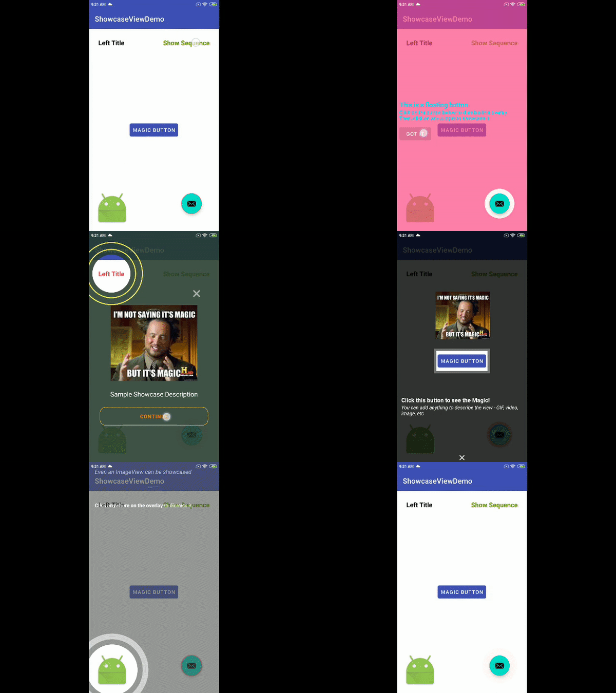
Sequence Demo
This ShowcaseView library can be used to showcase any specific part of the UI or can even be used during OnBoarding of a user to give a short intro about different widgets visible on the screen. You may add any number of views (ImageView, TextView, FrameLayout, etc displaying images, videos, GIF, text etc) to describe the showcasing view.
- Add the jitpack repo to your your project's build.gradle at the end of repositories
/build.gradle
allprojects {
    repositories {
        jcenter()
        maven { url "https://jitpack.io" }
    }
}/app/build.gradle
dependencies {
  implementation 'com.github.naci:showcaseview-v2:$latest_version'
}For a working implementation of this project see the /app folder
Initialise the ShowcaseView as follows:
val showcaseView = ShowcaseView.Builder(this)
            .setTargetView(targetView)
            .setBackgroundOverlayColor(Color.GRAY)
            .setRingColor(Color.BLUE)
            .setShowCircles(true)
            .setHideOnTouchOutside(false)
            .setShowcaseShape(ShowcaseView.SHAPE_CIRCLE)
            .setRingWidth(
                TypedValue.applyDimension(
                    TypedValue.COMPLEX_UNIT_DIP,
                    2f,
                    resources.displayMetrics
                )
            )
            .setDelay(500)
            .setDistanceBetweenShowcaseCircles(10)
            .setShowcaseListener(object :
                IShowcaseListener {
                override fun onShowcaseDisplayed(showcaseView: ShowcaseView) {
                    //TODO : do something..
                }

                override fun onShowcaseDismissed(showcaseView: ShowcaseView) {
                    //TODO : do something..
                }

                override fun onShowcaseSkipped(showcaseView: ShowcaseView) {
                    //TODO : do something..
                }
            })
            .addCustomView(R.layout.layout_showcase_body, Gravity.CENTER)
            .build()

showcaseView.show()
Register click listeners on the customView added as follows:
showcaseView!!.setClickListenerOnView(
    R.id.btn,
    View.OnClickListener {
        // showcaseView!!.showcaseSkipped() // Use this when skip button clicked
        showcaseView!!.hide()
    }
)
To hide the showcaseView just call:
showcaseView.hide()| Name | Description | Default Value |
|---|---|---|
| setTargetView | Sets the view which needs to be showcased (This method must be called inorder to use showcaseview) | NA |
| setBackgroundOverlayColor | Sets the color of the overlay to be shown | 0 |
| setRingColor | Set color of the focus highlight rings | 0 |
| setRingWidth | Set width of the focus highlight rings | 10f |
| setShowcaseShape | Set shape of showcase focus : SHAPE_SKEW or SHAPE_CIRCLE | SHAPE_CIRCLE |
| setHideOnTouchOutside | Set whether hide or not on touch showcase area | false |
| setDistanceBetweenShowcaseCircles | Set distance value between 2 highlight circles | 48 |
| setDelay | Delay in ms for Showcaseview to be shown | 0 |
| setShowCircles | Set whether or not show the highlight circles fır SHAPE_CIRCLE | true |
| setShowcaseListener | Set listener to listen showcase states : onShowcaseDisplayed, onShowcaseDismissed, onShowcaseSkipped | NA |
| setClickListenerOnView | Sets clicklistener on the components of the customView(s) added | NA |
| addCustomView | Sets the custom description view/layout to describe the showcaseView. Also, sets a gravity for the view (TOP, LEFT, RIGHT, BOTTOM) around the showcasing view | NA |
| setShowcaseMargin | Sets the custom description view margin from the showcaseView in the direction of the gravity defined, if any. If no gravity defined, then no point in using this method. | 12f |
Prepare ShowcaseView's first then call,
val sequence = ShowcaseSequence(this)
sequence.addSequenceItem(showcaseView1!!)
sequence.addSequenceItem(showcaseView2!!)
sequence.addSequenceItem(showcaseView3!!)
sequence.addSequenceItem(showcaseView4!!)
sequence.start()
Sequence will handle to show all showcases one by one with animation
If you want to show the sequel only for one time then create it with sequenceID as showed below,
val sequence = ShowcaseSequence(this, "sequenceID")
sequence.addSequenceItem(showcaseView1!!)
...
sequence.start()
Note: Sequence will be end if u call showcaseView!!.showcaseSkipped() method
- Call the
showcaseViewBuilder.show()only after adding all the customViews. setRingWidth(float width)and other margin setters take pixels as parameters. So make sure to send into density independent pixels (dp) value to support multiple screen sizes (See the sample code snippet above for reference)- Once
showcaseViewBuilder.hide()is called, all the click listeners get deregistered - Thus, you will have to set them back if showing it again. Better to register all the click listeners in a single method which can be called when showing the showcaseView.
Note : There is an unused MainActivity.java file in sample app which is written in Java
Copyright 2020 Naci Özyıldırım

Licensed under the Apache License, Version 2.0 (the "License");
you may not use this file except in compliance with the License.
You may obtain a copy of the License at

   https://www.apache.org/licenses/LICENSE-2.0

Unless required by applicable law or agreed to in writing, software
distributed under the License is distributed on an "AS IS" BASIS,
WITHOUT WARRANTIES OR CONDITIONS OF ANY KIND, either express or implied.
See the License for the specific language governing permissions and
limitations under the License.
