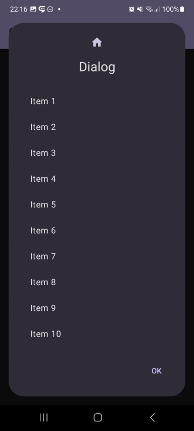
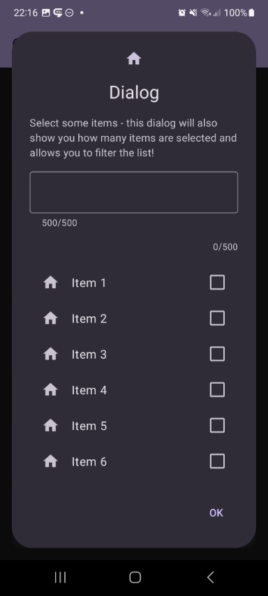
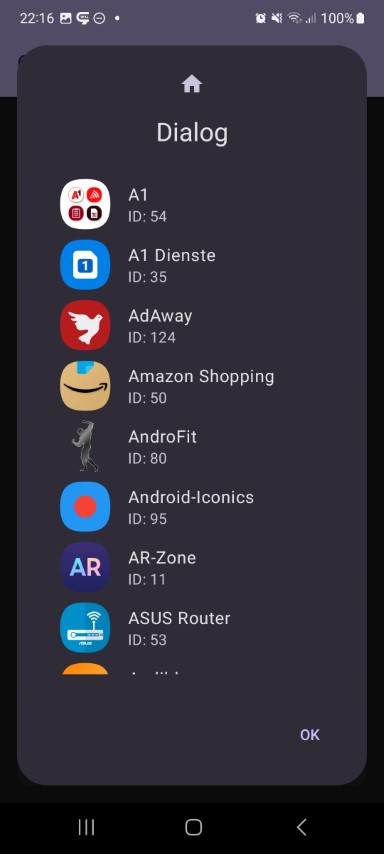
A compose framework for modal dialogs.
This library offers you an easily extendible compose framework for modal dialogs and allows to show them as a dialog or a bottom sheet.
- with this ibrary you get a very simple way to show dialogs
- supports showing dialogs as dialogs or bottom sheets
- easily extendible - creating a new dialog is just a few lines of code
All features are splitted into separate modules, just include the modules you want to use!
I only show the bottom sheet version for the info dialog, but of course any dialog does support the bottom sheet mode. Same holds true for the optional dialog icon.
Info Dialog
 |
 |
 |
 |
|---|
Input Dialog
 |
 |
|---|
Number Dialog
 |
 |
 |
|---|
Date Dialog
 |
 |
 |
|---|
Time Dialog
 |
 |
|---|
Color Dialog
 |
 |
 |
 |
|---|
List Dialog
 |
 |
 |
 |
|---|---|---|---|
 |
 |
 |
Progress Dialog
 |
 |
|---|
| Dependency | Version | Infos |
|---|---|---|
| Compose Multiplatform | 1.7.0 |
based on compose 1.7.1 and material3 1.3.0 |
| Module | Dependency | Version |
|---|---|---|
core |
- | |
dialog-billing |
KotBilling | 0.7 |
dialog-color |
- | |
dialog-date |
- | |
dialog-info |
- | |
dialog-input |
- | |
dialog-list |
- | |
dialog-number |
- | |
dialog-progress |
- | |
dialog-time |
- |
This library is distributed via maven central.
build.gradle.kts
val composedialogs = "<LATEST-VERSION>"

// core
implementation("io.github.mflisar.composedialogs:core:$lumberjack")

// modules
implementation("io.github.mflisar.composedialogs:dialog-billing:$composedialogs")
implementation("io.github.mflisar.composedialogs:dialog-color:$composedialogs")
implementation("io.github.mflisar.composedialogs:dialog-date:$composedialogs")
implementation("io.github.mflisar.composedialogs:dialog-info:$composedialogs")
implementation("io.github.mflisar.composedialogs:dialog-input:$composedialogs")
implementation("io.github.mflisar.composedialogs:dialog-list:$composedialogs")
implementation("io.github.mflisar.composedialogs:dialog-number:$composedialogs")
implementation("io.github.mflisar.composedialogs:dialog-progress:$composedialogs")
implementation("io.github.mflisar.composedialogs:dialog-time:$composedialogs")| Module | Info | Description |
|---|---|---|
core |
the core module - must always be included | |
| Dialogs | ||
dialog-billing |
optional | a dialog that offers an in-app purchase list |
dialog-color |
optional | a color picker dialog |
dialog-date |
optional | a date picker dialog |
dialog-info |
optional | a inf dialog |
dialog-input |
optional | a input dialog (string and numerical) |
dialog-list |
optional | a list dialog (with filtering, lazy loading and more) |
dialog-number |
optional | a number picker dialog |
dialog-progress |
optional | a progress dialog |
dialog-time |
optional | a time picker dialog |
Simple Example
// create and remember a state
val state = rememberDialogState()

// show a dialog if necessary
if (state.showing)
{
    DialogInfo(
        state = state,
        // Custom - Required
        info: String,
        // Custom - Optional
        infoLabel: String = "",
        // Base Dialog -  Optional - all options can be set up with custom attributes, following are just the default examples
        title: (@Composable () -> Unit)? = null,
        icon: (@Composable () -> Unit)? = null,
        style: DialogStyle = DialogDefaults.styleDialog(), // DialogDefaults.styleBottomSheet() => both have a few settings...
        buttons: DialogButtons = DialogDefaults.buttons(),
        options: Options = Options(),
        onEvent: (event: DialogEvent) -> Unit = {
            // optional event handler for all dialog events
        }
    )
}

// show the dialog inside a button press event or similar
Button(onClick = { state.show() }) {
    Text("Show Dialog")
}
Alternatively, if you want to use one dialog with many items (e.g. for list items) you can do following:
// create and remember a state with data (e.g. an Integer)
val state = rememberDialogState<Int>(data = null)

// show a dialog if necessary
if (state.showing)
{
    val data = state.requireData()
    DialogInfo(
        state = state,
        // Custom - Required
        info = "Data = $data"
    )
}

// a list that uses the dialog
val items = 1..100
LazyColumn {
    items.forEach {
        item(key = it) {
            Button(onClick = { state.show(it) }) {
                Text("Item $it")
            }
        }
    }
}
Dialog State
Check out the dialog state and the dialogs to find out what settings you can use and especially the demo app for a working example.
Dialog State (simple with a boolean flag or complex with a data object)
In case of the simple state true means that the dialog is visible and false that it's not. In case of the complex state holding an object means the dialog is visible and null means it's not visible.
fun rememberDialogState(
    showing: Boolean = false,
    buttonPositiveEnabled: Boolean = true,
    buttonNegativeEnabled: Boolean = true,
    dismissAllowed: Boolean = true,
    swipeAllowed: Boolean = true
): DialogState
In case of the complex state simply use state.show(data) to show the dialog and then inside your dialog call val data = state.requireData() to get the data from the state.
CAUTION: the state must be saveable by Bundle, if it is not, provide a custom saver!
fun <T : Any> rememberDialogState(
    data: T?,
    saver: Saver<MutableState<T?>, out Any> = autoSaver(),
    buttonPositiveEnabled: Boolean = true,
    buttonNegativeEnabled: Boolean = true,
    dismissAllowed: Boolean = true,
    swipeAllowed: Boolean = true
): DialogStateWithData<T>Supported Platforms
This is a KMP (kotlin multiplatform) library and the provided modules do support following platforms:
| Modules | Android | iOS | jvm | Information |
|---|---|---|---|---|
| core | √ | √ | √ | |
| billing | √ | googles in-app payment is an android only thing so this library is android only as well | ||
| color | √ | √ | √ | |
| date | √ | √ | √ | |
| info | √ | √ | √ | |
| input | √ | √ | √ | |
| list | √ | √ | √ | |
| number | √ | √ | √ | |
| progress | √ | √ | √ | |
| time | √ | √ | √ |
A full demo is included inside the demo module, it shows nearly every usage with working examples.
Modules