For our project we have explored the World Happiness Report Dataset
Available from Kaggle.com.
The report reviews the state of happiness around the world and shows how the science of happiness explains personal and national variations in happiness. The report attracts global recognition as governments and organizations often use happiness indicators in decision making.
The happiness scores found in the dataset use data from the Gallup World Poll, which provides scores based on answers to the main life evaluation question in the poll. The question reflects on the best possible life for them being a 10 on the scale, and the worst possible life being a 0.
There are 5 CSV files in this data set:
CSV files are placed in the Project Data folder.
The first step of data processing involved renaming column headings to formalise across all five datasets. A "Year" column was added for each dataset, as well as a "Region" column in the CSV files that it was missing. The title method was used to formalise all capitalisation for “Country” and “Region” columns across all datasets so they are the same. The Lambda function was applied to assign region values by referencing an existing region column. All five csv’s were then concatenated to form one csv and any country values that did not feature in each of the five datasets were dropped. A second csv was created where our dataset was grouped by country and the mean function applied for use with one of our bar plots.
The two CSV files are located in the Project Data folder:
- global_happiness_data
- global_happiness_mean_values
Using “The World Happiness Report” dataset, we will be analysing the correlation between the GDP per capita and life expectancy contribution towards a country’s overall happiness score. We will also be exploring how happiness score ranges between different world regions, investigating any trends that may be seen.
The dataset is in five separate csv files, which we will clean using pandas to drop irrelevant columns and rename in preparation for a database merge.
The database will be created using PostgreSQL. Two tables will need to be created to hold the data from the two seperate CSV's and will need to be queryed using our Python Flask API.
For the data visualisations we intend to use the D3 JavaScript plotting library Plotly, to create a bubble plot and bar chart. We will also be using an additional charting package called Frappe Charts to plot a bar chart using the mean happiness scores for different countries. The bubble plot will be used to show lifetime expectancy and GDP contribution towards happiness scores for different countries and also the regions these countries belong to. The Plotly bar chart will be used to visualise how happiness scores vary across the years 2015-2019 for seleceted countries. The two plotly plots will be interactive through the use of selector buttons, used to change year and country.
The project presentation can be found in the /Presentation directory:
- happiness_report.pdf
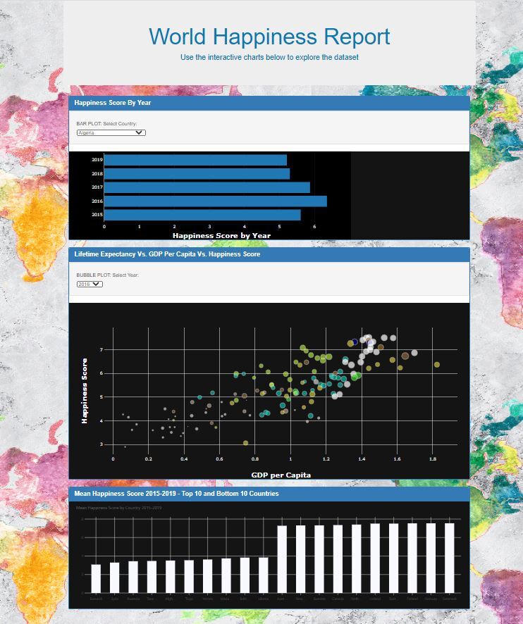
Frappe Charts a SVG Chart component was used to create the bar chart. Mean happiness score was used to plot the 10 countries with the highest mean happiness score and 10 countries with the lowest happiness score for all five years.
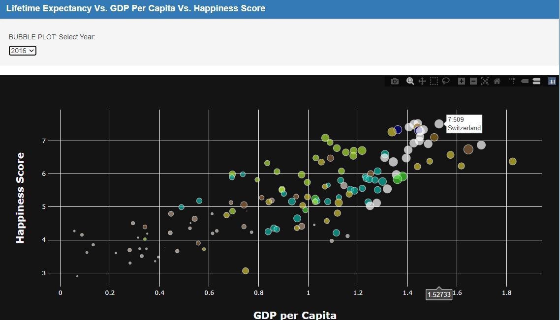
The interactive bubble plot was created using Plotly and Javascript. The hover text shows happiness score, country name and GDP per Capita value. The colour of the bubble corresponds to the country's region e.g. Western Europe and Southern Asia. The bubble size corresponds to the lifetime expectancy contribution to happiness score and the bubble plot can be changed on "Year" using the selector button.
The interactive bar plot was created using Plotly and Javascript. The hover text shows happiness score for the country over the years included in this dataset (2015-2019). The plot can be changed using the "Country" selector button, which includes 141 countries.
- Data cleaning and processing in Pandas - Jesse
- Database creation in SQL – Isha
- JavaScript coding for plots – Isha, Jesse, Jessica
- Rendering the HTML using Flask – Jessica, Isha and Jesse
- Project Presentation – Jessica, Isha, Jesse
- Readme file - Jessica


