| layout | title | date |
|---|---|---|
post |
Wrappers for running a co-expression network analysis (WGCNA) |
2015-07-23 |
Weighted correlation network analysis, also known as weighted gene co-expression network analysis (WGCNA), is a widely used data mining method especially for studying biological networks based on pairwise correlations between variables. While it can be applied to most high-dimensional data sets, it has been most widely used in genomic applications. The WGCNA method is extremely powerful for analysing gene expression data for deriving results and insights that are not possible with typical differential expression experiments.
The WGCNA methods and algorithms can be implemented using the the WGCNA R package available on CRAN and there are extensive tutorials and examples available.
Although these tutorials are excellent, the learning curve is steep, and they require the analyst to be reasonably proficient with R programming. As I have been regularly asked how to perform WGCNA, I thought I would share some wrapper scripts of some of the main functions that help get started with WGCNA.
I must emphasise that using these functions will not give the analyst much insight into how this method works. Nor will they allow you to fine-tune your analysis. If the user requires more functionality or in-depth analysis, I strongly urge they follow the WGCNA tutorials and manuals.
For a more in-depth description on WGCNA, see the WGCNA wikipedia page and the WGCNA home page.
First you need to ensure you have all the required R libraries to run these wrapper functions.
source("https://bioconductor.org/biocLite.R")
biocLite(c("AnnotationDbi", "impute", "GO.db", "preprocessCore"))
install.packages(pkgs=c("WGCNA", "flashClust", "ggplot2"))
Load the libraries and wrapper scripts
source("WGCNA_functions.R")
library(reshape2)
library(ggplot2)
Load the example data
dat <- read.table(file=unz("exprsExtimates.csv.zip",filename="exprsExtimates.csv"), header=TRUE, row.names=1, sep=",", )This example dataset is normalised microarray data from a human cell line experient designed to look at the gene expression differences in cells in different oxygen concentrations on different growth media.
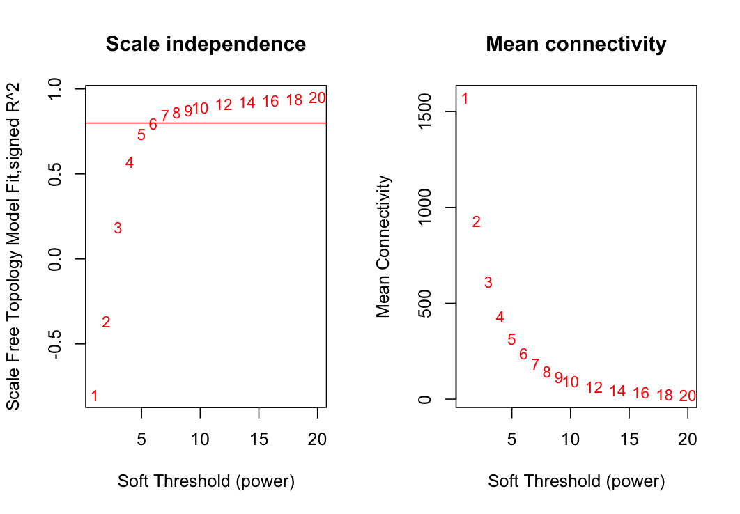
Constructing a weighted gene network requires the choice of the soft thresholding power to which co-expression similarity is raised to calculate adjacency. The determineSoftPowerWGCNA function returns a set of network indices that should be inspected, for example:
determineSoftPowerWGCNA(data1=dat, outFile="plots/powerPlots.png", propGenes=.1)These two plots show the summary network indices (y-axes) as functions of the soft-thresholding power (x-axes). Numbers in the plots indicate the cor- responding soft-thresholding powers. Plots indicate that approximate scale-free topology is attained at a power of 6. Therefore, the we will weight the network with a power of 6.
The propGenes argument specifies the proportion of genes to be included in the analysis. If this number is > 1, ir selects the proportion of genes with the highest variance across samples. For example, propGenes=0.33 will select the top 33% of most variable genes. This is desirable if the memory of your computer cannot handle larger datasets. However, the memory requirements can also be dealt with by using the blockwiseModules function in the WGCNA package. If your dataset has been through the appropriate filtering steps and you have the computational power, select propGenes=1.
net <- runWGCNA(data1=dat, propGenes=.1, softPower=3, signedNetwork=TRUE)
rm(dat)
The functions in this wrapper have many parameters, and in this example most of them are left at their default value.
plotModulesCut(referenceDataset=net, outFile="plots/modClusterPlot.pdf")Average linkage hierarchical clustering dendrogram of genes based on gene expression topological overlap. Modules of co-expressed genes were assigned colours which are represented in the horizontal bars below the dendrogram. The different rows of bars represent different dynamic tree cut heights.
e1 <- calculateModuleEigengenes(referenceDataset=net, split=2)This step summarises each module by calculating the module eigengene for each sample, which is the first principal component of gene expression values for the module. Therefore, the eigengene represents a weighted average of gene ex- pression.
If I choose to use split=1 (the top row in the above dendrogram figure) there will be a small number of large modules in the network. Conversely, if I choose split=4, there will be a larger number of small co-expression modules. Depending on the purpose of the analysis, it is sometimes preferable to choose a larger number of small modules—in such a case, split values of 3-4 would be chosen.
Step 5. Exploring the results by plotting the eigengene expression for each experimental group and co-expression module.
The example data used here were generated from a human cell line experiement designed to examine the effects of oxygen concentration and growth media on gene expression. There are 3 different oxygen concentrations (1%, 5%, 20%) and two different growth media (Plastic and Matrigel). The sample names represent these variables and the experimental replicate. Therefore, we can extract some sample information from the sample names and generate some meaningful plots.
groups <- gsub('.{2}$', '', x=rownames(e1))
groups <- t(data.frame(strsplit(groups, split=".", fixed=TRUE)))
colnames(groups) <- c("Oxygen", "Media")
groups[ ,1] <- gsub('X', '', groups[ ,1])
rownames(groups) <- NULL
e1 <- cbind(e1, groups)
Then reshape the data for easy plotting with ggplot2.
melted <- melt(data=e1, id.vars=c("Oxygen", "Media"))
melted$Oxygen <- gsub(pattern="pc", replacement="", melted$Oxygen)
melted <- melted[order(as.numeric(melted$Oxygen)), ]
melted$variable <- gsub("ME", "", melted$variable)
...and then plot the data.
png(file="plots/eigengenBoxplot.png")
q <- qplot(data=melted, y=value, x=Oxygen, facets=Media~variable,
           geom=c("boxplot", "point"), ylab="Eignegene expression",
           colour=Oxygen)
q + scale_x_discrete(limits=c("1","5","20"))
dev.off()
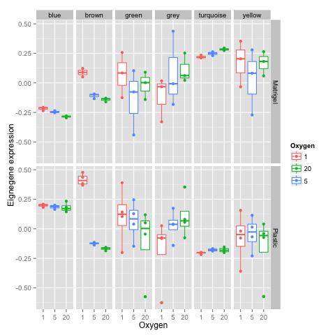
These boxplots show the eigenene 'expression' (y-axis) for each module (defined by colors) in panel columns for varying oxygen concentrations (x-axis) on different growth media (panel rows). We can see for the plastic media, the 'brown' module shows notable eigengene expression differences at 1% oxygen which are much more profound than the differences observed for the same oxygen concentration on the matrigel media. This suggests there are differences in the media that induce differences in co-expression in 1% oxygen.
Get the top module hub genes...
hubs <- moduleHubGenes(referenceDataset=net, MEs=calculateModuleEigengenes(referenceDataset=net, split=2), nGenes=10, split=2)...and list the top array genes for the brown module
hubs[ ,colnames(hubs) == "brown"]## [1] "ILMN_1736585" "ILMN_1757384" "ILMN_2383934" "ILMN_2279635"
## [5] "ILMN_1783684" "ILMN_1669584" "ILMN_1714820" "ILMN_1793384"
## [9] "ILMN_2189993" "ILMN_1777261"


