Languages used: Python, PostgreSQL, HTML/CSS, JavaScript
Please refer to the Project Proposal File for more information about the project details.
-
To get started, create a file named "config.py" in the main folder (the one main.ipynb is in). In there, store your PostgreSQL password in the format - password = "YOUR PASSWORD HERE".
-
Next, make sure your Pandas version is at least 1.5 or newer. Then, setup a PostgreSQL database named "covid_db" and copy the queries from covid.sql (in the Resources folder) to create all the necessary schema. Then, run the main.ipynb file to start scraping the data, as well as complete the cleaning process.
-
Finally, run app.py. This is the Flask API that powers this project and generates all the necessary web pages via render_template. The home page of the website (index.html) should open automatically in your browser, if not, then go to the url shown in the terminal running Flask (usually http:https://127.0.0.1:5000/).

Table of Contents:
The aim of this project is to explore and uncover patterns in COVID-19 case data within
Australia. We aim to create an interactive Flask-powered website for visualising live COVID-19 case data,
allowing the user to examine relationships between case numbers over time, between different
states and territories, and compared to vaccination and hospitalisation rates.

This will involve retrieving current and historical COVID-19 case data from websites that
report it, listed below under data sources. This data will be stored in an SQL database,
cleaned and organised as necessary, then visualised. The nature of COVID-19 reporting
means that the visualisations produced will be live, meaning that they will be updated
automatically.
https://covidlive.com.au
- main.ipynb contains the code used for scraping the website, retrieving the data, and cleaning the resulting dataset.
- covid.sql is located in the Resources folder, contains the SQL queries used for creating 8 tables in PostgreSQL.
- app.py contains all the relevant Flask code, such as the routes used for the website. This file also contains code for querying the SQL database and converting the data to JSON format.
- JavaScript libaries used:
- Leaflet and D3.js: Used for the interactive map of Australia on the homepage.
- Chart.js and it's annotation plugin: Our first time using this particular library. Used to generate all of the visualisations.
-
The Homepage:
Each webpage has a navbar located at the top of the screen. Clicking the state button on the navbar will show a dropdown menu with links to each Australian state's individual webpage. Clicking the comparison button will take you to a webpage where you can compare data between different states and territories. The home page contains a map of Australia, which colourfully differentiates each state and territory covered in this project. Mousing over a particular region will highlight it and display the name of the selected state/territory as a popup. Clicking on any state or territory will take you to that state/territory's individual webpage.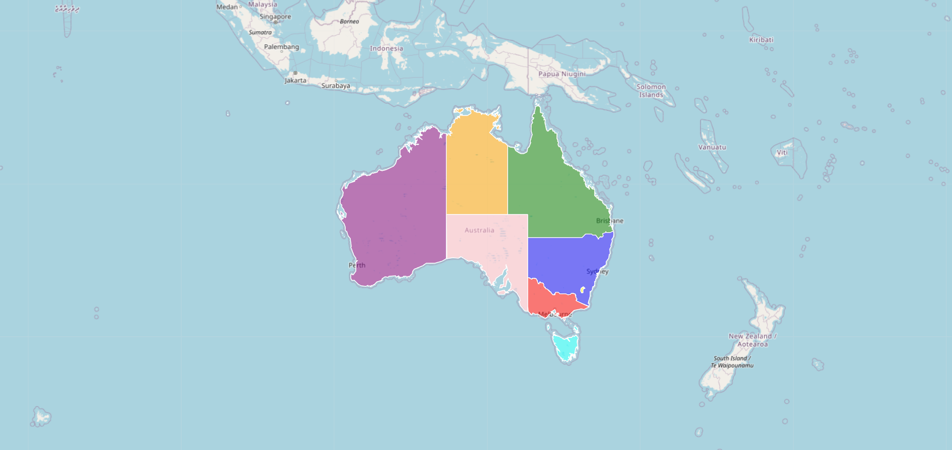
-
The individual state/territory webpages:
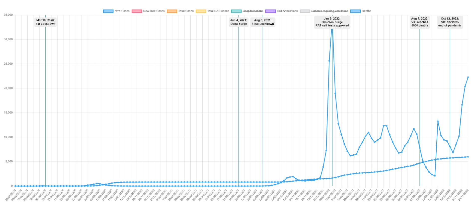
For each state and territory, we have created a page which displays a line graph, made using Chart.js, that visualises changes in different COVID-19 data over time. The labels shown at the top of the page can be clicked to toggle them on and off, according to the user’s preference. Some labels are automatically toggled off when first opening a webpage, to avoid overcrowding of lines and to only show the most important and useful labels first. The dataset spans over a time period from Jan 2020 to the current date, which will continue to update as new information is uploaded to the COVIDLIVE website. You may have also noticed some vertical green lines on our graph. The annotation plugin for Chart.js was used to add annotations to the graphs, identifying relevant key events over the time period for each region. Another small feature to note is that you can hover over all the data points to show more detailed info for that data point.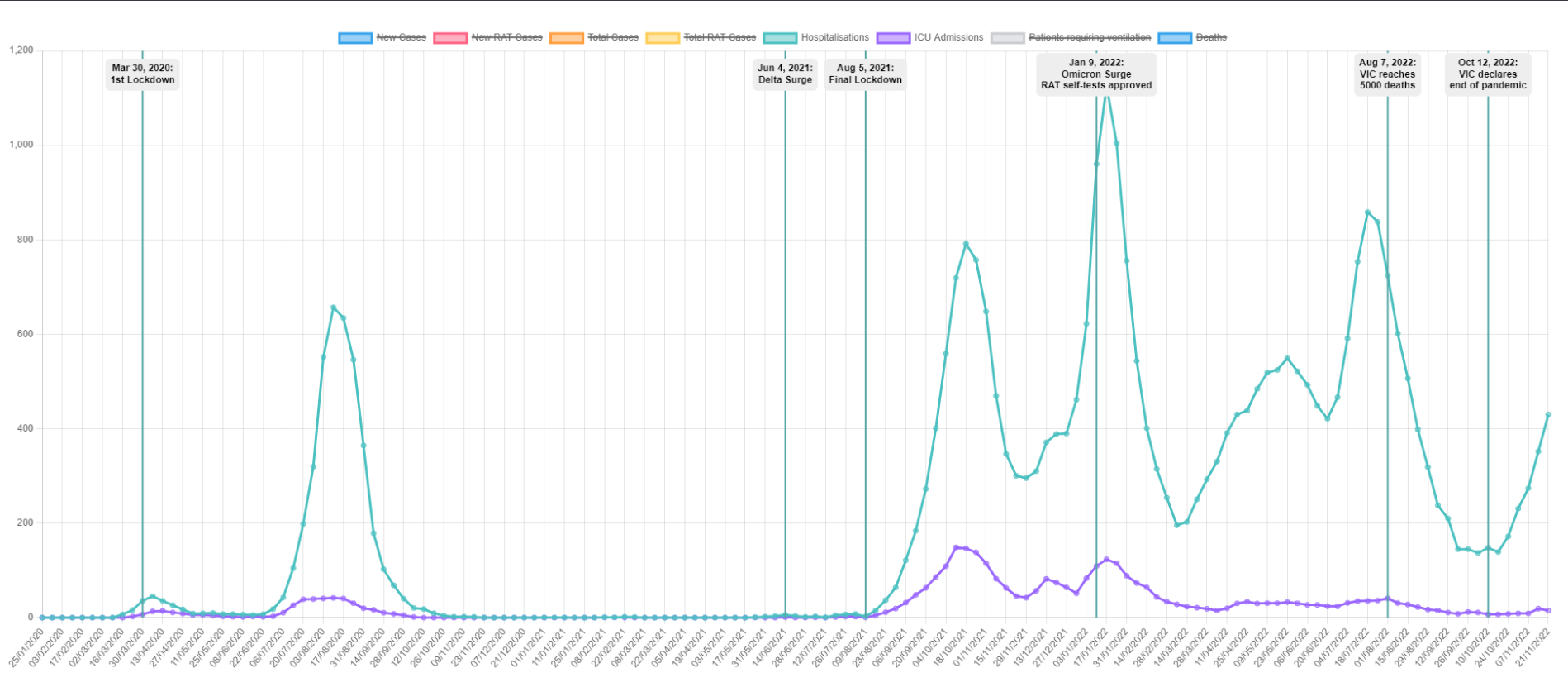
-
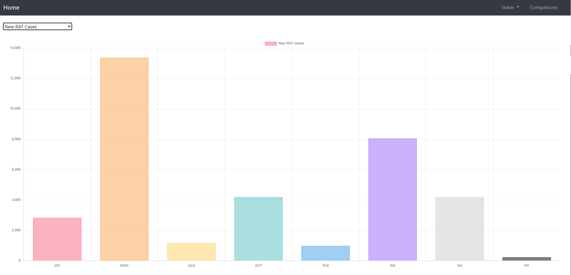
The Comparisons page:
Contains a bar chart, again made using Chart.js, displaying totals for each state/territory for easy comparison between them. A drop down menu is located above the bar chart, containing the same labels seen in the individual state webpages, allowing for the user to switch between different datasets. Finally, hovering over a particular bar on the chart will show more detailed information for the selected state or territory.