- 2024-02-16
- 2024-06-11
Here we apply a methodological approach used in processing ECG data, as detailed in ./ecg_process/ecg_process.R.
Our process emphasizes the integrity of data handling, leveraging automated methods to ensure reproducibility and objectivity, particularly suitable for preparing data for subsequent statistical analysis.
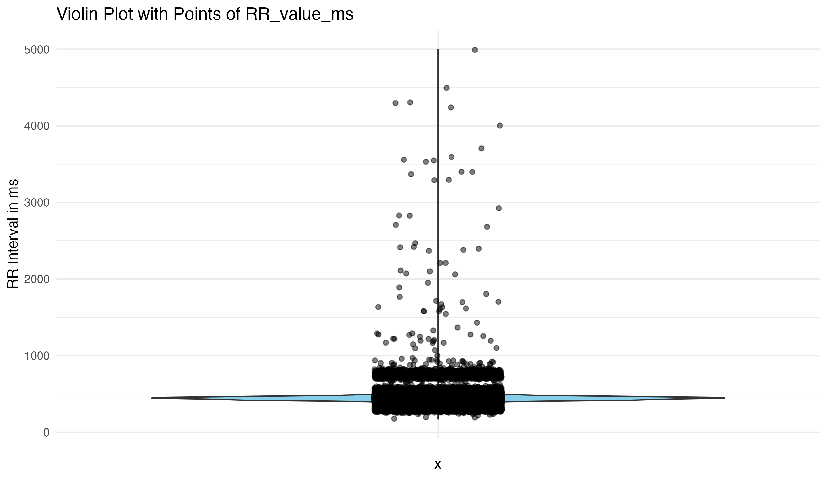
Visualizing the data is the first critical step, allowing us to understand the inherent characteristics and identify obvious anomalies or noise. This approach guides our subsequent data cleaning efforts, ensuring we base our decisions on empirical evidence rather than assumptions.
Initial Visual Assessment:
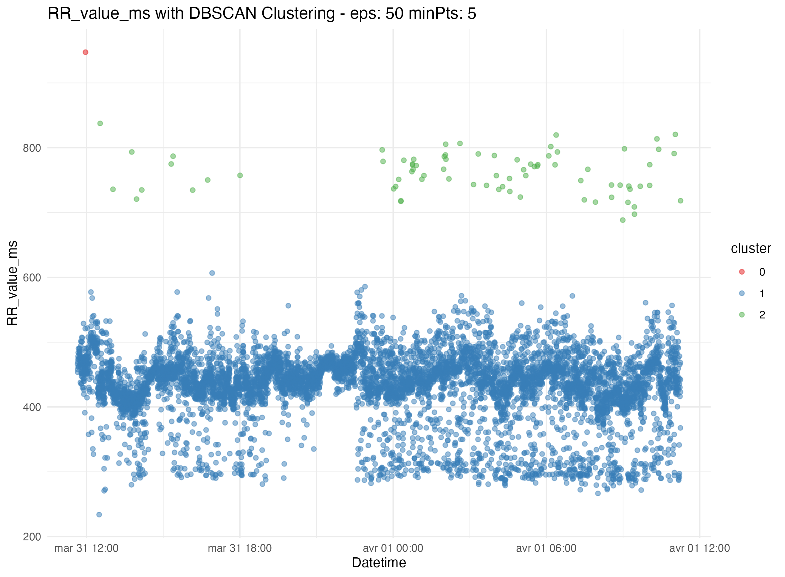
First we try to find the outlier thresholds using simple methods like interquartile range (IQR). This does not work for us, so we move to more advanced clustering algorithms like K-means, Z-score, DBSCAN. In our dataset DBSCAN works best, so we automatically segregate data into clusters to further identify and eliminate outliers and artifacts. This method enhances the reliability of the dataset by minimizing manual intervention and potential bias.
Clustering and Outlier Detection:
By applying statistical thresholds derived from the data distribution itself, we automate the filtering of noise and outliers. This step is crucial for maintaining data integrity, allowing the visualization to guide our interpretation and adjust our methods accordingly.
Refinement and Validation:
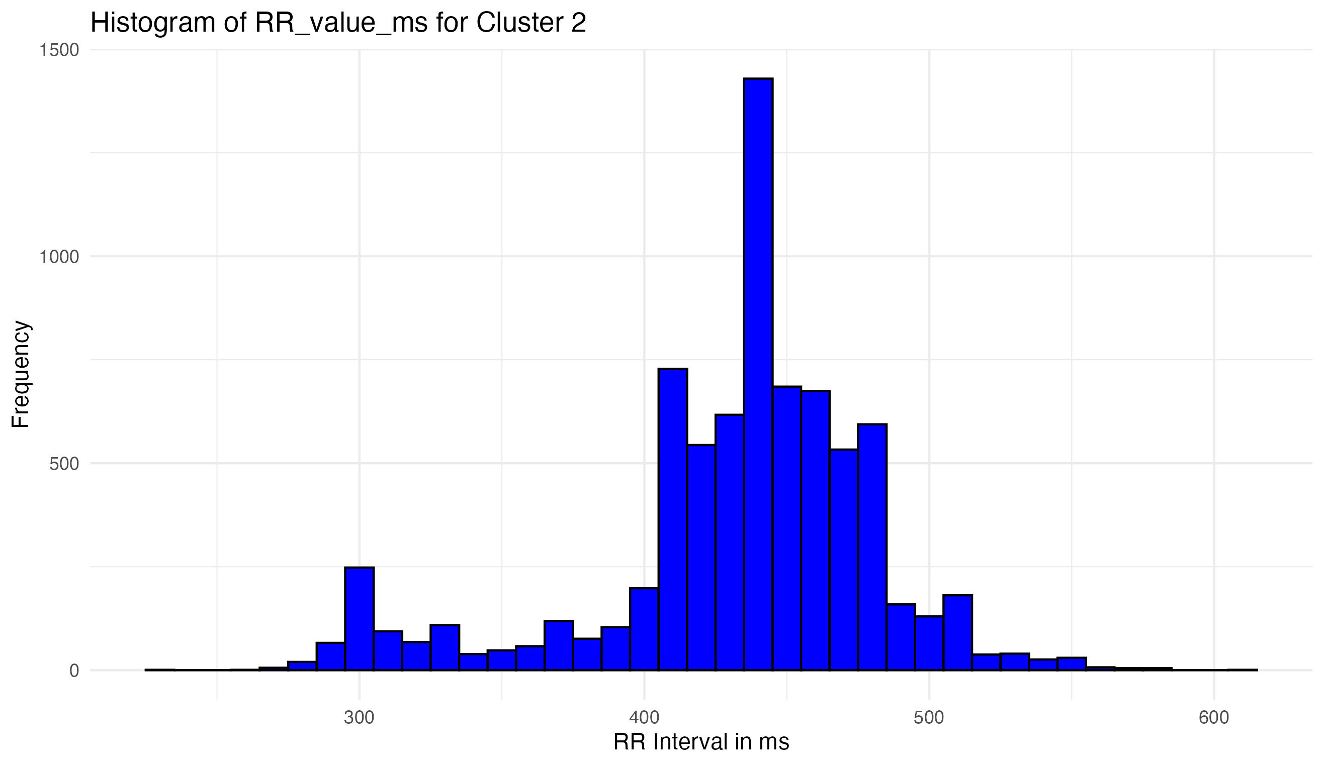
- Visualization of the cleaned data ensures the removal of artifacts while preserving true signals.
- Continuous validation against the original data characteristics confirms that the cleaning process enhances data quality without distorting fundamental features.
The cleaned and validated dataset is now primed for robust statistical analysis, ensuring that any findings or conclusions drawn are based on high-quality data.
The steps outlined here demonstrate our commitment to rigorous data processing, leveraging visualization not just for initial assessment but as an integral part of continuous validation throughout the cleaning process. For further details on the commands and specific methods used, please refer to the R script located at ./ecg_process/ecg_process.R.
This set of examples focuses on the simulation and analysis of Electrocardiogram (ECG) waveforms to study Heart Rate Variability (HRV) in a controlled, simulated environment. Using custom R functions for ECG waveform generation, we explore the effects of different conditions (control vs. case groups) on HRV, incorporating covariates such as age, sex, and treatment types in our analysis. The goal is to illustrate the application of statistical or machine learning methods, including Generalized Linear Models (GLM), to understand the potential influences on heart rate signals.
- ECG Simulation: Utilizing logistic map-based simulations to generate synthetic ECG waveforms, mimicking real heart rate variability patterns.
- Peak Detection: Implementing basic algorithms to identify R peaks within the ECG waveforms, a critical step for HRV analysis.
- Covariate Integration: Including simulated demographic and treatment data to examine the broader impacts on HRV.
- Statistical Analysis: Applying t-tests for initial comparisons and GLMs to account for multiple covariates, aiming to uncover any significant differences in HRV between groups.
- Visualization:
ggplot2for visualization of ECG data, analysis results, and the effects of covariates.
Load custom ECG simulation functions
source("./ecg_functions.R")
library(ggplot2)
library(dplyr)- Initial setup for ECG waveform simulation.
- Define the total number of heartbeats and other parameters for ECG simulation.
T <- 3  # Total heart beats
P1 <- 0.5  # Starting value for the logistic map
r <- 3.0  # Logistic map parameter
cons <- 0.0  # Constant added to logistic map output
SAMPLING_RATE <- 125 # Sampling rate for the ECG in Hz- Simulate ECG data
- Generate P vector using logistic map
P <- numeric(T)
P[1] <- P1
for (i in 2:T) {
  P[i] <- r * P[i - 1] * (1 - P[i - 1])
}
P <- P + cons- Convert P vector to Q vector and simulate ECG waveform
Q <- cumsum(P)
ecg <- fit_ecg_waves_to_beats(Q, sampling_rate=SAMPLING_RATE)
t <- seq_along(ecg) / SAMPLING_RATE- Plot simulated ECG waveform
ecg_data <- data.frame(Time = t, ECG = ecg)
head(ecg_data)
## Time ECG
## 1 0.008 0.81412525
## 2 0.016 0.66425004
## 3 0.024 0.50441533
## 4 0.032 0.34482331
## 5 0.040 0.08031695
## 6 0.048 -0.20324786
- Step 1: Detect peaks - Find local maxima
- A simple approach to find local maxima (peaks)
find_peaks <- function(ecg_data) {
  peaks <- which(diff(sign(diff(ecg_data$ECG))) == -2) + 1
  peak_data <- ecg_data[peaks, ]
  return(peak_data)
}

peak_data <- find_peaks(ecg_data)- Step 2: Filter peaks by separation - ensure they are at least 0.4s apart (assumption)
- Sort peaks by amplitude to get the highest peaks first
sorted_peaks <- peak_data[order(-peak_data$ECG), ]
filtered_peaks <- sorted_peaks[1, ]  # Initialize with the highest peak

for (i in 2:nrow(sorted_peaks)) {
  if (all(abs(filtered_peaks$Time - sorted_peaks$Time[i]) >= 0.4)) {
    filtered_peaks <- rbind(filtered_peaks, sorted_peaks[i, ])
    if (nrow(filtered_peaks) == 2) break  # Stop after finding the second peak
  }
}- Step 3: Plot and annotate the ECG waveform with R peaks
p <- ggplot(ecg_data, aes(x = Time, y = ECG)) +
  geom_line() +
  geom_point(data = filtered_peaks, aes(x = Time, y = ECG), color = "red", size = 3) +
  geom_text(data = filtered_peaks, aes(x = Time, y = ECG, label = "R"), vjust = -2, color = "red") +
  labs(title = "Simulated ECG Waveform with R Peak detection", x = "Time (s)", y = "Amplitude (mV)") +
  theme_minimal()

# print(p)

# Calculate the time difference between the two peaks
if (nrow(filtered_peaks) >= 2) {
  time_diff <- diff(filtered_peaks$Time)
  time_diff_label <- paste(round(time_diff, 2), "s")

  # Coordinates for annotation placement
  x_midpoint <- sum(filtered_peaks$Time) / 2
  y_max <- max(ecg_data$ECG) * 1.1

  # Add a line connecting the two peaks and annotate it with the time difference
  p <- p + geom_segment(aes(x = filtered_peaks$Time[1], y = max(ECG),
                            xend = filtered_peaks$Time[2], yend = max(ECG)),
                        linetype = "dashed", color = "blue") +
    annotate("text", x = x_midpoint, y = y_max, label = time_diff_label, color = "blue")
}

print(p)- Initial setup for ECG waveform simulation
# Define the total number of heartbeats and other parameters for ECG simulation

T <- 20  # Total heart beats
P1 <- 0.5  # Starting value for the logistic map
r <- 3.0  # Logistic map parameter
cons <- 0.0  # Constant added to logistic map output
SAMPLING_RATE <- 125 # Sampling rate for the ECG in Hz- Simulate ECG data.
- Generate P vector using logistic map.
P <- numeric(T)
P[1] <- P1
for (i in 2:T) {
  P[i] <- r * P[i - 1] * (1 - P[i - 1])
}
P <- P + cons- Convert P vector to Q vector and simulate ECG waveform
Q <- cumsum(P)
ecg <- fit_ecg_waves_to_beats(Q, sampling_rate=SAMPLING_RATE)
t <- seq_along(ecg) / SAMPLING_RATE- Plot simulated ECG waveform
ecg_data <- data.frame(Time = t, ECG = ecg)

ggplot(ecg_data, aes(x = Time, y = ECG)) +
  geom_line() +
  labs(title = "Simulated ECG Waveform", x = "Time (s)", y = "Amplitude (mV)") +
theme_minimal()- Simulate RR intervals with variability for two groups: control and case
N <- 100  # Number of RR intervals per group
control_rr <- simulate_rr_intervals_group(N, 0.8, 0.05, "Control")
case_rr <- simulate_rr_intervals_group(N, 0.8, 0.15, "Case")
hrv_data <- rbind(control_rr, case_rr)- Summarize HRV metrics for each group
hrv_summary <- hrv_data |>
  group_by(Group) |>
  summarise(Mean_RR = mean(RR_Interval),
            SDNN = sd(RR_Interval),
            RMSSD = sqrt(mean(diff(RR_Interval)^2)))

head(hrv_summary)
## # A tibble: 2 × 4
## Group Mean_RR SDNN RMSSD
## <chr> <dbl> <dbl> <dbl>
## 1 Case 0.808 0.0901 0.135
## 2 Control 0.800 0.0306 0.0423
- Plot HRV data showing RR interval variability between groups
ggplot(hrv_data, aes(x = Group, y = RR_Interval)) +
  geom_boxplot() +
  geom_jitter(alpha = 0.5, width = 0.3, height = 0) +
  labs(title = "RR Interval Variability by Group", x = "Group", y = "RR Interval (s)") +
theme_minimal()- Assess distribution of RR intervals for normality
# Plot histograms and Q-Q plots for visual inspection
ggplot(hrv_data, aes(x = RR_Interval, fill = Group)) +
  geom_histogram(bins = 30, alpha = 0.6) +
  facet_wrap(~Group) +
  labs(title = "Distribution of RR Intervals by Group", x = "RR Interval (s)", y = "Count") +
  theme_minimal()
# Q-Q plots for Control and Case groups using ggplot2
ggplot(hrv_data, aes(sample = RR_Interval)) +
stat_qq() +
stat_qq_line() +
ggtitle("Q-Q Plot for Control Group") +
theme_minimal() +
facet_grid(.~Group, scales="free")- Perform Shapiro-Wilk test for normality
shapiro_test_control <- shapiro.test(hrv_data$RR_Interval[hrv_data$Group == "Control"])
shapiro_test_case <- shapiro.test(hrv_data$RR_Interval[hrv_data$Group == "Case"])
print(shapiro_test_control)
##
## Shapiro-Wilk normality test
##
## data: hrv_data$RR_Interval[hrv_data$Group == "Control"]
## W = 0.94082, p-value = 0.0002163
print(shapiro_test_case)##
## Shapiro-Wilk normality test
##
## data: hrv_data$RR_Interval[hrv_data$Group == "Case"]
## W = 0.93559, p-value = 0.0001048
- Decision on statistical test based on normality assessment
- If normality is not rejected, use t-test; otherwise, consider Mann-Whitney U test.
- Example of performing a t-test (replace with Mann-Whitney U test if necessary)
t_test_result <- t.test(RR_Interval ~ Group, data=hrv_data)
print(t_test_result)
##
## Welch Two Sample t-test
##
## data: RR_Interval by Group
## t = 0.8715, df = 121.53, p-value = 0.3852
## alternative hypothesis: true difference in means between group Case and group Control is not equal to 0
## 95 percent confidence interval:
## -0.01055037 0.02714454
## sample estimates:
## mean in group Case mean in group Control
## 0.8084336 0.8001365
In this section of our analysis, we employ a Generalized Linear Model (GLM) as a more sophisticated approach to analyzing our data, as opposed to relying solely on a t-test. The example of GLM framework is chosen for several reasons:
-
Incorporation of Multiple Covariates: Unlike the t-test, which is limited to comparing means between two groups, GLM allows us to account for the influence of multiple covariates simultaneously. This is crucial in our study, as we’re interested in understanding how factors such as age (
Age_day), sex (Sex), and treatment type (Treatment) might impact Heart Rate Variability (HRV), alongside the primary variable of interest (Group). -
Flexibility in Modeling Different Types of Data: GLM extends the general linear model to allow for response variables that have error distribution models other than a normal distribution. This makes it suitable for a wide range of data types and link functions, providing a more accurate analysis that aligns with the underlying data distribution.
-
Ability to Handle Non-linear Relationships: Through the use of link functions, GLMs can model relationships between the predictor and response variables that are not necessarily linear. This capability is particularly important in biomedical data, where many relationships are complex and non-linear.
-
Direct Estimation of Effect Size and Significance: GLMs provide direct estimates of the effect size for each covariate, including confidence intervals and p-values, making it easier to interpret the impact of each factor on the response variable. This comprehensive insight is invaluable in discerning not just if there is an effect, but how strong that effect is, and how confidently we can assert its presence.
-
Improved Precision and Power: By adjusting for additional covariates that might influence the response variable, GLMs can reduce unexplained variability in the data. This leads to more precise estimates of the effects of interest and potentially increases the statistical power of the analysis.
By leveraging a GLM, we’re not just comparing group means; we’re constructing a more nuanced understanding of how various factors contribute to differences in RR intervals, providing a deeper insight into the dynamics of heart rate variability. This approach allows us to make more informed conclusions about the data, supported by a robust statistical framework that accounts for the multifaceted nature of biological phenomena.
- Simulating covariate data
set.seed(123)  # For reproducibility

covariate_data <- data.frame(
  Sample = 1:(2*N),  # Assuming N samples per group as before
  Age_day = sample(0:60, 2*N, replace = TRUE),
  Sex = sample(0:1, 2*N, replace = TRUE),
  Treatment = sample(c("a", "b", "c"), 2*N, replace = TRUE)
)

# Combine with HRV data
hrv_data <- cbind(hrv_data, covariate_data)
head(hrv_data)
## RR_Interval Group Sample Age_day Sex Treatment
## 1 0.7742978 Control 1 30 1 b
## 2 0.7938344 Control 2 14 1 a
## 3 0.8480075 Control 3 50 1 b
## 4 0.7611492 Control 4 13 0 b
## 5 0.7843837 Control 5 2 0 b
## 6 0.7632358 Control 6 41 1 a
# Convert necessary factors
hrv_data$Group <- as.factor(hrv_data$Group)
hrv_data$Sex <- as.factor(hrv_data$Sex)
hrv_data$Treatment <- as.factor(hrv_data$Treatment)- Fit GLM model
glm_model <- glm(RR_Interval ~ Group + Age_day + Sex + Treatment, data = hrv_data, family = gaussian())

# Summary of GLM results
summary(glm_model)
##
## Call:
## glm(formula = RR_Interval ~ Group + Age_day + Sex + Treatment,
## family = gaussian(), data = hrv_data)
##
## Deviance Residuals:
## Min 1Q Median 3Q Max
## -0.156667 -0.035937 0.006798 0.039084 0.147207
##
## Coefficients:
## Estimate Std. Error t value Pr(>|t|)
## (Intercept) 0.7999151 0.0142399 56.174 <2e-16 ***
## GroupControl -0.0086322 0.0096890 -0.891 0.374
## Age_day 0.0004314 0.0002968 1.453 0.148
## Sex1 -0.0077469 0.0097240 -0.797 0.427
## Treatmentb 0.0047564 0.0121710 0.391 0.696
## Treatmentc -0.0065654 0.0122398 -0.536 0.592
## ---
## Signif. codes: 0 '***' 0.001 '**' 0.01 '*' 0.05 '.' 0.1 ' ' 1
##
## (Dispersion parameter for gaussian family taken to be 0.004542105)
##
## Null deviance: 0.90077 on 199 degrees of freedom
## Residual deviance: 0.88117 on 194 degrees of freedom
## AIC: -503.39
##
## Number of Fisher Scoring iterations: 2
- Predicted vs. Actual RR Intervals Plot
- This plot shows the relationship between the actual RR intervals and the predicted RR intervals from the GLM, providing insight into the model’s accuracy.
# Calculate predicted values
hrv_data$Predicted_RR <- predict(glm_model, type = "response")

# Plot of Actual vs. Predicted RR Intervals
ggplot(hrv_data, aes(x = Predicted_RR, y = RR_Interval)) +
  geom_point(aes(color = Group), alpha = 0.6) +
  geom_abline(intercept = 0, slope = 1, linetype = "dashed", color = "red") +
  labs(title = "Actual vs. Predicted RR Intervals", x = "Predicted RR Interval (s)", y = "Actual RR Interval (s)") +
theme_minimal()- Residuals Plot
- This plot examines the residuals (differences between actual and predicted values) to check for any systematic patterns that might suggest inadequacies in the model.
# Calculate residuals
hrv_data$Residuals <- residuals(glm_model)

# Residuals Plot
ggplot(hrv_data, aes(x = Predicted_RR, y = Residuals)) +
  geom_hline(yintercept = 0, linetype = "dashed", color = "red") +
  geom_point(aes(color = Group), alpha = 0.6) +
  labs(title = "Residuals vs. Predicted RR Intervals", x = "Predicted RR Interval (s)", y = "Residuals") +
theme_minimal()- Effect Plot for a Single Covariate
- To illustrate the effect of a single covariate while holding others constant, you can create a plot for one covariate at a time. Here’s an example for Age:
# Assuming 'Age' is a continuous variable in your model
ggplot(hrv_data, aes(x = Age_day, y = RR_Interval)) +
  geom_point(aes(color = Group), alpha = 0.6) +
  geom_smooth(method = "glm", method.args = list(family = "gaussian"), formula = y ~ x, aes(group = Group, color = Group)) +
  labs(title = "Effect of Age on RR Interval", x = "Age (days)", y = "RR Interval (s)") +
theme_minimal()- Visualize effects of Group and Covariates on RR Interval
ggplot(hrv_data, aes(x = Group, y = RR_Interval, color = Group)) +
  geom_boxplot() +
  geom_point() +
  facet_wrap(~Sex + Treatment, scales = "free_x") +
  labs(title = "RR Interval Variability by Group with Covariates\n(sex 0/1, treatments a,b,c)", x = "Group", y = "RR Interval (s)") +
theme_minimal()The ecg_functions.R file includes custom functions designed for
simulating Electrocardiogram (ECG) waveforms and analyzing Heart Rate
Variability (HRV). These functions are used to generate synthetic ECG
data, detect R peaks, simulate variability in RR intervals, and prepare
data for case/control studies. The original inspiration for these
functions came from the ecg_wave function from Tanzir Hasan’s ECG
Simulation project.
The ECG waveform simulation leverages several key functions:
-
ecg_wave: Generates individual ECG wave components (P, Q, R, S, T waves) based on Fourier series expansions. Each wave represents different phases of the heart’s electrical activity. -
fit_ecg_waves_to_beats: Combines the individual wave functions into a complete ECG waveform over a series of heartbeats, adjusted for heart rate variability.
To analyze HRV, we introduce variability in the simulated RR intervals:
-
simulate_rr_intervals: Simulates RR intervals with specified baseline and variability, representing the time between successive R peaks. -
rr_intervals_to_beats: Converts RR intervals into cumulative beats for further simulation, facilitating HRV analysis.
For our case/control study, we simulate groups with different HRV characteristics:
simulate_rr_intervals_group: Generates RR intervals for a specified group, incorporating baseline RR intervals and variability, useful for simulating control and case groups in our analysis.
Finally, automatically convert this document to the GitHub project level README.
file.copy("ecg_vcurrent.md", "README.md", overwrite = TRUE)## [1] TRUE


