Selection controls: switches
Selection controls allow the user to select options.
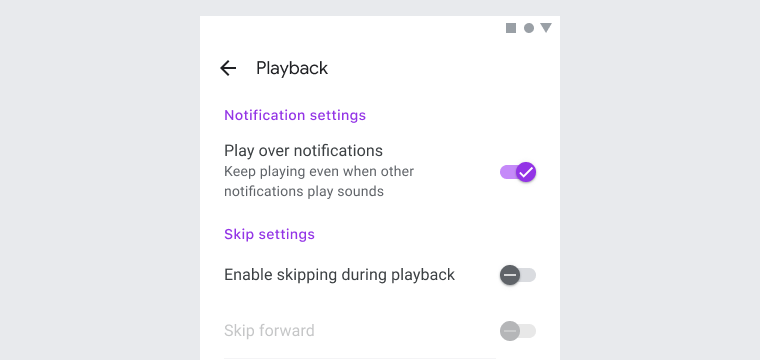
Switches toggle the state of a single setting on or off. They are the preferred way to adjust settings on mobile.
Contents
Using switches
Use switches to:
- Toggle a single item on or off, on mobile and tablet
- Immediately activate or deactivate something
Installing switches
npm install @material/switch
Styles
@use '@material/switch/styles';JavaScript instantiation
The switch requires JavaScript to function, so it is necessary to instantiate
MDCSwitch on the mdc-switch element.
import {MDCSwitch} from '@material/switch';

for (const el of document.querySelectorAll('.mdc-switch')) {
  const switchControl = new MDCSwitch(el);
}
Note: See Importing the JS component for more information on how to import JavaScript.
Switches
Switch example
<button id="basic-switch" class="mdc-switch mdc-switch--unselected" type="button" role="switch" aria-checked="false">
  <div class="mdc-switch__track"></div>
  <div class="mdc-switch__handle-track">
    <div class="mdc-switch__handle">
      <div class="mdc-switch__shadow">
        <div class="mdc-elevation-overlay"></div>
      </div>
      <div class="mdc-switch__ripple"></div>
      <div class="mdc-switch__icons">
        <svg class="mdc-switch__icon mdc-switch__icon--on" viewBox="0 0 24 24">
          <path d="M19.69,5.23L8.96,15.96l-4.23-4.23L2.96,13.5l6,6L21.46,7L19.69,5.23z" />
        </svg>
        <svg class="mdc-switch__icon mdc-switch__icon--off" viewBox="0 0 24 24">
          <path d="M20 13H4v-2h16v2z" />
        </svg>
      </div>
    </div>
  </div>
  <span class="mdc-switch__focus-ring-wrapper">
    <div class="mdc-switch__focus-ring"></div>
  </span>
</button>
<label for="basic-switch">off/on</label>
The mdc-switch__focus-ring element ensures that a focus indicator is displayed
in high contrast mode around the active/focused switch.
Switch states
Switches can be on or off. Switches have enabled, hover, focused, and pressed states.
Other variants
Initially disabled switch
Add the disabled attribute to the mdc-switch element to disable the switch.
This logic is handled by the MDCSwitch.disabled property, but you'll want to
avoid a FOUC by initially adding this attribute.
<button id="disabled-switch" class="mdc-switch mdc-switch--unselected" type="button" role="switch" aria-checked="false" disabled>
  <div class="mdc-switch__track"></div>
  <div class="mdc-switch__handle-track">
    <div class="mdc-switch__handle">
      <div class="mdc-switch__shadow">
        <div class="mdc-elevation-overlay"></div>
      </div>
      <div class="mdc-switch__ripple"></div>
      <div class="mdc-switch__icons">
        <svg class="mdc-switch__icon mdc-switch__icon--on" viewBox="0 0 24 24">
          <path d="M19.69,5.23L8.96,15.96l-4.23-4.23L2.96,13.5l6,6L21.46,7L19.69,5.23z" />
        </svg>
        <svg class="mdc-switch__icon mdc-switch__icon--off" viewBox="0 0 24 24">
          <path d="M20 13H4v-2h16v2z" />
        </svg>
      </div>
    </div>
  </div>
  <span class="mdc-switch__focus-ring-wrapper">
    <div class="mdc-switch__focus-ring"></div>
  </span>
</button>
<label for="disabled-switch">off/on</label>
Initially "on" switch
Add the mdc-switch--selected class and aria-checked="true" attribute to the
mdc-switch element to toggle the switch to "on". This logic is handled by the
MDCSwitch.selected method, but you'll want to avoid a FOUC by initially adding
this class and attribute.
<button id="selected-switch" class="mdc-switch mdc-switch--selected" type="button" role="switch" aria-checked="true">
  <div class="mdc-switch__track"></div>
  <div class="mdc-switch__handle-track">
    <div class="mdc-switch__handle">
      <div class="mdc-switch__shadow">
        <div class="mdc-elevation-overlay"></div>
      </div>
      <div class="mdc-switch__ripple"></div>
      <div class="mdc-switch__icons">
        <svg class="mdc-switch__icon mdc-switch__icon--on" viewBox="0 0 24 24">
          <path d="M19.69,5.23L8.96,15.96l-4.23-4.23L2.96,13.5l6,6L21.46,7L19.69,5.23z" />
        </svg>
        <svg class="mdc-switch__icon mdc-switch__icon--off" viewBox="0 0 24 24">
          <path d="M20 13H4v-2h16v2z" />
        </svg>
      </div>
    </div>
  </div>
  <span class="mdc-switch__focus-ring-wrapper">
    <div class="mdc-switch__focus-ring"></div>
  </span>
</button>
<label for="selected-switch">off/on</label>
API
CSS classes
| CSS Class | Description |
|---|---|
mdc-switch |
Mandatory, for the parent element. |
mdc-switch--unselected |
Optional, styles the switch as unselected ("off") |
mdc-switch--selected |
Optional, styles the switch as selected ("on") |
mdc-switch__track |
Mandatory, for the track element. |
mdc-switch__handle-track |
Mandatory, for the handle's track element. |
mdc-switch__handle |
Mandatory, for the handle element. |
mdc-switch__shadow |
Mandatory, for the shadow effect. |
mdc-elevation-overlay |
Mandatory, for the shadow effect's overlay in dark mode. |
mdc-switch__ripple |
Mandatory, for the ripple effect. |
mdc-switch__icons |
Mandatory, for the icons. |
mdc-switch__icon |
Mandatory, for the icon elements. |
mdc-switch__icon--on |
Mandatory, for the on icon. |
mdc-switch__icon--off |
Mandatory, for the off icon. |
Theme mixin
The switch may be customized using the theme() mixin and providing an
MDC Theme string (such as primary) or other values to the
theme keys.
@use '@material/switch';
@use '@material/theme/color-palette';
@use '@material/theme/shadow-dom';

// Include for IE11 support
// @include shadow-dom.enable-css-selector-fallback-declarations(true);

.my-switch {
  @include switch.theme((
    selected-handle-color: color-palette.$teal-600,
    selected-track-color: color-palette.$teal-300,
  ));
}
View the theme file for available keys and built-in themes.
MDCSwitch properties
| Property | Value Type | Description |
|---|---|---|
disabled |
Boolean | Indicates whether or not the switch is disabled. |
selected |
Boolean | If true, the switch is on. If false, the switch is off. |
Usage within web frameworks
If you are using a JavaScript framework, such as React or Angular, you can create a switch for your framework. Depending on your needs, you can use the Simple Approach: Wrapping MDC Web Vanilla Components, or the Advanced Approach: Using Foundations and Adapters. Please follow the instructions here.
See MDCSwitchAdapter and MDCSwitchFoundation for up-to-date code documentation of switch's foundation API.

