MacBook Pro review (2016): A step forward and a step back
Touch ID and a thinner design are nice, but give me back my ports. (And my Function keys.)
The last time Engadget reviewed a brand-new MacBook Pro design was in June of 2012. It weighed 4.46 pounds (a heavyweight by today's standards) and it ushered in some newfangled thing called the Retina display. Though Apple has occasionally refreshed the processors (the last time being all the way back in early 2015), that design from 2012 is virtually the same one we've been reviewing all these years.
Thanks to that stale design and often neglected internals, many Mac fans out there have delayed upgrading -- surely a new model was just around the corner, right? Though we're not sure you all were able to hold off until now, Apple has finally updated its MacBook Pro line, and it's not just a processor refresh either. Both of the new 13- and 15-inch Pros are thinner, lighter and more compact than their predecessors, with faster graphics and disk performance, a brighter, more colorful screen, Touch ID fingerprint sensor and louder, clearer audio.
Most notably, they mark the debut of yet another newfangled thing: the "Touch Bar," an OLED strip above the keyboard that replaces the age-old Function bar with touch-sensitive controls that change depending on the app you're using. Factor in a narrower selection of ports (almost guaranteeing you'll need a dongle) and the MacBook Pro isn't just a thinner or different-looking Mac; it's one you're meant to use differently. That's not necessarily a good thing.
Hardware
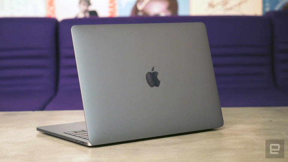
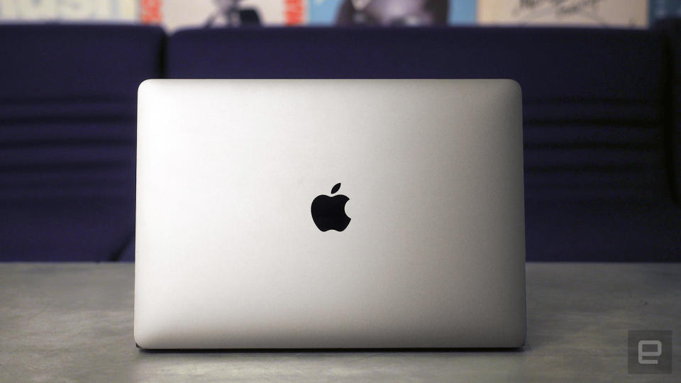
The new MacBook Pro is a clear departure from the previous generation, but it does look an awful lot like the more recent 12-inch MacBook. Like its stablemate, the new Pro has a unibody aluminum chassis, available in silver and space gray -- a first for the Pro series. As on the smaller MacBook, there's a metal logo on the lid where the glowing Apple used to be. (I don't miss it, to be honest.) The keyboard has the same flat buttons as on the smaller MacBook, and the glass Force Touch trackpad is exactly what you're used to, just a lot bigger this time.
Also familiar is the Retina display, whose 13.3-inch size and 2,560 x 1,600 resolution haven't changed from last year's MacBook Pro. (Ditto for the 15.4-inch screen, with a resolution of 2,880 x 1,800.) What has changed is the quality of the screen: It's 67 percent brighter this year, with a max brightness rating of 500 nits. (Notebook displays don't get much brighter than that.) Apple also promises a higher contrast ratio and a 25 percent wider color gamut that now includes the P3 color space -- an important spec for photographers, videographers and other creative professionals.
As I said in my review of the current iMac, which also supports the P3 color gamut, you might not notice the difference in color on your own, but once someone points it out for you, it can be hard to un-see. In particular, you'll notice the biggest difference with reds and greens, or even colors that occupy a similar spot on the spectrum, like orange.
There's also a second display, if you will: the so-called Touch Bar sitting above the keyboard where the Function buttons used to be. I'll spend a lot of time later explaining what the Touch Bar does and how it works, but for now, all you need to know is that this 2,170 x 60 touch strip offers a changing set of controls, depending on what app you're using. There's also a Touch ID fingerprint sensor built into the power button on the far-right side, which consistently delivered fast, accurate results in my tests. I much prefer it to entering a password or even logging in with an Apple Watch.
Again, I'll have much more to say about the Touch Bar in just a moment, but suffice to say, as far as both design and features go, this is the single most obvious thing setting the new MacBook Pro apart from its predecessor. That's especially true when the machine is powered on -- the OLED strip displays millions of colors, the likes of which we're not used to seeing emanating from a Mac keyboard.
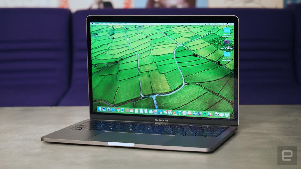
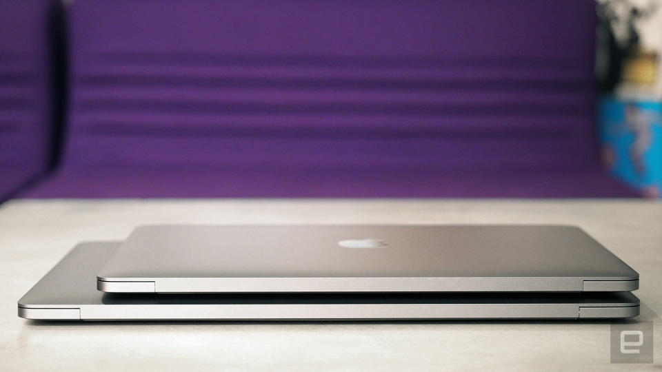
Another noticeable change: The MacBook Pro is considerably thinner and lighter than before. The 13-inch model weighs just 3.02 pounds -- a hair more than the 2.96-pound Air, and half a pound less than the last-gen MacBook Pro 13. It's also 18 percent thinner, at 14.9mm thick, and has a 23 percent smaller footprint. Meanwhile, the 15-inch Pro comes in at 15.5mm thick, a 14 percent slim-down. It weighs four pounds, or about half a pound less than before, and takes up 20 percent less space.
Regardless of which size you choose, the port selection will be the same. Which is to say, less than on last year's models. If you buy a MacBook Pro with a Touch Bar, you'll get four Thunderbolt 3 ports, which use the USB Type-C standard. If you go with the entry-level MacBook 13, which does not have the Touch Bar, you'll have to make do with two Thunderbolt connections.
Either way, it's through one of those Thunderbolt ports that you'll charge the laptop. That's right, the ol' MagSafe power connector is a thing of the past. I admit, I've been enjoying being able to charge my Mac on either side, depending on where the nearest power outlet happens to be. At the same time, this move to USB-C means there's a greater risk of either breaking the cable or someone tripping over the cord and pulling your laptop to the ground.
Other than that, you just get a headphone jack. No SD slot, no HDMI output and no DisplayPort. You'll need an adapter (sold separately, of course) to plug in just about any peripheral you already own. And given the MacBook Pro's supposed demographic, I'm sure many people do indeed work with external monitors or backup drives attached. Photographers in particular like their memory card readers -- heck, I needed one to produce this very review you're reading.
I get why Apple went with USB-C -- that standard is the future, and offers some real benefits like transfer speeds of up to 40Gbps and support for two external monitors up to 5K each. Right now, though, in the year 2016, I would have preferred a mix of USB-C and full-size USB sockets.
Apple must realize this new setup will be a pain for some: It temporarily slashed the prices of its adapters to as low as $9 for a USB-C-to-USB dongle. Take advantage of that soon, though, as Apple only plans to keep these prices in effect through the end of the year. Even if you do already own Thunderbolt 3 accessories, though, you might be disappointed to find that they don't always work. We've already seen at least one report about the new MacBook Pros not playing nice with some existing peripherals.
It would be easy in our hardware tour to gloss over the small speaker grilles flanking the keyboard. As it happens, though, Apple retooled the audio setup within, adding stereo speakers offering twice the dynamic range and 58 percent more volume. The result is some of the clearest sound I've heard yet from a notebook. Everyone from Dolly Parton to Peggy Lee to Bob Dylan sounded more ... present. With no discernible distortion crackling through the speakers, all my favorite artists sounded more than ever like they were in the room with me. Audiophiles might dispute my use of the phrase "studio quality," but if nothing else, I think we can agree that, although laptop audio is usually unremarkable, this is actually pretty good.
Keyboard and trackpad
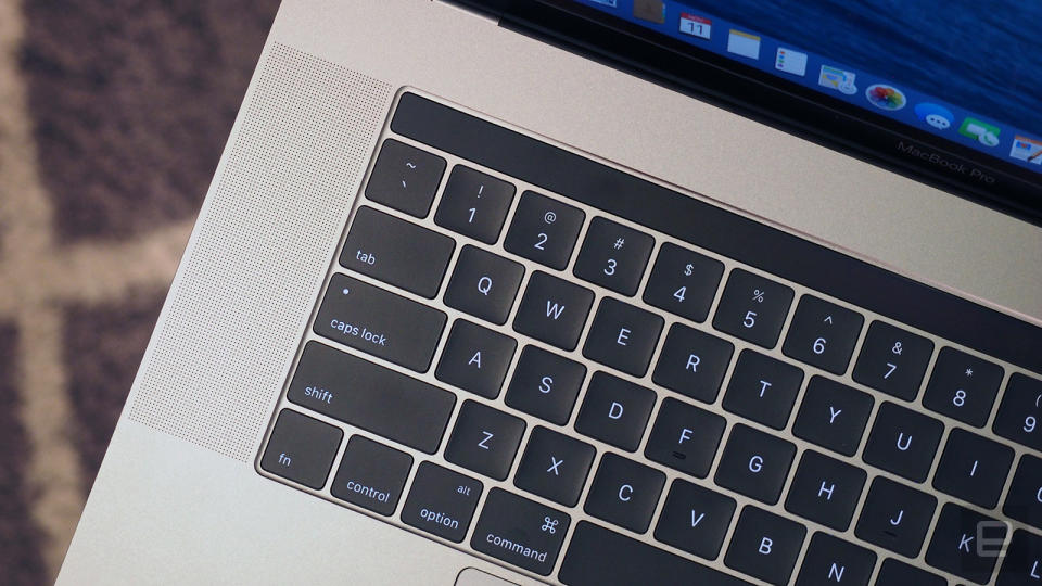
I was almost as pleasantly surprised by the keyboard. I did always love the cushy keyboard on the older MacBook Pro, and so I was wary when Apple announced it was moving to the same shallow keyboard used on the 12-inch MacBook. The buttons here use the second generation of Apple's "butterfly" button design, offering four times more key stability than before. They also offer the same travel as on that smaller notebook: just 0.5 millimeters.
Indeed, though I've used the smaller MacBook, I still encountered something of a learning curve here. Particularly tricky were the sorts of long, complex passwords required by my company's IT department. Though Apple claims the butterfly mechanism allows for more even button presses, my key strikes would sometimes fail to register, leading me to make typos and forcing me to go back and reenter my long password a second or even third time.
By now, though, after some two-odd weeks of testing, I'm typing at a faster clip. I still sometimes screw up my passwords, but my emails and first drafts (including this review!) are mostly clean. I've gone from merely tolerating the new keyboard to actually appreciating it.
Sitting beneath the keyboard, of course, is the touchpad, which is 46 percent larger than on the previous 13-inch model. On the 15-incher, it's twice as big as before. And it's ridiculous. Just look at it!
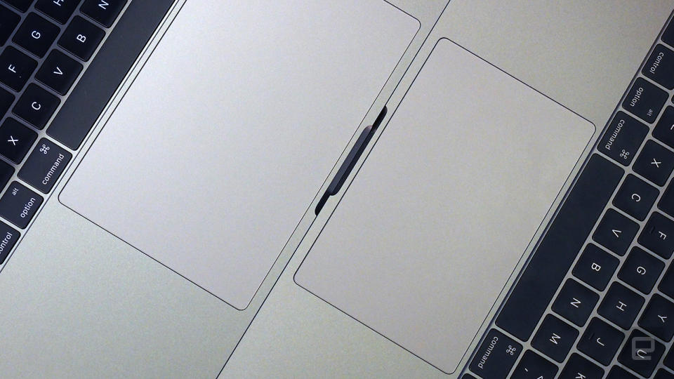
Whatever antipathy I used to have for Apple's Force Touch trackpads has faded with time, as they're now the standard on the company's newer laptops. Apple has by now fooled me into believing that I'm still clicking a button, when really I'm bearing down on a fixed, unmoving piece of glass with a vibrating haptic engine underneath. It's partly thanks to trackpads like this that Apple is able to make its notebooks as thin as they are.
Personally, I still don't make much use of the various pressure-sensitive Force Touch gestures available to me. I could bear down to fast-forward through an iTunes movie or peek at a file in Finder, but it never occurs to me to do so. I sometimes open a dictionary preview for a word in an article I'm reading, but I pretty much do it only by accident. The thing that makes Force Touch most special, then, remains lost on me. But at least the touchpad is spacious and does well at the basics: tap-to-click, single-finger tracking, two-finger scrolls and pinch-to-zoom.
Touch Bar
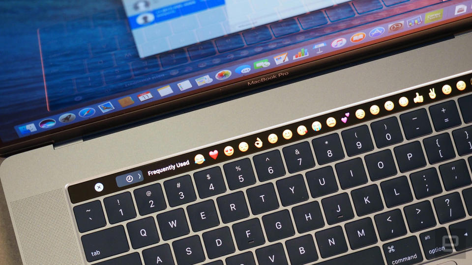
Apple sees the Touch Bar as an extension of the mouse and keyboard. That means that, although it's technically a second display, you won't see it used as such. You won't see a moving stock ticker, for instance. No Facebook notifications. You can only use the Touch Bar in situations where you already use a Mac (or iOS!) keyboard. As it turns out, that mostly includes function buttons, word suggestions, emoji and a whole lot of sliders.
By default, when you boot up your Mac and aren't in any particular app yet, you'll see the Escape key at the far left of the Touch Bar (where it belongs) and a handful of icons over on the right. From right to left, that includes Siri, the mute button and volume and brightness shortcuts. Those Touch Bar shortcuts are all programmable, with options to add, remove and reorder shortcuts. You do this not in the System Settings, where you might expect, but from the View menu on the desktop.
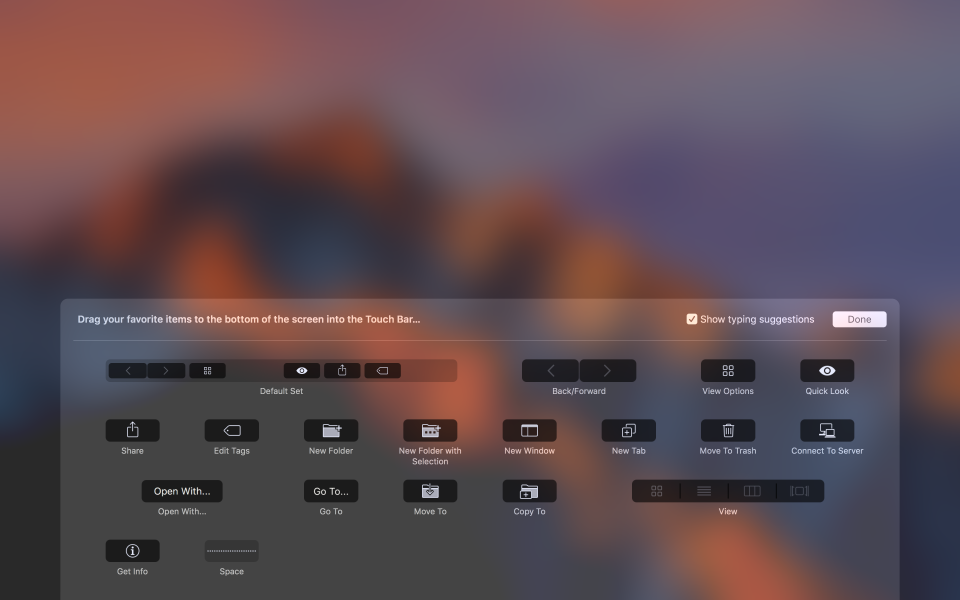
In addition to those four default Touch Bar shortcuts, you'll also notice an arrow sign, which allows you to expand that short list of icons to fill out the entire touch strip. Though that full list might initially seem cluttered, I like it because it's more similar to the setup I'm used to. For instance, with the shortcuts fully expanded, you get separate buttons for increasing and decreasing the brightness. Ditto for volume: You'll see separate keys for volume up and down. Unfortunately, though, that expanded view fades away after a few seconds of idle time; there's no way to just lock in that function row so that you see it there every time you look down at the keyboard.
In addition to expanding the Touch Bar menu, you can tap the volume or brightness icons to bring up a slider. What's annoying about this whole setup is that either way, some of the most important system controls are now buried in Touch Bar menus. Want to lower the volume? You can either hit the volume icon and swipe the slider, or hit the arrow key and tap the volume up or down key. That's less efficient than just pressing a dedicated volume button in the function row. It's inconvenient enough that I eventually started using my mouse to do things like pause Spotify or raise the volume on a track. Apple made me change my way of doing things, and not necessarily for the better. That pisses me off.
Another thing: I too often end up hitting the Touch Bar when I mean to strike the Delete key. By default, it's Siri sitting in that spot above the backspace button, which means I've more than once summoned Apple's virtual assistant when I didn't mean to. I did use the settings menu to move Siri over to the left, but that just means something else will then be sitting above the Delete key, and you will accidentally hit that too. I'm frankly not sure what Apple should do about that. Maybe issue a software update that pushes those four shortcuts slightly left? Think on it, guys.
The Touch Bar works throughout the rest of macOS too, and occasionally it's actually useful. In Safari, for instance, you can tap or slide to switch between open tabs. Also, when you put your cursor in the search field, your favorite websites will automatically pop up. In Mail you'll see predictive text, formatting options (bold, italics, etc.) and even suggestions for where you should archive highlighted messages.
The Messages app also has Quick Type word suggestions, along with emoji and "Tapback" responses. In Calendar, you can select a day, month or year from the Touch Bar. Notes gives you checklists, formatting tools and, once again, predictive text. Rounding out the list, in Photos you'll see a slider to scrub through your photos, along with buttons for cropping, favoriting, rotating pictures, or adding filters to them.
I think the reason some of these use cases work is that many of the things I just mentioned -- picking emoji, accepting spellcheck suggestions -- are things we're already used to doing on touchscreens. Using iPhones for as long as nine years has prepared loyal Apple fans well for this moment. At the same time, I can understand why Apple didn't go all in with a full touchscreen: macOS simply wasn't designed to be finger friendly. Still, that didn't stop me from poking the screen in vain several times, with the expectation that the Mac would behave the same as any Windows laptop I've tested recently.
In addition to those apps I mentioned, the Touch Bar works in other Apple programs like Pages, Numbers, Keynote and Final Cut Pro X. The company has also released an API for developers, and indeed, we've already seen previews of upcoming apps that take advantage of the Touch Bar, like Photoshop and Microsoft Office. For now, though, as this is only the first day that the Touch Bar MacBook Pros are on sale, the feature is mostly limited to first-party apps.
Performance and battery life
For its newest MacBook Pros, Apple went with sixth-, not seventh-generation ("Kaby Lake") Intel Core CPUs. Which makes sense, because the specific (read: more powerful) Kaby Lake processors that Apple would need for the MacBook Pro series aren't even available yet.
That said, even with the currently available Intel chips, Apple is claiming some big performance claims -- up to 130 percent faster graphics on the 15-inch model, and up to 103 percent faster integrated graphics on the 13-inch model. The SSDs here are said to be up to 100 percent faster, with sequential read speeds of up to 3.1 gigabytes per second and sequential write speeds of up to 2.1 GB/s on the 13-inch model and up to 2.2 GB/s on the 15-incher.
Laptop | Geekbench 4 CPU test (64-bit, single-/multi-core) | Xbench |
|---|---|---|
MacBook Pro 2016 (15-inch, 2.7GHz Core i7, 16GB RAM, 2GB Radeon Pro 455) | 4,309/13,367 | 558.81 |
MacBook Pro 2016 (13-inch, 2.9GHz Core i5, 8GB RAM, Intel Iris Graphics 550) | 3,876/7,504 | 476.36 |
MacBook Pro 2016 (13-inch, 2GHz Core i5, 8GB RAM, Intel Iris Graphics 540) | 3,756/7,268 | 473.65 |
Surface Book 2016 (2.6GHz Core i7-6600U, 16GB RAM, 2GB NVIDIA GeForce GTX 965M) | 3,824/7,189 | N/A |
As for disk speeds, the Blackmagic test showed average write speeds of 1.36 GB/s on the 13-inch Pro and 1.84 GB/s on the 15. (Blackmagic capped all read speeds at 2 GB/s -- an error suggesting the test can't handle disks this fast.) In a separate experiment, I duplicated a 6.02GB folder. This took as little as 8.2 seconds on the 15-inch model and a similar 8.44 seconds on the 13-incher.
Obviously, you're not going to see maximum read or write speeds in a scenario like that, since both are happening at the same time. That said, speeds of 734 MB/s (or 713 MB/s on the 13-incher) are none too shabby. An eight-second transfer time is pretty brisk, considering how many photos, videos and other files I had in that six-gigabyte folder.
Boot-up took around 15 seconds to the login screen on the entry-level 13-inch model, though I logged a faster 10-second startup on my higher-specced 13-incher. In any case, this is on par with how last year's models performed. This might be a good time to mention, by the way, that Apple has done away with its long-standing startup chime. I've been hearing some people say they miss it, but personally, I've been enjoying my silent boot-ups.
Though the MacBook Pro wasn't intended for gaming, per se, for this kind of money it had better be able to do a passable job when pros feel like taking a break from work. For the purposes of this review, I installed Tomb Raider and used its built-in benchmark to measure frame rates. (Yes, I observed actual gameplay too.)
At the game's native resolution (1,440 x 900 on the 13-inch Pro), I saw an average of 40.5 frames per second on the entry-level model, with frame rates ranging from 48.8 all the way down to a sluggish 18.8 at one point. On a more souped-up 13-inch Pro (one with a Touch Bar), the frame rate average rose to 47.4, with a range of 21.3 to 58.1 in my tests. Whichever configuration you get, the gameplay will net out to playable frame rates at default settings, though I can't guarantee you won't see any slowdowns.
As you'd expect, things improve a bit on the 15-inch model, which comes standard with discrete graphics. The Radeon Pro 455 GPU in my unit delivered average frame rates of 53 frames per second in Tomb Raider, with the default screen resolution of 1,650 x 1,050. Even the lowest frame rates were more playable here, with the fps rating ranging from 31.4 to 60.5.
Surface Book with Performance Base (2016) | 16:15 |
Surface Book (Core i5, integrated graphics) | 13:54 / 3:20 (tablet only) |
Apple MacBook Pro 2016 (13-inch, no Touch Bar) | 11:42 |
Surface Book (Core i7, discrete graphics) | 11:31 / 3:02 (tablet only) |
Apple MacBook Pro with Retina display (13-inch, 2015) | 11:23 |
Apple MacBook Pro 2016 (15-inch) | 11:00 |
HP Spectre x360 15t | 10:17 |
HP Spectre x360 (13-inch, 2016) | 10:03 |
Apple MacBook Pro 2016 (13-inch, Touch Bar) | 9:55 |
ASUS ZenBook 3 | 9:45 |
Apple MacBook (2016) | 8:45 |
Samsung Notebook 9 | 8:16 |
Microsoft Surface Pro 4 | 7:15 |
HP Spectre 13 | 7:07 |
Dell XPS 15 (2016) | 5:25 (7:40 with the mobile charger) |
This would be a good time to talk about operating temperatures. The 15-inch model in particular adds a split-blade fan design that promises more efficient cooling. Both models got hot on the bottom after just a few minutes of gaming, but in regular use they were more tolerable to keep in my lap -- they sometimes got warm after a while, but never uncomfortably hot with more mundane use.
Apple rates both the 13- and 15-inch MacBook Pro for up to 10 hours of battery life, and that's either with web surfing or iTunes movie playback. Even after half a dozen battery tests, I'm still noticing some inconsistencies in my results: 13-inch battery life is sometimes in the seven- to eight-hour range, with some tests hinting at a ten-and-a-half-hour capacity. Testing on the 15-inch model has also been inconclusive. I've generally seen between nine and 10 hours of video playback, but in one instance I exceeded the 13-hour mark by lowering the brightness slightly. I'll be conducting more tests and updating this review with final battery life results.
(Update: It took a few battery cycles and some very specific system settings, but I eventually saw the 15-inch model last 11 hours in the iTunes playback test, with the 13-inch Touch Bar model coming in at nine hours and 55 minutes. The entry-level 13-inch Pro without the Touch Bar lasted 11 hours and 42 minutes in the same test. That said, I've heard other tech reviewers complain of shorter battery life and I believe them — especially if they were judging by everyday use as opposed to video playback.)
Even if we take my best battery results as fact, though, it's worth noting that earlier-gen MacBook Pros lasted longer on a charge. In particular, the 13-inch MacBook Pro I tested a year ago was rated for 12 hours of iTunes playback, and logged nearly 11 and a half hours in the same test I used this time. That's about on par with this year's entry-level, lower-spec model, but an hour and a half longer than what I got with the Touch Bar configuration.
And then you have to consider what other computer makers are doing. Microsoft's updated Surface Book, which just began shipping yesterday, is rated for up to 16 hours, and I actually got slightly more than that in my video rundown test (and that was with a Core i7 processor and discrete graphics, mind you). And while the Surface Book admittedly achieves that runtime with a heftier, 3.68-pound design, the same can't be said of the 13-inch HP Spectre x360 -- it lasted 10 hours in our video test with a Core i7 processor and a 2.85-pound design that weighs less than either of Apple's MacBook Pros.
Taking all that into consideration, I'd be even happier with the battery life on the 13-inch model if Apple had been able to accomplish the same thing with a lighter design à la HP, or if it had accepted a slightly heavier build in the name of better endurance.
Configuration options
The 13-inch MacBook Pro starts at $1,299 without the controversial Touch Bar. For the money, you get a 2.0GHz dual-core Core i5 processor, 8GB of RAM, a 128GB solid-state drive, integrated Intel Iris 6100 graphics and just two USB-C ports. The non–Touch Bar machine is also available with a bigger 256GB drive, a different 2GHz Core i5 processor and Intel Iris 540 graphics for $1,499.
The Touch Bar models start at $1,799, and it's at this tier, too, that you step up from two USB-C ports to four. At that price you get a 2.9GHz dual-core Core i5 processor, 8GB of RAM, a 256GB SSD and Intel Iris 550 graphics. The top-end model has a 512GB drive, bringing the total to $1,999.
Well, assuming you don't buy any add-ons. You can purchase a 3.1GHz Core i5 processor for $100 or a 3.3GHz dual-core Core i7 CPU for $300. Doubling the RAM to 16GB costs $200. A 1TB SSD, meanwhile, costs an extra $400. This means the most tricked-out 13-inch Pro will set you back $2,899. Price of dongles not included.
If it's the 15-inch version you're after, that starts at $2,399 with a 2.6GHz quad-core Core i7 processor, 16GB of RAM, a 256GB SSD and a 2GB AMD Radeon Pro 450 graphics card. An even pricier $2,799 configuration nets you double the storage (512GB), a slightly faster 2.7GHz quad-core Core i7 CPU and an incrementally better Radeon Pro 455 GPU.
From there, too, you have upgrade options. There's one more CPU tier -- a 2.9GHz quad-core Core i7 chip for $200. You can bump the disk capacity to 1TB ($400) or 2TB for a mighty $1,200 -- the first time the 15-inch Pro has offered that storage option at all. Lastly, there's one more GPU option: a 4GB Radeon Pro 460 chip, available for an extra $100. All told, the most expensive 15-inch Pro you could get costs a stinging $4,299,
The competition
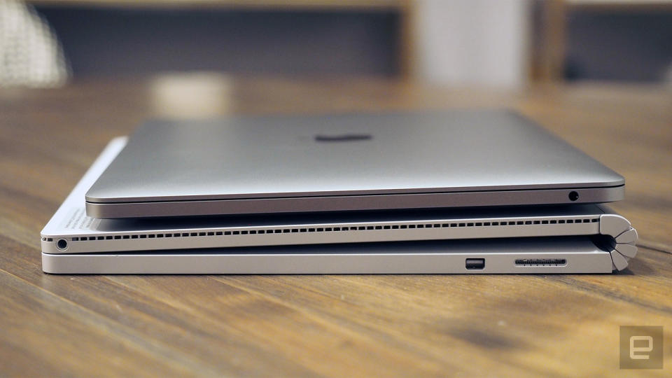
I can think of a handful of machines I'd suggest you add to your short list, and as it happens I've reviewed all of them recently, or am in the middle of testing them now. The most obvious might be Microsoft's updated Surface Book, which went on sale late last week and was met with positive reviews, including from Engadget. To recap my own review, its biggest drawbacks are that it's fairly heavy, at 3.68 pounds, and it's expensive. (Though last year's model is still around for $1,499 and up, you'll have to pay $2,399 and up for the newest configurations.)
If you can stomach the weight and price, though, you'll be rewarded with long battery life, a comfortable keyboard, ample ports, fast performance and a versatile design that allows you to detach the screen and use it as a pen-enabled tablet. (It's a very lightweight tablet too, I might add.)
People considering the 13-inch Pro would also be smart to consider HP's newly updated Spectre x360 ($1,050-plus), which packs seventh-generation Intel processors and sports a more compact design. You also get a choice of 8GB or 16GB of RAM and between 256GB and 1TB of storage. The graphics performance can't quite match the MacBook Pro, but it's otherwise fast, with a lighter design and longer battery life, not to mention a more versatile design. Keep in mind, though, that the screen resolution tops out at 1080p, making it less pixel-dense than a Retina display.
Lenovo's new 13.9-inch Yoga 910 ($1,050 and up; review coming soon) fits a similar profile: 3.04 pounds with up to a Core i7 processor, Intel HD 620 graphics, 16 GB of RAM and up to a 1TB SSD. Unlike on the similar HP Spectre 360, though, there's a higher-res 3,840 x 2,160 screen option to rival the Retina display. You might even consider the 14-inch Razer Blade ($1,800 and up). Though it looks the part of a gaming laptop with its green logo and colorful keyboard backlighting, its portable design and specs (chiefly an NVIDIA GTX 1060 GPU) qualify it as a MacBook Pro competitor.
Lastly, don't count out Dell's XPS line. I recommend the 15-inch model in particular here because it's one of the few other 15-inch laptops thin and powerful enough to rival the larger MacBook Pro. (The smaller XPS 13 is one of my favorite general-purpose laptops, but it doesn't pack the graphics power to compete with the MBP.) The XPS 15, which starts at $1,000, weighs under four pounds, making it about as light as Apple's machine, and can be configured with a 4K display, quad-core Core i7 CPU, a 2GB NVIDIA 960M GPU, up to 32GB of RAM and a 1TB SSD. That top configuration costs $2,600.
Wrap-up
I'm one of many Mac owners out there who has been waiting for Apple to upgrade the MacBook Pro line. Now that it finally has, I find the new laptop isn't quite what I wanted. For me, the ideal MacBook Pro is actually a mashup between this and last year's model. Let me keep my full-size USB ports, and my function keys, and my longer battery life, but stick with this thinner and lighter design. Stick with this improved display, Touch ID sensor, fast disk performance and more robust audio quality. For me, this is both a step forward and a step backward.
I'm sure Apple disagrees, and not just because its job is to sell lots of computers. Apple seems to earnestly believe it knows how people should be getting work done -- so much so that it has the chutzpah to ask loyal customers to unlearn old habits. Get used to using dongles to attach your existing accessories. Say goodbye to your memory card slot, creatives. Resign yourself to adjusting the brightness or volume with taps and swipes, instead of a simple button press. Accept the risk that your existing Thunderbolt 3 peripherals might not work.
As I said, there's ultimately a lot to like about the new MacBook Pro. But it's designed for someone who I'm not sure exists outside Apple's fantasies of how professionals use computers. The MacBook Pro I want to see is built around real people's work habits. I still recommend it, and I imagine many of you who have been waiting patiently will indeed buy this. But I'd enjoy it more if it were designed for people like us.


