FlexColorPicker is a customizable color picker for Flutter. The ColorPicker can show six different types of color pickers, three of which are used for the standard Flutter Material colors and their shades. The size and style used for the pick items can be customized.
The picker is also Windows, Mac, Linux and Web desktop compatible with focus handling, optional menus for handling copy-paste of color from/to the picker, including desktop keyboard copy/paste shortcuts.

The different types of available color pickers are:
- Material primary colors and its shades.
ColorPickerType.primary - Material accent colors and its shades.
ColorPickerType.accent - Both primary and accent colors and their shades, in the same color picker.
ColorPickerType.both - Black and white colors, including near black and near white shades.
ColorPickerType.bw - Custom material like colors and their shades, that you define and name.
ColorPickerType.custom - HSV color wheel picker, that allows you to select or enter any color.
ColorPickerType.wheel
When you show more than one color picker, a segmented sliding control allows you to select which one to use. You can
configure the ColorPicker to include any of the above color pickers. Showing pickers 1 and 2, together with picker 3
is not very useful, they are available as optional ways of showing and selecting the standard Material primary and
accent colors.
Give the ColorPicker a heading and a subheading for the color shades, typically Text widgets with appropriate style.
Decide if the Material shades can be selected or not and if the selected color names and code are visible in the
picker. If the color HEX RGB code is visible, the picker also includes a button that allows you to copy the selected
color's code to the clipboard. On the wheel picker you can also enter a HEX RGB for the color to be selected.
The shape, size and spacing of the color picker items can be modified. There is a built-in dialog that can be used to
show and use the ColorPicker in a pre-made dialog. You can of course also make your own dialog and just use the color
picker widget in your own custom dialog.
In the pubspec.yaml of your Flutter project, add the following dependency:
dependencies:
  flex_color_picker: ^2.0.0-nullsafety.5
In your library file add the following import:
import 'package:flex_color_picker/flex_color_picker.dart';To try a basic example of the ColorPicker on a device or simulator, clone the flex color picker repository and run the example:
cd example/
flutter run --release
The result is a default color picker with only the primary and accent color pickers available. Plus another picker
that opens up in a dialog, with all pickers enabled, except 3 ColorPickerType.both and 4 ColorPickerType.bw.
You can also try a live web demo of the FlexColorPicker here. With the Web demo you can modify most of the color picker's settings, and use it as a tool to find a style that fits your application.
The source code for the Web demo, which is a bit more elaborate example than the default example, is also bundled with the package source code in "example/lib/demo/main.dart".
The WEB demo has a responsive view, the expands into maximum four separately scrollable columns. The columns contain a massive amount of controls that you can use to adjust the picker's settings. On a normal 1080p desktop screen, you can see most of the settings at the same time as the adjusted picker, so you test and see their impact on the picker as you adjust them.
The WEB demo also has tooltips on each control that show the name of the API it uses and its current value. With this feature you can use the web demo as a tool configure the color picker to desired style, and find the APIs and values that you used. The same toggle that is used to demo turning OFF the tooltips in the picker, also turns OFF the API tooltips in the demo, in case they get in the way, by default they are ON, to show the used API and its value.
The default bundled example application is used as an introduction to the color picker. The example uses a
StatefulWidget where we define a Color variable and give it a start value in the StatefulWidget's initState().
class _ColorPickerPageState extends State<ColorPickerPage> {
  late Color screenPickerColor;

@override
void initState() {
  super.initState();
  screenPickerColor = Colors.blue;
}
We can use the ColorIndicator Widget that the ColorPicker uses internally to show and select a new color.
Alternatively you can make and use a custom for Widget for this purpose. Here we use the ColorIndicator in
a ListTile, we add it above the ColorPicker and use the ColorIndicator as its trailing property to show the
selected color.
The color picker also includes ColorTools, a set of helper functions, that you can use to display names of the
standard material colors, and their shade index value, as well as an optional Flutter style Hex color code. Below
we use ColorTools.materialNameAndCode in the ListTile's subtitle property, to describe the selected color.
We show its Material color name and index, as well as its Flutter style HEX code. We also use the
ColorTools.nameThatColor function, that will name any color based on the closest matching color, from a list
consisting of 1566 colors and their English names.
We begin by adding this ListTile to a ListView in the Scaffold body.
@override
Widget build(BuildContext context) {
return Scaffold(
appBar: AppBar(
centerTitle: true,
title: const Text('FlexColorPicker Demo'),
),
body: Scrollbar(
child: ListView(
padding: const EdgeInsets.fromLTRB(8, 0, 8, 0),
children: <Widget>[
// Show the selected color.
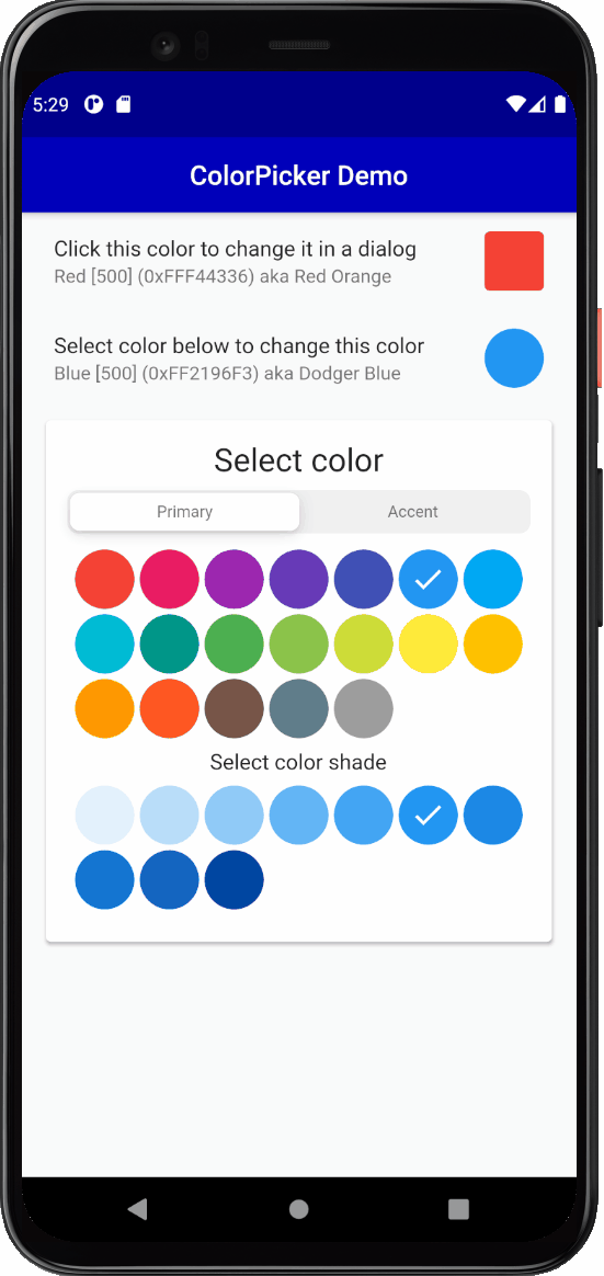
ListTile(
title: const Text('Select color below to change this color'),
subtitle:
Text('${ColorTools.materialNameAndCode(screenPickerColor)} '
'aka ${ColorTools.nameThatColor(screenPickerColor)}'),
trailing: ColorIndicator(
width: 44,
height: 44,
borderRadius: 22,
color: screenPickerColor,
),
),
...Next we add the ColorPicker to the ListView. We give it the defined starting color, in this case
screenPickerColor, a heading and subHeading, plus the required onColorChanged callback function.
We use the color from the callback in a setState() to modify the screenPickerColor to the color returned by
the callback. The callback in the ColorPicker is called whenever you select a new color in the ColorPicker. In
this example we have also wrapped the color picker in a Card.
// Show the color picker in sized box in a raised card.
SizedBox(
width: double.infinity,
child: Padding(
padding: const EdgeInsets.all(6),
child: Card(
elevation: 2,
child: ColorPicker(
color: screenPickerColor,
onColorChanged: (Color color) =>
setState(() => screenPickerColor = color),
width: 44,
height: 44,
borderRadius: 22,
heading: Text(
'Select color',
style: Theme.of(context).textTheme.headline5,
),
subheading: Text(
'Select color shade',
style: Theme.of(context).textTheme.subtitle1,
),
),
),
),
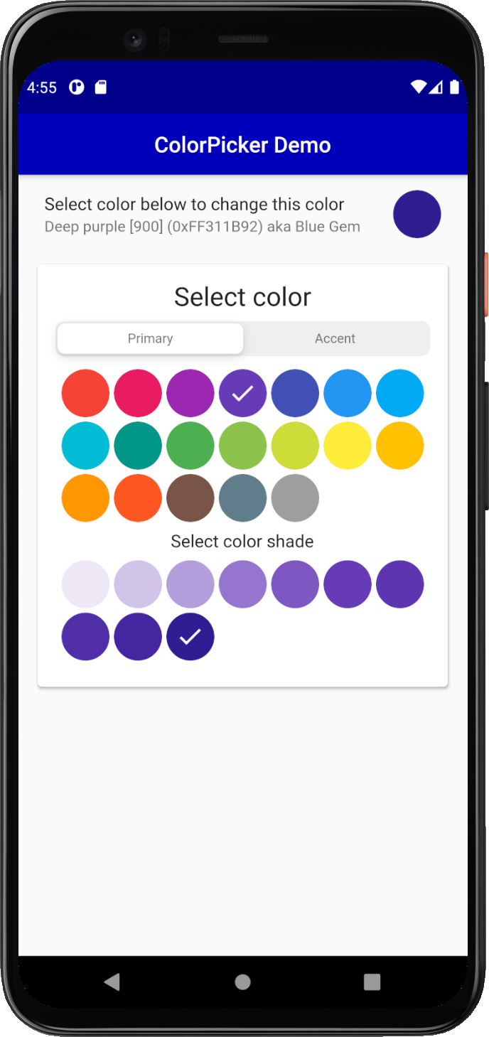
),This gives us round color pick items and an indicator for the selected color:
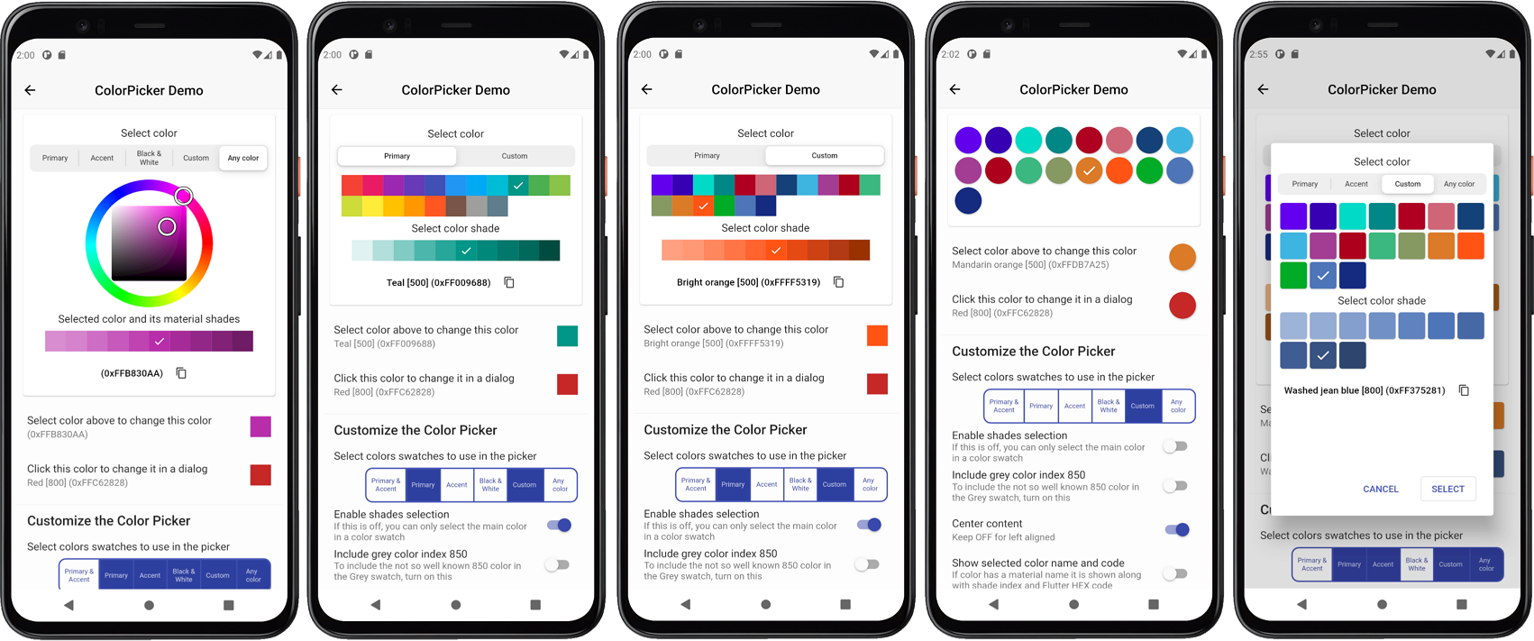
A common use case for a color picker is to show a color selection widget and allow users to select a new color in
a dialog. The ColorPicker comes with a built-in dialog that can be used for this. Alternatively you can just use
the ColorPicker widget and include it in your own custom dialog.
For the dialog example we will show all the built-in picker color selection options, except the combined primary and
accent colors picker, and the black and white shades' picker. We will also add some custom colors for the Custom
colors section of the ColorPicker.
First we define our custom colors and from our color definitions we create primary and accent color swatches by
using ColorTools.createPrimarySwatch or ColorTools.createAccentSwatch for accent color swatches.
We add these color swatches as keys to a ColorSwatch Map, that we map to our own custom String name values
for our custom color swatches. You don't have to use the ColorTools functions to create the color swatches from
a color, you can just as well define and use your own custom hand tuned ColorSwatch swatches. The ColorTools
functions are just convenient helpers that can be used to make Material like primary and accent color
swatches from a single color.
  // Define custom colors. The 'guide' color values are from
  // https://material.io/design/color/the-color-system.html#color-theme-creation
  static const Color guidePrimary = Color(0xFF6200EE);
  static const Color guidePrimaryVariant = Color(0xFF3700B3);
  static const Color guideSecondary = Color(0xFF03DAC6);
  static const Color guideSecondaryVariant = Color(0xFF018786);
  static const Color guideError = Color(0xFFB00020);
  static const Color guideErrorDark = Color(0xFFCF6679);
  static const Color blueBlues = Color(0xFF174378);

  // Make a custom ColorSwatch to name map from the above custom colors.
  final Map<ColorSwatch<Object>, String> colorsNameMap =
      <ColorSwatch<Object>, String>{
    ColorTools.createPrimarySwatch(guidePrimary): 'Guide Purple',
    ColorTools.createPrimarySwatch(guidePrimaryVariant): 'Guide Purple Variant',
    ColorTools.createAccentSwatch(guideSecondary): 'Guide Teal',
    ColorTools.createAccentSwatch(guideSecondaryVariant): 'Guide Teal Variant',
    ColorTools.createPrimarySwatch(guideError): 'Guide Error',
    ColorTools.createPrimarySwatch(guideErrorDark): 'Guide Error Dark',
    ColorTools.createPrimarySwatch(blueBlues): 'Blue blues',
  };
Then add a Color object for the dialog picked color dialogPickerColor and set a start value for it as well, we use
red in this case.
class _ColorPickerPageState extends State<ColorPickerPage> {
  late Color screenPickerColor;
  late Color dialogPickerColor;

@override
void initState() {
  super.initState();
  screenPickerColor = Colors.blue;
  dialogPickerColor = Colors.red;
}
We use another ListTile to display a ColorIndicator, that we style a bit differently for this example. We also
use its onSelect callback to open a dialog with another ColorPicker.
Before we open the dialog we store the current dialogPickerColor's color value. This way we can restore this
color value if the user cancels the dialog. We put this ListTile before the previous one, first in our list view.
This will just ensure that it does not get hidden by the dialog on most phones.
  // Pick color in a dialog.
  ListTile(
    title: const Text('Click this color to change it in a dialog'),
    subtitle: Text(
      '${ColorTools.materialNameAndCode(dialogPickerColor, '
      'colorSwatchNameMap: colorsNameMap)} '
      'aka ${ColorTools.nameThatColor(dialogPickerColor)}',
    ),
    trailing: ColorIndicator(
      width: 44,
      height: 44,
      borderRadius: 4,
      color: dialogPickerColor,
      onSelect: () async {
        final Color colorBeforeDialog = dialogPickerColor;
        if (!(await colorPickerDialog())) {
          setState(() {
            dialogPickerColor = colorBeforeDialog;
          });
        }
      },
    ),
  ),
Next we create a method to show a ColorPicker with the built-in dialog. The colorPickerDialog is an asynchronous
bool function, that returns true if the user closed the dialog picker with the Select button. If Cancel
was selected or user dismissed the dialog by clicking outside it, false is returned.
The pickersEnabled takes a map with ColorPickerType enum keys to boolean values. The map defines which color
pickers we want to enable and use in the ColorPicker. In the example below we included Material primary,
accent colors, and the custom colors we defined, plus the HSV color wheel that allows us to select any
color. We did not include the picker that combines the primary and accent colors in the same picker, nor the
near black and near white color picker.
In the example below the custom colors we defined in colorsNameMap are given to the color picker's constructor
property customColorSwatchesAndNames. If you leave customColorSwatchesAndNames without an entry and
happen to have ColorPickerType.custom: true enabled, the custom picker will still not be shown.
  Future<bool> colorPickerDialog() async {
    return ColorPicker(
      color: dialogPickerColor,
      onColorChanged: (Color color) =>
          setState(() => dialogPickerColor = color),
      width: 40,
      height: 40,
      borderRadius: 4,
      spacing: 5,
      runSpacing: 5,
      wheelDiameter: 155,
      heading: Text(
        'Select color',
        style: Theme.of(context).textTheme.subtitle1,
      ),
      subheading: Text(
        'Select color shade',
        style: Theme.of(context).textTheme.subtitle1,
      ),
      wheelSubheading: Text(
        'Selected color and its shades',
        style: Theme.of(context).textTheme.subtitle1,
      ),
      showMaterialName: true,
      showColorName: true,
      showColorCode: true,
      materialNameTextStyle: Theme.of(context).textTheme.caption,
      colorNameTextStyle: Theme.of(context).textTheme.caption,
      colorCodeTextStyle: Theme.of(context).textTheme.caption,
      pickersEnabled: const <ColorPickerType, bool>{
        ColorPickerType.both: false,
        ColorPickerType.primary: true,
        ColorPickerType.accent: true,
        ColorPickerType.bw: false,
        ColorPickerType.custom: true,
        ColorPickerType.wheel: true,
      },
      customColorSwatchesAndNames: colorsNameMap,
    ).showPickerDialog(
      context,
      constraints:
          const BoxConstraints(minHeight: 460, minWidth: 300, maxWidth: 320),
    );
  }
The above example uses a few more ColorPicker properties. It is styled to be more compact and to show the general
color name, as well as the HEX color code of the selected color in the dialog. With the color code indicator you can
also copy the color code with the copy icon button. When the wheel picker is active you can enter a hex color RGB
value, the two wheel color HSV selection indicators will then move to the color selection matching the entered
HEX RGB value.
Most importantly the above example uses the showPickerDialog method to show the defined ColorPicker in a
pre-made dialog. The dialog also needs a build context, that we pass to it.
In this example we also define size constraints for the dialog. If you do not define size constraints, it will auto size to fit the dialog content. Using constraints allows the dialog to keep the same size when the content size changes slightly as you switch between the different color selection tools you enabled.
It looks a bit better if the dialog size does not change when you switch picker type with the selector. The color wheel picker in particular will often require more space. The wheel size can be customized as well, it does however become more difficult to operate it, if it is made very small. In this example it is on purposes on the lower side of still usable size.
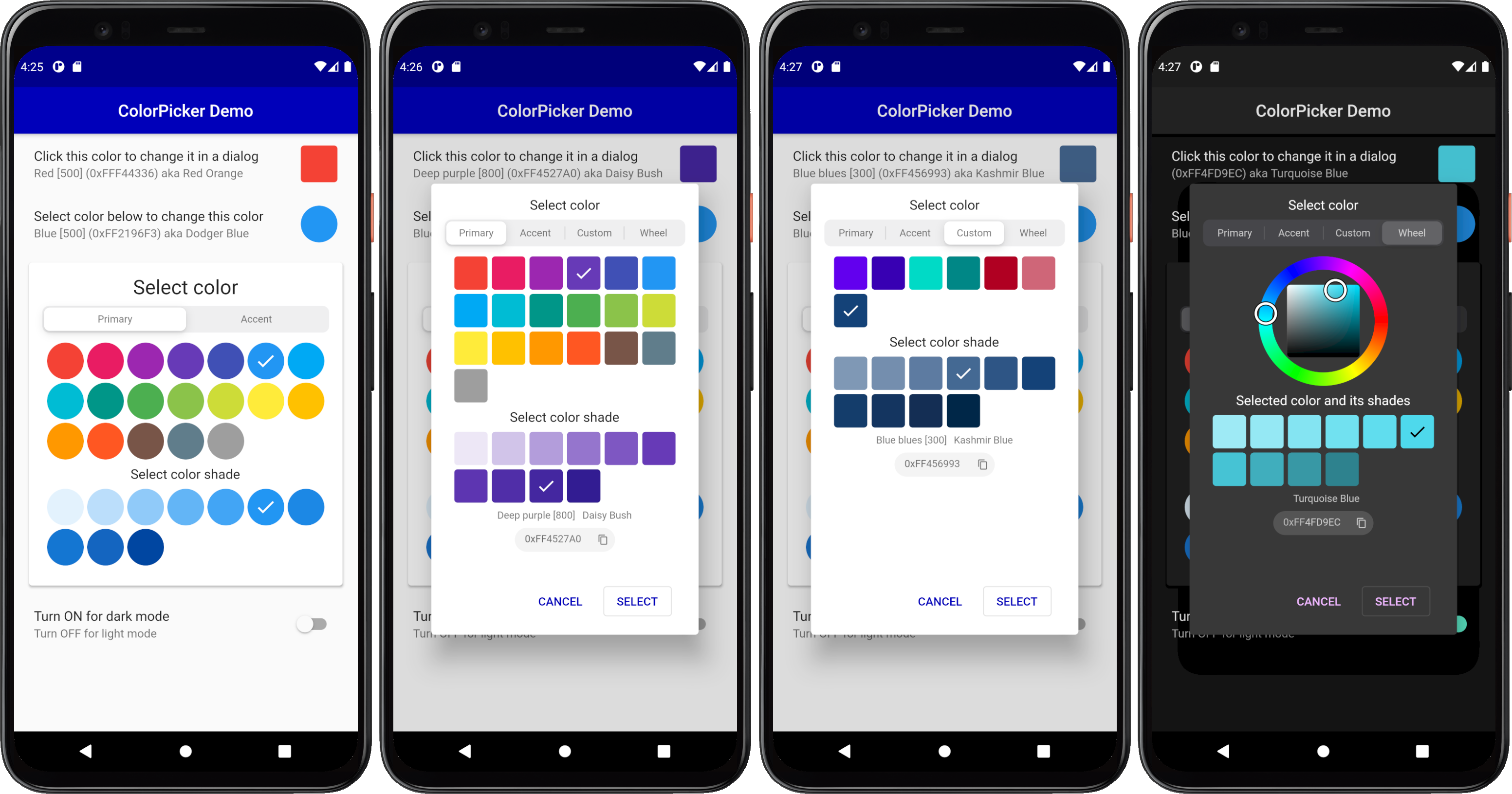
The end result of the above setup is a ListTile where the trailing color indicator widget can be clicked to
open a dialog to select a new color for the trailing ColorIndicator color.
As the dialogPickerColor color changes in the dialog, the ColorIndicator's color also changes via this
interaction. If the dialog is cancelled, the ColorIndicator's original color is restored.
As an extra exercise, and to better see this interactive change of the color when it is modified in the dialog,
try connecting the dialogPickerColor value to the AppBar's backgroundColor property. Did you manage to do it?
What happened?
:
appBar: AppBar(
  backgroundColor: dialogPickerColor,
  elevation: 1,
  centerTitle: true,
  title: const Text('Color Picker Simple Demo'),
),
As can be seen below, now the selected color in the dialog changes the AppBar's color as you select color in
the dialog and cancelling it restores the AppBar's color as well, pretty cool!
You can connect the color picking interaction to theme colors and modify your application's theme color values interactively as well, but that goes beyond the scope of this example.
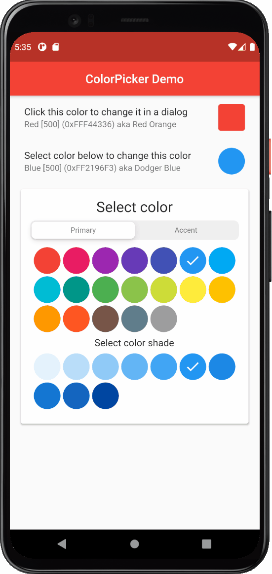
The example also includes a light and dark theme mode toggle, so you can test the look and operation of the color picker with a dark theme.
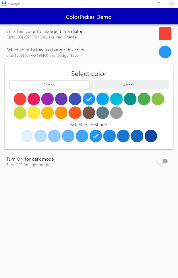
FlexColorPicker works on all Flutter platforms, Android, iOS, Web, Windows, macOS and Linux. Here is an example of the demo application running on Windows desktop.
The FlexColorPicker has a large amount of additional features. Its behavior can easily be modified with its direct
properties and two additional configuration property classes ColorPickerActionButtons and
ColorPickerCopyPasteBehavior, that can be configured and passed in for even more customization options.
This guide goes through the API settings, and provides links to API references.
NOTE
In the first version of 2.0.0 reference links are not provided to all API. Newer API doc ref link will be added in a +1 documentation update after 2.0.0 has been released, when the links can be obtained.
This chapter shows the different visible elements of the color picker that you can enable and disable, or show and hide by adding Widgets to the picker.
As shown in above example, at the core is a passed Color(...) object to the property color and a
ValueChanged<Color> callback onColorChanged that is called whenever a new color value is selected in the color
picker. What you do with the callback depends on your use case, in the shown examples we typically just update the
passed in color with setState. However, in the earlier dialog example it was also demonstrated how it interactively
could be used to change the AppBar color of the app itself. You can of course use the picker to change any color in
your application theme.
ColorPicker(
  color: myColor,
  onColorChanged: (Color color) => setState(() => myColor = color),
),
Below we will explore other, both basic and more advanced features of the FlexColorPicker.
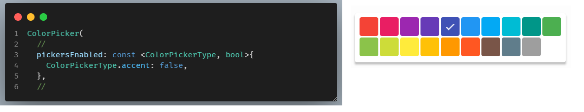
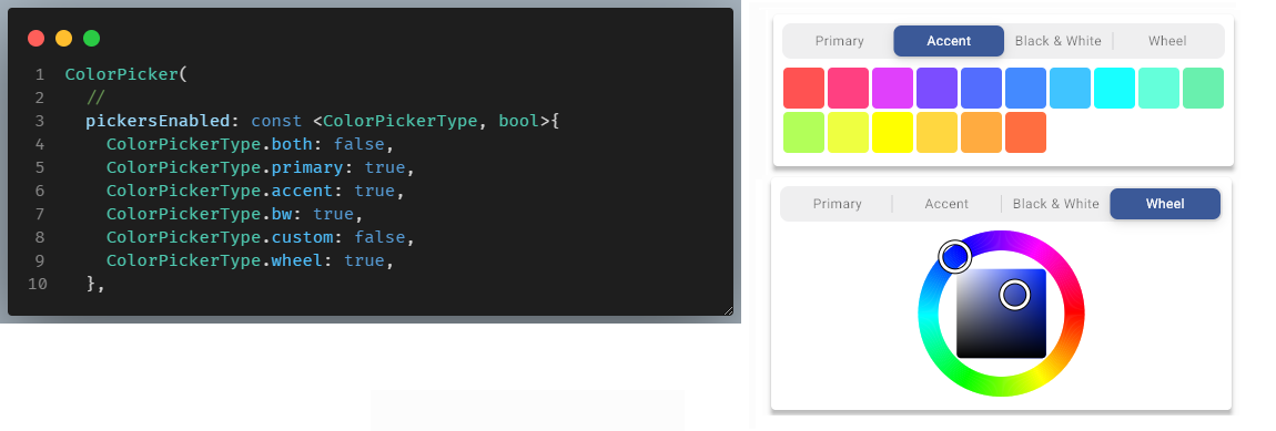
By default, the Material primary colors and accent colors pickers are enabled. To change the enabled pickers
you provide a ColorPickerType key to bool value map, with the pickers you want enabled to the property
pickersEnabled. You only need to provide key-values pairs for picker keys you want to change. Key values that are not
provided use their defaults.
If you only have one picker enabled, there is no control shown that will allow you to switch between the pickers. If all pickers are disabled, the Material primary color picker is shown.
If all other features are disabled (by default they are not), the screenshot below represents an example of a
bare-bones minimum picker, showing only the main colors of Material primary colors. If other defaults are OFF to enable
producing this picker style, only the following pickersEnabled setting to disable the accent color picker is needed
to get the shown picker:
Normally you would enable a few more pickers, here we enable the primary, secondary, near black and white and the wheel pickers. Since more than one picker is enabled, the color picker selector automatically appears:
If you want to show both Material primary and accent colors in the same picker you can enable the
ColorPickerType.both picker. In that case you usually want to disable ColorPickerType.primary and
ColorPickerType.accent, as they then contain duplicates of already available color in the both picker. The live
Web demo implements this as exclusive selections in its logic. It is of course possible to show all three pickers, but
it does not really make much sense.
API reference: customColorSwatchesAndNames
To use the custom color swatch picker you have to define your own custom ColorSwatch colors and pass them to the
picker via the customColorSwatchesAndNames property. By default, there are no custom colors defined. If you
enabled the custom picker and have not provided any custom color swatches, the picker will not be shown despite
being enabled since it has no colors to show.
You can make ColorSwatch objects with the Flutter SDK MaterialColor or the MaterialAccentColor classes by
providing swatch color shades for each index. Alternatively you can use the helpers
ColorTools.createPrimarySwatch(color) and ColorTools.createAccentSwatch(color) by just giving it a single color
value. For createPrimarySwatch the provided color will always be used as the base for [500] index and
for createAccentSwatch for as color for index [200], the rest of the index are computed.
Please note that these helpers just produce lighter and darker shades of the provided color for lower and higher swatch indexes. If you give e.g. the
createPrimarySwatchthe same color value as a built-in Material primary color with index [500], you will not get the same swatch as the built-in hand tuned Material primary color swatch.
To start define a final Map with your custom ColorSwatch objects and their names. Here we make three, with the
different mentioned methods.
final Map<ColorSwatch<Object>, String> customSwatches =
<ColorSwatch<Object>, String>{
  const MaterialColor(0xFFfae738, <int, Color>{
    50: Color(0xFFfffee9),
    100: Color(0xFFfff9c6),
    200: Color(0xFFfff59f),
    300: Color(0xFFfff178),
    400: Color(0xFFfdec59),
    500: Color(0xFFfae738),
    600: Color(0xFFf3dd3d),
    700: Color(0xFFdfc735),
    800: Color(0xFFcbb02f),
    900: Color(0xFFab8923),
  }): 'Alpine',
  ColorTools.createPrimarySwatch(const Color(0xFFBC350F)): 'Rust',
  ColorTools.createAccentSwatch(const Color(0xFFB062DB)): 'Lavender',
};
And use it in your color picker.
ColorPicker(
  color: myColor,
  onColorChanged: (Color color) => setState(() => myColor = color),
  pickersEnabled: const <ColorPickerType, bool>{
    ColorPickerType.both: false,
    ColorPickerType.primary: true,
    ColorPickerType.accent: true,
    ColorPickerType.bw: false,
    ColorPickerType.custom: true,
    ColorPickerType.wheel: true,
  },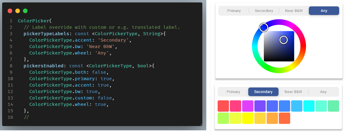
customColorSwatchesAndNames: customSwatches,API reference: pickerTypeLabels
The picker labels have default English labels, you can override them to customize or translate the labels. You set the
labels by providing a ColorPickerType key to String value map with the picker labels you want to change with the
property pickerTypeLabels. You only have to provide key-value pairs for the labels you want to change, omitted keys
will keep their default labels.
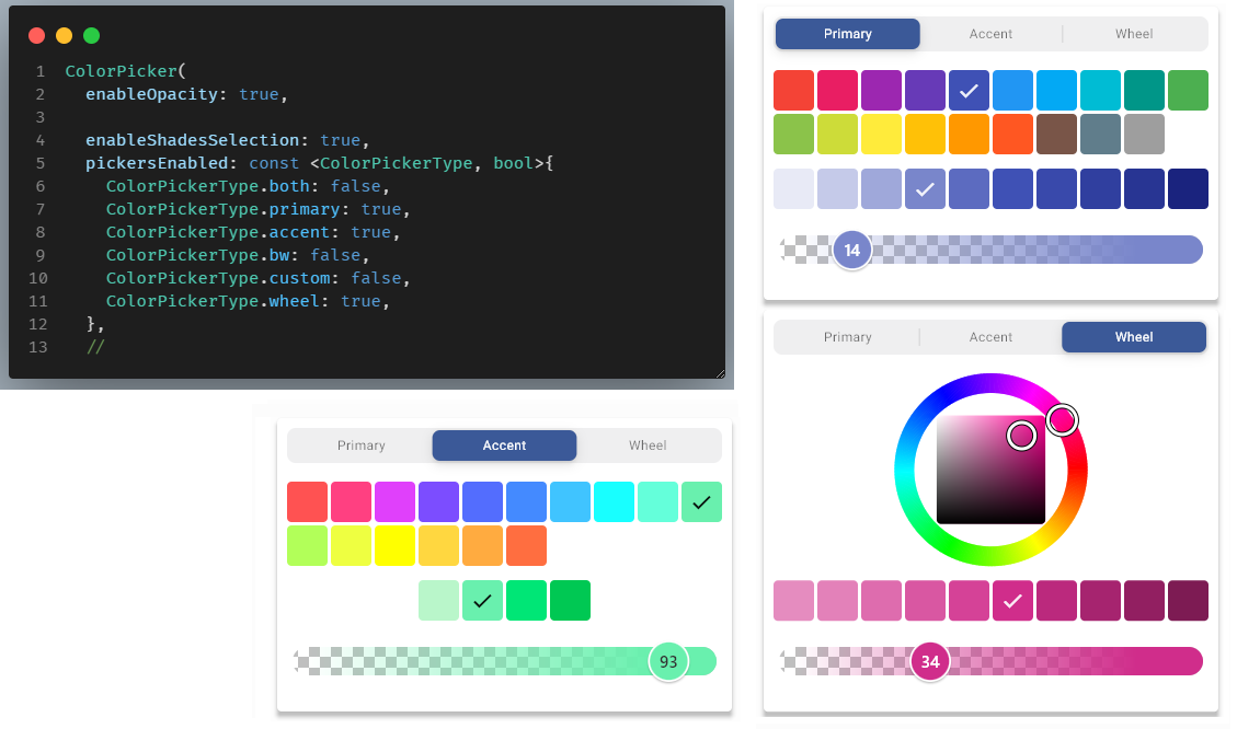
API reference: enableShadesSelection
By default, selection of the Material primary and Accent color swatch shade color, after selection of the main
color is enabled. In the above example enableShadesSelection had on purpose been disabled to produce the above,
main only color picker example.
Below we enable the Material color swatch shades selection. You probably want to be able to also select the Material shade colors, so typically, you would just keep the default enabled value.

You can enable a color opacity slider by setting enableOpacity to true. With the slider you can adjust the opacity
of the selected color. You can adjust opacity from fully opaque at 100%, to totally transparent at 0%. The selected
color and the impact of the opacity value on it, is visualized by the checkered gradient on the opacity slider,
and the selected color's opacity gradient on the slider. The thumb's position visualize the resulting color's opacity
when applied over a background.
The slider thumb only show opacity value changes in 1% increments, however the slider has 255 discrete steps, so there is a step for every alpha value in the resulting ARGB color value. If the color code value is also enabled and set show alpha value, you can see that it can be adjusted in single steps as well.
You cannot pass in the opacity separately to the color picker to get a starting opacity value. If your passed in color
value has opacity in its alpha channel, it will automatically get used, but only if enableOpacity is true. If it
is false, any passed in opacity/alpha in the color value or in colors pasted into the picker, is ignored and used as
fully opaque by applying alpha value #FF to it.
ColorPicker(
 ...
 pickersEnabled: const <ColorPickerType, bool>{
   ColorPickerType.both: false,
   ColorPickerType.primary: true,
   ColorPickerType.accent: false,
   ColorPickerType.bw: false,
   ColorPickerType.custom: true,
   ColorPickerType.wheel: true,
  },
  ...
)The above introduction was a walk through of the bundled example, please see the example section for the complete source code.
There are many more configuration options available for the ColorPicker, use the API reference guide for additional information.
You can also try the more complete live Web example. Its source code is also included in the package example folder, in "example/lib/demo/main.dart". By studying it you can see practical examples of how to use all the new features.
Happy color picking!