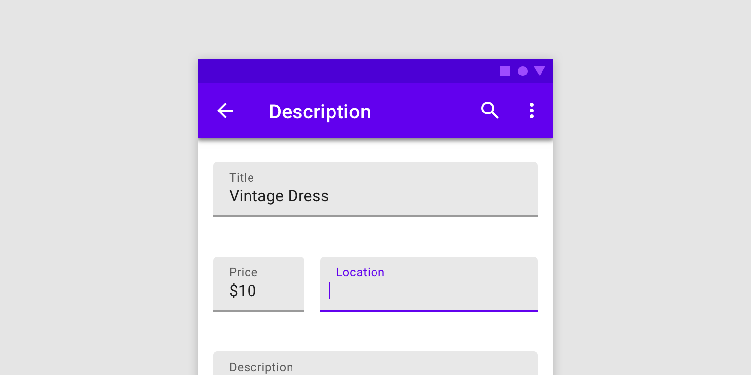
Text fields let users enter and edit text.
Contents
To make use of Material text fields, add any of the following subspecs to your Podfile:
pod 'MaterialComponents/TextControls+FilledTextAreas'
pod 'MaterialComponents/TextControls+FilledTextFields'
pod 'MaterialComponents/TextControls+OutlinedTextAreas'
pod 'MaterialComponents/TextControls+OutlinedTextFields'
Then, run the following command:
pod installFrom there, import the relevant target or file and instantiate your text field.
import MaterialComponents.MaterialTextControls_FilledTextAreas
import MaterialComponents.MaterialTextControls_FilledTextFields
import MaterialComponents.MaterialTextControls_OutlinedTextAreas
import MaterialComponents.MaterialTextControls_OutlinedTextFields#import "MaterialTextControls+FilledTextAreas.h"
#import "MaterialTextControls+FilledTextFields.h"
#import "MaterialTextControls+OutlinedTextAreas.h"
#import "MaterialTextControls+OutlinedTextFields.h"Material iOS text field offerings either inherit from UITextField or they contain UITextView instances. Both of these classes are accessible by default, and generally work out of the box with VoiceOver. However, the text fields we provide make use of floating labels above the text and assistive labels below the text, which makes the VoiceOver behavior of our text fields slightly different. If accessibilityLabel is not explictly set on a single-line text field or multi-line text area, the accessibilityLabel that VoiceOver reads is a concatenation of the floating label text, the entered text, and the assistive label text. If accessibilityLabel is set, the screen reader will read whatever it is set to. If you would like fine-grained control over what VoiceOver reads for these classes it is probably best to set the accessibilityLabel yourself.
Types
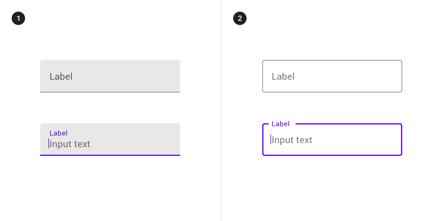
There are two types of text fields: 1. filled text fields 2. outlined text fields
Material iOS text fields consist of both single-line and multi-line offerings in both filled and outlined styles. The single-line text fields are MDCFilledTextField and MDCOutlinedTextField. The multi-line text fields (text areas) are MDCFilledTextArea and MDCOutlinedTextArea. Because these classes make use of things like floating labels and assistive labels, their layout considerations are different than those of UITextField and UITextView. Where UITextField and UITextView can be whatever height a developer wants them to be, these classes have heights that they need to be in order to look correct. The process for ensuring that instances of these classes are sized correctly depends on whether one is in an Auto Layout or Manual Layout environment. In an Auto Layout environment, the text field or text area's preferred height will be reflected in -intrinsicContentSize, and the user will probably not have to do anything other than set a width constraint on the view to ensure that the preferred height is achieved. In a Manual Layout environment, standard methods like -sizeThatFits: or -sizeToFit must be used to inform the frames of the text field. These methods assume that the view already has a preferred width, and that any relevant APIs related to preferred number of lines have been set.
Filled text fields have more visual emphasis than outlined text fields, making them stand out when surrounded by other content and components.
To set up a single-line filled text field using MDCFilledTextField, do the following:
let estimatedFrame = ...
let textField = MDCFilledTextField(frame: estimatedFrame)
textField.label.text = "Phone number"
textField.placeholder = "555-555-5555"
textField.leadingAssistiveLabel.text = "This is helper text"
textField.sizeToFit()
view.addSubview(textField)CGRect estimatedFrame = ...
MDCFilledTextField *textField = [[MDCFilledTextField alloc] initWithFrame:estimatedFrame];
textField.label.text = @"Phone number";
textField.placeholder = @"555-555-5555";
textField.leadingAssistiveLabel.text = @"This is helper text";
[textField sizeToFit];
[view addSubview:textField];To set up a multi-line filled text field (text area) using MDCFilledTextArea, do the following:
let estimatedFrame = ...
let textArea = MDCFilledTextArea(frame: estimatedFrame)
textArea.label.text = "Label"
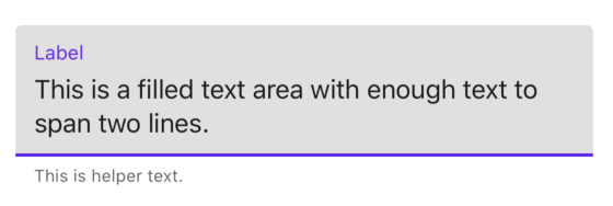
textArea.textView.text = "This is a filled text area with enough text to span two lines."
textArea.leadingAssistiveLabel.text = "This is helper text"
textArea.sizeToFit()
view.addSubview(textArea)CGRect estimatedFrame = ...
MDCFilledTextArea *textArea = [[MDCFilledTextArea alloc] initWithFrame:estimatedFrame];
textArea.label.text = @"Label";
textArea.leadingAssistiveLabel.text = @"This is helper text";
textArea.textView.text = @"This is a filled text area with enough text to span two lines.";
[textArea sizeToFit];
[view addSubview:textArea];A filled text field has a filled container, input text, a label, an activation indicator, optional helper/error text and optional leading/trailing icons. This applies to both text fields and text areas.
- Container
- Leading icon
- Label
- Input text
- Trailing icon
- Activation indicator
- Helper/error/counter text
- Prefix/suffix/placeholder (not supported on iOS)
| Attribute | Related method(s) | Default value | |
|---|---|---|---|
| Color | N/A | -setFilledBackgroundColor:forState:-filledBackgroundColorForState: |
On surface color at 12% opacity |
| Attribute | Related method(s) | Default value | |
|---|---|---|---|
| Icon | leadingView |
-setLeadingView-leadingView |
nil |
| Attribute | Related method(s) | Default value | |
|---|---|---|---|
| Text | label.text |
N/A | nil |
| Color | label.textColor |
-setFloatingColor:forState: -floatingLabelColorForState: -setNormalLabelColor:forState: -normalLabelColorForState: |
On surface color at 60% opacity when not editing and primary color when editing |
| Attribute | Related method(s) | Default value | |
|---|---|---|---|
| Input text | text |
-setText:-text |
nil |
| Typography | font |
-setFont: -font |
Subtitle 1 |
| Input text color | textColor |
-setTextColor:-textColor-setTextColor:forState-textColorForState: |
On surface color at 87% opacity |
| Cursor color | tintColor |
-setTintColor:-tintColor: |
Primary color |
| Attribute | Related method(s) | Default value | |
|---|---|---|---|
| Icon | trailingView |
-setTrailingView-trailingView |
nil |
| Attribute | Related method(s) | Default value | |
|---|---|---|---|
| Color | N/A | -setUnderlineColor:forState:-underlineColorForState: |
On surface at 42% opacity when not editing and Primary when editing |
| Attribute | Related method(s) | Default value | |
|---|---|---|---|
| Helper/Error text | leadingAssistiveLabel.texttrailingAssistiveLabel.text |
N/A | nil |
| Helper/Error text color | leadingAssistiveLabel.textColortrailingAssistiveLabel.textColor |
N/A | On Surface at 60% opacity |
| Helper text typography | leadingAssistiveLabel.fonttrailingAssistiveLabel.font |
N/A | Caption |
Not supported.
Outlined text fields have less visual emphasis than filled text fields. When they appear in places like forms, where many text fields are placed together, their reduced emphasis helps simplify the layout.
To set up a single-line outlined text field using MDCOutlinedTextField, do the following:
let estimatedFrame = ...
let textField = MDCOutlinedTextField(frame: estimatedFrame)
textField.label.text = "Phone number"
textField.placeholder = "555-555-5555"
textField.leadingAssistiveLabel.text = "This is helper text"
textField.sizeToFit()
view.addSubview(textField)CGRect estimatedFrame = ...
MDCOutlinedTextField *textField = [[MDCOutlinedTextField alloc] initWithFrame:estimatedFrame];
textField.label.text = @"Phone number";
textField.placeholder = @"555-555-5555";
textField.leadingAssistiveLabel.text = @"This is helper text";
[textField sizeToFit];
[view addSubview:textField];To set up a multi-line outlined text field (text area) using MDCOutlinedTextArea, do the following:
let estimatedFrame = ...
let textArea = MDCOutlinedTextArea(frame: estimatedFrame)
textArea.label.text = "Label"
textArea.leadingAssistiveLabel.text = "This is helper text"
textArea.textView.text = "This is an outlined text area with enough text to span two lines."
textArea.sizeToFit()
view.addSubview(textArea)CGRect estimatedFrame = ...
MDCOutlinedTextArea *textArea = [[MDCOutlinedTextArea alloc] initWithFrame:estimatedFrame];
textArea.label.text = @"Label";
textArea.leadingAssistiveLabel.text = @"This is helper text";
textArea.textView.text = @"This is an outlined text area with enough text to span two lines.";
[textArea sizeToFit];
[view addSubview:textArea];An outlined text field has a stroked container, input text, a label, optional helper/error text and optional leading/trailing icons.
- Container
- Leading icon
- Label
- Input text
- Trailing icon
- Helper/error/counter text
- Prefix/suffix/placeholder (not supported on iOS)
The following examples shows a filled text field with a label.
| Attribute | Related method(s) | Default value | |
|---|---|---|---|
| Stroke color | N/A | -setOutlineColor:forState:-outlineColorForState: |
On surface at 38% opacity when not editing and primary when editing |
| Attribute | Related method(s) | Default value | |
|---|---|---|---|
| Icon | leadingView |
-setLeadingView-leadingView |
nil |
| Attribute | Related method(s) | Default value | |
|---|---|---|---|
| Text | label.text |
N/A | nil |
| Color | label.textColor |
-setFloatingColor:forState: -floatingLabelColorForState: -setNormalLabelColor:forState: -normalLabelColorForState: |
On surface color at 60% opacity when not editing and primary color when editing |
| Attribute | Related method(s) | Default value | |
|---|---|---|---|
| Input text | text |
-setText:-text |
nil |
| Typography | font |
-setFont: -font |
Subtitle 1 |
| Input text color | textColor |
-setTextColor:-textColor-setTextColor:forState-textColorForState: |
On surface color at 87% opacity |
| Cursor color | tintColor |
-setTintColor:-tintColor: |
Primary color |
| Attribute | Related method(s) | Default value | |
|---|---|---|---|
| Icon | trailingView |
-setTrailingView-trailingView |
nil |
| Attribute | Related method(s) | Default value | |
|---|---|---|---|
| Color | N/A | -setUnderlineColor:forState:-underlineColorForState: |
On surface at 42% opacity when not editing and Primary when editing |
| Attribute | Related method(s) | Default value | |
|---|---|---|---|
| Helper/Error text | leadingAssistiveLabel.texttrailingAssistiveLabel.text |
N/A | nil |
| Helper/Error text color | leadingAssistiveLabel.textColortrailingAssistiveLabel.textColor |
N/A | On Surface at 60% opacity |
| Helper text typography | leadingAssistiveLabel.fonttrailingAssistiveLabel.font |
N/A | Caption |
Not supported.
Text fields and text areas support Material Theming using a Container Scheme. The filled and outlined text fields and text areas each have default theming methods and theming methods intended to convey an error state. Learn more about theming extensions. Below are some screenshots of filled and outlined text fields using the Shrine theme:
In order to achieve something like the examples shown above, add one of the relevant theming subspecs to your Podfile:
pod 'MaterialComponents/TextControls+FilledTextAreasTheming'
pod 'MaterialComponents/TextControls+FilledTextFieldsTheming'
pod 'MaterialComponents/TextControls+OutlinedTextAreasTheming'
pod 'MaterialComponents/TextControls+OutlinedTextFieldsTheming'
Then Run the installer:
pod installNext, import the relevant target or file.
import MaterialComponents.MaterialTextControls_FilledTextAreasTheming
import MaterialComponents.MaterialTextControls_FilledTextFieldsTheming
import MaterialComponents.MaterialTextControls_OutlinedTextAreasTheming
import MaterialComponents.MaterialTextControls_OutlinedTextFieldsTheming#import "MaterialTextControls+FilledTextAreasTheming.h"
#import "MaterialTextControls+FilledTextFieldsTheming.h"
#import "MaterialTextControls+OutlinedTextAreasTheming.h"
#import "MaterialTextControls+OutlinedTextFieldsTheming.h"From there, call either the default or the error theming method.
let containerScheme = ... // Set up a container scheme
textField.applyTheme(withScheme: self.containerScheme) // Default theming method
textField.applyErrorTheme(withScheme: self.containerScheme) // Error theming methodMDCContainerScheme *containerScheme = ... // Set up a container scheme;
[textField applyThemeWithScheme:self.containerScheme]; // Default theming method
[textField applyErrorThemeWithScheme:self.containerScheme]; // Error theming method


