The Adobe I/O Theme powers all the Adobe developer.adobe.com sites to ensure that content is consistent across all the sites.
This project uses Yarn 3 to manage package dependencies. If you do not have Yarn 3 installed, follow these instructions:
-
Install Node.js LTS. At the time of writing, the latest LTS version is
v16.15.1. -
Install Yarn 3 by running the following command:
corepack enable
Corepack is a binary shipped with all Node.js releases starting from 16.10.
-
Update Yarn to the latest version by running the following command:
yarn set version stable -
Make sure you are now using version 3.2.1 of Yarn:.
yarn --version
That's it. For more information on Yarn 3 usage, see Yarn usage.
Gatsby Themes allow site functionality to be packaged as a standalone product for others to easily reuse. Using a theme, all of your default configuration lives in an npm package.
View the site templates using the Adobe I/O Theme:
Documentation template
- Adobe I/O Theme
- Prerequisites
- Theme usage
- Contents
- Getting started
- Content structure
- Configuration
- Global Navigation
- Menus
- Home link
- Side Navigation
- Versions
- Building the site
- Deploying the site
- Writing Enhanced Markdown
- Metadata with Front matter
- OpenAPI
- Redocly API Block
- On-premise license keys
- Local development limitation and workaround
- Full width page
- Displaying long API response descriptions
- width (optional)
- typography (optional)
- codeblock (optional)
- disableSidebar (optional)
- disableSearch (optional)
- hideTryItPanel (optional)
- scrollYOffset (optional)
- sortOperationsAlphabetically (optional)
- sortTagsAlphabetically (optional)
- jsonSampleExpandLevel (optional)
- generateCodeSamples (optional)
- requestInterceptor (optional)
- JSDoc
- MDX
- Modular Content System
- JSX Blocks
- Hero Block
- Resources Block
- Discover Block
- Code Block
- InlineAlert block (Updated: 2022-06-08)
- Media Block
- Announcement Block
- Summary Block
- Title Block
- Text Block
- Table Block
- Tabs Block
- Product Card
- Mini Product Card
- Product Card Grid
- Resource Card
- MiniResourceCard
- Carousel
- VideoCarousel
- ImageTextBlock
- TeaserBlock
- Accordion
- ListBlock
- PDFViewer
- ProfileCard
- Edition
- Embedding markdown documents and filtering content
- Get Credential
- Toast
- Customizations
- Upgrading
- Issue tracker
- Contributing
- Releases
This section will help you get started building a site with the Adobe I/O Theme.
To initialize a site repository, you can use one of the available site templates mentioned above. Simply click on the “Use this template” button to create a new GitHub repository of the template.
The templates are pre-configured with example pages.
First make sure the dependency of the theme-aio is added to the project's package.json.
"dependencies": {
    "@adobe/gatsby-theme-aio": "^4.7.11",
    "gatsby": "4.22.0"
}
Then do a yarn install.
yarn installFor running the Adobe theme I/O example or run your repo locally
yarn devDoing a full clean up on your local repo
yarn clean && yarn cache clean && rm -r node_modules && rm yarn.lockThis is what you can do to develop and test locally with an updated aio-theme. Make all your changes in aio-theme. Change your directory to /packages/gatsby-theme-aio
cd /packages/gatsby-theme-aioPublish the current state of the theme package to your yalc directory.
yalc publish --pushSwitch to the project that you would like to test your latest theme-aio with. Navigate to the root directly of that local project(eg. document-services - you would navigate to document-services repo's root .
yalc add @adobe/gatsby-theme-aioView the package.json dependency of the local project to make sure it has added the theme like this. Also make sure it is using gatsby version 4.22.0.
  "dependencies": {
    "@adobe/gatsby-theme-aio": "file:.yalc/@adobe/gatsby-theme-aio",
    "gatsby" : "4.22.0"
   }
Clean the project and run again
yarn clean && yarn cache clean && rm node_modules && rm yarn.lockyarn devThe content of the site is written in Markdown which is both easy to read and easy to learn.
As in most cases, the markdown content is stored in GitHub, we support GitHub Flavored Markdown (GFM), which provides additional functionality for common formatting needs. Additionally, Adobe extended Markdown in a few ways to support certain features see Writing Enhanced Markdown.
Frontmatter is metadata — at the top of a markdown file — that looks like this:
---
title: FAQ—Frequently Asked Questions
description: The FAQ page provides answers to common questions about the configuration and usage of Adobe Analytics in your site.
keywords:
  - Creative Cloud
  - API Documentation
  - UXP
edition: ee
contributor_name: Kalpesh Mehta from Corra
contributor_link: https://partners.magento.com/portal/details/partner/id/70/
layout: none
---
# First heading
The key:value entries shown in the preceeding example provide your topic with features that include:
- Edition-specific pages for products (such as Commerce vs Open Source)
- Contributor attributions for partners and community members (contributor_name, contributor_link)
- Better search results (title, description, keywords)
- Customizable layouts for pages
- Topic maintainer names and links, and more.
More keywords and value options can be added in future versions as needed.
Adding an edition keyword to the frontmatter adds a badge to the top of the page, indicating that the page applies to that product edition. Current values for the edition keyword are:
ee: Adobe Commerce onlyb2b: B2B featurepwa: PWA Studio only
For example, adding the edition keyword to the frontmatter generates a badge above the page title, as shown here using the ee value:
Adding contributor_name and contributor_link keywords adds a badge to the top of the page, indicating the partner agency or community contributor name with a link to their business or GitHub profile.
For example, adding the contributor_name and contributor_link keywords to the frontmatter adds an additional badge above the page title:
Adding noIndex: true will flag the page to be skipped during local search indexing. This is required when storing transcluded files under src/pages/ since we index all pages by default.
Note: duplicate results in local search are likely due to not setting noIndex: true inside transcluded pages.
Make sure the markdown content is located under src/pages.
It is recommended to use a folder structure to define your site pages e.g. :
root
├- src/pages [/]
│  ├- index.md
│  ├- hero.png
│  ├- api [/api/]
│  │  └- index.md
│  └- guides [/guides/]
│      ├─ index.md
│      └- get_started [/guides/get_started/]
│        ├- index.md
│        └- debugging [/guides/get_started/debugging/]
│           └- index.md
├- .env
├─ gatsby-config.js
└─ package.json
Using a folder structure with only index.md files gets you close to the final site build files. During the build process, md files will be transformed into index.html files.
The build files can be found in the public folder. Please read the Overview of the Build Process for more information.
Here's a simple example of a content structure with md files and the resulting html files:
root
├- src/pages [/]
│  ├- index.md
│  ├- i_follow_recommendation [/i_follow_recommendation/]
│  │  └- index.md
│  └- i_dont_follow_recommendation.md [/i_dont_follow_recommendation/]
├- .env
├─ gatsby-config.js
└─ package.json
will output:
root
└- public
   ├- index.html
   ├- i_follow_recommendation
   │  └- index.html
   ├- i_dont_follow_recommendation
   │  └- index.html
   └- Minified JS, CSS files
You can exclude pages from the build by either moving them out of src/pages or by prefixing the filename with _.
By default, the theme automatically generates an anchor link for headings h2 – h6, using the kabab-case (lowercase words separated by hyphens).
For example, if the heading name is Inline code example, the theme creates the following anchor link: #inline-code-example.
You can customize the anchor link for a heading using the following syntax:
## Inline code example {#myCustomAnchorLink}This will override the auto-link behavior and create a custom anchor link. Your custom anchor link can be any case format you want, as long as you don't use any spaces.
Using markdown links to link to pages e.g. :
Relative link
[Link to mypage](../mypage.md)
Absolute link
[Link to mypage](/src/pages/mypage.md)
Add the suffix # to a link to jump to a section of the page for example if your page has a heading named Join the future, you can link to it:
[Link to mypage](../mypage.md#join-the-future)
You can also use absolute links or relative links to link between markdown pages e.g. with the example folder structure from Content Structure you can add a link from /guides/index.md to /api/index.md with:
Relative link
[Link to API](../api/)
Absolute link
[Link to API](/api/)
Please note that currently only absolute links will work with transcluded content.
External links will automatically open in a new tab or window.
[Link to example.com](https://example.com)
You can prevent this behavior by adding the search parameter ?aio_internal to the link.
Images can be placed next to markdown pages inside src/pages and referenced using relative links. In this case, they'll be optimized during the build process and resulting file names are hashed to resolve potential caching issues.
Other asset types (e.g. PDFs etc.) can be placed inside a static folder at the root. Those assets are not being processed but simply copied into the public folder.
Here's a simple example of a content structure with a markdown page file and 2 different asset types:
root
├- src/pages [/]
│  ├- index.md
│  └- image.png
├- static [/]
│  └- document.pdf
├─ gatsby-config.js
└─ package.json
where image.png is referenced in index.md as an image:

and document.pdf is referenced in index.md as a link:
[document](/document.pdf)
You'll find more information about the static folder at Using the Static Folder.
Please find guidance on ideal illustration sizes in this document.
To make sure you don't run into troubles during the site build process, please follow the below configuration steps.
Follow these steps to configure your .env file.
- Copy
.env.exampleto.env - Add the appropriate values in the
.envfile
The .env should not be committed.
GitHub's API is being called during the site build phase to retrieve the authors of every markdown page under src/pages.
If the GitHub Token information is missing, the build will just print a warning, and no contributor information will be retrieved (just the contributor information in a page's front matter, if any, will be used).
To retrieve your GitHub personal access token, you can follow these steps.
Only READ permissions on repositories are required for the token.
For example, if your doc site repo was at https://github.com/adobe/aio-theme using the main branch, this would be what your .env would look like:
REPO_GITHUB_TOKEN=YOUR_PERSONAL_ACCESS_TOKEN_HERE
REPO_OWNER=adobe
REPO_NAME=aio-theme
REPO_BRANCH=main
REPO_ROOT=example
By default, you can omit the REPO_ROOT env var, and it should use the root folder as the source of the documentation pages. If your site is in a sub-folder, add the relative path as the REPO_ROOT.
The GATSBY_ADOBE_LAUNCH_SRC= env var is used to enable the Analytics and Feedback component. To add analytics to your site, you need to set up Adobe Launch, with an Adobe Analytics Reporting Suite. Use the following steps:
In Adobe Analytics:
- Within Adobe Analytics, add a custom eVar (Text String type) to capture the feedback. This eVar will contain either
yesorno.
In Adobe Launch:
- Create two Data Elements:
- Feedback-Yes:
Editthe code and paste inreturn document.querySelectorAll('button.feedback-yes')[0].innerText - Feedback-No:
Editthe code and paste inreturn document.querySelectorAll('button.feedback-no')[0].innerText
- Feedback-Yes:
- Make sure the following checkboxes are checked:
- Enable Default Value
- Force lowercase value
- Clean text
- Create these three Rules:
- Feedback-Yes: On click, it will set variables in Adobe Analytics (set the custom eVar to value of the Feedback-Yes Data Element), and then Send the Beacon.
- Feedback-No: On click, it will set variables in Adobe Analytics (set the custom eVar to the value of the Feedback-No Data Element), and then Send the Beacon.
In Adobe Analytics:
- On library loaded (page top), Send the Beacon
In Adobe Launch:
- Go through the
Publishing Flow, don't forget toAdd All Resources. - In
Environments, select the appropriate environment, and under theInstallcolumn, select the icon. - Copy the URL displayed in the
scripttag. - Add the URL to the
.envfile as the value forGATSBY_ADOBE_LAUNCH_SRC=.
Example:
GATSBY_ADOBE_LAUNCH_SRC=https://your.adobe.launch.url.hereTo enable IMS on the browser side, you'll need to set the following .env variables:
GATSBY_IMS_CONFIG- Map ofclient_idandscopesetc.GATSBY_IMS_SRC- URL source of IMS library
Sites hosted on the developer.adobe.com domain use Algolia search when staged or published to production.
To test your site's search locally — when you build it from your computer using yarn dev — you'll need to add Algolia search keys to the following .env variables:
GATSBY_ALGOLIA_INDEX_NAME=your-sites-repo-name
GATSBY_ALGOLIA_APPLICATION_ID=adobes-application-key
GATSBY_ALGOLIA_SEARCH_API_KEY=adobes-public-search-key
Please contact the Adobe DevSite team to get the correct values for your site.
GATSBY_ALGOLIA_INDEX_NAME— your-sites-repo-name (by convention, the repo and index names are the same).GATSBY_ALGOLIA_APPLICATION_ID— Alpha-numeric string required to access Adobe's product documentation, including yours.GATSBY_ALGOLIA_SEARCH_API_KEY- Alpha-numeric string required to search Adobe's product documentation, including yours.
The Global navigation links are configurable in gatsby-config.js under pages.
If you follow the recommended content structure, you can define the path value using the folder names.
For example, the following folder structure maps to the URL defined in brackets:
src/pages [/]
├- index.md
├- api [/api/]
│  └- index.md
└- guides [/guides/]
   └─ index.md
then define your Global Navigation using pages in gatsby-config.js:
pages: [
  {
    title: 'Adobe Analytics',
    path: '/'
  },
  {
    title: 'Guides',
    path: '/guides/'
  },
  {
    title: 'API Reference',
    path: '/api/'
  }
]
You can also define it by pointing to the markdown files:
pages: [
  {
    title: 'Adobe Analytics',
    path: 'index.md'
  },
  {
    title: 'Guides',
    path: 'guides.md'
  },
  {
    title: 'API Reference',
    path: 'api.md'
  }
]
Search ?foo=bar and hash #foo values are also supported.
The order in which the pages are defined is respected in the Global Navigation.
If the current location corresponds to a path defined under pages, the correspond tab in the Global Navigation is set as active.
Otherwise, the first defined tab is set as active by default.
At least one defined page is required. It's recommended to define the first page path as the root path /.
You can group links inside a dropdown menu in the Global Navigation with the menu field.
Optionally, you can set a description to better differentiate grouped links e.g. based on the previous example:
pages: [
  {
    title: 'Adobe Analytics',
    path: 'index.md'
  },
  {
    title: 'Guides',
    path: 'guides.md'
  },
  {
    title: 'API Reference',
    menu: [{
      title: 'v2.0'
      description: 'Version 2.0 of API' // optional,
      path: '2.0/api.index'
    }, {
     title: 'v1.4'
     description: 'Version 2.0 of API' // optional,
     path: '1.4/api.index'
   }]
  }
]The home link should be used to inform the user about a parent or sibling site external to the current one. Breadcrumbs will be displayed automatically to help the user understand its current location.
You can define a home link in gatsby-config.js for instance:
home: {
  title: 'Photoshop',
  path: 'https://www.adobe.com/products/photoshop.html'
}
A default home link is displayed if none provided. If you don't want to display any home link, set hidden to true:
home: {
  hidden: true
}When inserting image to table, please ensure it has a complete .svg path.
The Side navigation links are configurable in gatsby-config.js under subPages.
You have to create a directory hierarchy which will be represented literally in the URL so that any sub page path starts with a path from pages.
For example, the following folder structure maps to the URL defined in brackets:
src/pages [/]
├- index.md
├- api [/api/]
│  └- index.md
└- guides [/guides/]
   ├─ index.md
   └- get_started [/guides/get_started/]
      ├- index.md
      └- debugging [/guides/get_started/debugging/]
         └- index.md
then define your Side Navigation for /guides/ using subPages in gatsby-config.js:
pages: [
  {
    title: 'Adobe Analytics',
    path: '/'
  },
  {
    title: 'Guides',
    path: '/guides/'
  },
  {
    title: 'API Reference',
    path: '/api/'
  }
],
subPages: [
  {
    title: 'Get Started',
    path: '/guides/get_started',
    pages: [
      {
        title: 'Debugging',
        path: '/guides/get_started/debugging/'
      }
    ]
  }
]
Similarly to the Global Navigation:
- The order in which the sub pages are defined is respected in the Side Navigation.
- Setting search and hash values in the path is supported
- Linking markdown files is supported
Important: All sub pages paths have to be children of a top-level navigation path.
There are 3 variations of the Side Navigation:
- Single-level side navigation
- Categorical single-level side navigation
- Multi-level side navigation
Please refer to the section use the right variation to understand which side navigation variation to use.
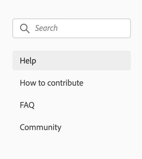
To create a single-level side navigation, you shouldn't specify pages for subPages for example:
is matching to the following config:
pages: [
  {
    title: 'Support',
    path: '/support/'
  }
],
subPages: [
  {
    title: 'Help',
    path: '/support/'
  },
  {
    title: 'How to contribute',
    path: '/support/contribute/'
  },
  {
    title: 'FAQ',
    path: '/support/FAQ/'
  },
  {
    title: 'Community',
    path: '/support/community/'
  }
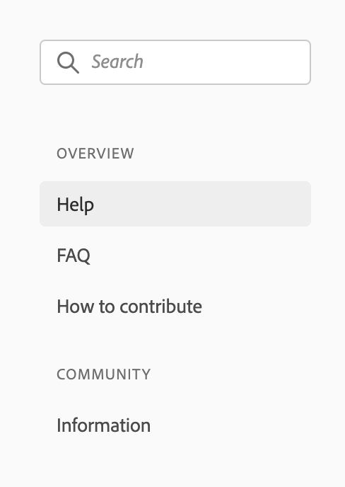
]To create a single-level side navigation with headers, you should set header: true on top-level subPages and follow the auto-collapsing rules. Do note if one subpage has header enabled, use header navigation type for all navigation items for example:
is matching the following config:
pages: [
  {
    title: 'Support',
    path: '/support/'
  }
],
subPages: [
  {
    title: 'Overview',
    path: '/support/',
    header: true,
    pages: [
      {
        title: 'Help',
        path: '/support/'
      },
      {
        title: 'FAQ',
        path: '/support/FAQ/'
      },
      {
        title: 'How to contribute',
        path: '/support/contribute/'
      }
    ]
  },
  {
    title: 'Community',
    path: '/support/community/',
    header: true,
    pages: [
      {
        title: 'Information',
        path: '/support/community/'
      }
    ]
  }
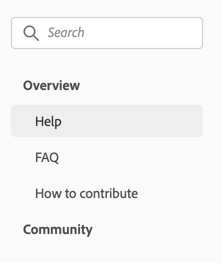
]To create a multi-level side navigation, you have to define pages for subPages for example:
is matching the following config:
pages: [
  {
    title: 'Support',
    path: '/support/'
  }
],
subPages: [
  {
    title: 'Overview',
    path: '/support/',
    pages: [
      {
        title: 'Help',
        path: '/support/'
      },
      {
        title: 'FAQ',
        path: '/support/FAQ/'
      },
      {
        title: 'How to contribute',
        path: '/support/contribute/'
      }
    ]
  },
  {
    title: 'Community',
    path: '/support/community/',
    pages: [
      {
        title: 'Information',
        path: '/support/community/'
      }
    ]
  }
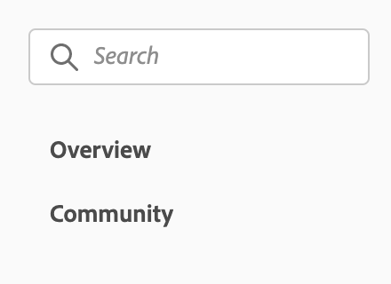
]In the previous multi-level side navigation example, if the current location is /support/, Overview auto-collapses and selects Help by default because Overview and Help paths both matches the current location /support/.
It also means that if you don't want the auto-collapsing behavior, you have to define different paths for subPages than you defined for pages e.g. for the previous example, to avoid auto-collapsing of Overview,
you would have to define a different path for Overview and Help:
pages: [
  {
    title: 'Support',
    path: '/support/'
  }
],
subPages: [
  {
    title: 'Overview',
    path: '/support/overview/',
    pages: [
      {
        title: 'Help',
        path: '/support/overview/help/'
      },
      {
        title: 'FAQ',
        path: '/support/overview/FAQ/'
      },
      {
        title: 'How to contribute',
        path: '/support/overview/contribute/'
      }
    ]
  },
  {
    title: 'Community',
    path: '/support/community/',
    pages: [
      {
        title: 'Information',
        path: '/support/community/'
      }
    ]
  }
]
which will render:
Navigation should be helpful. Choose titles for navigation items that clearly represent the surfaces where they'll go. Avoid using titles that are arbitrary or un-useful, since this can pose usability issues for your product.
Along with being descriptive, navigation items should be succinct. Reduce any unnecessary words in order to ensure simplicity. Navigation items should never be so long that they require truncation, except in instances where navigation is user-generated.
Navigation items should be written in sentence case.
Make sure that you are using the right variation for your products’ context and users’ needs. Don’t mix behavior, styles, or variations together in a single navigation menu:
- When navigation is simple, use the single-level side navigation.
- When navigation is simple but categorical, use the single-level side navigation with headers.
- When navigation is expansive, hierarchical, and/or you need progressive disclosure in your menu behavior, use the multi-level side navigation.
The multi-level side navigation should only go 3 levels deep. More than 3 levels will make the indentation indiscernible, which can become a major usability issue in your product.
If top-level navigation items have a location associated with them, send the user to that location and open the sub-level navigation items. If a top-level navigation item does not have any associated location, only open the sub-level navigation items.
Side navigation can use either of these behaviors, but should never mix behaviors in the same experience.
You can specify multiple versions for your site in gatsby-config.js under versions.
The first entry is the selected version by default.
versions: [
  {
    title: 'v2.0',
    selected: true
  },
  {
    title: 'v1.4',
    path: 'https://github.com/AdobeDocs/analytics-1.4-apis'
  }
],
Important: managing multiple versions inside a single repository is not supported.
You can generate a production version of the site using following commands:
With the CLI:
aio doc generateOr run following commands:
- To build and preview a production version of the site:
npm run start. - To build and preview a production version of the site with path prefix:
npm run start:prefix. - To build and preview a development version of the site with hot reloading:
npm run dev.
Many applications are hosted at something other than the root (/) of their domain.
For example, a blog could live at example.com/blog/, or a site could be hosted on GitHub Pages at example.github.io/my-site/.
To add a Path Prefix, go to your gatsby-config.js file and specify the prefix with:
pathPrefix: process.env.PATH_PREFIX || '/MY_PREFIX/'To enable GitHub Pages, go to your repository settings under the GitHub Pages section, select the gh-pages branch as source and press Save. Your site will be available for preview at https://ORG_NAME.github.io/REPO_NAME.
On every commit to the main branch, the site will be built to GitHub Pages automatically, for you to preview as a development version. This is the default branch for new repos in GitHub.
GitHub Contributors component: this will use the GitHub token automatically provided by the GitHub Action to retrieve data
Feedback component: no environmental variable should be set since GitHub Pages should only be for development purposes
You can manually trigger the deploy workflow by pressing the Run workflow button:
- Go to your repository actions overview page i.e. https://github.com/ORG/REPOSITORY/actions
- Click on the "Deploy" workflow
- Press Run workflow. You can choose which branch the workflow is run on and specify the deployment type (
devfor development or/andprodfor production).
Using the Clean cache: typically you won't have to set this to yes. The most common scenario of when to use is when you do a deploy and a particular resource isn't updating to the most recent change. eg, a static image is still on the old version. Try setting this to yes and redeploy the site.
Using the Exclude a subfolder from deletion: folders listed here separated out by commas will exclude them from being overwritten when doing a deploy. This is useful if you have multiple sites deploying to the same path. eg, one repo deploys to /photoshop/ and another repo deploys to /photoshop/docs/. You can set the the repo that deploys to /photoshop/ option as Exclude a subfolder from deletion: docs. Then whenever that /photoshop/ repo deploys, the subfolder docs will not get deleted. You can also list out multiple subfolders separated by commas like so: api, photoshop-api-docs, uxp, another-path etc.
Pre-requisites:
- Setting your
PATH_PREFIXas explained here. This is the sub-folder to deploy this micro-site to.
- For example, if you want to deploy to
https://example.com/foo/bar, you must setPATH_PREFIXto/foo/bar/ - For sites deployed to the
root, use/as thePATH_PREFIX
- The person initiating the deploy workflow must have
writeaccess to the repository.
Front matter allows an author to specify metadata for a page. For example, you can define the page meta title and description by adding front matter to the beginning of your markdown file:
---
title: Guides - Adobe Analytics
description: This is the guides overview page of Adobe Analytics
---
In addition to the GitHub contributors of a markdown file, you can specify external contributors with front matter. They'll show up first before the GitHub contributors.
---
contributors:
- https://github.com/simonwex
---
You can also specify whether or not to hide breadcrumb navigation on pages without a hero at the top. Pages with a Hero can flag the breadcrumb option on the Hero component if needed.
---
title: Guides - Adobe Analytics
description: This is the guides overview page of Adobe Analytics without a breadcrumb
contributors:
  - https://github.com/simonwex
  - https://github.com/davidbenge
hideBreadcrumbNav: false
---
We use Redoc to render OpenAPI specs. Simply use front matter to define the spec URL.
## openAPISpec: https://raw.githubusercontent.com/AdobeDocs/analytics-2.0-apis/master/docs/swagger.json
<RedoclyAPIBlock src="URL pointing to your open api yaml file." />We can now host your own OpenAPI YAML files and have them rendered by Redocly documents. This approach allows us to avoid using iframes and instead host our own API YAML files directly in Redocly.
When using RedoclyAPIBlock, ensure that GATSBY_REDOCLY_KEY: ${{ secrets.REDOCLY_LICENSE_KEY }} is added to the deploy.yml file in your repository (e.g. add to build-dev and build-production). Any public repo in the AdobeDocs organization will have access to this development environment secret.
Dev-site team is responsible for making sure the license key is up to date, which can be found in redocly account settings -> On-premise license keys.
Due to the way Redocly API works, it’s not possible to test RedoclyAPIBlock locally:

To test, temporarily deploy to stage:

Use custom layout to do a full width page
By default, Redocly displays API response descriptions as the button text (styled as one line, no-wrap). If too long, the text could get truncated, and the page widens beyond 100%:


For long descriptions, Redocly suggests to use the x-summary specification extension. If specified, it is used as the response button text, and the description is rendered under the button:
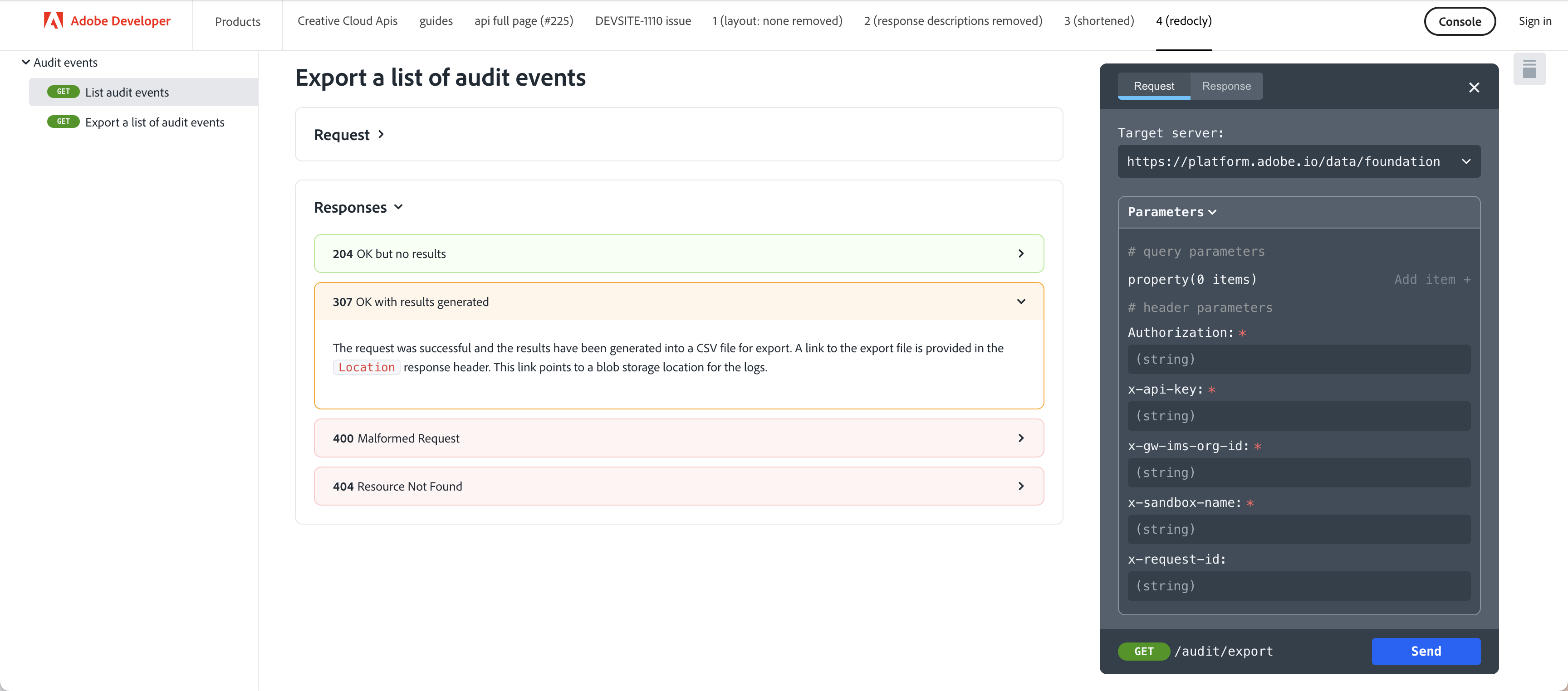

<RedoclyAPIBlock src="URL pointing to your open api yaml file." width="600px" />Sets the width (of the right panel).
Defaults to '500px'
https://redocly.com/docs/api-reference-docs/configuration/theming/#path=rightPanel
<RedoclyAPIBlock src="URL pointing to your open api yaml file." typography="fontFamily: `serif`, fontSize: '16px'" />Controls the appearance of text.
Defaults to 'fontFamily: `adobe-clean, "Source Sans Pro", -apple-system, BlinkMacSystemFont, "Segoe UI", Roboto, Ubuntu, "Trebuchet MS", "Lucida Grande", sans-serif`'
https://redocly.com/docs/api-reference-docs/configuration/theming/#path=typography
<RedoclyAPIBlock src="URL pointing to your open api yaml file." codeBlock="tokens: { punctuation: { color: 'red ' }}" />Controls the appearance of code snippets.
Defaults to "tokens: { punctuation: { color: 'white' }}"
https://redocly.com/docs/api-reference-docs/configuration/theming/#path=codeBlock
<RedoclyAPIBlock src="URL pointing to your open api yaml file." disableSidebar />If set to true, hides the navigation sidebar (the left panel). Setting this option to false does not disable the search feature.
Defaults to false
https://redocly.com/docs/api-reference-docs/configuration/functionality/#theme-object-openapi-schema
<RedoclyAPIBlock src="URL pointing to your open api yaml file." disableSearch />Disables search indexing and hides the search box from the API documentation page.
Defaults to false
https://redocly.com/docs/api-reference-docs/configuration/functionality/#theme-object-openapi-schema
<RedoclyAPIBlock src="URL pointing to your open api yaml file." hideTryItPanel />Disables the Try it console in the right panel.
Defaults to false
https://redocly.com/docs/api-reference-docs/configuration/functionality/#theme-object-openapi-schema
<RedoclyAPIBlock src="URL pointing to your open api yaml file." scrollYOffset={64} />Specifies a vertical scroll-offset. This is useful when there are fixed positioned elements at the top of the page, such as navbars, headers etc. You can specify the scrollYOffset value as a number - a fixed number of pixels to be used as the offset.
Defaults to 0
https://redocly.com/docs/api-reference-docs/configuration/functionality/#theme-object-openapi-schema
<RedoclyAPIBlock src="URL pointing to your open api yaml file." sortOperationsAlphabetically />When set to true, sorts operations in the navigation sidebar and in the middle panel alphabetically.˙
Defaults to false
https://redocly.com/docs/api-reference-docs/configuration/functionality/#theme-object-openapi-schema
<RedoclyAPIBlock src="URL pointing to your open api yaml file." sortTagsAlphabetically />When set to true, sorts tags in the navigation sidebar and in the middle panel alphabetically. Note that only tags will be sorted alphabetically in the middle panel, not the operations associated with each tag. To sort operations alphabetically as well, you must set sortOperationsAlphabetically to true.
Defaults to false
https://redocly.com/docs/api-reference-docs/configuration/functionality/#theme-object-openapi-schema
<RedoclyAPIBlock src="URL pointing to your open api yaml file." jsonSampleExpandLevel="all" />Sets the default expand level for JSON payload samples (response and request body). Takes a number >= 1, or the string 'all'.
Defaults to 2
https://redocly.com/docs/api-reference-docs/configuration/functionality/#theme-object-openapi-schema
<RedoclyAPIBlock src="URL pointing to your open api yaml file." generateCodeSamples="languages: [{ lang: 'curl' }, { lang: 'Node.js' }, { lang: 'JavaScript' }, {lang: 'Python'}]" />Controls options for generating code samples, including code sample languages.
Defaults to languages: [], skipOptionalParameters: false
https://redocly.com/docs/api-reference-docs/configuration/functionality#theme-object-openapi-schema
<RedoclyAPIBlock
    src="/redocly-test/openapi/openapi.yaml"
    requestInterceptor="
        function(req, operation) {
            console.log('Args:', req, operation);
            return req;
        }
    "
Configures the request interceptor for the Try it console. As a prerequisite, the Try it console must be enabled in Reference docs (hideTryItPanel must be set to false). When configured, the interceptor can capture the request object and modify it according to specified criteria. Async usage is supported.
Defaults to ``````
Limitations: Due to gatsby and markdown limitations, we can't add comments in the function string nor empty lines.
https://redocly.com/docs/api-reference-docs/configuration/functionality#theme-object-openapi-schema https://redocly.com/docs/api-reference-docs/configuration/functionality#example-configuration-with-javascript-library
We currently recommend to use the JSDoc to markdown converter.
Use front matter to specify a JSDoc markdown document.
## jsDoc: true
Then annotate your JS parameters with <JsDocParameters/> to render them nicely see the example markdown file.
MDX is supported out of the box. MDX enables writing JSX React components in markdown giving authors new powers.
Despite the markdown files having all an md extension, they are actually treated as MDX files. You can use md and mdx extensions interchangeably.
As we try to limit the use of MDX in favor of pure markdown, we have come up with a way to couple the use of basic markdown syntax with JSX.
Always make sure to close JSX blocks and use line breaks between JSX blocks and markdown content to avoid MDX parser issues.
The modular content system is a set of content blocks with variants and compositions that can be used to create pages.
-
Content Blocks are goal-focused. A group of content that has a specific goal or intention, to structure and support the overall narrative. Examples are groupings of text, groupings of buttons, and hero content.
-
Variants are messaging-focused. The messaging points/content (this includes both written and visual content/images) that makes the goal of the content block happen. Examples are text content blocks with icons vs no icons.
-
Compositions are layout-focused. The overall narrative for the page.
A variant can go into a content block. Multiple content blocks make up a composition.
The Content Blocks are defined as JSX Blocks. They use a slots property to identify which markdown elements to ingest using only string properties.
This helps maintain better readability when rendered on https://github.com.
Common slots are: heading, image and text. See below examples for full details.
A Hero Block should be used on every home page. Only 1 Hero Block per page is allowed. They are used to set up the tone of the page and optionally add call to actions and intentions for users.
There are 3 different variants:
- The default variant for Documentation pages.
- The half width variant for Product/Platform authored pages.
- The full width variant for Index home pages.
Default variant:
<Hero slots="image, heading, text" background="rgb(64, 34, 138)" hideBreadcrumbNav={false}/>

# Adobe Analytics
Adobe Product API offers limitless ways to integrate your most important customer data into key business processes. Adobe Product API offer limitless ways.
Use slots to identify the markdown content:
heading(required)text(required)image(optional)videoUrl(optional)
Use background to set a custom background color matching your color scheme. Defaults to rgb( 29, 125, 238);
Use theme to match the text color to your color scheme. Defaults to dark.
Use hideBreadcrumbNav to optionaly hide the breadcrumb navigation on this variant. Defaults to false.
Use videoUrl to videoURL to post the video in half width /full width
Half width variant
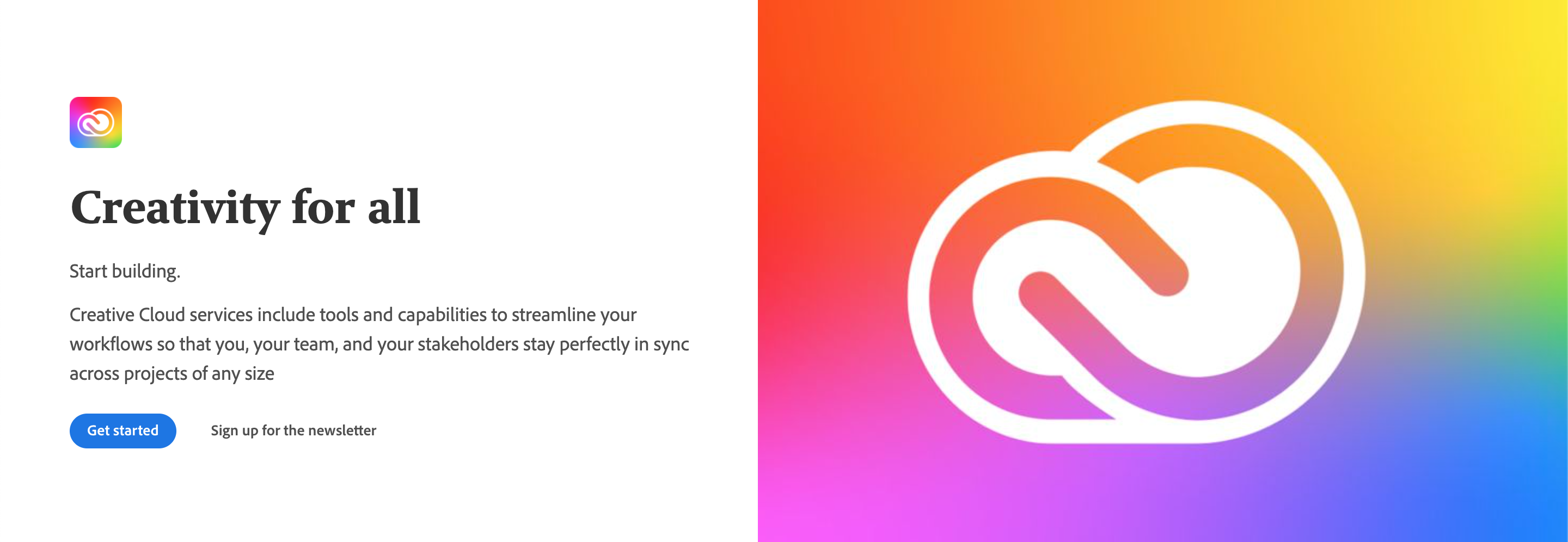
<Hero slots="image, icon, heading, text1, text2, buttons" variant="halfwidth" />


# Creativity for all
Start building.
Creative Cloud services include tools and capabilities to streamline your workflows so that you, your team, and your stakeholders stay perfectly in sync across projects of any size
* [Get started](https://adobe.io)
* [Sign up for the newsletter](https://adobe.io)
Use variant="halfwidth"" to set the half width variant.
Use slots to identify the markdown content:
heading(required)text(required)image(required)background(optional)icon(optional)buttons(optional)
Full width variant
<Hero slots="image, heading, text, buttons" variant="fullwidth" background="rgb(51, 51, 51)" />

# The most memorable digital experiences are unleashed by developer creativity
Adobe products and technologies power them
* [Explore our APIs](https://adobe.io)
* [Subscribe](https://adobe.io)
Use variant="fullwidth"" to set the full width variant.
Use slots to identify the markdown content:
heading(required)text(required)image(required)background(optional)buttons(optional)
Use theme to match the text color to your color scheme. Defaults to dark.
Each Documentation overview page has a Resources Block with to display a list of links. They can point to internal or external documents or pages.
Only 1 Resource Block per page is allowed.
<Resources slots="heading, links"/>

#### Resources

* [Quickstart Guide](https://www.adobe.io/apis/experiencecloud/analytics/docs.html)
* [Adobe Analytics GitHub Repo](https://github.com/AdobeDocs/analytics-2.0-apis)
Use slots to identify the markdown content:
heading(required)links(required)
A Discover Block is a section of content that can be used to highlight certain areas of a Documentation overview page. There can be multiple Discover Blocks in a row. Discover Blocks can be illustrated but only one illustration per row is allowed.
Single Discover Block
<DiscoverBlock width="100%" slots="heading, link, text"/>

### Get Started

[Quickstart Guide](guides/)

Get started with the Adobe Analytics APIs.
Multiple Discover Blocks in a row
<DiscoverBlock slots="heading, link, text"/>

### Guides

[Calculated Metrics API](guides/calculated_metrics_api/)

Returns information on the user's company that is necessary for making other Adobe Analytics API calls.


<DiscoverBlock slots="link, text"/>

[Segments API](guides/segments_api/)

Provides configuration guidance and best practices for the /segments endpoint.


<DiscoverBlock slots="link, text"/>

[Reporting Guide API](guides/reporting_api/)

Provides configuration guidance and best practices for the /reports endpoint.

<DiscoverBlock slots="link, text"/>
Discover Block with illustrations
<DiscoverBlock slots="image, heading, link, text"/>

### Developer forum
[Get started](https://adobe.io)
Open discussion and support with community experts and Adobe staff.
<DiscoverBlock slots="link, text"/>
[Experience league](https://adobe.io)
Tutorials and videos for the community.
Use slots to identify the markdown content:
heading(1 required per row)text(required)link(required)image(optional)
Use width to define the size of the block.
A Code Block is an enhanced code section which supports additional features like request/response format, multiple languages etc.
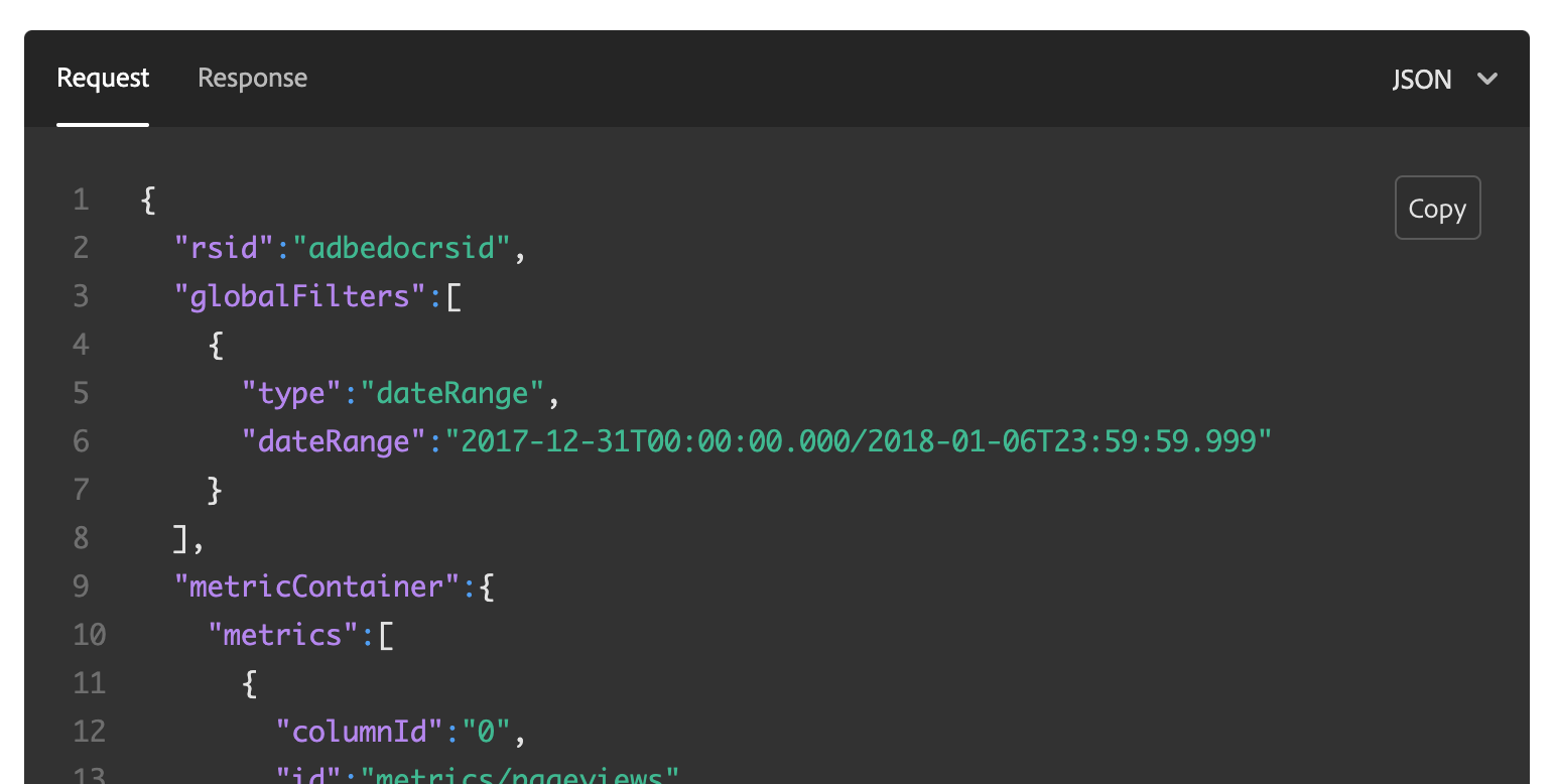
<CodeBlock slots="heading, code" repeat="3" languages="JSON, CURL, JSON" />
#### Request

```json
{
  "rsid":"adbedocrsid",
  "globalFilters":[
    {
      "type":"dateRange",
      "dateRange":"2017-12-31T00:00:00.000/2018-01-06T23:59:59.999"
    }
  ]
}
```

#### Request

```bash
curl -X POST \
  https://analytics.adobe.io/api/{COMPANYID}/reports \
  -H 'Accept: application/json' \
  -H 'Authorization: Bearer {ACCESSTOKEN}' \
  -H 'Content-Type: application/json' \
  -H 'x-api-key: {APIKEY}' \
  -H 'x-proxy-global-company-id: {COMPANYID}' \
  -d '{REQUESTJSON}'
```

#### Response

```json
{
  "totalPages":1,
  "numberOfElements":7,
  "number":0,
  "totalElements":7
}
```
Use slots to identify the markdown content:
heading(required)code(required)
Use repeat to define how many code sections are part of the Code Block.
Use languages to define a language name for each code section. Code sections with the same heading are automatically
grouped together. The number of languages should match the number of headings. If no language is present, each of the heading
will render in each tab with even the same headings.
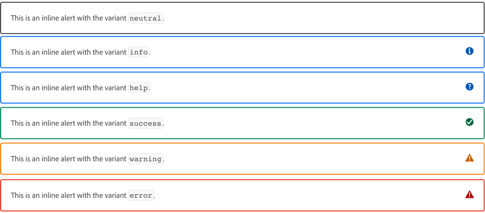
The Inline Alert block provides ways to highlight various types of information, using an optional title, text blocks, and variants.
<InlineAlert variant="[value]" slots="title, text1, text2, text[n]" />Variant values
As shown above, the first property of an InlineAlert is the variant property. The value of this property determines
the icon and border color of the alert. The variant values you can use are described here:
info(default) — use to add helpful information.help— use to add brief steps from or links to other help topics.error— use to highlight errors that may result from an action.success— use to highlight success messages that may be displayed after an action.warning— use to focus attention on a potential problem that could occur.neutral— use as an all-purpose callout that displays a black border and no icon.
The slots and variants of an InlineAlert block are as follows.
Slot values
Use the following slots to style your markdown text within the InlineAlert block:
title(optional) — Use plain markdown text. The slot will bold the title and space it above your text appropriately. You can only use one title per alert block.text(required). Use plain markdown text.text2...text[n](optional) - You can use additional text slots to display multiple paragraphs. Just make sure each additional text block starts with the wordtextfollowed by numbers or letters that make each text slot unique.
The simplest InlineAlert you can create uses a single text slot, as shown here:
<InlineAlert slots="text" />

This is the text that displays within the default alert variant — info.To add an InlineAlert with a different variant, a title, and multiple paragraphs, you can specify all the optional properties, as shown here:
<InlineAlert variant="help" slots="header, text1, text2, text3, text4" />

Alternative steps:

**Step 1:** This is faux step text for the `text1` slot.
This is faux step text for the `text1` slot.
This is faux step text for the `text1` slot.
This is faux step text for the `text1` slot.
This is faux step text for the `text1` slot.

**Step 2:** This is faux step text for the `text2` slot.
This is faux step text for the `text2` slot.
This is faux step text for the `text2` slot.

**Step 3:** This is faux step text for the `text3` slot.

**Step 4:** This is faux step text for the `text4` slot.
This is faux step text for the `text3` slot.To add an InlineAlert within another component, we have created a new component to do that. Here is how you should create an inline alert within another component:
<InlineNestedAlert variant="info" header="true" iconPosition="right">

   Personal Information :

   Lorem ipsum dolor sit amee

   Add more information

   Lorem ipsum dolor sit amet

 </InlineNestedAlert>
This new InlineNestedAlert will not be supporting the 'slot' parameter as the regular InlineAlert. The nested InlineAlert must wrap around the content that it wants to display. It can only supports one header by using the parameter header="true". Header will not be supported if there is only 1 line. It supports variant the same way as the regular InlineAlert. Also it supports another parameter as iconPosition to be displayed either left or right side of the alert.
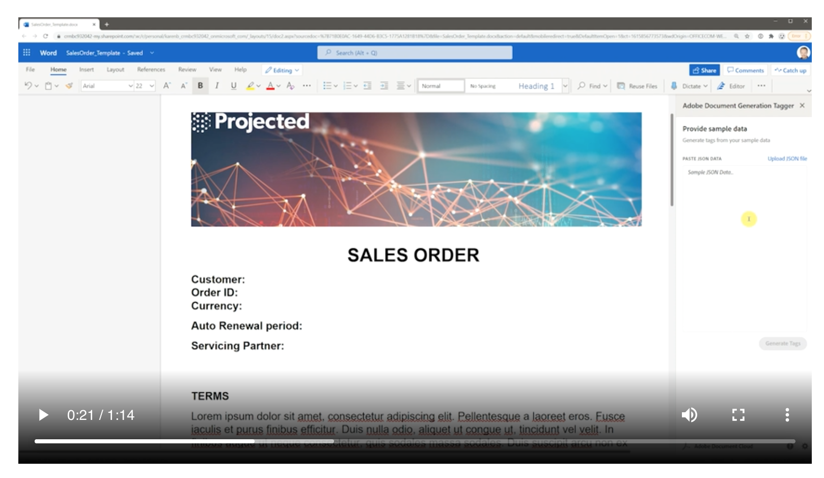
The Media Block is used to display interactive medias like videos.
<Media slots="video"/>

<https://www.youtube.com/watch?v=mkgpeWbHrjA>
Use slots to identify the markdown content:
video(required)
The Announcement Block goes directly underneath the Hero Block for Product/Platform pages. It's used to call out new features, blog posts, news etc. anything that needs that needs to be surfaced above the fold.
<AnnouncementBlock slots="heading, text, button" />

### Try out the magic of Photoshop

Pull together Photoshop, Lightroom and Adobe Sensei into one place. Reduce time spent in each app, freeing you up for more creative time.

[Demo](https://www.adobe.io/apis/creativecloud/photo-imaging-api/api-demo.html)
Use slots to identify the markdown content:
heading(required)button(required)text(optional)
Use theme to match the text color to your color scheme. Defaults to light.
Use className to customize the component at your own risk.
The Summary Block acts as an anchor at the end of the page. It's a change for Products to give users another call to action, and encourage them to interact after they have gotten to the bottom of the page.
<SummaryBlock slots="image, heading, text, buttons" background="rgb(246, 16, 27)" />

## Subscribe to the Creative Cloud developers newsletter
A monthly newsletter featuring news for anyone who creates, develops, or build plugins, extensions, or integrations for the
Creative Cloud family of products.
- [Subscribe to the newsletter](https://adobe.io)
- [Learn more](https://adobe.io)
Use slots to identify the markdown content:
heading(required)buttons(1 button required at least)text(optional)image(optional)
Use background to set a custom background color matching your color scheme.
Use theme to match the text color to your color scheme. Defaults to dark.
Use className to customize the component at your own risk.
A Title Block is used at the beginning of sections, or to frame compositions on Product/Platform pages.
<TitleBlock slots="heading, text" theme="light" />

### Collaborate better with Content Cloud APIs

With the Cloud Content APIs, you can bring design work created in XD directly to your product or service.
Use slots to identify the markdown content:
heading(required)text(optional)
Use theme to match the text color to your color scheme. Defaults to lightest.
Use className to customize the component at your own risk.
Text Blocks are used for layout compositions. They are areas for long blocks of text and explaining features etc. for Product/Platform pages. They are coupled with images or videos.
With an image, texts and links
<TextBlock slots="image, heading, text1, text2, links" />

### Extend Adobe CC Flagship Apps
Extend Creative Cloud desktop apps like [Photoshop](https://www.adobe.com/products/photoshop.html), [Premiere Pro](https://www.adobe.com/products/premiere.html), and [InDesign](https://www.adobe.com/products/indesign.html) through our APIs and SDKs.
Be sure to check out [Common Extensibility Platform (CEP)](https://www.adobe.io/apis/creativecloud/cep.html), which lets you build custom UI panels for multiple CC apps at once.
When you're ready to ship, distribute your work on [Adobe Exchange](https://exchange.adobe.com/), the preferred marketplace for Adobe Creative Cloud users.
And be sure to join the [Exchange Program for Creative Cloud](https://partners.adobe.com/exchangeprogram/creativecloud) to unlock more benefits, including streamlined publishing and promotional opportunities.
-  [Adobe Premiere Pro](https://www.adobe.com/products/premiere.html)
-  [Adobe InDesign](https://www.adobe.com/products/indesign.html)
-  [Adobe After Effect](https://www.adobe.com/products/aftereffects.html)
Multiple Text Blocks in a row
<TextBlock slots="image, heading, text, links" width="33%" />

### Microsoft teams
Easily share Creative Cloud assets and files, and get comment notifications on your prototypes.
- [Learn more](https://www.microsoft.com/microsoft-365/microsoft-teams/group-chat-software)
<TextBlock slots="image, heading, text, links" width="33%" />

### JIRA Cloud
Make designer to developer handoffs easy. Find the latest designs and specs and get thumbnail previews and asset info.
- [Learn more](https://www.atlassian.com/enterprise/cloud)
<TextBlock slots="image, heading, text, links" width="33%" />

### Slack
Instantly share Creative Cloud files, designs, specs, and notifications all in real time.
- [Learn more](https://slack.com/enterprise)
With a video, icons, buttons dark themed
<TextBlock slots="video, icons, heading, text, buttons" theme="dark" />
[Creative Cloud for a new era](https://www.youtube.com/watch?v=JemJbNJ4ZtU&ab_channel=AdobeCreativeCloud)
- 
- 
### Partner Success Story
Connect your users to Creative Cloud right from within your mobile or web apps with our service APIs. Give users access to
world-class creative assets with the Adobe Stock API, or sign up for early information on our upcoming CC Storage API.
- [Learn more](https://adobe.io)
- [Sign up for partner program](https://adobe.io)
With a local video
import video1 from '../videos/localVideo.mp4'
<TextBlock slots="icons,heading,text,buttons" videoUrl={video1} variantsTypePrimary='accent' variantStyleFill = "fill" homeZigZag position="left" />

### One-click edits with Adobe Express quick actions
Quick actions turn multistep design workflows into just a few clicks, making removing backgrounds, resizing images and merging videos faster than ever – all powered by Adobe Photoshop and Adobe Premiere Pro. Enable these powerful shortcuts in any website in minutes.
- [Learn more](https://adobe.io)
- [Try it ](https://adobe.io)
Use slots to identify the markdown content:
heading(required)text(required). Support multiple texts e.gtext1, text2etc.links(optional). Supports 1 optional image per link.buttons(optional)icons(optional)image(optional).imageshould only be defined as first or last slot to define the layout.imageexcludesvideo.video(optional).videoshould only be defined as first or last slot to define the layout.videoexcludesimage.
Use theme to match the text color to your color scheme. Defaults to lightest.
Use width to define the size of the block. Supported values are 100%, 50%, 33% and 25%;
Use isCentered to center the text.
Use className to customize the component at your own risk.
Use videoUrl to add the local video to the block
Use position to position the video values are left, right. The preset variant is left.
The table block automatically decorates markdown and html tables:
Markdown:
| Tables        |      Are      |  Cool |
| ------------- | :-----------: | ----: |
| col 3 is      | right-aligned | $1600 |
| col 2 is      |   centered    |   $12 |
| zebra stripes |   are neat    |    $1 |
HTML:
<table>
    <th>
        <td>Tables</td>
        <td>Are</td>
        <td>Cool</td>
    </th>
    <tr>
        <td>col 3 is</td>
        <td>right-aligned</td>
        <td>$1600</td>
    </tr>
    <tr>
        <td>col 2 is</td>
        <td>centered</td>
        <td>$12</td>
    </tr>
    <tr>
        <td>zebra stripes</td>
        <td>are neat</td>
        <td>$1</td>
    </tr>
</table>
Will both look like this:
When should I use an HTML table over Markdown?
Markdown has a simple way of defining and formatting your tables, but it can be limited in customization and difficult to format with a lot of data. You should consider using HTML tables if you're experiencing said limitations.
Here is a couple of examples:
By default, the column width distribution is even across all columns in the table. To customize it we support a columnWidths property which you can configure like so:
<table columnWidths="20,60,20">
  ...
</table>
The columnWidths property expects a distribution by percentage of the table width. Comma separated numbers only.
You can assign any distribution as long as the number of entries matches the number of columns and the distribution adds up to 100% otherwise it may not work as expected.
| # Columns | Default Distribution | Custom Distribution Example |
|---|---|---|
| 2 | "50,50" | "25,75" |
| 3 | "33.33,33.33,33.33" | "10,20,70" |
| 4 | "25,25,25,25" | "10,20,35,35" |
We also support inline css overrides using the css property like so:
<table
  css="
    background-color:teal;
    tbody {
      background-color:orange;
    }">
  ...
</table>
Combining modifiers is supported as well unless mentioned otherwise.
Tabs block is a custom block component that allows for tabbed content that can be displayed either vertically or horizontally.
<TabsBlock orientation="vertical" slots="heading, image, content" theme="light" />
### Create PDF from URL

<Overview/>
<TabsBlock orientation="vertical" slots="heading, content" theme="light" />
### Dynamic PDF Document Generation
<Overview/>
<TabsBlock orientation="horizontal" slots="heading, image, content" theme="light" />
### Create PDF from URL

<Overview/>
<TabsBlock orientation="horizontal" slots="heading, content" theme="light" />
### Dynamic PDF Document Generation
<Overview/>
Use slots to identify the markdown content:
heading(1 required per row)image(optional)content(1 required per row)
Use theme to match the text color to your color scheme. Defaults to light.
Use orientation to tabs can be either horizontal or vertical. Defaults to horizontal.
Use repeat to define how many tab items sections are part of the tabs Block.
Product Cards group information that allow to browse a collection of related content.
<ProductCard slots="icon, heading, text, buttons" theme="light" width="33%" />

#### CC Storage API
CC Storage API lets you access and modify assets stored in the Creative Cloud, the world's most popular creative platform.
- [Learn more](https://adobe.io)
- [View docs](https://adobe.io)
<ProductCard slots="icon, heading, text, buttons" theme="light" width="33%" />

#### Adobe Stock
Gives your users access to the perfect Adobe Stock asset to enhance their creative projects.
- [Learn more](https://adobe.io)
- [View docs](https://adobe.io)
<ProductCard slots="icon, heading, text, buttons" theme="light" width="33%" />

#### Common Extensibility Platform
Build extensions with HTML, CSS, Javascript and Node. Deploy across multiple Adobe apps.
- [Learn more](https://adobe.io)
- [View docs](https://adobe.io)
Use slots to identify the markdown content:
heading(required)text(required)buttons(1 button required at least)icon(optional)
Use theme to match the text color to your color scheme. Defaults to lightest.
Use width to define the size of the block. Supported values are 100%, 50%, 33% and 25%;
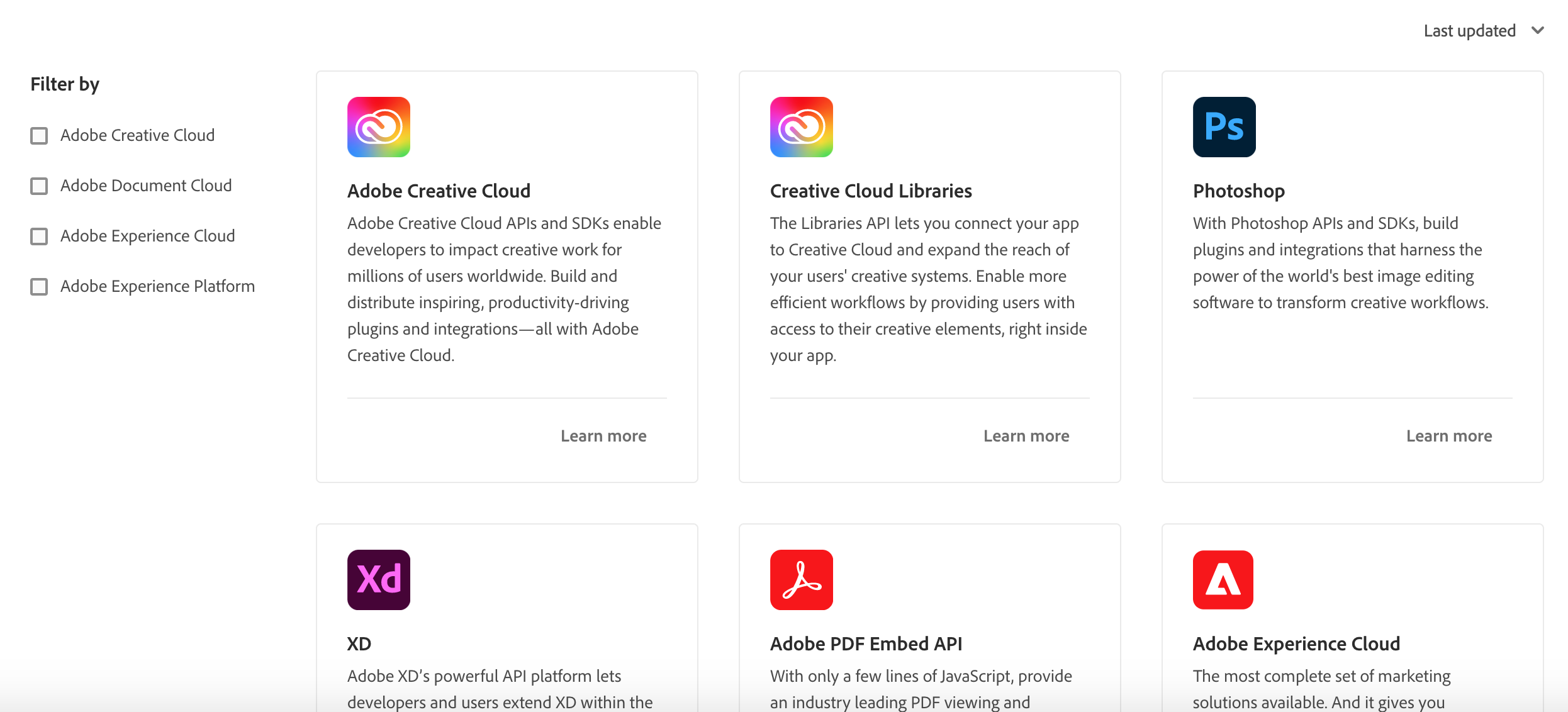
Use Product Card Grid to display Product Cards with filter and sort options based on meta data.
Set interaction to true to display the filter and sort options.
See the data example to provide for clouds and products.
<ProductCardGrid clouds={clouds} products={products} interaction={true} />
Use orderBy to define the default ordering. Choose between last_updated and name.
Use filterByCloud to define the default cloud filter. You can define multiple clouds by default filterByCloud={[cloud1, cloud2]}.
Use filterByIds to define a custom filter e.g. filterByIds=[1, 3, 4] to display products with ids 1, 3 and 4 in that order.
Resource Cards are used on Product/Platform pages for external cross-promotion of materials. Examples includes articles, videos etc.
There are 2 variants: horizontal and vertical Resource Cards. Use multiple Resource Cards with different variants to create a Resource composition.
<ResourceCard slots="link, image, heading, text" width="33%"/>
[Adobe I/O](https://adobe.io)

### Creating a Great Adobe XD Plugin Listing
Rob Kleiman, July 8th 2020
<ResourceCard slots="link, image, heading, text" width="33%" />
[Adobe I/O](https://adobe.io)

### Pattern Builder: A Behind the Scenes Look at Adobe Capture
Nihil Gupta, July 24th 2020
<ResourceCard slots="link, image, heading, text" width="33%" />
[Adobe I/O](https://adobe.io)

### Photoshop Extensibility Enters a New Era Soon: How to get Involved Early
Ash Ryan Arnwine, March 12th 2020
Use slots to identify the markdown content:
link(required)heading(required)image(required)text(optional)
Use theme to match the text color to your color scheme. Defaults to lightest.
Use width to define the size of the block. Supported values are 100%, 50% and 33%.
Used to display the Product information along with the images/icons and headings, with link in a concise and visually appealing way.
<MiniResourceCard slots="image,heading,text,link" repeat="6" theme="lightest" inRow="3" textColor="#427dcd"/>

### Remove Background
To remove the background from an image
[Adobe I/O](https://adobe.io)

### Convert to GIF
To convert the video to the GIF format
[Adobe I/O](https://adobe.io)

### Crop Image
To crop the image
[Adobe I/O](https://adobe.io)

### Merge Video
Merge two or more videos
[Adobe I/O](https://adobe.io)

### Resize Video
To resize the video
[Adobe I/O](https://adobe.io)

### Trim Video
Trimming the video
[Adobe I/O](https://adobe.io)
Use slots to identify the markdown content:
image(required)heading(optional)text(optional)link(optional)
Use theme to match the text color to your color scheme. Defaults to dark.
Use repeat to define how many code sections are part.
Use textColor to define the color of the text. The preset is black.
Use inRow to define the number of mini cards in a row
Carousel is used to show the information along with images and buttons.
<Carousel slots="image,heading, text, buttons" repeat="2" theme="light" />

#### CC Storage API
CC Storage API lets you access and modify assets stored in the Creative Cloud, the world's most popular creative platform.
* [Learn more](../guides)
* [View docs](../guides)

#### CC Storage API
CC Storage API lets you access and modify assets stored in the Creative Cloud, the world's most popular creative platform.
* [Learn more](../guides)
* [View docs](../guides)
Use slots to identify the markdown content:
image(required)heading(optional)text(required)buttons(optional)
Use theme to match the text color to your color scheme. Defaults to dark.
Use repeat to define how many code sections are part of the carousel.
VideoCarousel is used to show the information along with videos and buttons.
Use slots to identify the markdown content:
heading(optional)text(required)buttons(optional)
Use videos give the imported video varaiables in an array example videos={[video1,video2,...]}
Use position to position the video left/right. By default it position to left.
Use variant to specify full width or half width values are fullWidth,halfWidth. By default it is fullWidth.
Use enableNavigation to display navigation icon. By default it is in false. If you want naviagtion set it to true
Use navigationIconColor to change the icon color. By default it is black.
import video1 from './video1.mp4'
import video2 from "./video2.mp4"
import video3 from "./video3.mp4"

<VideoCarousel slots="heading, text, buttons" repeat="3" theme="lightest" videos={[video1,video2,video3]} isCenter position="right" variant = 'fullWidth' enableNavigation={true} navigationIconColor="#1473E6"/>

#### Acrobat on web and desktop

The Adobe Express full editor allows users to edit images and quickly create eye-catching cover and divider pages within Acrobat.

* [Learn more](../guides)
* [View docs](../guides)

#### Breakout EDU

Breakout EDU is an educational game platform for teachers and students that enables users to bring more creativity to virtual games with the Adobe Express full editor.

* [Learn more](../guides)
* [View docs](../guides)

### Letter

Letter is an email newsletter tool that helps content creators, designers, and developers make standout communications with the Adobe Express full editor.

* [Learn more](../guides)
* [View docs](../guides)
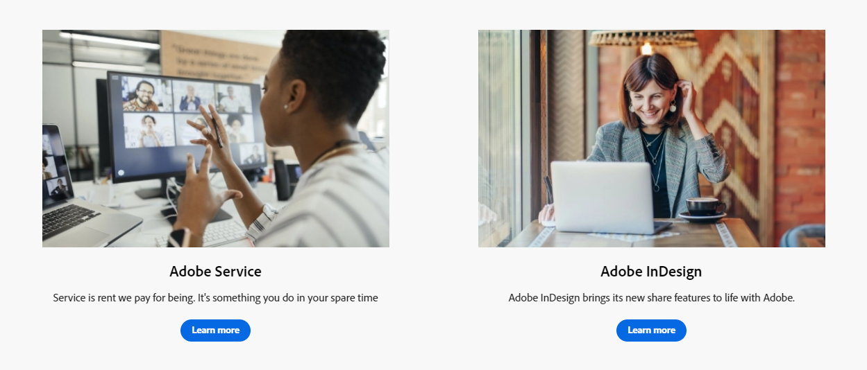
ImageTextBlock is used to display two images, along with text, a heading, and buttons, arranged horizontally. This layout allows for a visually appealing presentation of the content within the modal.
<ImageTextBlock slots="image,heading,text,buttons" repeat="2" bgColor="#f8f8f8" className="boxmodal" isCenter variantsTypePrimary='accent'/>

## Adobe Service
Service is the rent we pay for being. It is not something you do in your spare time
- [Learn more](https://adobe.io)

## Adobe InDesign
Adobe InDesign brings its new share for review features to life with Adobe.
- [Learn more](https://adobe.io)
Use slots to identify the markdown content:
image(required)heading(optional)text(optional)buttons(optional)
Use bgColor to load the backgroundcolor.
Use repeat to define how many code sections are part. The limit for repeat is two.
Use isCenter to center the text.
Use className to customize the component at your own risk.
Teaser component is used to place the text over the background image/color
import bgImg from "./Images/black_image.png"
<TeaserBlock  slots="heading,text,button" textColor="white" position="right" bgURL={bgImg}/>

### TeaserBlock with image background

In TeaserBlock using bgURL={img}, we can load the backroundimage in the div and align the text position on the right by using position="right" attribute

- [Learn more](../guides/)


<TeaserBlock slots="heading,text" textColor="white" position="left" backgroundColor="rgb(64, 34, 138)" />

### TeaserBlock with background color

In TeaserBlock using bgURL={img}, we can load the backroundimage in the div and align the text position on the right by using position="left" attribute
Use slots to identify the markdown content:
heading(optional)text(optional)buttons(optional)
Use bgURL to load the image, backgroundColor to load the backgroundcolor.
Use position to position the heading, text values are left, right, center.
Use textColor to color the heading, text
Use variant to specify full width or half width values are fullwidth,halfwidth.
Accordion has a group of accordion items used to collapse and expand the child content
Accordion item is to expand and collapse the content by clicking the icon. By default it uses + and - icon
Use isOpen to expand the content without clicking the icon
Use header to display the heading with the icon
Use isChevronIcon to use ChevronIcon to expand and collapse instead of the default icon.
Use position to position the icon text values are left, right. It default to the left
Use iconColor to change the icon color. By default it is black
<Accordion>

<AccordionItem header="AccordionItemWithDefaultIcon">

AccordionItem with default options to expand and collapse

</AccordionItem>

<AccordionItem header="AccordionItemWithChevron" isChevronIcon  position="right" iconColor="#1473E6">

AccordionItem expand and collapse using ChevronIcon

</AccordionItem>

<AccordionItem header="AccordionItemDefaultOpen" isOpen>

AccordionItem default expand

</AccordionItem>

</Accordion>
The ListBlock component showcases a two-column layout with alternating left and right content.
<ListBlock slots="text1, text2" repeat="4" iconColor="#2ac3a2" icon="checkmark" variant="fullWidth" />

500 free Document Transactions per month

Volume and multi-product discounts

Access to all 15+ PDF Services including PDF Extract, PDF Accessibility Auto-Tag API, and Document Generation

Access to all 15+ PDF Services including PDF Extract, PDF Accessibility Auto-Tag API, and Document Generation

Easy to sign up and create credentials in minutes

Technical Support included (different tiers available)

No credit card or commitment required

Scalable for high volume needs.
Use slots to identify the markdown content:
text1(required) is placed in left side.text2(required) is placed in right side.
Use repeat(required) to define how many code sections are part.
Use iconColor to define the marker color. The preset is black.
Use icon used to indicate individual items or elements within the list. By default it is in checkmark. Values are checkmark,disc, number.
Use variant to specify full width or half width values are fullWidth,halfWidth.
Text1 will align the text on the leftside list i.e (1,3,5,...) Text2 will align the text on right side i.e (2,4,6...)
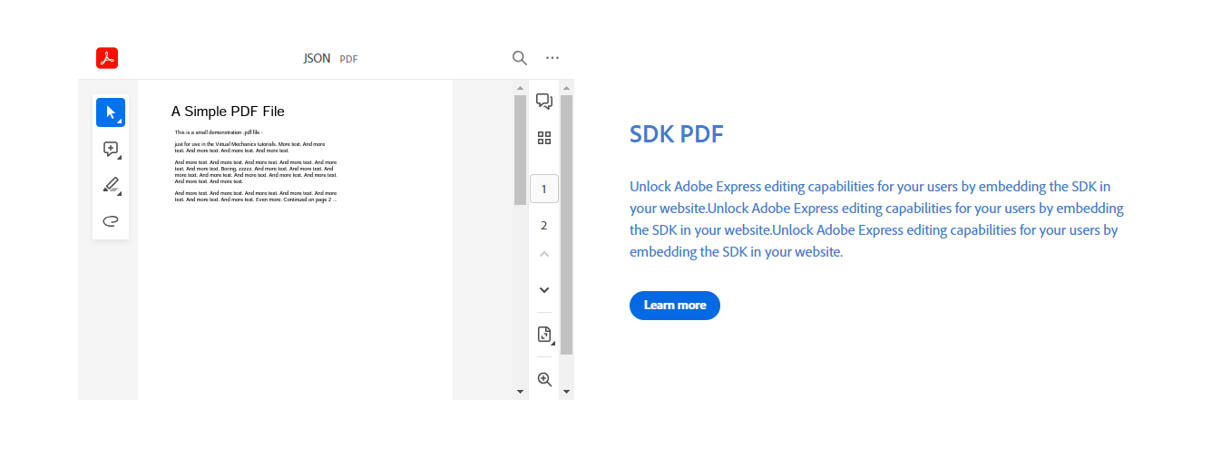
The PDFViewer component integrates PDF display with accompanying text, headings, and buttons for a seamless user experience.
import pdf from "./sample.pdf";

<PDFViewer slots="heading,text,buttons" url={pdf}  showDownloadPDF showZoomControl showPrintPDF customId="sample_pdf_viewer" showAnnotationTools fileName="JSON" variant="fullWidth" textColor="#427dcd" showDirection="row"/>

## SDK PDF

Unlock Adobe Express editing capabilities for your users by embedding the SDK in your website.

- [Learn more](https://adobe.io)
Use slots to identify the markdown content:
heading(optional)text(optional)buttons(optional)
Use url (required) give the imported video varaiables like url={pdf}
Use client_id(required) is used to access and view the PDF.
Use showDownloadPDF to display the option for downloading the PDF.
Use showZoomControl to show the option for zooming in the PDF.
Use showPrintPDF to show the option for printing the PDF.
Use showAnnotationTools to display the edit icon for editing, deleting, or replying to comments.
Use showDirection to determine the layout of the content, either in rows or columns. The possible values are row or column, with the default setting as row.
Use customId to specify a custom ID for the PDF. The default value is adobe-pdf.
Use textColor to define the color of the text. The preset is black.
Use variant to specify full width or half width. The values can be 'fullWidth' or 'halfWidth', and the default is fullWidth.
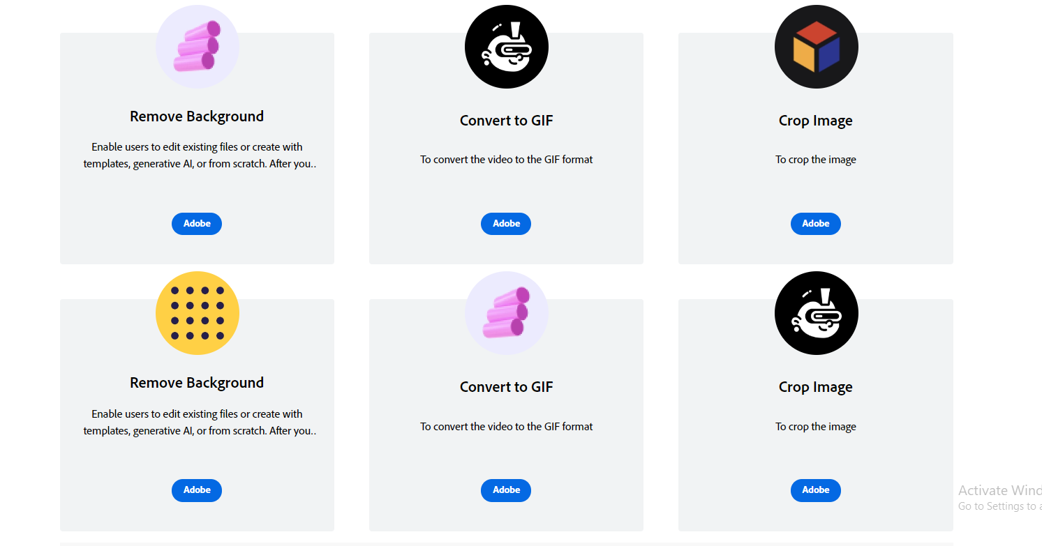
This component is designed to showcase product information using images/icons, headings, and links in a profile card format, presenting the details in a concise and visually appealing manner.
<ProfileCard slots="image,heading,text,link,buttons" repeat="6" theme="lightest" inRow="3"/>

### Remove Background
Enable users to edit existing files or create with templates, generative AI, or from scratch.
After you embed the full editor, users can quickly and easily edit existing files or create new content like social media graphics, flyers, and ads using Adobe Firefly capabilities such as text-to-image and text effects alongside thousands of creative templates and design assets.
[Adobe I/O](https://adobe.io)
- [Adobe](https://adobe.io)

### Convert to GIF
To convert the video to the GIF format
[Adobe I/O](https://adobe.io)
- [Adobe](https://adobe.io)

### Crop Image
To crop the image
[Adobe I/O](https://adobe.io)
- [Adobe](https://adobe.io)

### Remove Background
Enable users to edit existing files or create with templates, generative AI, or from scratch.
After you embed the full editor, users can quickly and easily edit existing files or create new content like social media graphics, flyers, and ads using Adobe Firefly capabilities such as text-to-image and text effects alongside thousands of creative templates and design assets.
[Adobe I/O](https://adobe.io)
- [Adobe](https://adobe.io)

### Convert to GIF
To convert the video to the GIF format
[Adobe I/O](https://adobe.io)
- [Adobe](https://adobe.io)

### Crop Image
To crop the image
[Adobe I/O](https://adobe.io)
- [Adobe](https://adobe.io)
Use slots to identify the markdown content:
image(required)heading(required)text(optional)link(optional)buttons(optional)
Use theme to match the text color to your color scheme. Defaults to dark.
Use repeat to define how many code sections are part.
Use textColor to define the color of the text. The preset is black.
Use inRow to define the number of profile cards in a row.
Miniproductcard component is used to display the product card with little image and description
<MiniProductCard slots="image, heading , text , buttons" repeat="4" theme="lightest" inRow="4" variantsType="primary" buttonStyle="outline" />

# Firefly API
Firefly API
- [Learn more](https://developer-stage.adobe.com/)
Use slots to identify the markdown content:
image(required)heading(required)text(optional)buttons(optional)
Use repeat to define how many code sections are part.
The Edition component is used to display the edition of the product.
You can use MDX transclusion to embed markdown documents into other markdown documents see the MDX documentation.
For example, if you want to include the content of overview.md into index.md:
index.md content:
import Overview from './overview.md'

# Welcome

Lorem ipsum

<Overview/>

## Questions

Lorem ipsum
overview.md content:
## Overview

Lorem ipsum
index.md will be rendered as:
# Welcome

Lorem ipsum

## Overview

Lorem ipsum

## Questions

Lorem ipsum
Sites are using npm to define dependencies so we can also include external markdown documents.
You have to define a name in the package.json like here to be able to include it
as a dependency in another site.
You don't have to release the site on npm since npm supports installing dependencies using github repository urls. For example, to install https://github.com/AdobeDocs/dev-site-documentation-template/
as a dependency in another site, you can run the command npm install --save adobedocs/dev-site-documentation-template;
Your site package will show up under node_modules/[PACKAGE_NAME] e.g. node_modules/dev-site-documentation-template.
When pointing to a github repo as a dependency and wanting to get the latest change from that dependency, you have to ensure that your package.json is pointing to latest version of that dependecy. Otherwise, if you have already pulled down that dependency and it exists in your node_modules/, it won't grab the latest changes. To get around this, simply delete your node_modules/ and then yarn install again.
See full example below using a Variant block.
Together with Variant Blocks, the author can query what should be rendered from external sources.
This allows to write content once, and reuse it everywhere.
For example, let's say there are 2 repositories named https://github.com/adobedocs/repo1 and https://github.com/adobedocs/repo2.
Both are sites using the theme and have markdown content defined under src/pages.
- repo1 has reusable markdown content written with Variant Blocks under
/src/pages/debugging/index.md:
## How to Debug Your Plugin
Bugs happen! In this tutorial, you will learn how to debug your plugin.
<Variant product="XD" repeat="2" />
First launch the XD console, by clicking Developer > Console
[XD link](https://adobe.io)
<Variant product="Photoshop" repeat="2" />
First launch the Photoshop console, by clicking Developer > Console
[Photoshop link](https://adobe.io)
<Variant test="image" repeat="2" />
#### Image

Use repeat to define how many elements are part of the Variant Block. Use any key=value property to mark your Variant Block.
-
repo2 added repo1 as dependency with
npm install --save adobedocs/repo1to be able to reference its markdown content. -
repo2 embeds repo1 content by using the
importstatement and inserts the content in its own markdown together with aqueryfilter to only display what is needed.
import Debugging from 'repo1/src/pages/debugging/index.md'

# Debugging

<Debugging query="product=Photoshop" />

More content
will be rendered as:
# Debugging

## How to Debug Your Plugin

Bugs happen! In this tutorial, you will learn how to debug your plugin.

First launch the Photoshop console, by clicking Developer > Console

[Photoshop link](https://adobe.io)

More content
You can query multiple elements, for example you can add the section with the image by adding it to the query.
<Debugging query="product=Photoshop&image=test" />
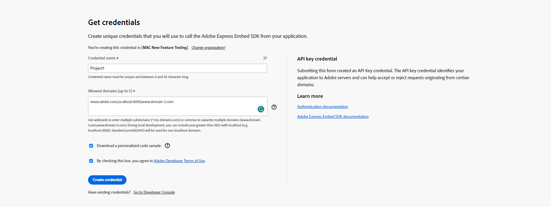
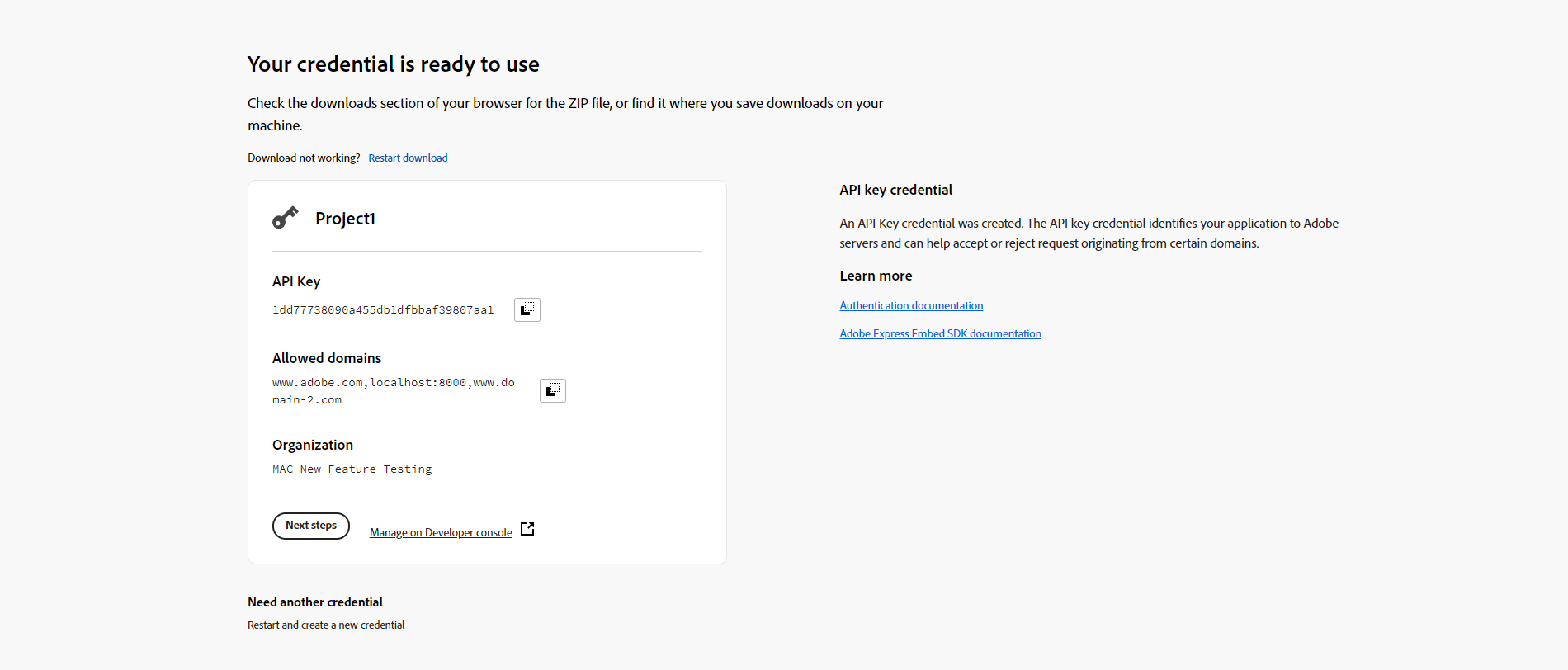
The Get Credential component allows easy credential generation and code sample access on the developer website, utilizing developer console APIs. Child component should only work if it's inside the parent GetCredential component.
Use credentialType(optional) prop to specify the credential type . Defaults to apiKey.
Use service(optional) prop to define the Adobe Product & Service.The preset is CCEmbedCompanionAPI.
Use className to customize the component's styling using CSS. However, remember that modifying the component's styles with className carries certain risks.
GetCredential.SignIn is a component utilized to prominently showcase the sign-in page, offering users a straightforward access point to login.
Use title(required) to provide a title for the credential.
Use paragraph(optional) to describe the credentials.
Use buttonText(required) to specify the sign-in button label
GetCredential.Form is a flexible for designing the credential form, ensuring a seamless and personalized user experience.
Use title(required) to provide a title for the credential.
Use paragraph(optional) to describe the credentials.
GetCredential.Form.CredentialName(required) streamlines credential name structure creation.
Use label(optional) defines the label for the credential name.
Use description(optional) prop is employed for adding helptext to the credential name.
Use placeholder(optional) sets the input field's placeholder for the credential name.
Use range(optional) prop to specify the allowed length of the credential name.
Use contextHelp(optional) shows a user extra information about the state of either an adjacent component.It's boolean value true or false. The preset is false.
Use contextHelpHeading(optional) defines the contextHelp heading.
Use contextHelpText(optional) shows the extra info about the credentialname.
Use contextHelpLink(optional) adds a standalone link.
Use contextHelpLabelForLink (optional) prop to specifies the link label.
GetCredential.Form.AllowedOrigins(optional) streamlines credential name structure creation.
Use label(optional) defines the label for the domain name.
Use description(optional) prop is employed for adding helptext to the domanis.
Use placeholder(optional) sets the input field's placeholder for the AllowedOrigins.
Use contextHelp(optional) shows a user extra information about the state of either an adjacent component.It's boolean value true or false. By default false.
Use contextHelpHeading(optional) defines the contextHelp heading.
Use contextHelpText(optional) shows the extra info about the credentialname.
Use contextHelpLink(optional) adds a standalone link.
Use contextHelpLabelForLink (optional) prop to specifies the link label.
GetCredential.Form.Downloads(optional) is used to specify the option for downloading code samples.
Use label(optional) defines the label for the domain name.
Use contextHelp(optional) shows a user extra information about the state of either an adjacent component.It's boolean value true or false. By default false.
Use contextHelpHeading(optional) defines the contextHelp heading.
Use contextHelpText(optional) shows the extra info about the credentialname.
Use contextHelpLink(optional) adds a standalone link.
Use contextHelpLabelForLink (optional) prop to specifies the link label.
GetCredential.Form.Download(optional) is used to define the available languages and provide download links for code samples.
Use title to specify the language title
Use href to set the download hyperlink for sample code in zip files.
GetCredential.Form.Side(optional) content is customizable, allowing you to display whatever you prefer based on user needs.
GetCredential.UnknownError (optional) is utilized for displaying unknown errors.
Use helpLink(optional) is employed for obtaining assistance.
Use helpLinkText(optional) is used to specify the label for the help link.
GetCredential.Card(optional) is employed to present the credential result.
Use title(optional) to furnish a title for the credential card.
Use paragraph(optional) to provide a description for the credential card.
Use nextStepsLabel(optional) is employed to indicate the next steps or actions to be taken.
Use nextStepsHref(optional) specifies the hyperlink for the next steps or actions to be taken.
Use developerConsoleManage(optional) specifies the label for the developer console
GetCredential.Side(optional) content is customizable, allowing you to display whatever you prefer based on user needs.
<GetCredential credentialType="apiKey" className="getCredentialContainer" service="CCEmbedCompanionAPI" >


    <GetCredential.SignIn title="Get credentials" paragraph="Create unique credentials that you will use to call the Adobe Express Embed SDK from your application." buttonText="Sign in to create credentials" />

    <GetCredential.Form title="Get credentials" paragraph="Create unique credentials that you will use to call the Adobe Express Embed SDK from your application." className="formClass">

        <GetCredential.Form.CredentialName label="Credential name" description="Credential name must be unique and between 6 and 45 character long." range="45" />

        <GetCredential.Form.AllowedOrigins label="Allowed domains (up to 5)" contextHelp={true} contextHelpHeading="What are allowed domains" placeholder="Example: www.domain-1.com, www.domain-2.com, *.my-domain.com, localhost:5000" contextHelpText="To prevent a third party from using your client ID on their own website, the use of your client ID is restricted to a list of domains that you specifically authorize." contextHelpLink="https://www.adobe.com/" contextHelpLabelForLink="Learn more in our documentation" description="Use wildcards to enter multiple subdomains (*.my-domains.com) or commas to separete multiple domains (www.domain-1.com,www.domain-2.com). During local development, you can include post greater than 1023 with localhost (e.g. localhost:3000). Standard ports(80,443) will be used for non-localhost domains." />

        <GetCredential.Form.Downloads label="Download a personalized code sample" contextHelp={true} contextHelpHeading="Select Language">
          <GetCredential.Form.Download title="JavaScript" href="https://acrobatservices.adobe.com/dc-integration-creation-app-cdn/8bab684/files/samples_q3_2023/PROD/dc-pdf-services-sdk-java-samples.zip" />
          <GetCredential.Form.Download title=".Net" href="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/Net.zip" />
          <GetCredential.Form.Download title="Python" href="https://python.zip/" />
          <GetCredential.Form.Download title="Ruby" href="https://www.ruby.zip/" />
        </GetCredential.Form.Downloads>

        <GetCredential.Form.Side>
          <div className='side-container'>
            <h3 className="spectrum-Heading spectrum-Heading--sizeS side-header" >API key credential</h3>
            <p className="spectrum-Body spectrum-Body--sizeM">Submitting this form created an API Key credential. The API key credential identifies your application to Adobe servers and can help accept or reject requests originating from certian domains.</p>
            <h3 className="spectrum-Heading spectrum-Heading--sizeS side-header" >Learn more</h3>
            <a className="side-documentation" href='https://some_help_link'>Authentication documentation</a>
            <a className='side-documentation' href='https://some_help_link'>Adobe Express Embed SDK documentation</a>
          </div>
        </GetCredential.Form.Side>

    </GetCredential.Form>

    <GetCredential.UnknownError helpLink="https://some_help_link" helpLinkText="Get Help" className="unKnownError" />

    <GetCredential.Card title="Your credential is ready to use" paragraph="Check the downloads section of your browser for the ZIP file, or find it where you save downloads on your machine." nextStepsLabel="Next steps" nextStepsHref="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/credentials/nextsteps" developerConsoleManage="Manage on Developer console" className="card_developer_console">

    <GetCredential.Side>
        <div className='side-container'>
            <h3 className="spectrum-Heading spectrum-Heading--sizeS side-header" >API key credential</h3>
            <p className="spectrum-Body spectrum-Body--sizeM">An API Key credential was created. The API key credential identifies your application to Adobe servers and can help accept or reject request originating from certain domains.</p>
            <h3 className="spectrum-Heading spectrum-Heading--sizeS" >Learn more</h3>
            <a className="side-documentation" href='https://some_help_link'>Authentication documentation</a>
            <a className="side-documentation" href='https://some_help_link'>Adobe Express Embed SDK documentation</a>
        </div>
    </GetCredential.Side>

    </GetCredential.Card>

</GetCredential>
Create the new JS component in the component folder and import the component in the markdown file wherever you want to add credential
For the above code I named like CreateCredential.js, You can use the component in the markdown file like the below code
import { CreateCredential } from "../components/CreateCredential.js";

...

<CreateCredential />
To customize the side component within the GetCredential component. In Credential.css specify the custom styles you want for the side component.
Import the Credential.css file into your JavaScript component CreateCredential.js to apply the styles.
import './Credential.css';
Toasts are brief, unobtrusive messages used for user notifications or feedback
<Toast variant="success" message="Page Loaded successfully" disable={5000} />
Use variant(optional) to specify the toast's variant.The values are Info, Success, Neutral, and Error. By default Neutral.
Use message(optional) to display a message within the toast.
Use disable(optional) to prevent the automatic closure of the toast. You can set a specific duration (e.g., 1000 milliseconds) to close it, or manually close the toast when desired.
When using themes, you can take advantage of something called shadowing. This allows you to override the default component included in the theme with a custom one you’ve created.
The Adobe I/O Theme package has a component to render code using the Prism syntax highlighter. With shadowing, you can override the component to provide your own.
If you look at the file tree of your site, you’ll see it looks something like this:
root
├─ src/pages
│   ├- index.md
│   └- etc.
├- .env
├─ gatsby-config.js
└─ package.json
To enable shadowing, you need to add a folder called @adobe/gatsby-theme-aio.
Any file placed in that directory with a path that matches the path of a file from the theme will completely shadow the file.
So the new folder structure with shadowing enabled will look like following:
root
├─ src
│  ├- pages
│  │  ├- index.md
│  │  └- etc.
│  └- @adobe
│     └- gatsby-theme-aio
│        └- components
│           └- Code
│              └- index.js
├- .env
├─ gatsby-config.js
└─ package.json
You can define your own Code components under src/@adobe/gatsby-theme-aio/components/Code/index.js.
Notice omitting the src directory in the shadow folder.
You can build pages without the default layout by setting layout to none within the page front matter.
The Global Header, Footer, Side Navigation etc. are always shown but anything in between can be customized.
See the example markdown file.
This can be useful if you want to embed pages from another system. The embedded page will be framed between the Global Header and Footer.
Simply set frameSrc to the url of the external page within the front matter.
See the example parent page and child page which leverages the Penpal library to create a communication channel to exchange information.
Currently, you can only define a light or dark theme for Code blocks. By default, Code blocks are displayed in dark theme.
To change Code blocks from dark to light theme, you have to shadow the theme/index.js file:
export default {
  code: 'light'
};
To upgrade to the latest version of the theme, simply run npm update if you have defined the dependency with a version range selector.
If not, update the version of the dependency by setting the version manually in the package.json and run npm install.
This will also update the lock file package-lock.json.
We recommend to setup GitHub dependabot in your site repository.
Simply copy the dependabot file in your .github folder.
The bot will automatically submit pull requests to keep your version of the theme up to date. Please make sure to use a version range selector for your dependencies in your package.json.
Use the GitHub issue tracker to report issues, ask questions or log feature requests. Any feedback is welcome !
Please check existing issues before filing anything new.
Contributions are welcomed! Read the Contributing Guide for more information.
See Conventional Commits for commit guidelines.
You can check the latest released version of the theme at https://github.com/adobe/aio-theme/releases.
This repository is setup as a monorepo using lerna for automated publishing to NPM.
Use GH_TOKEN=[YOUR_GH_TOKEN] lerna version --create-release github --conventional-commits --no-private -m "chore(release): publish" for publishing the theme on npm.
By default, any document pages will have "Log an issue/ Edit in Github" feature enabled.
This can be turned off through gatsby-config.js
  siteMetadata: {
    githubIssue: {
    removeLogIssue: true,
  },
}


