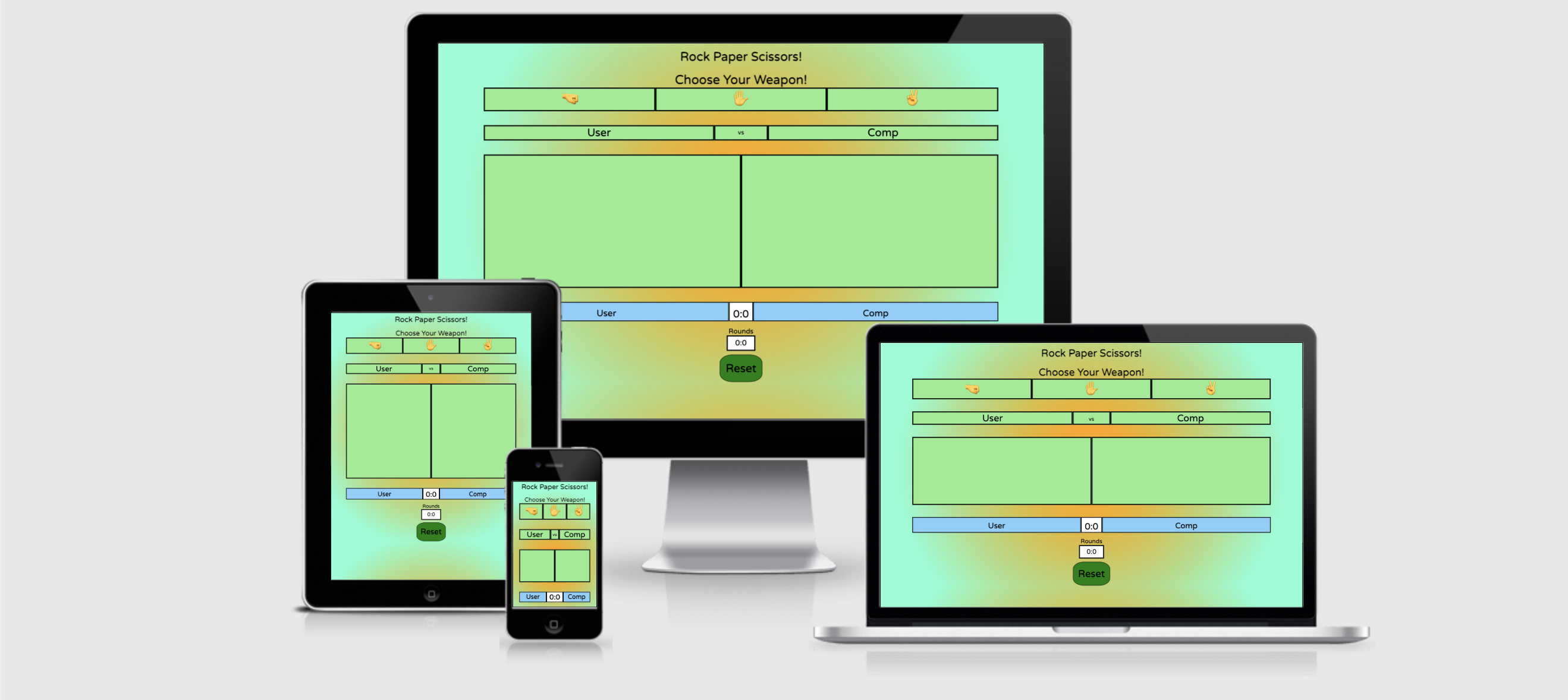
Welcome to my Rock-Paper-Scissors game!
This is a player vs computer game where, following the rules of the game, the user and computer can score points up to 10, before one or the other wins that round.
This game is designed to be played by someone who wants to play a game but doesn't have the time to play something complex. Perhaps on a mobile phone when travelling on the subway/underground. It is also ideal for a younger audience This game is at a simple enough complexity that is can be played and enjoyed by anyone, as it is everyday by children everywhere. The game has many variations to it across the globe, swapping out the names of rock, paper and scissors for other words, or adding complexity by introducing other variables (Such as Rock, Paper, Scissors, Lizard, Spock!). For my game, I've opted to keep the traditional 3 variable rock, paper and scissors!
The goal of this website, beyond testing my Javascript abilities, is to make a well-tested and fully functioning basic game that combines functionality with clean design and colours.
- Wireframe
- UX Description
- Website Features
- Features to implement
- Testing and Validation
- Bugs and Issues
- Peer Reviews
- Deployment
- Credits
- Final Thoughts
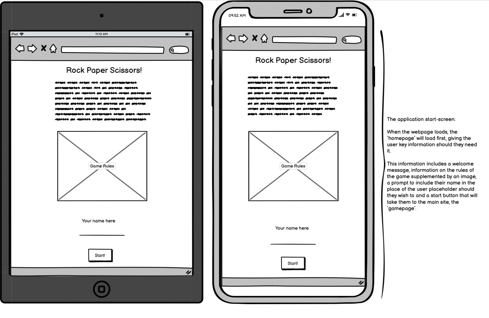
I used Balsamiq to create my wireframes for this project. I took a mobile/tablet-first approach with this project, and as such, my wireframes reflect that.
I first went about creating a wireframe for how I wanted my starting page to look, and when I was happy, I moved on to the game page sections for tablet and mobil respectively.
For this game, bright and bold colours were a must. However, I wanted to make sure that they kept the player's focus and didn't distract from the objective of the game! I featured the follwing:
Colours:
- A radial gradient background featuring #fdbb2d, orange and aquamarine.
- Start-Game and Reset buttons in Green.
- All content boxes in Lightgreen.
- User and Computer score labels in Lightskyblue
- Score and Timer in #fff
- All fonts and borders in Black.
An essential task for this website was to have to responsive displays that change upon clicking a button/div when the player is ready to play.
By hiding the main page through surrounding it in a div in my html file, I was able to make this start page show by default and then hide that page when the player clicks 'start'.
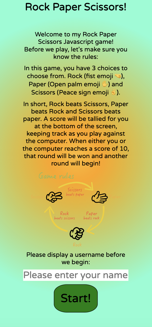
The Start-Page briefly describes the rules of the game of Rock, Paper, Scissors and tells the user how the scoring system works. An image provides visual feedback to the user as well to help cement the rules in their mind. When they feel they understand the rules of the game, then can enter a name/username and click 'start'.
Once the player has clicked start, the game page will appear. This is done by hiding the start page div in Javascript and revealing the main page div. This is the full page on mobile:
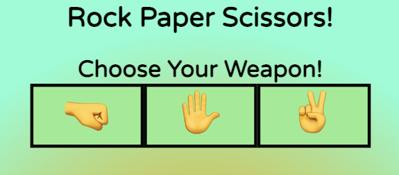
The game features a choices bar with 3 options to select. Rock (Fist emoji 🤜), Paper (Open hand emoji ✋) and Scissors (Peace sign emoji ✌️). There is an event listener on each choice that will listen for a click and replicate in the arena section.
The arena is where the users choice and the random computer generated response will show. The user choice will show on the left and the computer choice on the right.
The arena before the player makes any selection:

Player choice and random computer choice displayed:

This section displays the user and computer in a bar with the match score in between, and the round score below that. The match score will increment as the game goes on until one of the players reaches 10. At which point, the round tally will go up by one and reset the match scores back to 0 to play another round.
At the very bottom of the page is a green reset div/button, that has an event listener that when clicked on, will reset all the scores (match and round) to 0 to start the game over again from thew beginning.
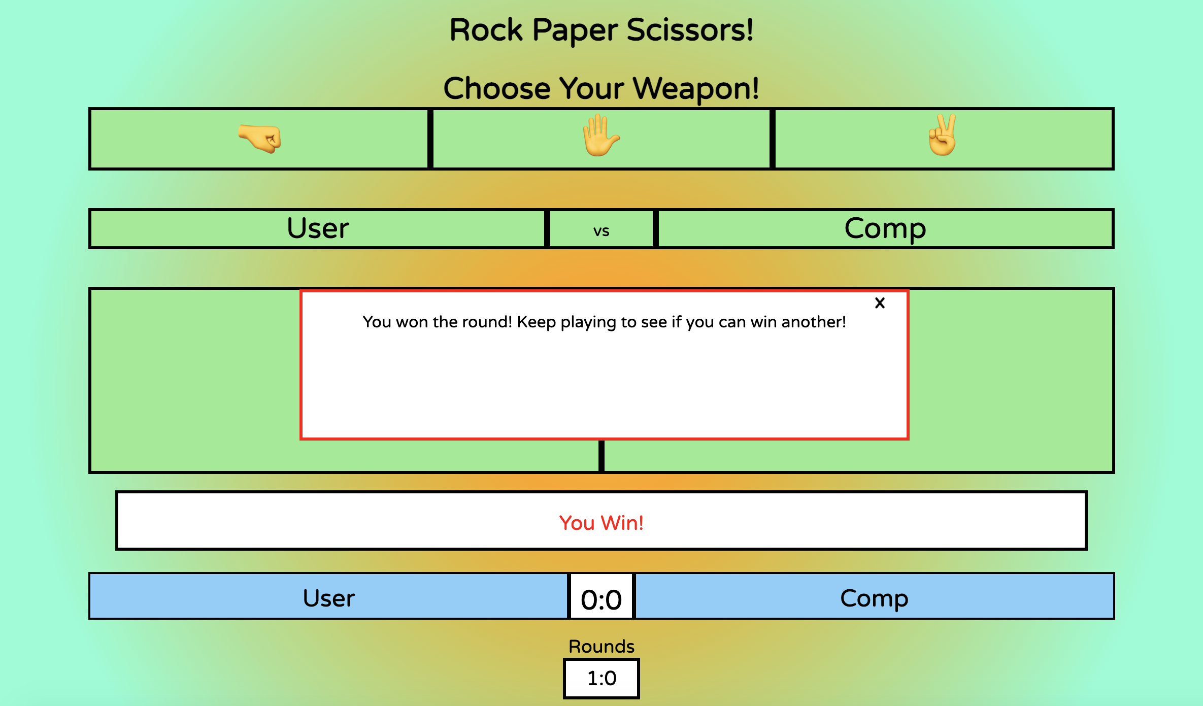
This is the modal that displays when a round is won by either the player or the computer. Depending on which player wins the round, a different message will display.
Given more time to invest in the project, I would likely aim to implement the following features:
-
Either a countdown or count-up timer. Depending on which, there would either be a limited amount of time in which you have to win as many matches and rounds as you can, or in the case of counting up, the timer would serve just to show the user how long they've been playing.
-
An extra pair of choices to replicate something akin to rock, paper, scissors, lizard, spock. This would add an extra layer of complexity to the game, and would be selectable as an option in-game, so the player could jump between 3 and 5 option versions of the game as they so desire.
-
Some basic animation to the emojis to add some nice visual effects to the project. Perhaps an emoji can increase in size slightly for the winning player and decrease in size slightly for the losing player.
I had several issues with this project. And thanks to some keen-eyed people who helped me troubleshoot and gave me a walkthrough on debugging, I was able to get past them.
The first issue I had was that when I was trying to create a function for getting a result back from the computer, I was always getting a draw when I console.log'd the result.
- Fonts imported from: Google Fonts
- Favicons imported from: Favicon.io
- Learned how to make colour gradient backgrounds on: cssgradient.io
- Image for Rock, Paper, Scissors rules came from here: RPS Rules image
- Responsiveness check from: Am I Responsive?
- W3 Schools inspired my modal design: W3 Schools
- A massive thanks to Danilo D'Auria for his superb help in getting me through some hurdles on my JS journey!
- Many thanks to Daisy McGirr, my mentor through this project, who gave me all the guidance and support required to steer me in the right direction.
- The London C.I Coding Community group. Always supporting which me with my questions and giving great advice.
This project really challenged my understanding of Javascript and I certainly learned a lot through doing this project and from getting help from peers and mentors across the board. The project has certainly inspired me to continue developing my JS skills further and I expect I will do some side-projects to accomplish this.
