-
Notifications
You must be signed in to change notification settings - Fork 1.3k
New issue
Have a question about this project? Sign up for a free GitHub account to open an issue and contact its maintainers and the community.
By clicking “Sign up for GitHub”, you agree to our terms of service and privacy statement. We’ll occasionally send you account related emails.
Already on GitHub? Sign in to your account
Loop for Apple Watch (watchOS 10.x) UI issue #2162
Comments
|
This was reported in an issue that was inadvertently closed. Adding the link for continuity. |
|
See my comments in #2082 for a fix/workaround. |
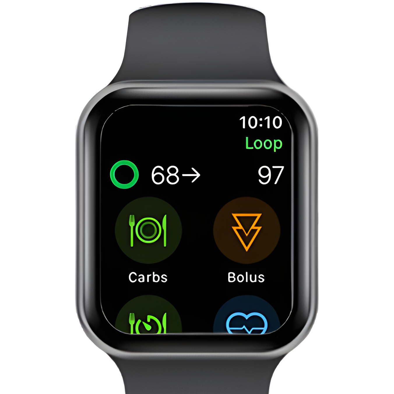
@A9qx Can you show a Watch screenshot of one or more of those apps? My guess is that they have redesigned their interfaces with new controls, but that you'll find that in all of them that top bar is at least two lines high (i.e. the height that Loop is now wrapping to with time plus title below it). Since WatchOS 10 now allows controls in those top corners, and those controls are two lines high, it's a common redesign. For example, here is the Carrot redesign, using two lines. I'm not saying that the Loop Watch interface couldn't be redesigned, but I don't think (for WatchOS 10 and later) it can go back to what it was, with a single narrow line that includes both the title and the time. Deleting the title ("Loop", which doesn't add much) is a simple fix for now. |
Sure. Here are more examples, below are Flighty, Carrot, Sleep, and Nike Run Club. I'd say in general, most apps that have optimized for watchOS 10 I'd agree have ditched the single narrow line that includes both title and time. Most have opted for replacing it with UI buttons and other elements instead. If a redesign is indeed on the table, definitely take inspiration for sure from Flighty and Carrot. Both did an excellent job showing how you can use the extra screen real estate found on modern AWs, they've gotten a lot bigger over the years. |
|
Hmm, I take it back - ECG does manage this somehow. Would be interested to see other examples, especially for non-built-in apps. It's either (a) possible with a full redesign in SwiftUI (not a simple task), or (b) another example of Apple allowing its own apps to do things that third-party apps can't. |
|
I'd also recommend looking at iAPS for inspiration on the T1D side of things as their Apple Watch app is really solid. |


Describe the bug
The Loop watch app is wrapping the label text "Loop" below the time on my Series 9 (41mm) watch running watchOS 10.4 (stable public release).
Screenshot:

Hardware: Apple Watch Series 9
OS Version: watchOS 10.4, 10.5 (non beta)
Loop Version: 3.2.3 (57)
Repo: LoopWorkspace/LoopWorkspace
CGM: Dexcom G6
Manager app: Dexcom G6 App
Pump: Omnipod DASH
Additional Context: This was a previous issue that was closed automatically for being stale, however this issue still exists, so I have reopened the issue (see original issue): #2082 (comment)
Also, this isn't an issue with watchOS 10, this is a stable release and other apps such as Carrot, ECG, Flighty, etc, don't have wrapping issues like this, it can be resolved within Loop's codebase.
The text was updated successfully, but these errors were encountered: